
My intent was to have the sky be a complement to the general color of the ground. At the end, my own, not well-trained, color sensibilities came into play.
darktable-3.7.0+1510
_MG_3103_14.CR2.xmp (66.3 KB)

Edit: To me, the preview here looks less sharp and grittier than the jpg on my computer.
1 Like
So I think this can be a product of the user settings (scaling, preview 1/2 size raw, and prefer performance over quality)…For me it seems like at least with DT the jpg will have the level of detail that you see at 100%…When you view full screen for the whole image you have scaled the image to around 25%…using whatever combination of setting you have for both preview and scaling… If you export and change the scale from 1 to 0.25…then your jpg will at least from my experience appear to have a more similar level of detail as that shown in the preview…this came up in a thread a few weeks back where the poster noted that the exported jpg seemed to have more noise than the preview of the edit…messing around a bit I think it was the same issue…likely also why RT has chosen to only show the impact of some tools at 1 to 1…comes down to the way you like to handle sharpening and other modifications that are really only accurately portrayed at 100%
I’m comparing the image in my post when I click on it to my jpg in IrfanView zoomed to the same size. One difference that may affect it is I have a dark gray background on pixls versus a medium gray background in IrfanView.
Are they the same image ie the same size so do you mean the jpg you exported you have uploaded here …and you are comparing how it looks when view here in the browser vs in IV??
Yes. I’m seeing a difference I don’t normally notice. Especially the sharpness, even though I did not edit for extreme sharpness. I used diffuse and sharpen presets for local contrast and soft contrast only. It just might be browser versus a viewer app.
Edit: I might have noticed the sharpness since there are a million edges in the picture.
My take, using dt. 3.7
I was aiming for a warm, but natural looking, image - but I’m still just learning how to use color balance rgb.

_MG_3103.CR2.xmp (36.4 KB)
1 Like

wow, i really like this version  , it reminds me of the colour in one of Wes Anderson’s movies, I’m gonna dig the XMP, and maybe try to make the skin tone a little bit neutral with mask and opacity.
Thanks. Looking forward to seeing your work on the skin tone.
What skin tone?
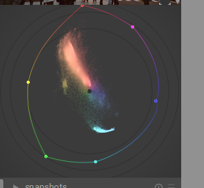
It’s basically teal and orange. desaturated sky of red and some CB to make darker stuff orange…you can clearly see it on the vectorscope…
Would be easy I think…your grade has strong orange transferred to skin…mask skin and use clut module tweak the two skin tone patches or better yet load the skin tones preset and tweak the patches …likely desaturated and lighten a bit
Just FYI, I was studying your use of diffuse or sharpen and found that d or s 4, denoise: fine, removed all the sharpening effect of the earlier uses of d or s.
I was trying to follow Boris’ method of using Palleton to do color grading. I tried to get three analogous colors for the warm tones. Then I obtained the RGB of a largish, rectangular area in the middle and used another color guide site to get the complement to it, a shade of blue. Then I played with the blue color a bit to get something that looked good to me. All that trying this and trying that put a lot of steps into the history, and attempting to follow it might drive you crazy.
It wasn’t too hard to follow actually…and the result was clear…
1 Like
Yes, I just saw this with another photo, really I was trying to increase to get sharpen, but using the denoise: fine after is the opposite. I need to study the new d & s module because have a lot of options.

Where did you get the LUT for the first one?
Yes, I already understand how to implement colour when editing photos (and already have a preferred workflow to achieve that), I am just curious how other people achieve their results because there are many different steps to achieve the same image, right? 