So the options seem to be, in no particular order:
Remove the widgets by default. The user can then populate that space with the widgets they want. Downside is that its not obvious that you can put widgets there.
Move those widgets to another toolbar.
Change the icons to something else
Populate it with widgets different from the current ones.
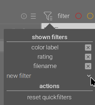
Next to the Filter icon is the word FIlter …that should denote and make it clear that this is the Filter row. So it looks like there is room on the lower bar to start with a word…Say “Rate” or “Label” or something like that to clearly denote the function of the following buttons…that would just shift things over a bit…
I also found myself confused by the different color labels to use for filtering and setting this week. I don’t usually use color labels, and for star ratings, I use the keyboard. Of course, I solved the problem by clicking all the color labels and finding the correct one. However, I believe this need to experiment rather than “just know” can be described as not intuitive.
I’m wondering if this possible confusion is not a symptom of something else. At the bottom of the UI, there are two sets of controls. One is local and applies only to the selected image, while the other applies to the view. At the top, there are also multiple sets of controls that apply to different things. For example, one “star” is a filter rating, and the other “star” configures the contents of the thumbnail overlay.
I feel a slight but not significant lack of consistency in the UI, where “things in this region do X/in this region do Y.” This inconsistency makes it difficult to predict the behavior of the UI without experimentation or reading the manual. Some improvements to the design language that state, “all the behavior that applies to the selected image is defined in this section, and all the behavior that changes views in this part” could help?
I think it is somewhat confusing, but it cannot be avoided completely.
If you want to assign a star rating, and filter by star rating, or assign a colour label, and filter by a colour label, then the icons will be similar.
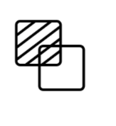
But, sometimes icons are reused just because they are there, it seems. For example, why is this icon a star? Has nothing to do with star ratings:
Honestly, that’s a bit disheartening, especially coming from you who know very well that I have several outstanding very concrete contributions (1 open PR for dtdocs, of which you are a reviewer, and at least three implemented features for DT, to which you contributed with very insightful comments and suggestions, that are waiting that 5.4 is released before they become actual PRs).
I didn’t ask for any dev cycles. If the discussion goes somewhere and we end up with some nice ideas, I will prepare a concrete proposal and most probably also go ahead and implement it (after making sure that the core devs approve of it, as I always did so far).
I wrote the following paragraph or similar ones many times, but here it comes again:
Before one can come up with an “actionable suggestion”, one must first (1) identify a problem, (2) reason about possible solutions, (3) turn the abstract idea of a solution into an actionable plan (4) [possibly] go ahead and implement it.
This specific discussion is in between phases (1) and (2). Since this is a discussion forum, it seems like an appropriate venue to have it. There is some agreement that there is margin for improvement, and we are brainstorming on possible solutions.
This should be clear to any reader of this thread, so how does the remark that this is not “actionable” (it clearly is not) advance the discussion?
This may very well be the final conclusion of this discussion. But let’s give it a chance, shall we?
Yes, I get that. And yes, the tooltip clears up the situation. Still, when one looks at the icon, it says ‘star’, not ‘overlay’ or ‘metadata’. While the latter is probably impossible to capture in an icon, ‘overlay’ might be possible to convey. These are generic examples, cannot be used directly in darktable (not consistent with the UI), just providing them as ideas:
I didn’t use colours or numbers until recently, when I realised that I don’t have a use for them in my minimal overall media database management, they can be very useful in organising my workflow for each processing batch.
Yes, I had some confusions. IIRC, maybe the two sets of colour buttons were part of that.
We are all “new users” when we use an aspect of dt that is new to us. But, mostly, the confusion state transitions to the accustomed state. It’s temporary. So, in most cases, unless its a real killer, I wouldn’t suggest devs to putting too much effort into it.
Mind you: Yes, the word “Filter” is a big clue for the top panel. Perhaps the word “Set” might not be too much effort on the bottom panel? Just a thought.
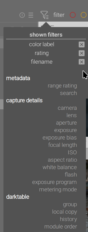
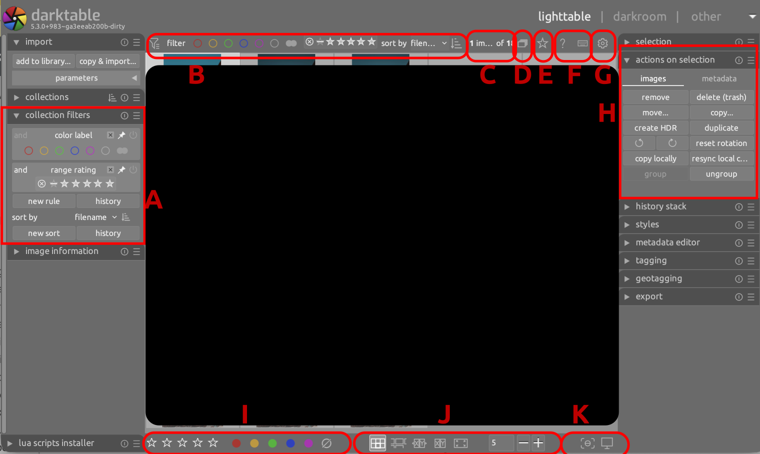
Left sidebar in lighttable view, collection filters:
some of the rules you can add have a “pin” icon, those can be “pinned” to the top bar (see the manual).
The top filter bar is a limited short-cut to the “collection filters” module.
So it’s neither a config option, nor hard-coded, you can change it any time from the lighttable view.
A and B are about collection filtering. They affect which images you see in the view. They do the same thing, the difference being that B is also visible in the darkroom, as all the elements in the top bar.
C is information about the current selection.
D affects which images you see (leaders only or all)
E affects which information you see overlayed on each image, but not the set of images
F are global actions that affect the state of the UI and expect that you follow up with an interaction with the UI
G opens the preferences window
H lists the actions that you can perform on the current selection
I looks very much like B, and like H lets you perform actions on the current selection
J affects how the images are presented (not what)
K is also about the behavior of the view
I would say that E, J and K belong together, as they are all about properties of the view.
H and I also belong together, as they are actions on the selection.
C is related, as it is information about the selection.
A and B are the same thing, and D belongs together.
F and G are unrelated to everything else.
So, one possible solution would be:
For the A, B, D cluster:
Remove B, as it i subsumed by A.
Move D inside A.
Keep A visible also in the darkroom, so that the functionality stays available.
Result: the “Collection filters” module (A) centralizes all controls that have an effect on which images are listed in the lightroom or filmroll.
For the H, I, C cluster:
Move I inside H
Move C inside H
Result: all selection actions/info are centralized in one place.
With I no longer in the bottom panel, there would be more space to consolidate all the view properties there:
Move E to the bottom panel together with J and K
Make it available also in the darkroom, in the same position
Result: All view properties (both in the lighttable and darkroom) are consistently in the same place.
Now, on the top bar there are only F and G. Two options:
Move them to the very top bar (where you can switch the view, possibly on the opposite side where there is a lot of empty space)
Move them to the left side of the bottom toolbar, where I was and now there is a lot of space, and make them available also in the darkroom. This would do without the top toolbar, and free some precious vertical screen estate.
Overall result:
All view controls in the bottom toolbar
All collection controls in the “Collection filters” module
All selection controls in the “Actions on selections” module
Top toolbar no longer needed, F and G repositioned somewhere else, possibly on the very top (next to the “darktable” logo) or in the bottom toolbar
At first I was a bit “old man yells at clouds” (TM paperdigits), but I can see something like this working for me - I don’t change the collection filters very often, and generally use shortcuts for setting star ratings or colour labels. I’ll be watching to see what happens
So we’re talking about removing the ability to rate and colour-flag images from the darkroom, except via shortcut, because we think the UI of the filters looks too similar?


