In this thread, I will be uploading a set of images for you to cull as an exercise. It was a windy day, so the light the tree canopy and clouds let through was in flux. I recently started a thread to see how you all approach the culling of images. I think this thread will be a more hands-on version of that.
I have enclosed the out-of-camera (OOC) JPGs in a zip file. The post’s previews are resized versions of those JPGs. I encourage you to use the zip file’s for comparison as they are at full resolution. They have raw counterparts but those files are too large to upload en mass. My internet connection is rather slow.
The goal is to select 1-3 images out of the series of photos. Personally, which do you think is a good candidate for an as-is OOC JPG? Which do you think is a good Play Raw candidate? Explain why you think so and why the others didn’t make the cut. I look forward to having an engaging (and animated ) exercise with you all.
Thanks for the exercise … already from the previews I find it easy to identify my favourites … my bandwidth is horrifyingly slow (20 KB/s) at the moment, so it is taking forever to download the zip.
When it is done I’ll cast my votes.
Culling is for me a muti-step process:
On importing my pics, remove obvious rejects - motion blur, focus problems, massive exposure or composition fail.
Depending on the number left (say <5 per subject), and available time, I may go further, but usually a break is best
At least 24 hours later, sometimes 3 or more days later, I find myself able to more dispassionately critique my output. Decisions which were hard become much more straightforward.
Sometimes a poorly framed/composed shot that is otherwise ok is a candidate for a close detail crop.
I tend to keep the best 3 or so of each subject, but choose my favourite to put all my processing touches on.
Purely on viewing the full-res pics on Gwenview and using my eyes I shall try to describe my thought processes.
OK, here goes:
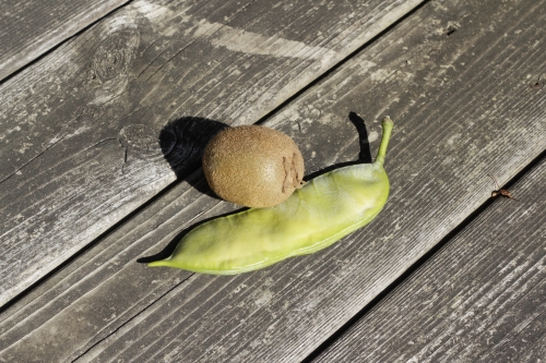
1322 … slightly overexposed;
1323 … appears identical to 1322 … is this a trick?
1324 … less depth of field - wood grain not sharp - wider aperture?
1325 … looks the same as 1322 and 1323, sharper woodgrain again
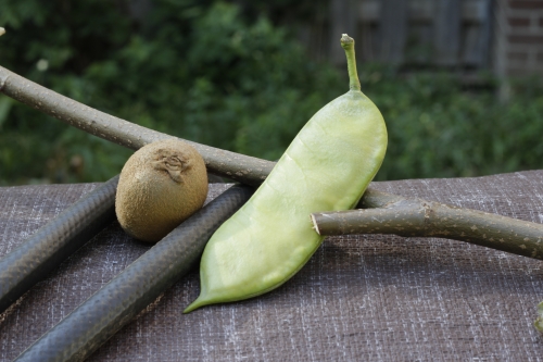
1326 … my favourite of this composition … both technically and with the heart … the range of tones is much more pleasing; the wood is not distracting the eye to the extent with all the previous; the slight specular reflection on the kiwi and the chilli is managed; no blown highlights here; and the dark shadows cast are helpful in giving depth.
Next set:
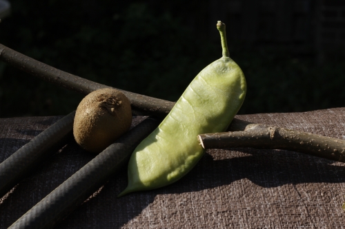
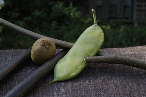
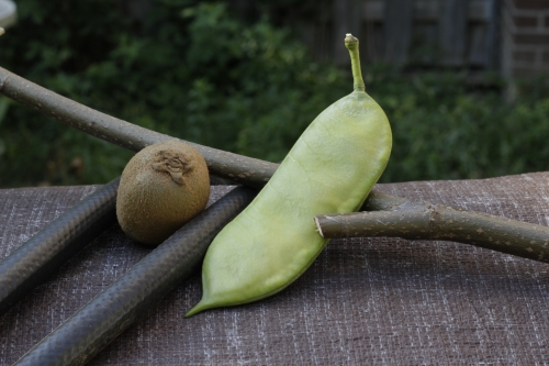
1331 … hugely blown-out - ugh!
1332 … under-exposed, but the moodiness of the fruit is nice. The composition frames the fruit well and there is no doubt of the subject
1333 … good exposure overall, the result is less arresting than 1332 however.
1334 … this has more diffuse light and hence no strong shadows; very pleasing texture-wise; possibly slightly under-exposed
1335 … same as 1334 but good exposure
1336 … over-exposed
1337 … more appealing than 1336 with less direct and more diffuse light. Seemingly better depth-of-field.
1338 … technically possibly better than 1337, but less appealing, 1337 pops more.
1335 is my favourite of this set - more my heart than technically, but the diffuse light well-exposed seems the key. Honourable mention to 1332 because of its moodiness.
I think 1327 & 1332, with 1333 being close, but no light on the kiwi. I didn’t inspect for sharpness, all were by light.
I like the idea of the diagonal lines in the first set, but the placement of the items doesn’t have enough intent for me. The kiwi doesn’t violate the line of the table enough; it looks unintentional.
The second set the background is too busy, and the bike cable (??) Does not get into the frame enough.
I’ve tried shooting some still life as well, and I have nothing good enough to share. it is certainly difficult. Makes you appreciate things like Weston’s pepper shots even more.
Looking forward to this thread, I hope I gain some new insight.
For more context, I took about 20 shots within 30 min. The light was shifting so much I took more for insurance and when I thought the wind had died down or the hornets weren’t buzzing in my ears.
I wrote this shortly after I posted the original thread:
I am definitely overthinking it. The more I look at them, the more uncertain I become. 1327 was on my list appearance-wise and statistically for both the RAW and the JPEG versions. Wasn’t sure about the next set as there are elements that I appreciate in each image and the canopy shadows change the hairs of the kiwi so much. The computational measure that I used in the RAW comparison points to the flatter images: 1335 and 1337. Along those lines, I would say that 1333 has a leg up on 1332.
Am a bit disappointed by the participation level. To me this topic is both interesting and practical. There are too many highly technical or critical / cynical threads out there. Oh well, it is what it is. Still:
I do wish more photographers would weigh in. I started this thread because I know this community has lots of experienced and discerning folk. I could use more critique and feedback so I can improve. Well, not just me but our visitors and other members.
It looks like the three of us enjoy the 1327 very much. @martin.scharnke confused me for a good minute: 1326 doesn’t exist. Permantly deleted.
I wasn’t thinking about the composition as much as I was trying to show how big the pod was compared to the kiwi from my kitchen. Same with the second set. The first set felt flat dimensionally; I wanted to prop up the subjects and have more shadows cast on them. The placement was more about size, shape and form. That and I never take staged photos: usually of people candidly and hurriedly. Oh, lastly, 1337 and 1338 don’t have a table corner encroaching on the top left corner of the frame.
Now set 2 is unsettled business.
Martin
Mica
Me
1335
1332
1335
1332
1333
?
I feel less strongly about set 2. In terms of RAW selection, I feel that having clear detail structures is key. Mood is important too, but if the overall image is too dark, I would take well exposed over that. That would be the reason that I chose 1335 over moodier captures.


 it is certainly difficult. Makes you appreciate things like Weston’s pepper shots even more.