Took it a bit further - added some color grading in color balance rgb and tweaked other things a bit more…
_MG_6290.CR3.xmp (13.3 KB)
Took it a bit further - added some color grading in color balance rgb and tweaked other things a bit more…
_MG_6290.CR3.xmp (20.3 KB)
hope I did not went over the to, but it’s my quick edit after a quick look at the reference image you mentionned.
I think the dynamic part is ok, color grading could be refined.
Nice place ! Nice shot as well, interesting challenge ![]()
That’s exactly what I do, yes. And it’s a good equivalent to LR’s saturation controls I think!
I like it! The way you used local contrast and the sigmoid module is quite interesting. Thank you!
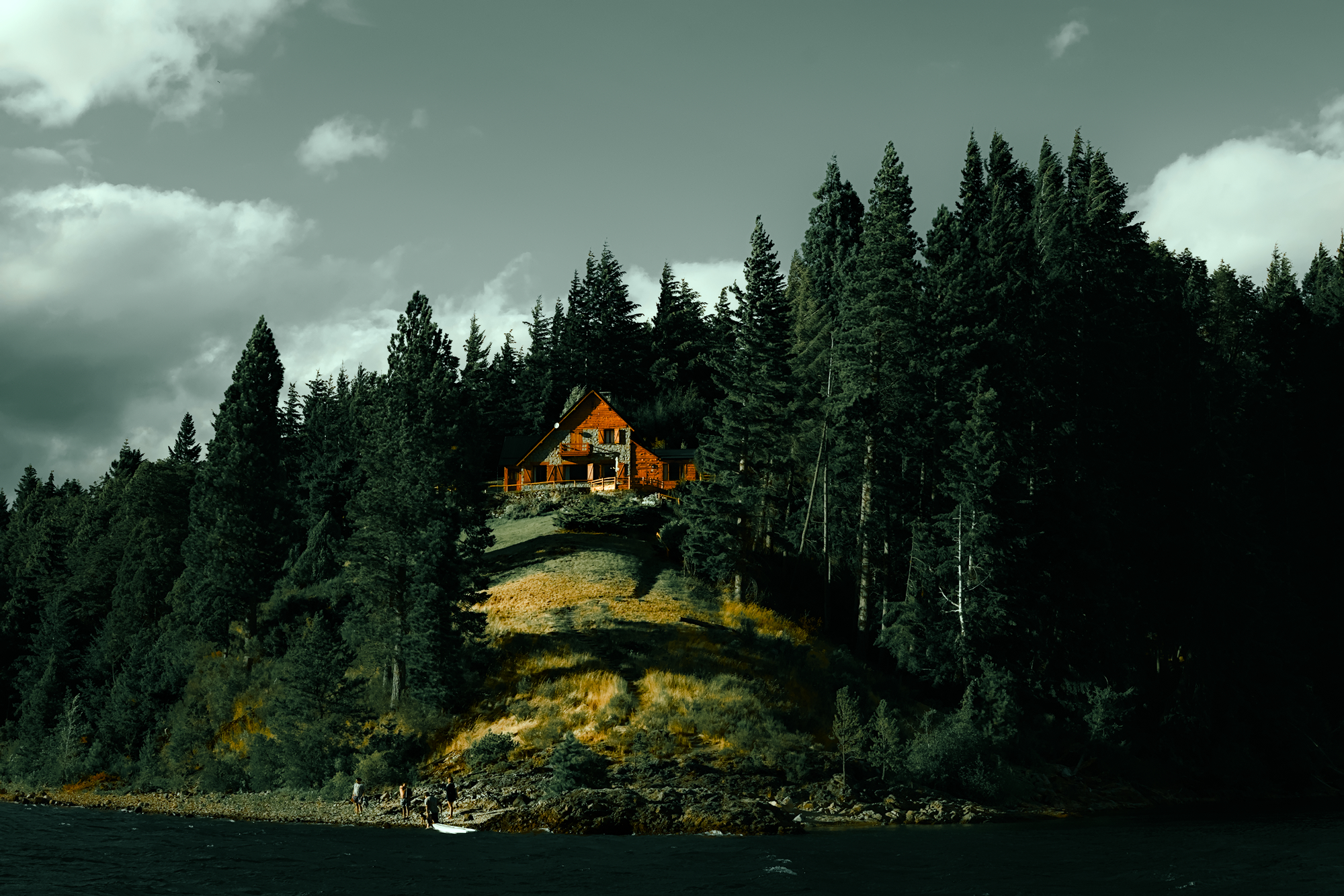
Yeah needs a bit more moodiness ![]()
Yours is my favorite so far! thank you. I wish the shadows in the right side weren’t so crushed but the original image already has that problem. I see you used tone equalizer to “pull the whites”. Interesting. I also noticed all of you are using the sigmoid module… I should look into that!
Thank you! I see you used the color calibration module quite a lot… I have no idea how to use that module.
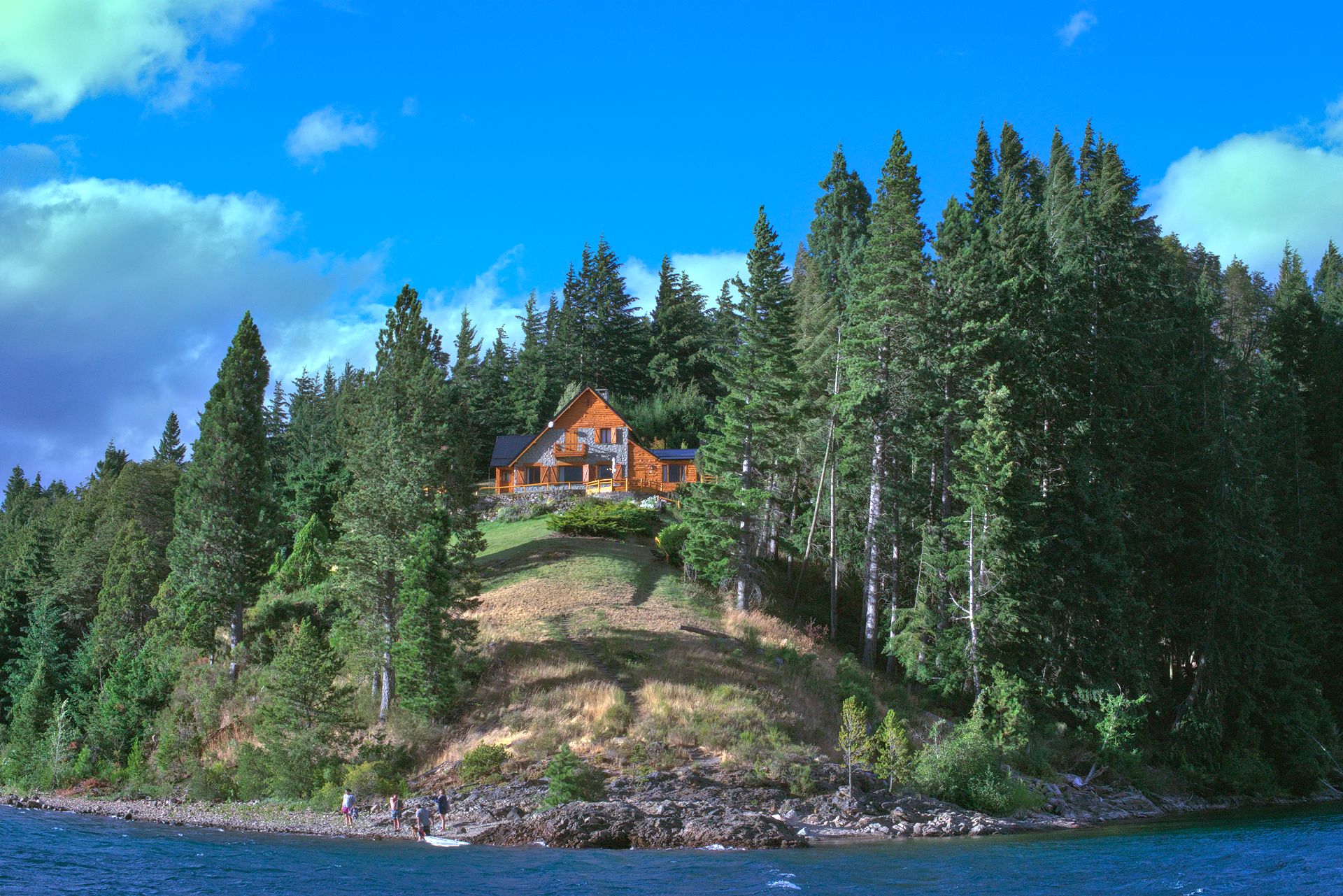
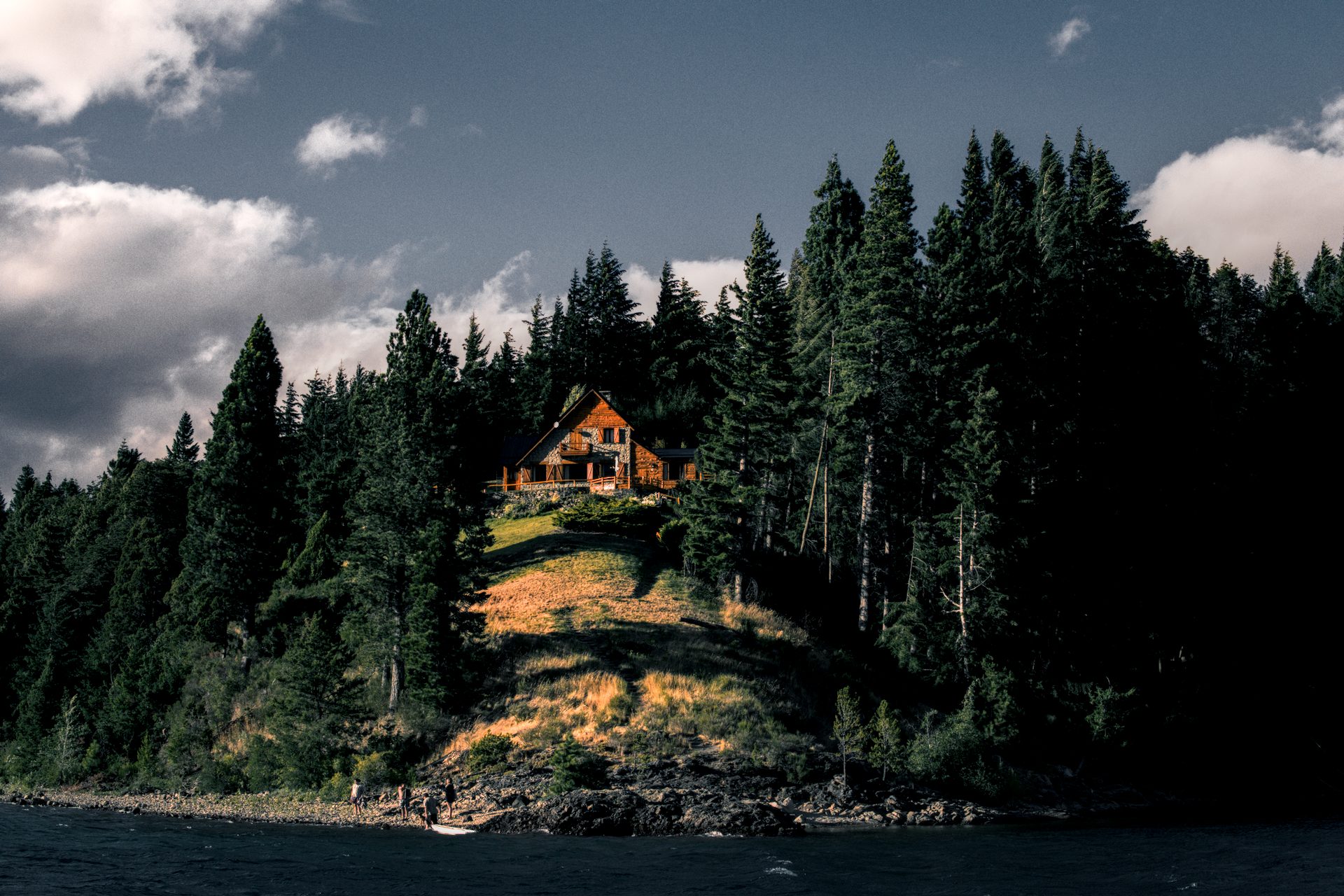
The picture was taken in Bariloche, in Patagonia Argentina. It’s a beautiful place. It’s not my favorite shot of the trip but I thought it was a good candidate for this experiment. I took some analog shots too (shameless plug ![]() )
)
That was fun! Interesting workflow, as shown in the video. Thanks for sharing. ![]()
Here is what I came up with.
edit: yeah the color zones module really shines here! Would love to try out the color equalizer ![]()
Hello.
You can mimic Lr workflow using different dt modules, and in any workflow, scene or display reference. This is an approach to the idea.
BTW the YouTube channel isn’t bad for learning, but when images are developed we have to take care to not over develop and avoid halos and artifacts like his one.
Gretings from Habana, Cuba.
Happy that you like it ![]() Re the crushed shadows, it would be easy to lift them a bit in tone eq - possibly in a new module as it might make it easier to separate the job from the ‘white lifting’ (for want of a better term…). While I think of it, I find the color zones works quite well as long as one doesn’t do too abrupt transitions from one color to the next. This is one of the only things I feel is slightly lacking in dt at the moment. The capabilty is there; one can use multiple instances of color balance rgb, with parametric masks for different colors, (loads of control) but the already mentioned ‘color eq’ would be nice. One day…
Re the crushed shadows, it would be easy to lift them a bit in tone eq - possibly in a new module as it might make it easier to separate the job from the ‘white lifting’ (for want of a better term…). While I think of it, I find the color zones works quite well as long as one doesn’t do too abrupt transitions from one color to the next. This is one of the only things I feel is slightly lacking in dt at the moment. The capabilty is there; one can use multiple instances of color balance rgb, with parametric masks for different colors, (loads of control) but the already mentioned ‘color eq’ would be nice. One day…
I wasn’t quite happy with that TBH - local contrast is a display referred module, so one’s not protected against clipping, and I was loosing clouds a bit. I dialed things back it bit in the second version. Maybe I’d try contrast EQ next time.
Wow, I really like what you did with the colours !
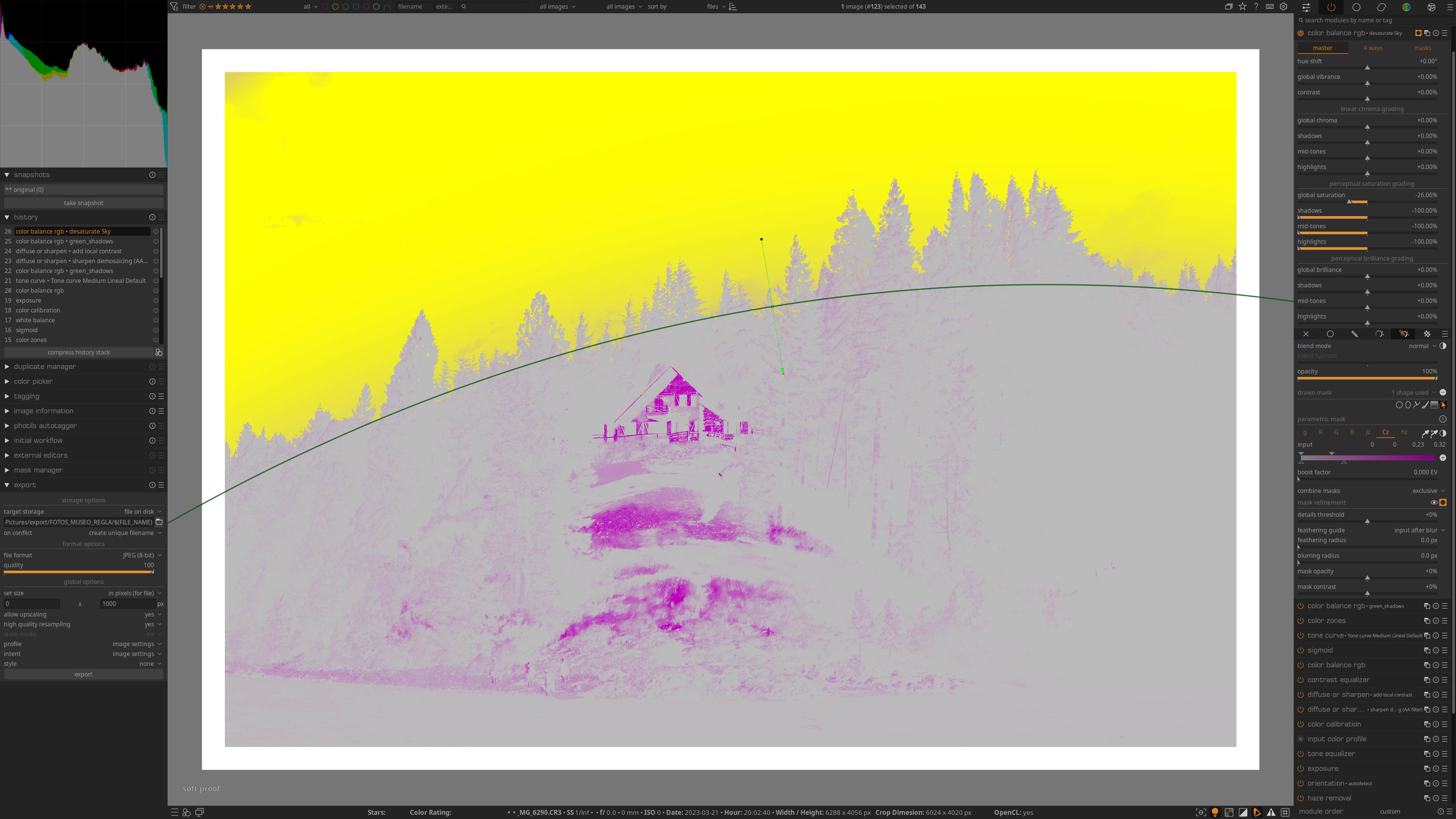
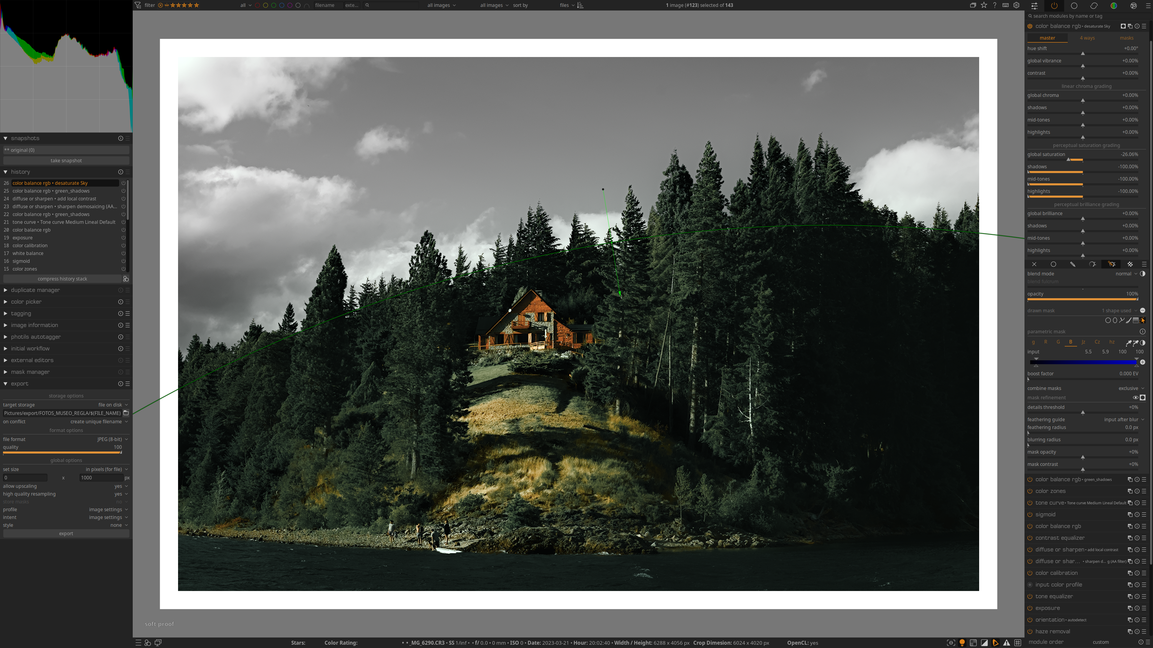
The way you id it surprised me as well : desaturating all colours but the yellowish reds with colour zones and re casting a blue green tint with colour balance RGB … I mean the process have nothing mysterious but you had the vision to decide to keep just a narrow range of colour and colouring everything else with the same hue/tint !
I’ll have to try to apply this thinking to other pictures, thanks for the demo !
On an other topic, I see a lot of people using the diffuse and sharpen to do chat seems to almost be achievable with contrast equalizer at a much lower performance cost Or is it just me not seeing what’s really different ?
I love it! ![]() You really made the house pop and somehow the image looks a lot sharper. I really need to learn the diffuse or sharpen module! I’m not very keen on the green clouds and sky though, I feel that would look great indoors though or in a night shot! But you really nailed the “moody” tones.
You really made the house pop and somehow the image looks a lot sharper. I really need to learn the diffuse or sharpen module! I’m not very keen on the green clouds and sky though, I feel that would look great indoors though or in a night shot! But you really nailed the “moody” tones.
Desaturate the sky and clouds it’s quite easy.
Just open a new color balance grb module and create a mask for the sky, then tweak the sliders to isolate the sky and de-saturate the hightlighs,mid-tones and shadows.
That’s great! Love it.
Its funny you chose this image for the moody tones. I see the light hitting the slope on the left and think this is such an amazing feature I can’t ever see this being a moody scene, only one full of light and shadows cast by the forest.
Thats something I really lack is vision of what an image can be. I find I tend to go with what I feel it offers because of this. I didn’t do it justice in my tongue in cheek post about not moody but you can see the light penetrating the forest on the lower right. Someone that knows how to work light could surely do a much better job of it than I did. I think that is a really cool little detail.
I guess my point is sometimes you have to ignore the “realism” to explore the potential of other looks and that would most certainly be a weakness of mine…
Well honestly I picked it without thinking too much. I thought the clouds and the house KINDA looked similar (in lighting conditions) as the one of the white house of the video. I like your different view of the photo!
I agree 100%! That’s something I struggle with though.
Hi @nahueljo,
here is my version, mainly used the tone-equalizer as the “whites slider” and the color zones for the desaturation of blue to green.
I hope this helps ![]()
Cool! I see you used mostly the color zones and color balance rgb modules ![]()
Oooo I like it! that’s moody! love the desaturated look and how the house pops.
Thank you so much to everyone that submitted their version and let me peep at their process. I’ve learned a lot from your work.