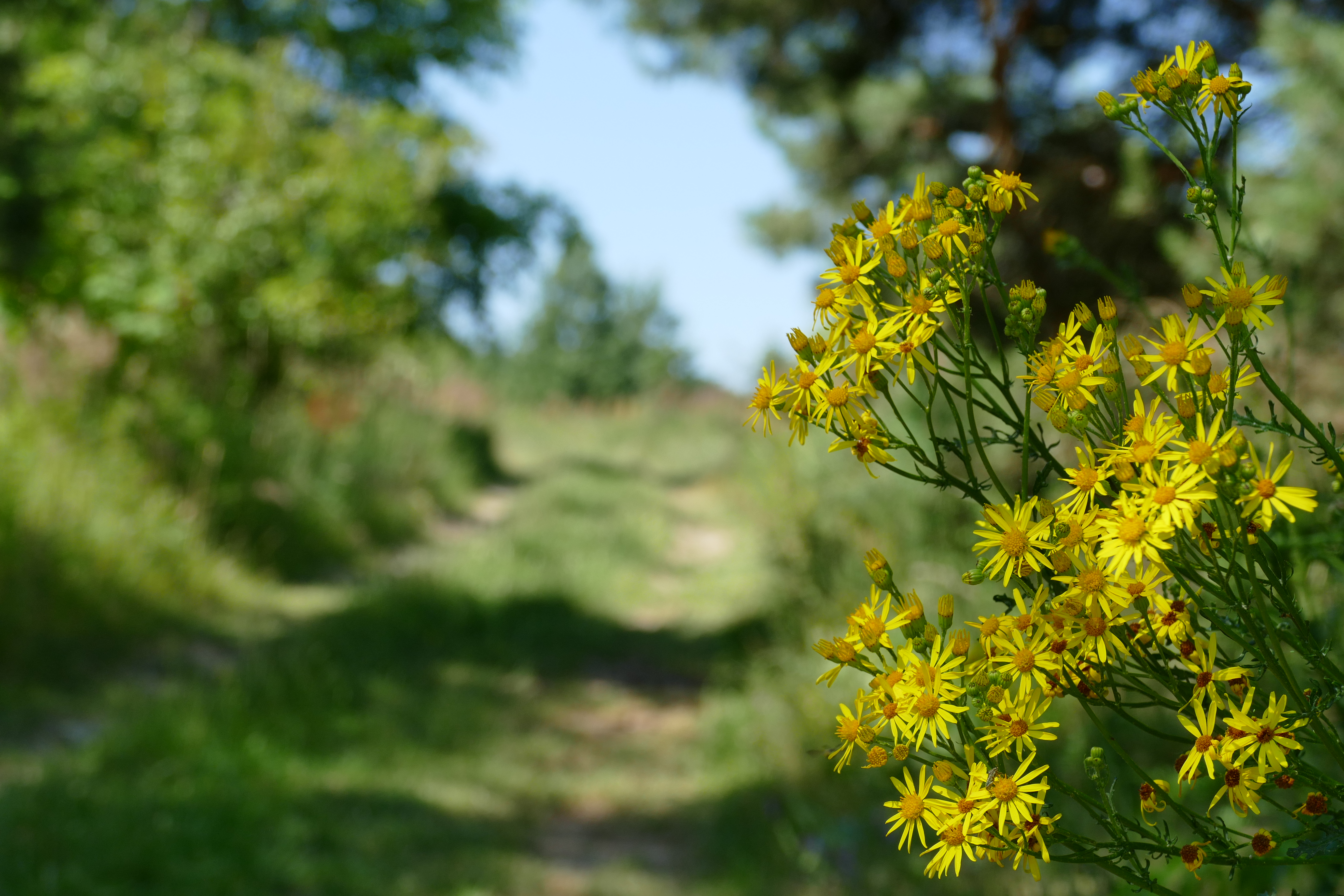
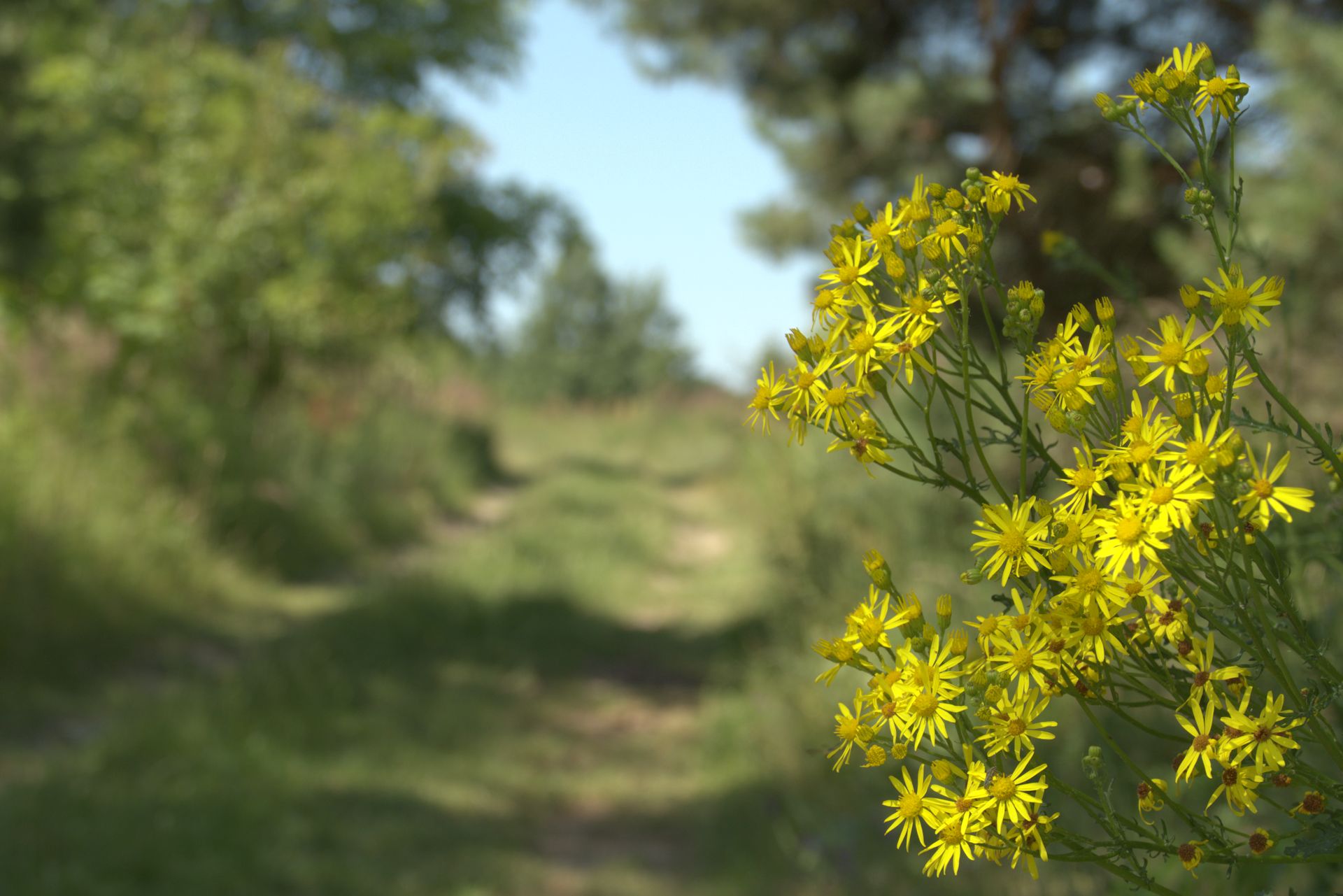
Hello, I’m wondering how to get the colors of the flowers in Darktable to be close to the jpg from the camera. I mean shades of yellow. In Darktable the color is solid, while the jpg photo has different shades of yellow. The petals are bright yellow and the center is more red. In Rawtherapee I get this without any problem using the DCP profile
Try without filmic and or use some other settings… less compression more contrast…I’ll check if the meta data is in your jpg or you should share it…
EDIT:
I downloaded the raw and extracted the jpg preview for reference…
To me the sky looked sort of weird and washed out and the green was an unnatural green… I use this as this is OOC… RT uses a profile or a DCP and or an automatched curve that also has options to affect the color so there could be many variants coming from it. If you use the DCP do you use the DCP tone curve or the RT one… DO you use the look table… I think to compare to DT out of the gate you would need to use something like the neutral profile… in any case … Here is the preview jpg from your raw extracted
Pulling up the raw in DT and not accepting the default bump (I use auto exposure on 50% of the whole image as my starting point) so less EV about 0.4 EV…
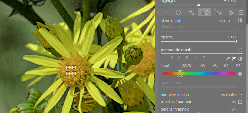
Not sure how that jives with your color expectations… you could further tweak CC with a colorchecker and or the input profile in DT as well… but I would be pretty happy with this … you could tweak the wb and tone differently than I have I just did a very basic tweak and no masking…
Personally I hate trying to match out of camera JPGs because if that is the look I want then I will use the JPG not the Raw file. However, I attempted to process this image with some consideration of the JPG shown in the OP.
What was interesting for me was that the local contrast module activated by selecting the HDR Local Tone Mapping preset seem instrumental in putting details or variations of color into the yellow petals to bring the image closer to the supplied JPG.
I think it might have something to do with the input color profile. Probably not a good solution, but I changed it to linear rec709 and got more contrast in the yellows. I also tried to get a more neutral white balance.
I am just recently experimenting with adding some black in the exposure module. I am trying all combinations including changes using filmic settings and CB module and still I think I am getting much richer colour by adding a little black. Once I do it I find images without it seem a bit washed out… It ongoing but I wonder if this could be part of what some others see and comment on when speaking about color in DT
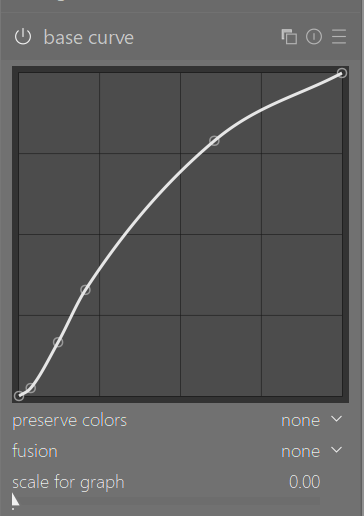
I wonder what @Damian_J would consider to the look obtained from base curve instead of filmic or sigmoid? However, note that I set preserve colors to none. The exposure module also is disabled as the base curve module brightens the image. P1030581_01.RW2.xmp (11.3 KB)
Intentionally clipping should be done as late as possible in the pipeline since lost information can’t be used later
But if you want to use a display referred workflow then clipping the information not needed to achieve room at the opposite side of the tonal range might make sense…
It doesn’t make sense to discuss display referred habits in a scene referred workflow - if you know what you’re doing and are aware of the pitfalls then the discussion is pointless.
For a learning prospective it make sense to be comfortable with the intentional tools of a workflow first before discussing if that result can also be achieved with different tools…
I’ve been experimenting with matching the OOC jpg look for some time and I’d like to share my findings.
Most important are the tone curve and the input profile. With a proper input profile, you have a better chance of getting matching colors. I think the manufacturers do a pretty good job with the colors in the OOC jpg. DT has only a generic Matrix. A customized input profile will probably improve the colors (I’m getting better matching tones for the sky and the greens and also for popping colors for example in jackets or so).
As for the tone curve, I actually like the adobe stuff and I copied the default Adobe camera raw tone curve in the tone curve module. Normally I don’t need to mess with it. A bit experimentation with filmic or sigmoid will give good results also (but probably not as a one click preset only solution).
For the bulk of my pictures, I like the look of the OOC jpeg and I need to only do a few minor adjustments (adding a bit contrast, local contrast, correcting exposure, and so on…). So, in my workflow, I’m establishing an OOC jpg look for the raw file with a few presets (it gets me really near the jpeg look), here an example
And then I can adjust minor things, if needed. This gets me pretty quick through my photos - I just finished editing a selection of 500 images from family holiday.
When I have a really good photo, occasionally , I’m takin more care for the details of course. But the above workflow gets me quick through the bulk of my images.
This all is of course highly subjective, everybody should fiddle a bit around, to find the best fitting workflow for their needings