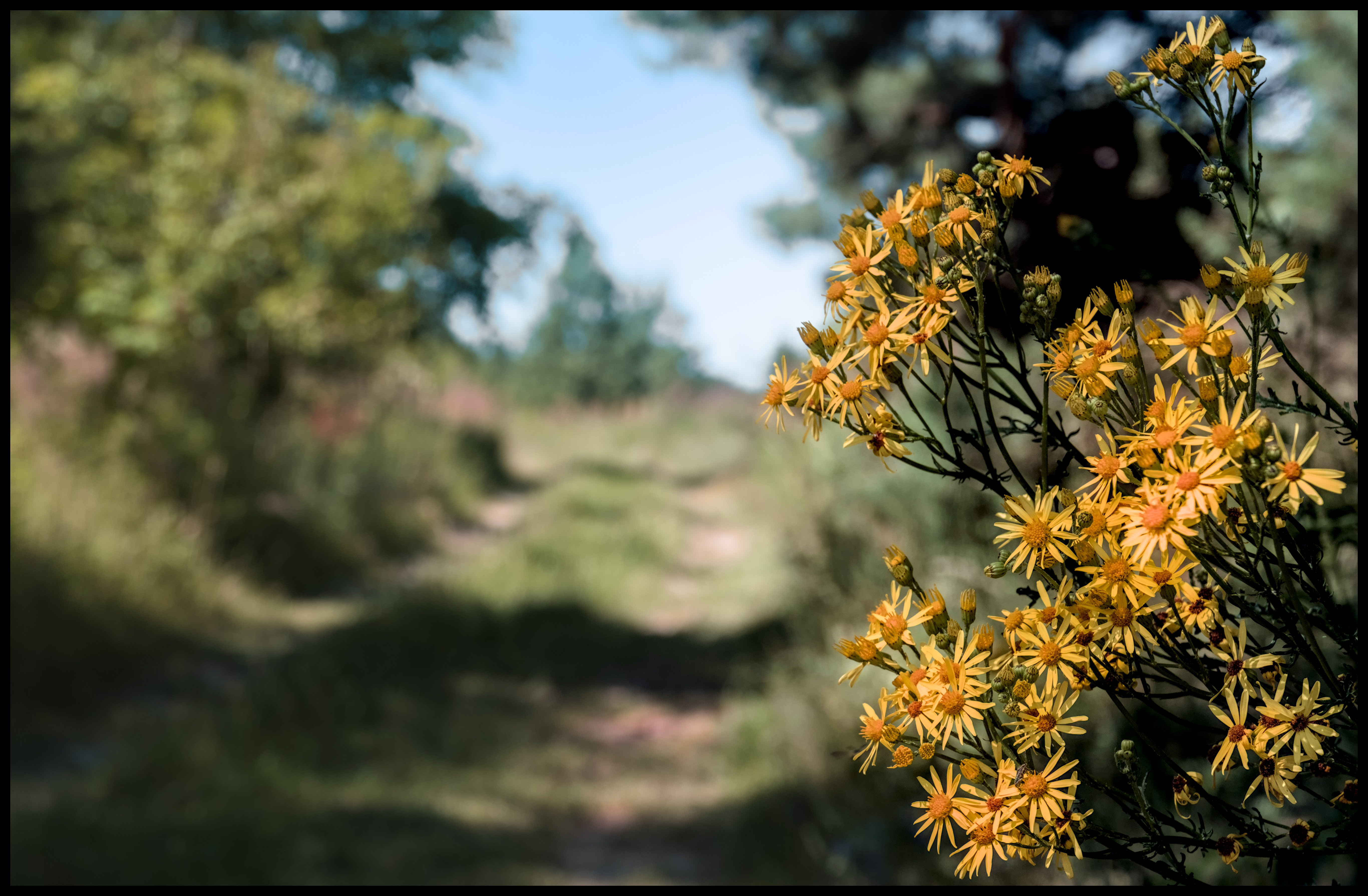
This was done in darktable by applying a style I use for film emulation. Plus some diffuse & sharpen. The shadows get somewhat red and the blue darker.

P1030581.RW2.xmp (8.7 KB)
This was done in darktable by applying a style I use for film emulation. Plus some diffuse & sharpen. The shadows get somewhat red and the blue darker.
If you don’t mind a question, how do you find/create a custom profile? I know there’s various possible ways… just curious as to your approach.
It would be nice if DT could accept DCP profiles. I don’t know whether there’s an obvious fundamental reason why it can’t, or if it’s just that it’s not seen as needed? And, again, I’m normally very happy without custom profiles, but there have been times when wanted to try it…
Sure, no problem.
I have some x-rite color targets, which work well and also an IT8.7 target which is even better. I shot these well exposed in plain mid day sun. Then I used a software called lumariver, which is a commercial version of dcamprof, to create icc profiles. Lumariver is really sophisticated and creates really good profiles, at least in my limited experience. You can adjust the color tradeoffs that have to be done in the profile.
I am happy with the icc profiles.
Thanks! I’ve looked at Lumariver… interesting!
there’s a quite simple reason: no one implemented it - features doesn’t happen by magic ![]()
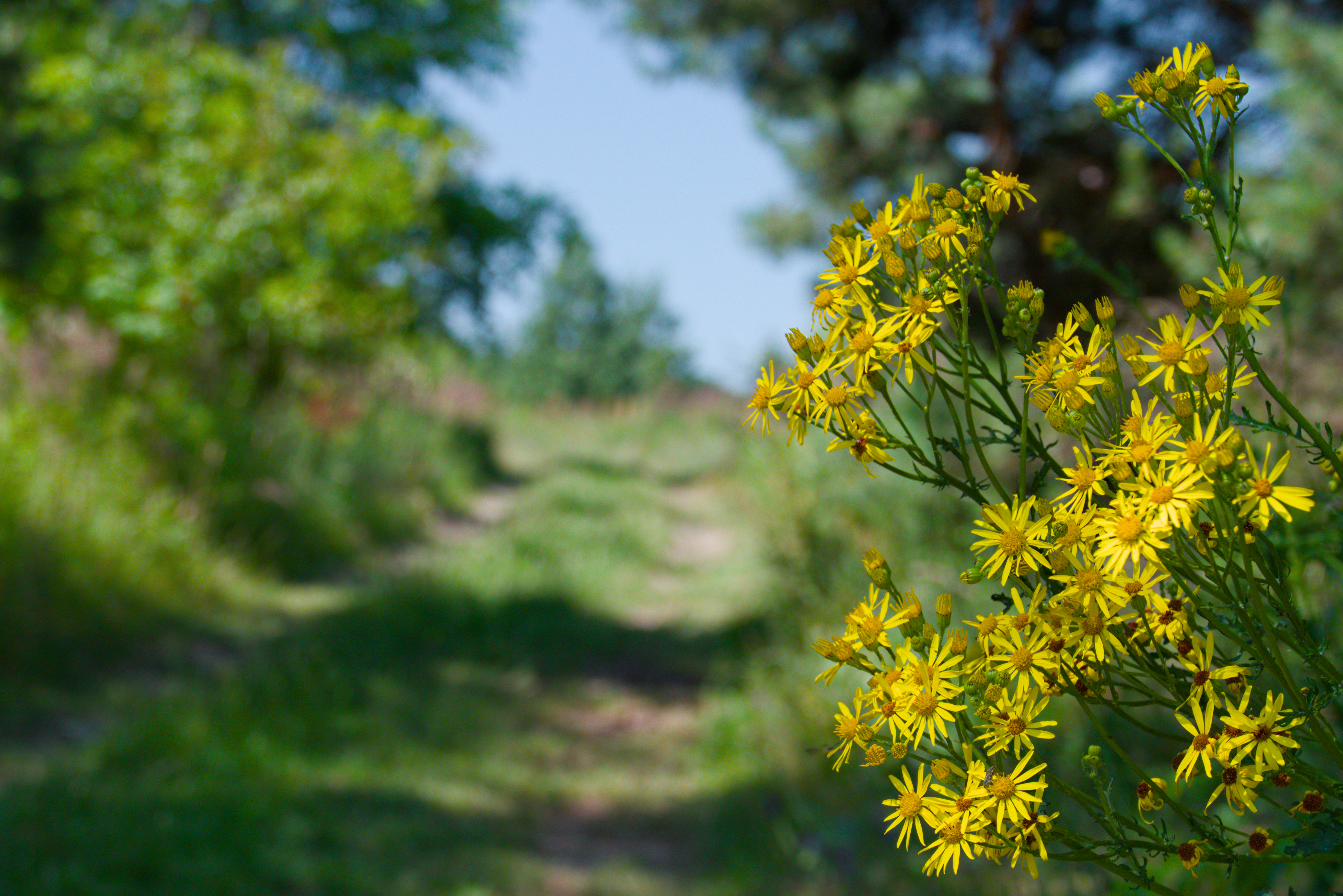
I went again to see what the flowers really look like. They are exactly like the jpg picture. So this time they are not tricks of the camera manufacturer ![]()
Thank you very much for your advice
I do respect AP’s judgement but on this one I have a calibrated monitor now and with most default processing the blacks are still not there. I have lowered them with dehaze and with global luma in the 4 way tab of CB and I have played with other options… I don’t know if its just my eye or my taste… but adding a small amount of black in exposure really sharpens up the image from a contrast perspective and brings the colors alive to me it does offset a bit that factor that people often seem to describe as dullness… I have cranked up settings in CB and you can saturate the color as well but I did some snapshots and still there is just a little something to it for my eye… I think by default DT takes a very little black out of the image as it was I think a way to help the black relative in filmic so its -.002 or something….
Anyway I will take any and all advice including AP’s but in the end use what works for me…. I might find its just with the few images that I have tried but maybe not ![]()
Actually on thinking about it he added the colorchecker function to CC module and one setting is that it tells you what to set black to in the exposure module for a better or accurate match so maybe its not forbidden… I am also not clipping I am using the histogram and just dropping the baseline at least it would appear so and the gain for me is noticeable …
In this case, the red and green channels must be separated a little from each other with the help of channel mixer. Also the brightness of all three channels must be adjusted. All this can be done in a new instance of the color calibration module after using the first one for white balance:
P1030581.RW2.xmp (10,3 KB)
Thanks for your suggestion. I’ve seen some of your videos where you show how to use the channel mixer, but unfortunately it’s still complicated for me
I feel you. The channel mixer is one of those things that is conceptually really simple, yet my brain refuses to fully comprehend it…
That is exactly my impression. But somehow I often hesitate to use it because the manual tells you explicitly not to use it. Archiving the same result by others means is often more time consuming and it is worth to include this slider as another option.
Totally agree. The look is the most important and when I tweaked the black in the exposure module it looked better globally, although I was worried I may have been crunching the blacks a little.
This is a fair comment. When we first start editing raw files our first challenge is to do a job equally as good as the OOC Jpg. I am sure we have all been there and wondered why bother, when the JPG looks so good. But then with time you will come to appreciate how much better a job we can do than the OOC Jpg. This often reveals itself in the shadow and even highlights details we can extract. The sharpness of my images compared to soft look of my JPGs also stands out for me, but sometimes matching the color of the OOC Jpgs is a real challenge. Only you the photographer can decide if the OOC Jpg color represents the scene or what you want best. And Boris @s7habo seems the real master of color and makes great videos teaching darktable. Worth watching his videos and listening to his advice. I 100% defer to him on this topic as the expert.
That’s curious, the result should be closer.
In any case, what I did was not a technically correct solution, but an ad hoc work-around.
I think the best bet with darktable is to try and find a good ICC camera profile you can use.
Fortunately - if all that was needed to add a feature was the words ‘I wish’ we’d be drowning in odd features! ![]()
Thanks for the clarification🙂
Definitely yes. The work it does in the channel mixer is astounding and the results are fantastic.