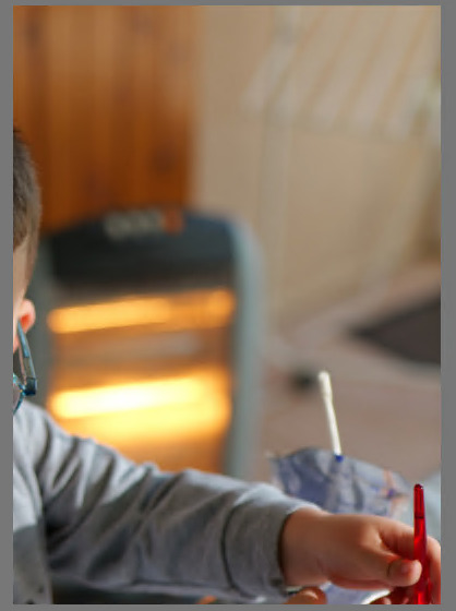
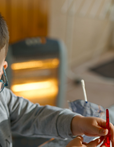
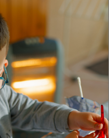
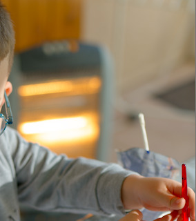
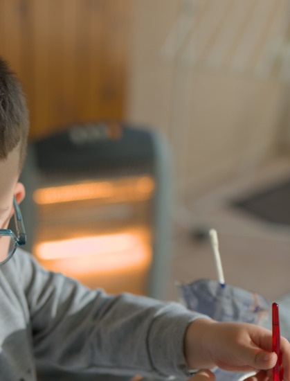
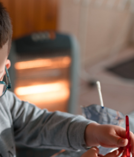
I took a picture (sorry it involves children so I can’t post the RAW file here, unless you know a way to modify a RAW & embeded JPG to hide some parts) that has some cut highlights as I was pointing a heater. This is for instance the look of the JPG that was produced directly by my camera (lumix S5ii if it makes any difference):
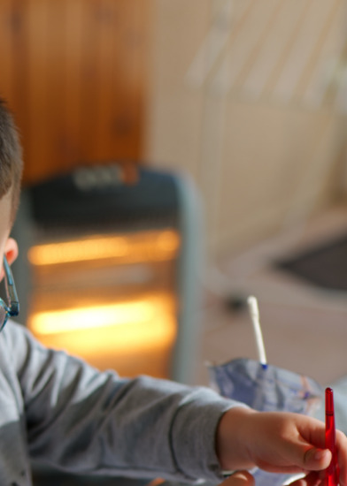
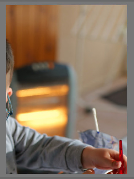
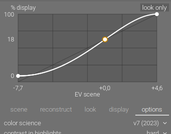
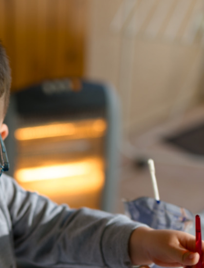
I really like the warm tones. If I open the photo using ART, I get a very close image (to the point that I was struggling to know if I was looking at the original picture or the ART one, the automatic style that tries to mimick the embeded JPG is truly impressive!). But if I open this image in darktable (default scene-refered workflow), I get a very different tone:

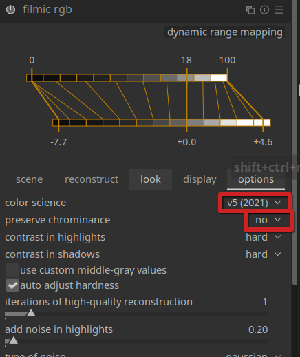
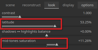
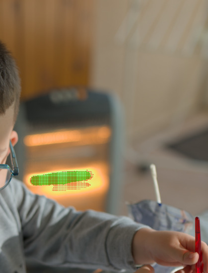
I very much prefer the style of ART/original JPG for the heater, but I can’t find a way to mimick it in darktable. I guess this has to do with highlight reconstruction since this part is overexposed (enabled “toogle indication of raw exposure” in the bottom left list of icons behind the picture):
Here is what I tried:
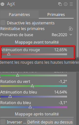
Try #1: use color equalizer to change the tone of the heater… the problem is that this is tool late in the pipeline: the color attributed to darktable to this area is too close to the color of the skin and other wooden elements in the scene: even after applying a very narrow mask on multiple bands, I still get ugly artifacts, so I think this is not the right approach to follow.
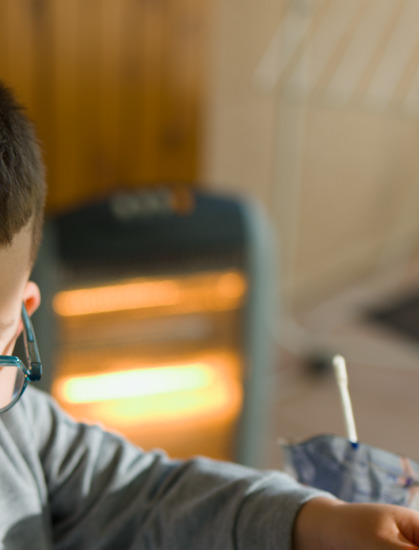
Try #2: play with highlight reconstruction: disabled, the tone does not change and I even lose the white part so I dislike this even more:
But one method gets me a bit closer: the “clip highlight” one:

The color are a bit closer, but this is still fairly different from ART’s result that I find much more subtle in the transition (ART uses a mode called “balanced highlight reconstruction”) + you can also observe that the top “heat line” of the heater (that is not clipped) is also warmer:
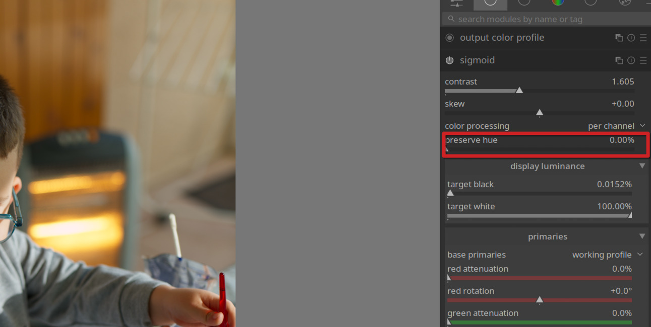
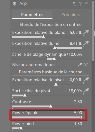
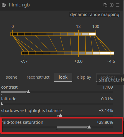
I tried to use sigmoid instead of filmic, this gives me a bit better transition:
but still not as cool as ART in my opinion.
But while playing with ART, I also realized that it has another feature that plays a huge difference in the color: the color management (ICM) tab:
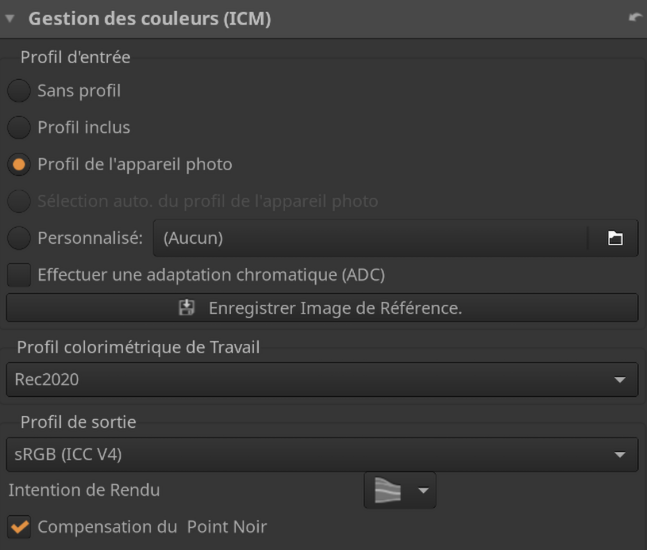
(the selected point translates to “camera profile”) If instead I select “no profile” in ART, I get a less warm result a bit closer to what I get with darktable!
So I’m wondering if this could make a difference… but I can’t find any option in darktable to use the camera color profile. Am I missing something? Any other tip to get a result closer to ART’s one in darktable? Sorry, this question is a bit of a mess without providing an example to test…