Shadows and highlights shift shadows to muddy blue because it works only on the L channel of Lab space, that is at constant chroma in a space that has problems in the blue area. Working on shadows should be made at constant saturation, aka through an exposure compensation.
The colour model used for this purpose is not suitable. Tone EQ on the other hand travels at constant saturation, so any colour in-gamut before is guaranteed to be in-gamut after, and there should be no colour shift because it’s simply exposure.
Thanks Aurélien for your considered and polite response. I am truly appreciative of the work you do with Darktable and how you bring a totally new approach to the processing. I love your work with Filmic and the Tone Equalizer. I also love the new modules you are creating. Keep up the great work. Your understanding of color science is amazing and the fact that you are now working on Filmic V6 means that you continue to learn and improve your own tools. Have a great week.
Using tone EQ on gradients is misleading. The masking is meant to isolate foreground from background while following edges, based on contrast detection. There is no point for masking if you have a a smooth gradient like that, in this setup, tone EQ will behave like any tone curve with simply a different interface.
And why should S&H be the reference here ?
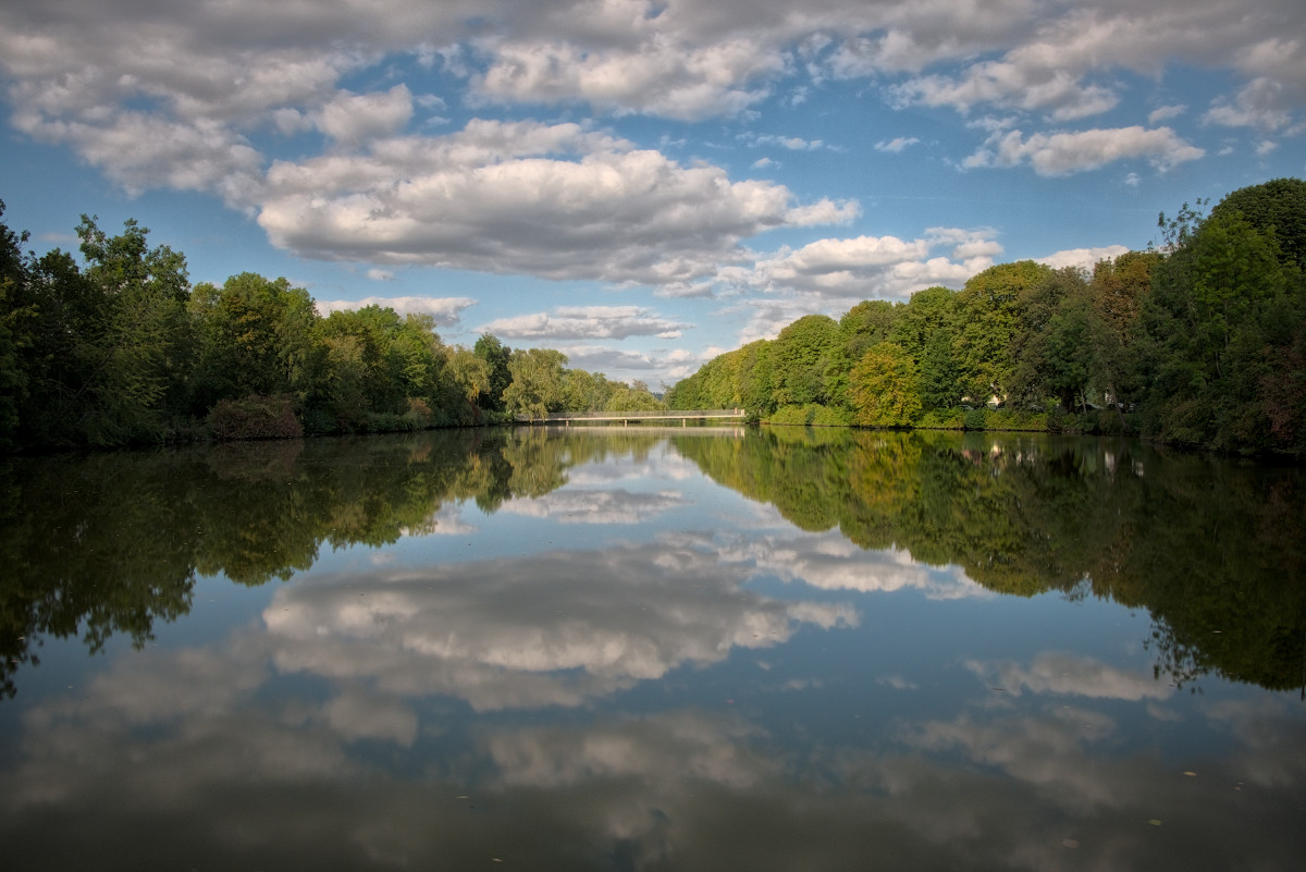
Take a picture with some vivid colours and sharp objects in back lighting, you will see how S&H will damage your colours.
We only understand algorithms by looking at how they fail.
It is not the reference, but one of many possibilities.
The tone equalizer is recommended as a replacement for shadows and highlights.
But I can’t get the same result as with shadows and highlights.
I also can’t get the same result with it as someone else did with the Tone equalizer unless I know the individual values for the sliders.
I think this is due to the setting of the mask.
But I probably just don’t have the experience here. Nevertheless, I find it very difficult in contrast to other modules.
The algorithm of shadows and highlights may be worse and work in non-linear color space. But the module is simpler and if I like the result for a photo, then why should I use the more complex module.
It’s simpler because it takes shortcuts, and those shortcuts will come back in your face when you least expect it. Broken clocks still give the accurate time twice a day, doesn’t mean you should trust them in general.
I think Tone Equalizer not only is technically superior, but can be used with the same ease.
My favourite preset I created is “Fill light”, as in the screenshot below:
Maybe I am OT, but I find Tone Equalizer is not needed at all here, the problem with the trees is largely due to the strong lens vignetting.
So I used the modules lens correction and exposure (with masks) to fix it locally.
I find that is always better to use local corrections when possible, it makes the job of global tone adjustment modules so much easier. 190918-T10X2232.raf.xmp (12.2 KB)
I tried to load your sidecar to compare with your comments but doesn’t seem to be in the jpg if its the same for others then you could you add your sidecar…
‘Simplicity’ is depending on who thinks what of which module :). S&H is ‘one click to get an effect you like’, and if you like it, that’s fine.
But what it’s doing is local-contrast and certain areas get brighter, so basically doing two things at once.
Now imagine you only want the tone to be brighter but not mess with local contrast. S&H is then a nightmare for a lot of people :). In your case (original topic starter), it does exactly what you wanted. Nice. There are a lot of people (but I don’t know if they are more or less… and I don’t care) that think ‘hey, what is happening here?’.
Starting from modern flow defaults, what I did: (there is no good or wrong here)
Disable highlight reconstruction (nothing to reconstruct)
Set filmic’s ‘dynamic range scaling’ to +10%, then hit the auto button next to it
Raise exposure until I like the shadows in the corner (I ended up using +2ev)
Highlights are now too ‘high’. Filmic can roll them off, but that looses too much local contrast / detail there. So I use the tone equalizer to lower highlights, not boost shadows.
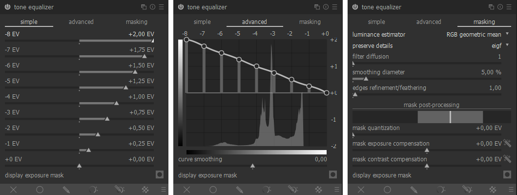
Enable tone equalizer, and I pick up the module and move it before the exposure module (so ‘under’ it in the list). Why? Exposure didn’t raise anything yet at this point, so the highlights are all still workable and visible without having to mess with the mask. I set 0ev to -0.45, -1ev to -0.75, -2ev to -0.75 and -3ev to -0.45 and leave the rest.
I go to filmic and hit the auto button next to dynamic range scaling once again, to let it reset white/black points.
Enable ‘color balance rgb’ with the ‘add basic colorfulness’-preset
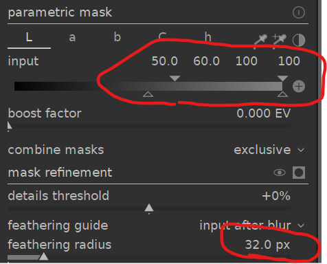
‘clarity in the highlights’ trick: enable ‘local contrast’ in ‘bilateral grid’ mode. Set contrast to 3, and detail to 400% (yes, 400%). Enable the ‘parametric mask’ with L values of ‘50.0 60.0 100 100’. So the mask only works on L values above 50 (and slowly increases between 50 and 60). Set the feathering radius to 32px to make the mask a bit better around the edges. The billateral effect now only works on ‘highlights’.
Add another instance of ‘local contrast’ but keep it at the defaults of ‘local laplacian’.
Image is now done, add the finishing touches with heavy modules
Set the demosaic module to markestijn 3-pass (absolutely no clue what to pick with xtrans files, not used to them. But I had some artifacts in the corners which were (almost) gone when switching from 1pass to 3 pass. Could also be artifacts of my 3.9 dev-build ?
I noticed some purple fringing in the corners. I enabled ‘chromatic aberrations’ with radius 6 and strength 1.
Enable diffuse with the ‘sharpen demosaic (no-AA)’ preset.
Add another instance of diffuse with the ‘lens deblur: medium’ preset.
The core of the settings are to raise exposure more than normally, and reduce the highlights in a curve-like manner with TE without messing with any of the mask parameters)… and then add some local-contrast with the default local-contrast module.
The bilateral ‘trick’ is for taste, not for the shadowy-corners. The diffuse is for sharpening (but might very well help with ‘detail in the leaves’ of the darker parts) and can be adjusted to taste, or maybe replaced with the ‘fast sharpness’ preset for performance?
Also, the numbers used are more rounded, so the edit can be ‘redone’ easily. Normally I just drag or click the slider, but I rounded the values for ‘easy repeating’.
Absolutely not saying you have to like it, but just a way of doing it without messing too much with mask parameters and trying to stick to presets.
Another quick way would be to raise exposure normally, and then use TE with the ‘compress shadows/highlights: soft’ preset. And then reset the highlight values of the curve in the ‘simple’ tab (so it becomes a compress-shadows-preset). Combined with some sharpening and local-contrast-module at the end, it seems to give good results without turning the corners details to mush. (which indeed is happening when just using TE I noticed).


 The billateral effect now only works on ‘highlights’.