Thank you @Masterpiga, your new code allowed me as I wished to be able to change the color of active module label. Works great for my tired eyes.
3 Likes
I spent a lot of years in school, LEARNING.
When I lived in foreign countries I had to LEARN the language before I could converse (or hope they knew English). At least in Germany I could understand the language and read the road signs. Asia, was a little different.
Never was there a case where I went to a foreign country and knew the language, sentence syntax, and spelling just by getting off the plane.
Yes, or if you have multiple instances you can cycle through them.
1 Like
Very actionable. Where does the button go?
Read the manual is not my argument. I feel no UI is going to please everyone. The developer put a lot of effort into developing AgX for DT and asked people who tested it what the sliders should be called. I for one supported the use of shoulder and toe.
Even if people don’t like or relate to the terms shoulder and toe it takes very little effort to learn what these sliders do. Changing the name won’t improve the edits.
BTW, I am not trying to be combative here. I would butt out of the conversation rather than being disrespectful and combatant. I am just trying to express my viewpoint about the UI as a regular user of DT.
If we just named things what people already know, even when it doesn’t describe what that slider does, we are going to have 30 sliders called “highlights” “shadows” or “compression” and I don’t think that’s really helpful either.
Shoulder and toe are not esoteric and are well established photography jargon. Further it is exactly what those two sliders in AgX do.
4 Likes
This is definitely true. It has to be analyzed from a usage and presentation standpoint. AgX presents itself as a highly technical module, and the control names follow that presentation. That is totally fine.
For something like the diffuse and sharpen module, my opinion would be that less technical names would be better, simple because the presentation feels halfway towards an explanation of the effect while all the control names feel highly technical technical.
I agree with that. Also because the actual curve is shown. I find that actually very helpful. And I am very happy with the results of AGX.
How do we determine if they are well established? I can’t recall any other raw editor where I have seen these terms. So I guess they are maybe not so established as we think in our little darktable corner.
Btw, I am not saying that saying we should follow the other editors!
Same here. No hard feelings. If I was too sharp in my wordings, I am sorry!
1 Like
Following the math and explanation from the module creator… might provide some context for the current working display
GUI: obfuscating white with temperature
Found here…
https://docs.acescentral.com/system-components/output-transforms/technical-details/tone-mapping/
The terms can come with the tonemappers using S-curves and those regions may have slightly different math…so they are decently established terms and concepts tied to the math and shape of the curve used… but to your point established for what audience… in general I think a good fit for DT but maybe not for a total novice trying to start out.
Wow…
I want to be charitable, but saying that the normal way raw developer softwares present white balance as a temperature is “nonsensical” is a little over the top.
Yes, the Color Calibration module is great, but it also has one of the highest learning curves for a white balance tool that I could think of. So much of the technical jargon could be abstracted away, and it would only get better.
But the original creator is obviously owed some gratitude for giving us a great module.
Sorry, I refuse to debate from first principles anymore. It’s silly and a waste of time.
The term toe and shoulder go all the way back to film, so at least to the mid 1990s, and I’d assume before that.
I already read that you didn’t shoot film and that’s fine, but you can’t just ignore 100 years of jargon because you personally didn’t experience it.
Which other raw editors even have something like this exposed?
Come on, your logic here is poor and the condescending tone is unnecessary.
There was another thread a while back in which this was being discussed. This affects also mask overlays.
The most discoverable option would be to put it where it s needed, i e., both in the crop module and in the masks panel.
The second best option would be to have a preferences section where editing controls are configured, which is the next place where you would look for it.
Different languages evolved because communities were isolated. And, as a matter of fact, language barriers are called barriers for a reason. darktable is a software aming other software. It’s more like, you live in Spain and choose to speak Herman, because you like it like that.
Its already in the crop module, rotate and perspective, and lens correction. There is a check box to show or not show them in those modules, and a left click on them brings up the dialog to switch them.
In the bottom bar, left click activates or deactivates it, while right click brings up the dialog.
That doesn’t really work at all, because it’s not a set-it-once or not-so-often kind of setting.
because it’s a completely different approach the learned whitebalancing habits doesn’t help.
To get comfortable with that approach it just need experience with it…
darktable shares a lot of concepts with video editing software. Raw editing and also image editing concepts are quite medieval compared to video editing …
If you’re comfortable with video editors like davinci resolve, then darktable isn’t that different…
2 Likes
Oh right. This is there. Sorry, I got confused then.
The problematic one is the mask overlay, which does not have a way to control the color of the overlay from within the widget. This is the one that would need to find a more appropriate home.
As for the guides, also here there is this inconsistency about the operation mode that would be nice to address.
Bottom bar: left click to toggle / right click to configure.
Crop module: a separate checkbox to toggle / left click on a button identical to the one in the bottom bar to configure.
This seems like a low hanging fruit.
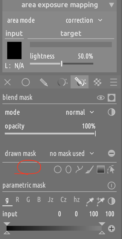
For drawn masks, what about adding a color swatch here?
Diffuse and sharpen is a voodoo module, not because the names are difficult, but because it’s exposing a powerful mathematical operation of which we have no intuition. Renaming its sliders would be hiding genuine complexity not making something simple more obvious and would be the wrong solution.
We should present things as simply as is accurate, but no more.
1 Like
That’s a good point. When people are making comparisons with other RAW editors, it might be worth regularly asking for equivalent comparisons to modern video tools.
2 Likes
So not so much a UX nightmare, but a missing feature?