Well of course, I meant more as a method of unstucking it, even if it meant that the wrong choice was made. In my opinion it’s better for a choice to be made, even if the wrong one, than none at all, at least in this context of course.
I strongly disagree.
What, if the majority says that they would rather have word order inverted? That does not mean that it should be done.
.wrong be still would It
3 Likes
I’d agree that decisions should be made, so that people know whether to spend time on it or not. Surely either specific changes are required, or it can be approved, or closed.
1 Like
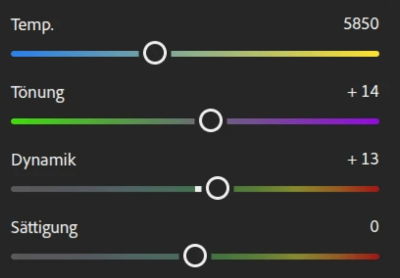
for me toe and shoulder are descriptive. Shadow and highlight compression less so. Hover over the slider and reading to sliders tool tip is very informative. Also people can read the documents if they need further help. The problem with UI and slider names is there is no way to please everybody.
1 Like
In principle I agree with you, but unfortunately unless you can convince maintainers of any project to opt for the “right” choice, they will end up doing what they think is best.
Well of course, it’s their codebase, they are the ones who call the shots. We cannot do much more that point their attention to what can be improved and, if possible, implement solutions ![]()
3 Likes
Talking about small UI improvements, I have just prepared this:
2 Likes
That same applies to you when the labels would have been ‘shadow’, ‘highlights’ and ‘compression’. Those terms are much more common in other editors than ‘toe’ and ‘shoulder’.
If ‘read the manual’ is your argument, then I don’t think that you get the point about a descriptive, self explanatory ui.
1 Like
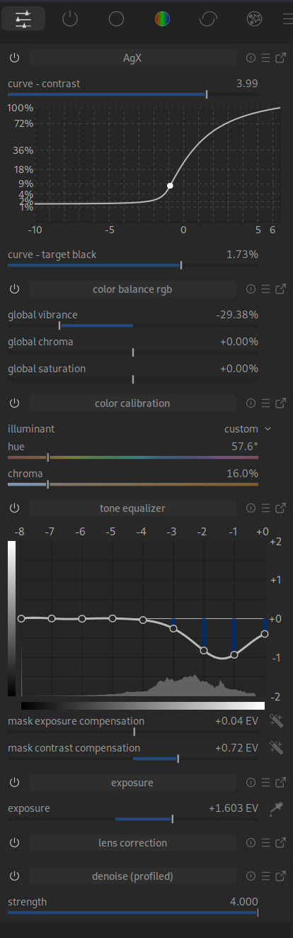
The labelling of the axes is not consistent here.
AgX: Numbers on the left and right (standard)
Tone Equalizer: Top and right
Here, I would make the brightness bars smaller, swap it with the labelling or leave it out altogether.
By the way, can anyone explain to me how I can change the size? With AgX, a bar appears at the bottom that I can use to change the size.
I also noticed that in the quick menu -> Tone Equaliser, the function cannot be used by moving the mouse over the area and scrolling.
Update:
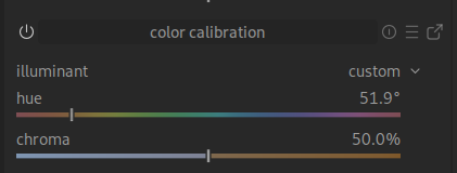
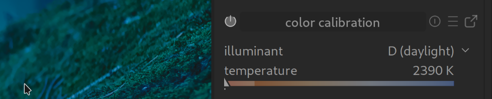
If I move the chroma slider to the left towards blue, the image becomes warmer; if I move it to the right towards orange/yellow, it becomes cooler.
Update2:
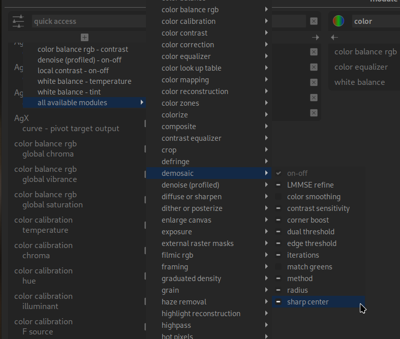
No option to add Capture Sharpening to Quick Access. Am I doing something wrong?
Update3: @kofa
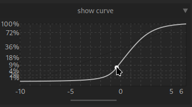
Would it be possible to move the pivot point with the mouse? In the chart, that is?
I tried that once, but the code was very messy. I’ll try again sometime.
1 Like
That’s because that is the color of the illuminant. If you say that the light is blue, the whites become orange to compensate. It is WAY.
One could have controls for the correction, instead of illuminant, which would behave as you expect. But the current approach is more rigorous.
You can only add bauhaus widgets to the QAP, which probably that is not. This is my educated guess, I am AFK and didn’t check.
I think of it like moving towards blue corrects for a blue light source. Moving towards orange corrects for an orange light.
I agree that being consistent and coherent is important. The different modules have very different histories and can feel like different fiefdoms rather than part of a single package.
This is a power user tool, so powerful and correct beat discoverable and simple, but discoverable and simple are important. Every decision is a cost benefit analysis. It’s wrong to only go for power if it makes the tool too hard for the user-base to use.
1 Like
Thank you for your prompt reply. I don’t think it’s “urgent”, but it would be a very intuitive feature.
Thank you for your explanations, but my point was more to show that this is another example of non-intuitive operation.
What you see is not what you get ![]()
Context is important, no?
Well, it says illuminant on the label, so technically WYSIWIG ![]()
I guess in this case is the underlying concept that is not very intuitive, it’s not a fault of the UI.
Also consider that the purpose of that slider is to reduce or remove color casts in the image. So the slider is telling you “pull me in the direction of the cast that you see in the image”.
1 Like
I try to be very careful with “intuition”. Most often, the things I find intuitive, are only thus due to my education or experience. Nothing about a car is a priori intuitive, although driving one becomes intuitive after a while.
You’re probably using the word as “requiring no further explanation”, but that begs the question “for whom?”; the necessary explanations will vary significantly between novices to image editing, versus experienced Lightroom users, versus experienced Darktable users.
I generally instead try to make things “more legible”, “clearer”, “less complex”, but try to avoid “intuition”, or “easy”.
Maybe that’s an unnecessary tangent. Sorry about that. It’s just, I’ve stepped into this trap too often myself.
5 Likes
That is probably a perfectly valid point, not only for “here”.
We are always talking about “possible” improvements here, i.e. suggestions. I find this easy to understand for beginners.
I understand that when I overlay the displayed colour value on the image, the areas that are supposed to be “grey” will be grey.
At least I don’t find it intuitive at first glance.
Very nice said!