I haven’t been able to figure out a way of targeting only the module headers for open modules. I did want to do this.
I tried that, but across all themes it looks cleaner with the icon being darker. Like dark glass that isn’t illuminated. Whereas the activated icons are very bright to simulate lights of some sort in comparison.
I am planning on making the changes on a code level if I can get to a point that people like enough. I love custom themes but my goal is for new users to have easy access to a better default (I know that is prideful for me to even consider, but I can always try).
I don’t know how this really functions, but I would tend to think that in the dt discussions in GitHub participants are mostly there because of their qualifications in architecture and programming.
But UI/UX is a field of its own that people may have several years with studies in – albeit, like for some other professional fields where the subject is something “lay” people somehow is involved in, everybody feel they should be able to influence a discussion on the topic with the same weight as professionals. (An example on this is myself, who have little education in the subject of UI/UX …)
Over the years much has been said and discussed, some individuals have produced some sweat, and several UI proposals has been put forward – illustrated by @thumper in this thread he created, and there are others – with the result you describe.
Could it be an idea that for once the UI/UX was given a major focus in that we (perhaps @Pascal_Obry ?) sought to establish a group of interested people with a more pronounced professional background with some kind of mandate to come up with a common proposal?
(I’m not thinking of any radical new UI approaches that will require comprehensive reprogramming – I believe that for most users with a little experience the current UI system for the most part lets us do our job in a good enough way, and the outcome of any major redesign is unlikely to be proportional to efforts needed. I rather think of a common approach to minor changes of the kind we’re discussing in this thread.)
Sometimes design by a committee can be a good thing.
I think that could be a good idea, but perhaps not solve the real issue. General UI/UX is as broad or broader than general coding, because it includes everything, from the actual GUi, to the way it feels, to how the internals are conveyed through the visuals, to fundamental philosophy and purpose, etc.
This is why many UI/UX efforts fail, because they become messy and confused. For now. My goal is to just keep updating this thread with my pure css changes and in the end I will offer the final result as a custom theme or I will go to GitHub and put together a PR for official inclusion.
Yes, it is broad, and that’s why I referred to some kind of “mandate” to set rational limits as to what there is any point to put efforts into. Much of the deeper/broader dimensions you refer to must for practical purposes be regarded as set in dt. (Look to hanatos who now rather work from the ground upwards on the vkdt-project.)
Fine with the css-work, please go on, but your good suggestion on e.g. “Module Library” goes further. @Qor and @Masterpiga has also come up with good ideas recently – can this and earlier gambits be coordinated in one way or another?
It’s nearly incredible how good dt as a FOSS project has become from individual efforts and consensus approaches. But I believe that there are other FOSS projects that has experienced lift from sometimes making a more directed effort.
I turn it and when I teach I get my students to turn it off. DT gives us this choice so I don’t have a problem with the QA panel. I can certainly imagine it would be useful for some users.
I doubt the average user even cares or realizes the difference.
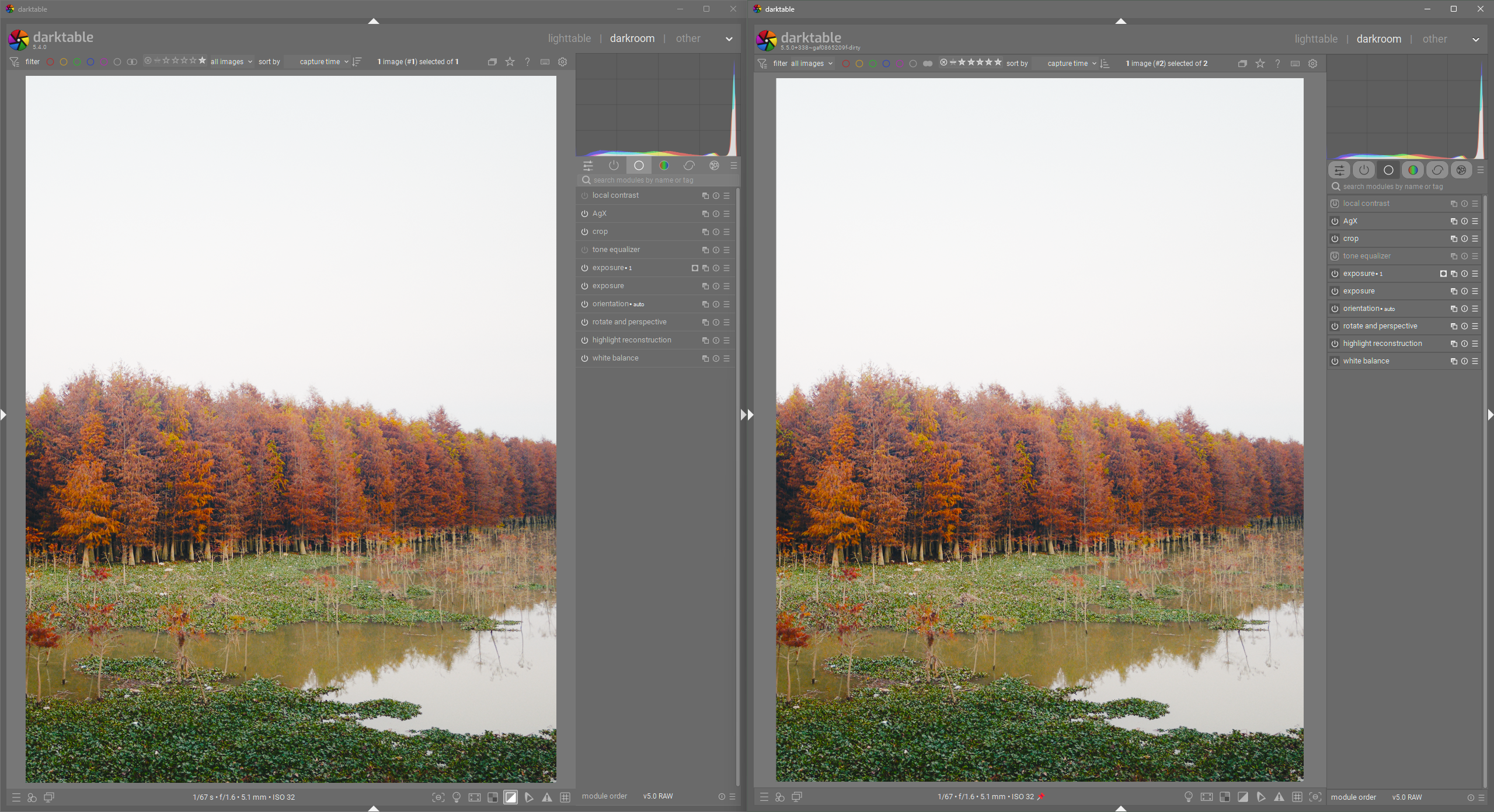
No extra scrolling will be required due to a change to the module group tabs.
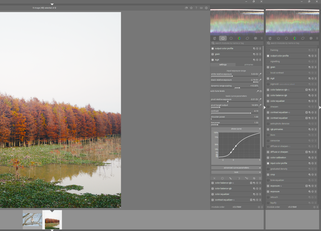
Here is a side-by-side of my current changes (I’m not saying this iteration needs to be implemented, but it should get the idea of what I am working on across). With my current css I am changing a lot, but notice how this does not significantly increase the height of elements, especially the module group buttons. All that changes with the module group buttons is their appearance. No difference in behavior.
The goal is for the GUI for module group buttons to look more like what people are used to in toggle buttons. In fact I have gone as far as to make the styling for module enable/disable toggle buttons the same. Now toggle buttons across the app have very similar styling (except in a few places).
To point out a few improvements: toggle buttons look like toggles, contrast between on/off modules is much better (without resorting to color), Toggle button styling now mimics physical toggle buttons (pressed down and lit up = ON, sticking up and unlit = OFF).
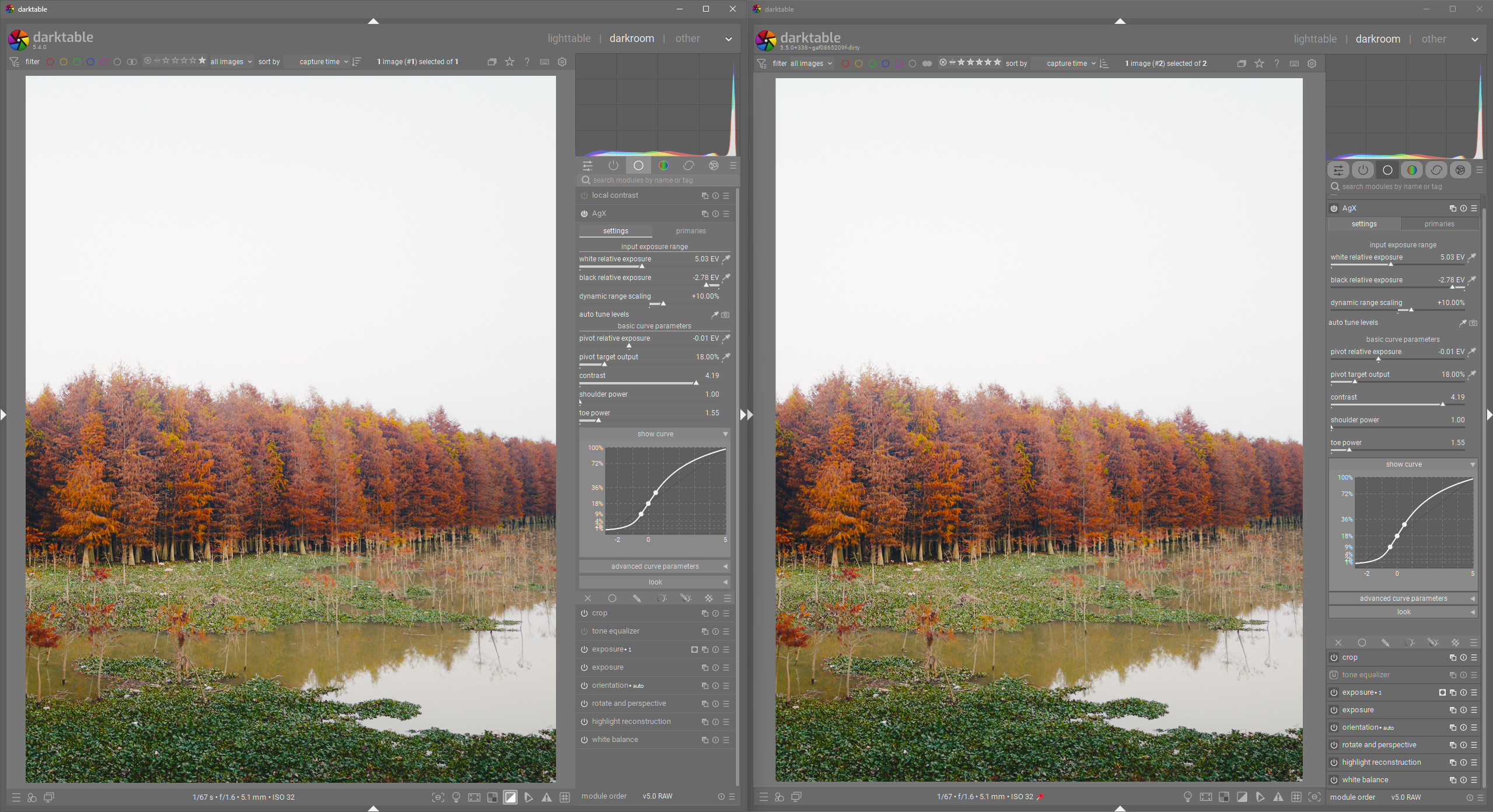
Now, for fun, let’s look at the improvement I made to module content styling:
In my opinion: Better tab styling (resembles physical tabs), Nicer control spacing, removal of horizontal bars for control sections (relies on spacing instead).
Again, this is a work in progress. I am not trying to push for this to be merged anytime soon. The current UI is very good in my opinion. I am just trying to explore ways to extract every bit of improvement we can, without resorting to a major UI overhaul or waiting for some mythical move to GTK 4