With recurring questions on the same topic, I think it’s good to compile all the available info in a centralized way.
Intro
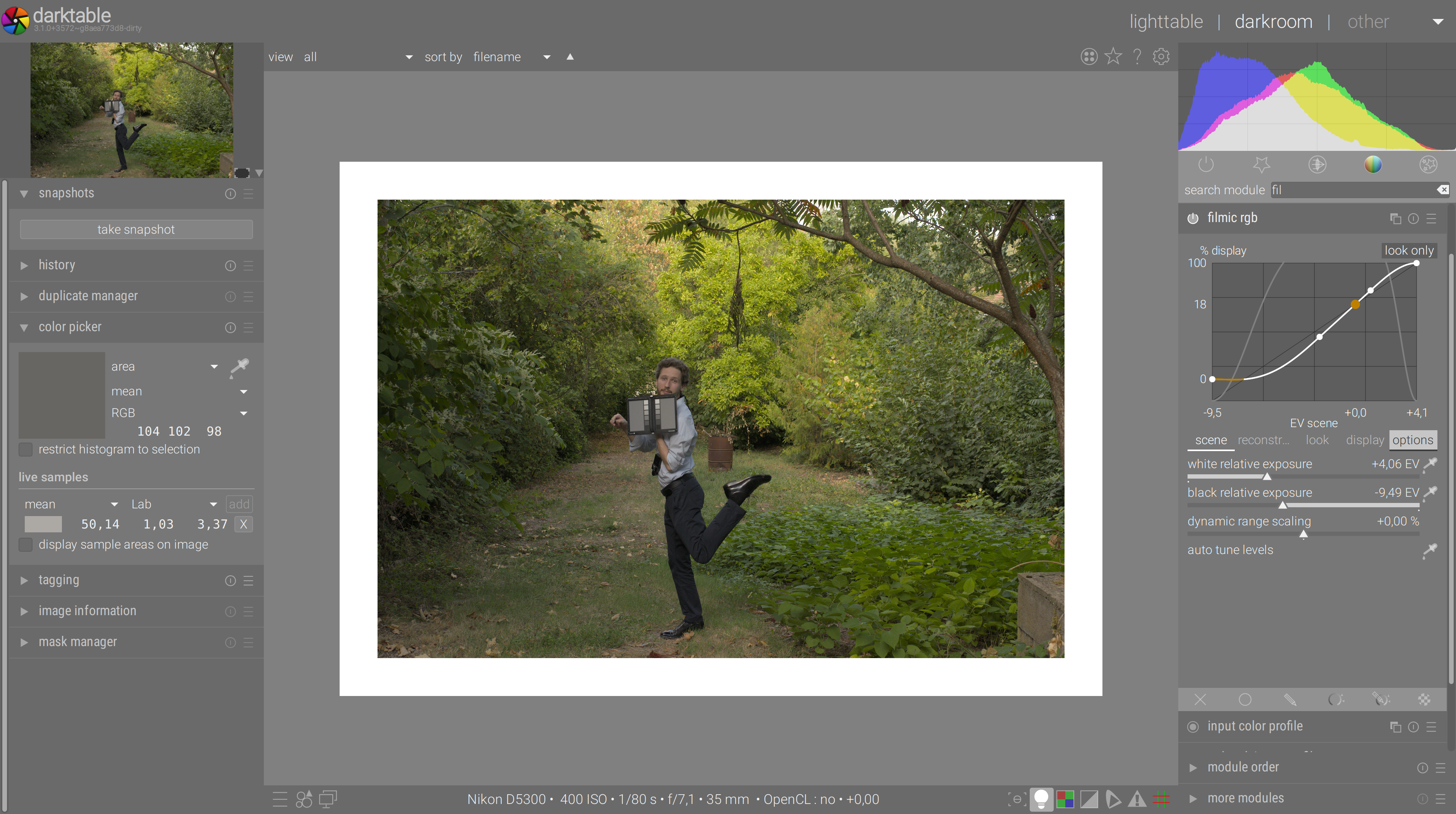
What is filmic ?
If you open a linear raw photograph and simply demosaic and color-correct it, then send it to display, you will notice it looks darker, duller and flatter than what you remember of the original scene.
What explains that is the brain enhances brightness and contrast in non-linear ways, which means that vision is not merely a product of your eyes, but mostly a brain construction.
So we need to non-linearly beautify your sensor’s readings to match your color memory. Every imaging software does that already, whether it shows it to you or not, by using some sort of tone curve, base curve or LUT, which fall into the larger category of tone-mapping operators.
Tone mapping is a very simple process of dispatching light emissions to new values. The goal is usually to brighten the mid-tones and shadows, darkening highlights, while ensuring a smooth tonal transition from black to white and retaining as much detail of the scene as possible.
As it happens, old-school analog film already does that as a side-effect of its technology. But it doesn’t stop there, since the gamut mapping is convolved in the mix too.
So filmic does that tone and gamut mapping at once by using a similar strategy as analog film (which is close in its logic to human vision) and putting emphasis on harmonious tonal transitions, at the expense of detail in highlights (which will be compressed, as human vision would be too).
Notice we don’t do gamut mapping at the same time as tone mapping just for the sake of making things more complicated. Non-color-managed tone mapping will push colors outside of the destination gamut by side-effect. So, gamut and tone mapping are two sides of the same coin, and need to be dealt with simultaneously. They are two different aspects of a general operation : color space conversion.
What is this middle grey you keep talking about ?
Well, it’s mostly a convention we use, but it’s convenient because it’s the middle of our physiological dynamic range (in the eye, before the brain starts doing things). Several vendors provide middle grey cards you can put in your shots to help setting exposure and white balance.
See here, in a scene set with static exposure settings (exposure set to prevent highlights clipping), what a such card looks like when our sexy model moves under the trees. Each set of picture is :
- RAW with no correction (only white balance),
- RAW + exposure compensation to anchor RAW grey to display grey
- RAW + exposure compensation + filmic to bring back highlights
RAW grey = 11% :


grey = 6%


grey = 4%


Middle grey is on the card (the scene one) and on the color-assessment preview background (the display one). In the same scene, the amount of light that the subject gets depends on where he stands, how much occluded is the sky above him, and so on. Yet, the scene stays the same, and especially the bright sky and background, for which we set the hardware camera exposure to prevent highlights clipping.
So, depending where our gorgeous subject stands, we will need a different correction to nail his grey to the display grey. The correction is a simple exposure adjustment to brighten the scene until both greys (scene/display) match. Then, we do damage control on the highlights with filmic to preserve the background. Notice that, once the middle grey has been anchored in exposure, filmic doesn’t change it one bit.
In real life, you rarely carry a grey card like that, so you will have to eyeball the correction. But the principle stays the same. If you had a real grey card in your candid shots, that’s what you could do to very quickly nail your exposure in post.
The bottom line, here, is RAW grey is never anchored to display grey, and even on a fixed scene, what we define as grey will change. So this step can’t be automated.
Why is filmic so difficult to use ?
Filmic redefines the workflow and the pipeline by bringing new assumptions and concepts inherited from physics and actual light, following the trend introduced by the cinema industry, because these new concepts make it scalable to whatever dynamic range you get in and out (SDR and HDR alike).
Typical imaging workflows come from the 1980’s when computers dealt with images encoded as 8 bits unsigned integers because it was both memory and computationally efficient. So they had 256 codes values, between 0 and 255 included, but couldn’t represent anything outside of that range, resulting in hard clipping of RGB values. The approach that was chosen was to assign “black” meaning to the value 0, “white” meaning to the value 255 (actually, white as the luminance of the 20% reflective patch lit evenly and anchored at 100 Cd/m² in display).
So these black and white were mostly untouched, and everything happened in-between, with non-linear operations all along. But then, black was not printed at 0 Cd/m², so that 0 == “black” lead to algorithmic issues, and non-linear operations destroy the relationship between the RGB ratios of the light emission, so this model had to break away from physics and failed to emulate a realistic darkroom experience.
Now, darktable and other software use 32 bits floating point numbers internally. They can represent values between virtually -infinity and +infinity. The former 0 is encoded 0, but the former 255 is encoded 1 (as 100%). It implies that, in the internal part of the pipeline, we can deal with overflowing the [0; 1] range, it doesn’t matter. We only need to remap the pipeline range to 0-255 as a last step before going to display. We are completely free in-between. If clipping happens in a 32 bits pipeline, it’s by choice or because devs tried to reproduce the legacy behaviour.
But this new assumption let us work with linear operations that preserve the physical properties of the light emissions encoded by your RGB values. Also, we don’t need to bother about the meaning of 0 or 1, they don’t mean anything by themselves. To still get a sort of reference, we only care about the middle grey, which is conveniently defined as the middle of the retina dynamic range, and the custom has been taken to scale RGB value such that this tone gets (linearly) mapped to 18.45%, because it is the ICC standard value.
That workflow, which deals primarily with linear operations (primarily but not solely) is called scene-referred, because the RGB values, treated as a code for light emissions, are preserved in a physical scaling that is connected to the light intensity on the scene. It is awesome because it scales to whatever dynamic range you have in and out.
The workflow that relies on an hard clipping at any stage in the pipe, because of the 0-255 legacy limitation (that is, 0-100% range) is called display-referred. It has been good enough for the most time because input and output were SDR (small dynamic range). Making display-referred work in HDR has been achieved with convoluted algos resulting in weird colors, slow runtimes, halos and disputable results (to say the least). Alpha compositing and lens blurs cannot work properly in display-referred.
Filmic is conceptually difficult because it is not only a tone-mapping, as a simple tone curve, but also the scene to display dynamic range scaling, and as such, it makes the conversion between a scene-referred pipeline to a display-referred output.
But then, it can also be quite simple if you forget about the theory and focus on the results.
The scene settings (black exposure, white exposure, and grey luminance if you chose to display it) behave exactly as what you are used to in the levels module, except levels only let you shrink the dynamic range, while filmic let you shrink, enlarge or preserve it.
Then, the look lets you choose how progressively you want to degrade from white to black. The latitude will set the tension in the spline curve, forcing extreme luminances to stick more or less to the bounds, and its position will define what pixels will get resaturated for beautification, or desaturated for gamut mapping.
Finally, the display settings shouldn’t change until we make darktable compatible with HDR screens. But be aware that, the day it will happen, you will have to set display white to 400% and that will be it.
Your questions
What is the difference between basecurve and filmic ?
Feature-wise, none. They both do tone mapping. Ok, perhaps filmic tries to gamut-map too, but the bulk is the same.
Concept-wise, base curve works in display-referred and maps camera RGB in [0% ; 100%] to display RGB in [0% ; 100%]. So 0% gets usually mapped to 0% and 100% to 100%. Everything happens in the middle.
Filmic works in scene-referred and let you choose the bounds of your dynamic range. So 18% gets mapped to 18% (if you don’t change the defaults), but everything else is fluid, and your S curve (the look) gets scaled to whatever bounds of the dynamic range you defined in the scene tab.
Put otherwise, filmic is a base curve where the abscissa bounds are fluid and set by users, while base curve set them to 0-100% and that’s it.
Filmic clips highlights ?
Filmic doesn’t clip anything unless you asked for it. The scene white relative exposure lets you define the clipping bounds on the right of the dynamic range. If you feel your legitimate whites are clipped, simply increase its value.
Filmic clips blacks ?
Filmic uses a logarithm to scale the dynamic range. If you have RGB values equal or very close to 0, their logarithm is -infinity, and they get darkened or clipped a lot. If you feel that blacks are clipped, simply decrease the scene black relative exposure. If it is not enough, decrease the black level in exposure module too.
Also, a lot of people confuse clipping with compressing. When your look contrast is high, blacks as well as whites are compressed much more, so details get flattened and loose local contrast. This is not clipping, since the actual display values (at filmic’s output) are still in the valid range, but people associate flat extreme luminances with clipping. It’s different.
Highlights colors are white/pink/desaturated ?
Filmic assumes whatever RGB values lie around the scene white relative exposure are whites. So it desaturates them, because white is supposed to be white, aka achromatic, aka colorless.
If you have legitimate colors, that should be saturated, ending up in the desaturated range, it simply means your scene white exposure setting is too low, and as a result, saturated colors are mapped to roughly 100% luminance in the display range. So, increase the scene white exposure setting to give more breathing room to these colors.
It’s simply not possible to display a color at 100% luminance on any screen or paper print, thus, saturated colors need to be anchored at maximum around 90% luminance.
Filmic adds too much/little contrast ?
The contrast is fully configurable in the look tab.
What if I want to use the scene middle grey value ?
Don’t. Filmic can do many things in many differents ways to achieve essentially the same result, because it’s so general and configurable. That backfired quickly because users, used to push and pull sliders until they get an intuition of what’s going on, can’t deal with open boxes like that, they need tunnels that naturally guide them to the exit.
Over time, the recommended fool-proof setting process has evolved to:
- anchor middle-grey (that is, overall brightness) from the scene value (dependent on each picture and in-camera exposure settings) to the display value (18.45%) in exposure module, not caring about clipping in your screen (don’t forget : clipping in screen/output doesn’t mean the pipeline is actually clipping),
- pull back highlights in display range using scene white relative exposure in filmic.
But I like to roll around white…
The current proposed workflow is to anchor the whole pipeline around the value of middle grey, which is 18% on ICC-compliant media, and to do so ASAP in the pipe. Some users prefer to interleave scene-linear assumptions with display-referred habits, and anchor it around the value of white, which is 100% on ICC-compliant media.
The problem is HDR screens and various display outputs are on the verge. And for HDR outputs, 100% white is not the same white as SDR 100%. Actually, 10 bits HDR white is 400% ICC/SDR-referred. So, in a near future, the definition of white will be medium-dependent (it is already, but ICC specifications hide it since screens are supposed to be calibrated at 100 Cd/m², which is roughly the luminance of a paper sheet lit by a 120 W tungsten bulb not too far away).
So, in the future, some white point will not necessarily be displayable on another medium. However, the grey point will forever be on your output medium, and using it as a reference ensures that the overall brightness matches between masters and all exports, no matter the output medium and the tonemapping needed to force-fit the image DR in it. Plus, we know most details will lie around middle grey ± 2 EV, so we know that critical part of the tonal range will be sent as-is to any output, will little if none modification, and that is a welcome appearance predictability for us. Then, the whole matter will be to compress the bounds of the DR, outside of middle grey ± 2 EV, to adjust the image for both the medium black and white points.
How to find the scene middle grey ?
Here is a secret : we don’t care about the middle-grey value. We know that, for an ICC-profiled display, it should be 18.45%, but it can be absolutely whatever in the scene, so we don’t care.
Conceptually, the scene middle grey will be matched to the display middle grey. That’s the goal of the algorithm, but it has nothing to do with you as a user.
We know from statistics that roughly 50% to 80% of the details (and likely the subject of the picture) will reside in the tonal range [middle grey - 2 EV ; middle grey + 2 EV]. So, your goal, as a user, is rather to balance the average brightness of the picture such that it matches a grey reference.
Now…

This GUI color makes your image look good, by contrast with a dark background shade.
And yet…

Against a middle-grey-ish background (the grey UI theme is actually a tiny bit darker than middle-grey, for better contrast with text labels), you see it looks darker, and actually too dark in average.
And if you use the color-assessment mode :

You see that it’s not just too dark, but also lacks real whites and therefore contrast.
So, the color-assessment mode has been designed, in conjunction with the grey theme, to provide a visual reference for display peak luminance (white border) and exact display middle grey (background). The most reliable way to adjust contrast and brightness is to raise the exposure until the average brightness of the picture matches the background brightness, with you picture fit in the screen (or even smaller, but never zoom-in).

Doing it zoomed at “small” size is even clearer:

This will also prevent most of the bad surprises that people get when they print their pictures, only to discover that the print is much darker than the preview was. In this case, they usually blame their ICC profiles (printer or display), whereas the color assessment conditions are to blame.
Filmic seems to act on its own ?
Filmic doesn’t do anything on its own, it’s too stupid for that. Anything that happens inside is configurable in GUI.
Filmic simply maps black, grey and white scene values that you set to black, grey and white display values that your average ICC-profiled output medium expects. Bad behaviour means bad settings, nothing is hard-coded inside and pretty much anything can be disabled.
One thing to remember is base curves come in different presets, one for each camera brand. These presets have been reverse-engineered over time and added to darktable’s core. Filmic comes with only one set of defaults settings, that adapts to some extent to the EXIF exposure bias, but that’s about it. So, don’t expect defaults to work as-is in 100% of cases when it comes to emulating your in-camera JPEG.
Would it be possible to auto-set filmic ?
Short : no.
Long : there is no way to guess where your camera anchors its middle-grey. If we were in 2002, we could use the display-referred assumption that grey = 18 %. But in 2020, with all the dynamic-range enhancements and optimizations that cameras do to squeeze as much scene dynamic range inside the sensor bounds, it’s completely impossible to programmatically guess what’s what.
Only you, the photographer, can know and decide and tell the software what is to be considered “grey”.
Yes we can analyze the picture histogram and use the assumption that the median should usually be the middle grey, but what if you are shooting high-key or low-key ? How do we detect that ?
I loose too much detail in highlights
First, look at a bright cloudy sky. How much detail do you perceive ? Not much, because you get blinded at some point. Now, put polarized sunglasses on. Much better, hmm ?
So, first thing first, if you want detailed skies, start with using a polarizer on-camera.
Then, of course, filmic trades some highlights for brighter midtones, but so does your brain. We live in a flawed world. Now, if you are used to the HDR-y skies with lots of local contrast, you may consider adding local contrast module and perhaps start darkening the whole sky with a masked exposure module or the tone equalizer in order to relax a bit filmic’s tone mapping bounds.
Filmic forces me to do back-and-forth editing
The bad thing with most imaging apps is they force you into a “tunnel” workflow while darktable is more like an open valley. If you are somewhere in a valley, and want to go somewhere else, there are usually lots of options, but the shortest path may well be the steepest, while the flattest way may be the longest. So you need to know the terrain and make decisions. Or pay a guide. Or get an engineer to build you bridges and tunnels to go straight ahead in a flat fashion. But remember this : flowers don’t grow in tunnels. And the tunnel-like apps don’t give you much creative freedom, you are stuck into the efficient workflow for your own good.
So you need to develop a rational method in darktable, while other soft might fix your mistakes silently for you, or even prevent you from doing them at all, and that way you don’t learn.
Filmic should not force you to do back-and-forth editing if used properly. The tabs are displayed in the order they should be set. Follow that path and things should go well. Users who apply this recommended workflow get properly exposed images in a matter of 30 s to 1 min. Then, inside a series of picture, you can copy-paste your editing history, and only the scene tab of filmic may be adapted to each individual picture (along with the exposure, perhaps).
Is filmic for HDR only ? What if my scene DR is small ?
Filmic has been built with HDR in mind, because it’s more demanding than SDR and less forgiving, but it is a general tonemapping with a look built-in (that is, the S contrast curve).
So filmic can do whatever in (SDR or HDR) and whatever out (SDR or HDR), it’s really just a matter of the parameters you set in the scene tab.$
What if I like to use the display-referred Lab tools ?
Remember filmic is your conversion from scene pipeline to display pipeline. All the Lab modules can still be used in conjunction with filmic, even though they are not optimal.
Sharpening, contrast equalizer, high-pass and low-pass filters work in Lab but perform local operations, so they don’t rely on any definition of grey or white. As such, they should go before filmic (where they are by default in the 3.0 pipe order).
Levels, tone curve, zone system, etc. have a display-referred GUI (in the 0-100% range). These modules rely on a fixed assumption about the values of grey and white. These should better go after filmic, where the pipe is dislay-referred.
Local contrast is a local operation that rely on an hard-set definition of grey and white. For some reason, I sometimes find it works better before filmic, and sometimes really not, while it always works ok after filmic (where it is by default in the 3.0 pipe).
Remember that the display-referred modules are not future-proof. When HDR displays come along, the definition of white will change while the definition of grey will stay the same. So, levels, tone curve, zone system etc. will not scale to HDR output.
Should I set filmic scene values (white and black) to match my sensor dynamic range ?
Short : no.
Long : not necessarily. Filmic comes quite late in the pipe and many things can happen before. Linear operations (divisions and multiplications) will preserve the sensor dynamic range along the pipe. Unfortunately, some offsets (additions and subtractions) happen there too, like the raw black point compensation, or the black compensation in exposure module, or even the offset in color balance.
Although your typical camera sensor dynamic range will roughly be around 10-12 EV at 100 ISO (meaning “black” is recorded with a non-zero value), once the raw black and white points are compensated, the RGB values are rescaled between 0 and 1, which is an infinite dynamic range. But this is only encoding, and has nothing to do with actual light emission.
To circumvent that, in the scene-referred workflow, a black offset of -12 EV (that is -0.000244140625) is applied by default in the exposure module. This way, we are sure that there are no 0 RGB and, if the raw black point was properly compensated, we know that the pipeline starts with an encoding using a flat 12 EV dynamic range.
But then, if you apply another offset, later on, between exposure and filmic modules, well the dynamic range of the pipeline can become absolutely anything. And filmic sees the dynamic range of the pipeline before it, not the original sensor dynamic range. So, all in all, don’t bother too much about the tabulated dynamic range data you get from DxoMark.com or PhotonsToPhotos.net. They might give you a fair enough starting point, or something completely off, depending on what you did earlier in your pixel pipeline.
Filmic explained to analog dads and grand-dads
- filmic reproduces the sensitometry curve of a virtual film we create in-software, on top of digital data,
- the scene white relative exposure is the Dmin (but in log2 instead of log10 – slightly different unit, same meaning),
- the scene black exposure is the Dmax (but in log2 instead of log10 – slightly different unit, same meaning),
- the look contrast is the gamma of the film,
- the look latitude is… well the latitude of the film,
- everything in the display tab is linked to ICC displays, so no need to touch that if you have a regular ICC profile,
- the scene-referred workflow is like having a virtual camera in your computer, in which you can redo the exposure (in exposure module) and build your custom-made film emulsion from scratch.
Additionaly, the color balance will help you achieve the same results you got from color calibration and color timing, under the enlarger, with a color head, and let you manage the relative sensitometry of each RGB curve.
What is the best chroma preservation option ?
None. If there are 5 modes in there, you might have guessed that’s because none of them is clearly superior to the others.
No chroma preservation will desaturate highlights and resaturate shadows, as any tone curve does when applied on separate RGB channels. Some people like that and it is the best option when you have out-of-gamut blues or reds straight out of the sensor.
The max RGB chroma preservation is the most physically meaningful one, but it tends to darken blues and flatten the local contrast quite a lot.
The luminance Y chroma preservation is the most perceptual one, but it tends to darken reds and does not behave well with saturated and out-of-gamut blues.
The power norm chroma preservation is usually the most visually pleasing one and fairly homogenous. It’s complete black magic.
The euclidean norm chroma preservation has the propriety of being RGB-space-agnostic so it will yield the same results no matter the working color profile used. It weighs more heavily on highlights than the power norm and gives more highlights desaturation. I personaly finds it is the closest to color film look.
The best is the one that produce the most pleasing result with the fewest artifacts, and that will be picture-dependent.
(to be continued…)
 ).
).