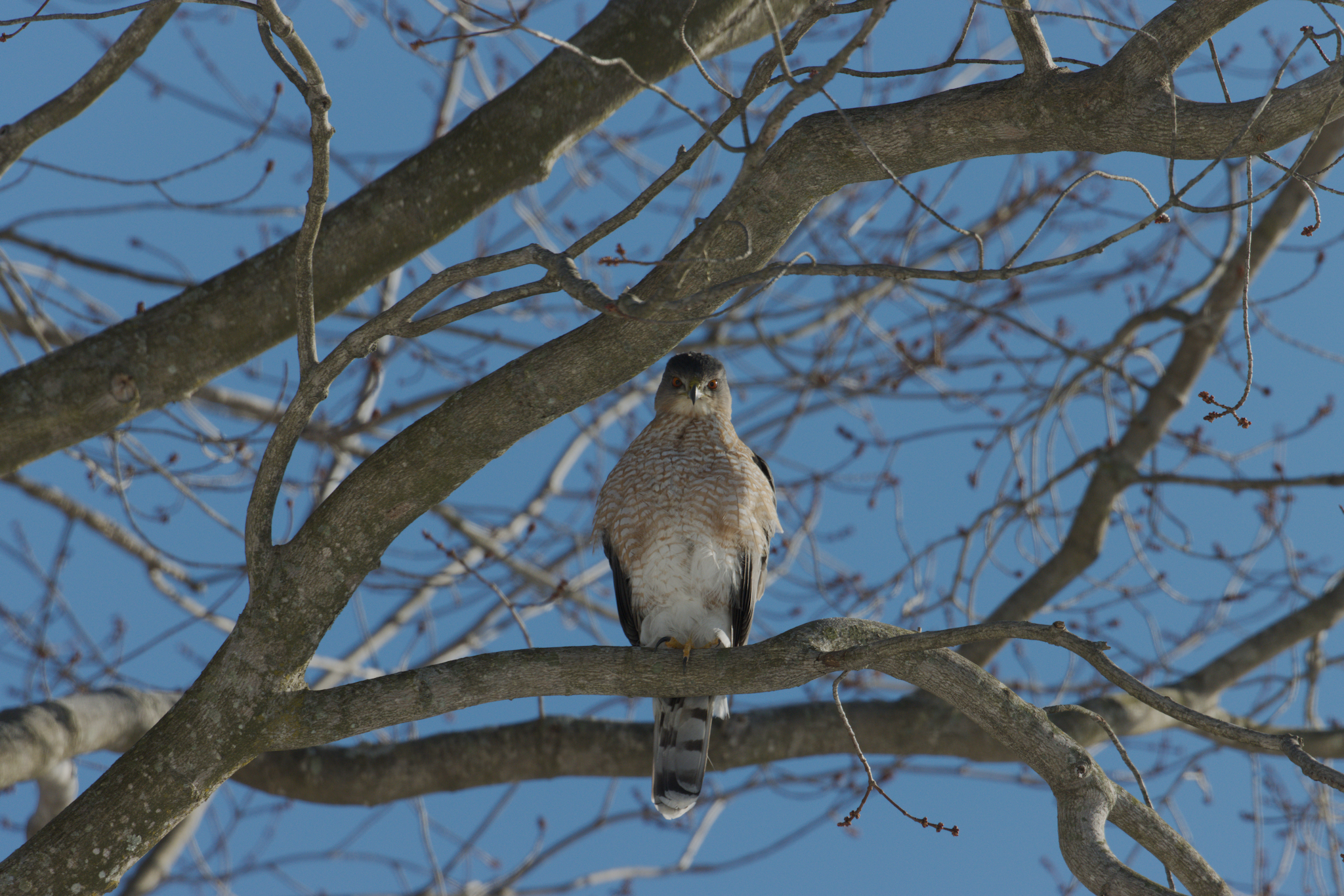
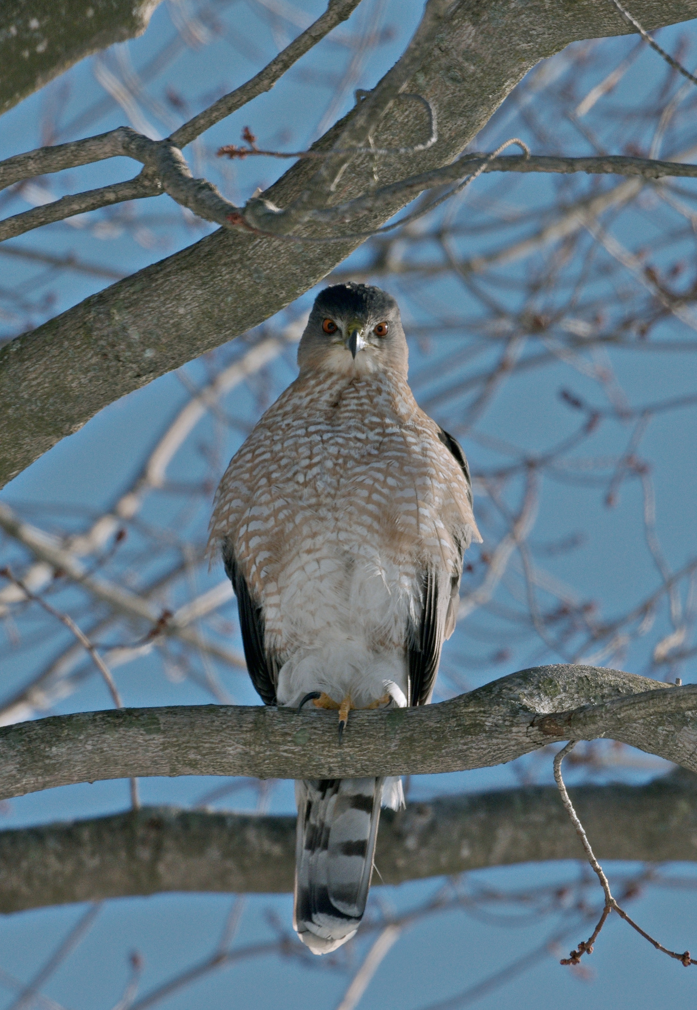
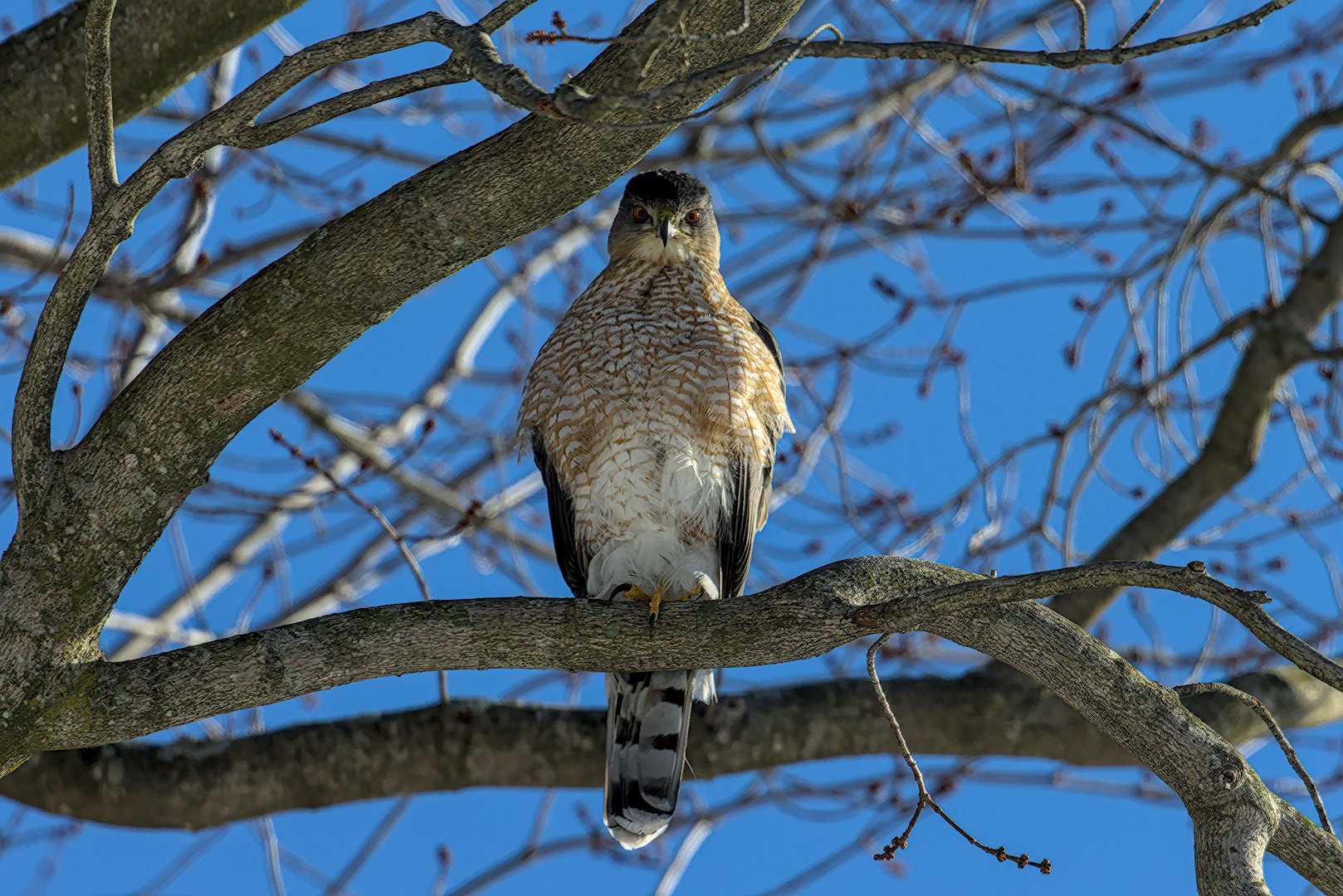
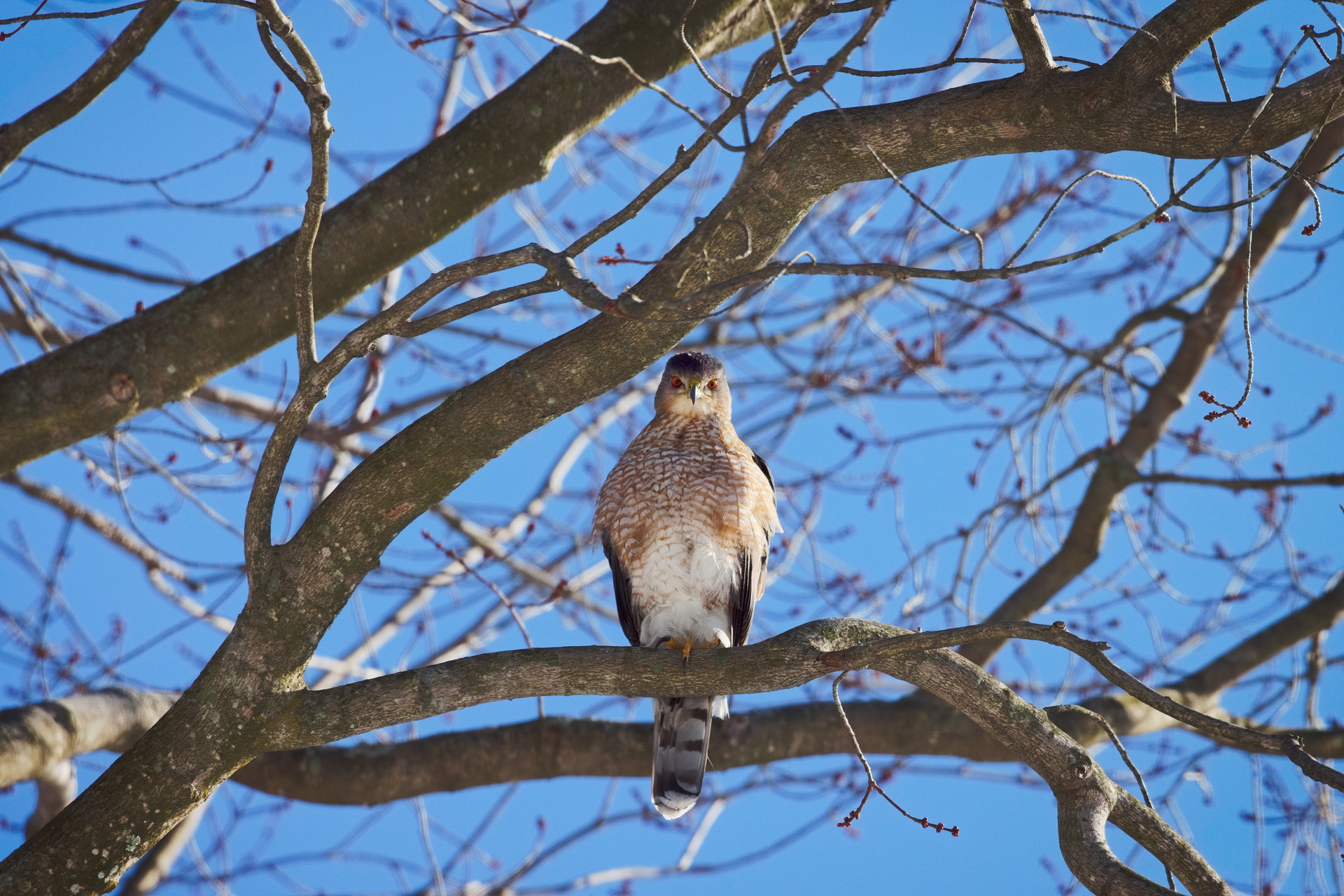
Awesome photo @rmishra!
For this sort of image I think about the following ways to increase “pop” or contrast in the following ways:
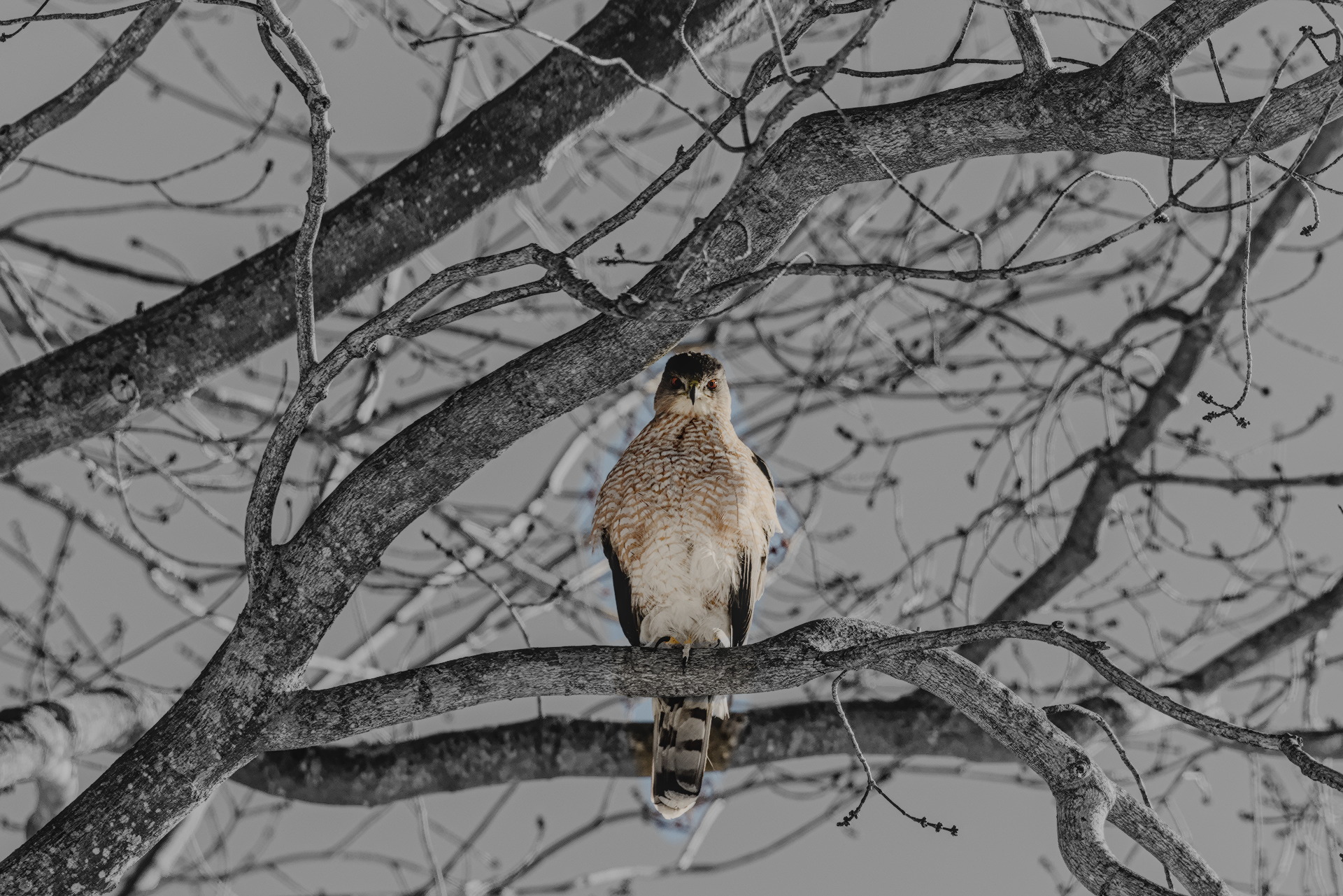
Subject Color vs Non-subject Color
Maximize differences between the subject (hawk) and the non-subject (branches and sky) in the realm of color: saturation, hue, etc.
Since there is a natural color contrast between the warm bird and the blue sky, I enhanced this using the primaries rgb module. I shifted reds to orange, green to yellow, and blue to cyan, which effectively compresses the colors of the image to accentuate the orange/cyan difference.
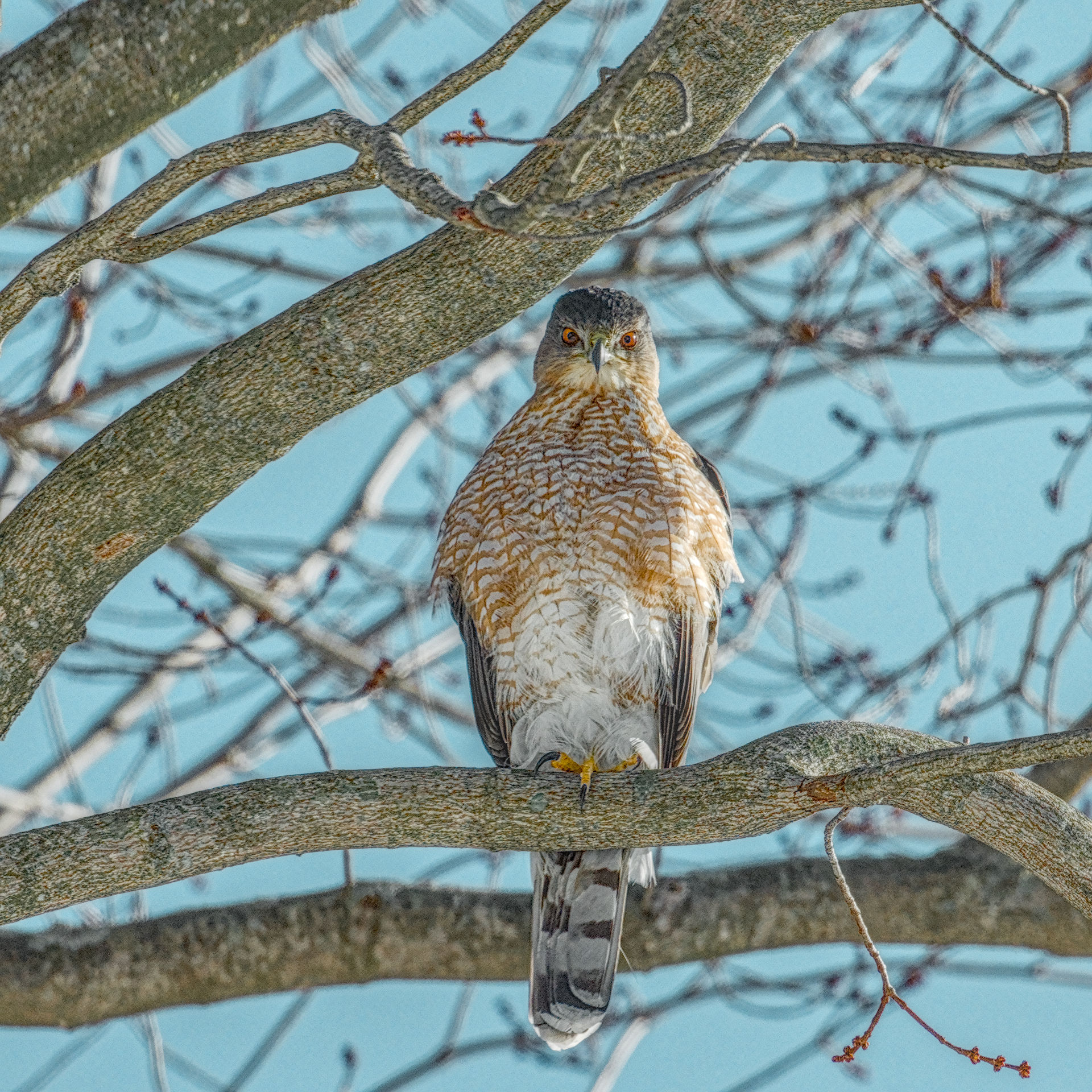
I then used selective masking with color balance rgb to increase saturation in the hawk and reduce it everywhere else. I used one instance for increasing saturation of the hawk, and one instance to decrease saturation everywhere else.
I also used the color equalizer to shift the colors of the hawk more orange, and the color of the sky more cyan. I also used this module to reduce the saturation of colors that were not present in the hawk. Since each hue can be modified separately, only one instance is necessary for this step.
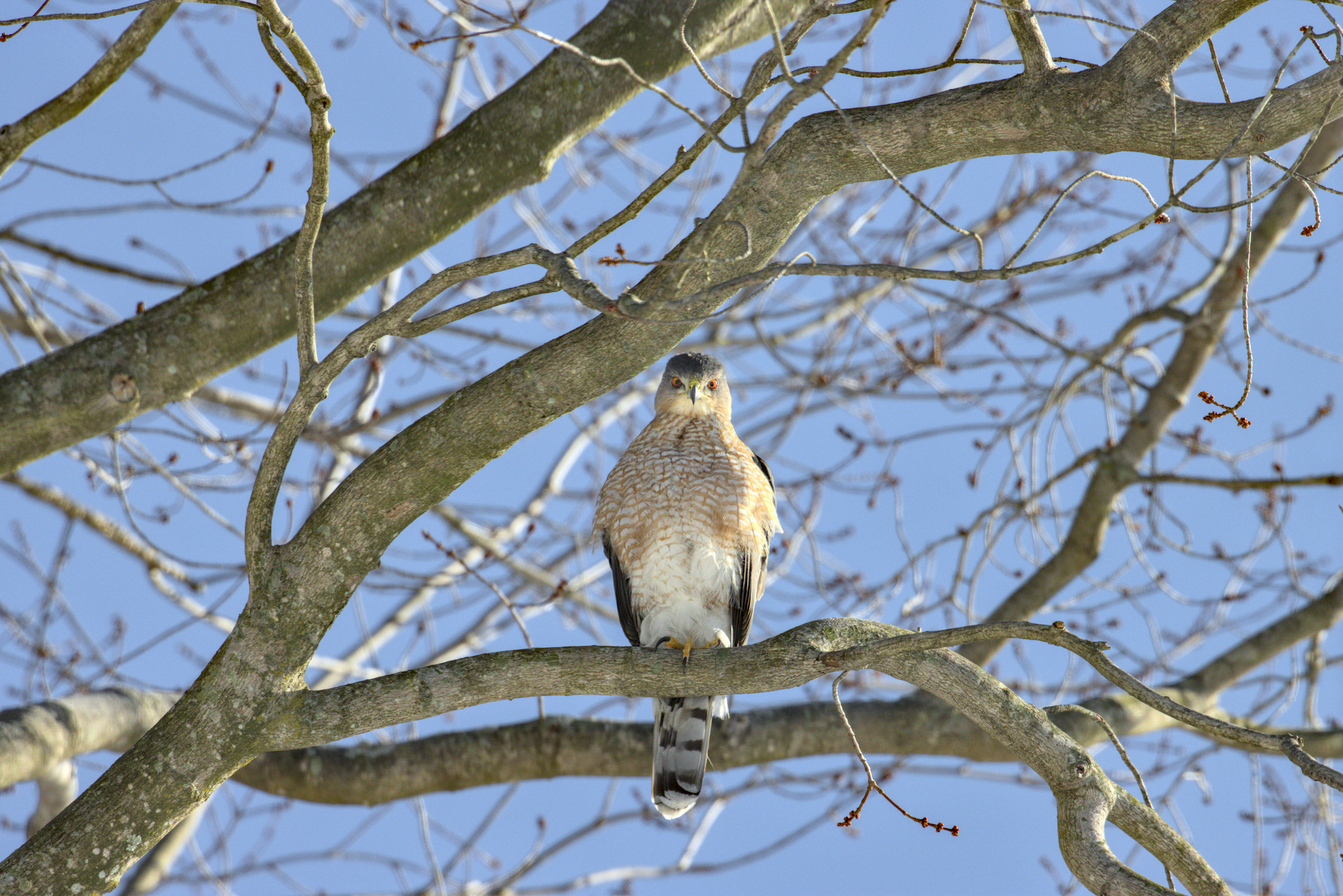
Subject Contrast vs Non-subject Contrast
Using the contrast equalizer module, I reused the mask selection from the color editing, inverted the mask, and then reduced the mid to high frequency contrast in the image everywhere other than the hawk.
Subject Sharpness
I again reused the selective mask for the hawk in the Diffuse & Sharpen module to add sharpening to the hawk.
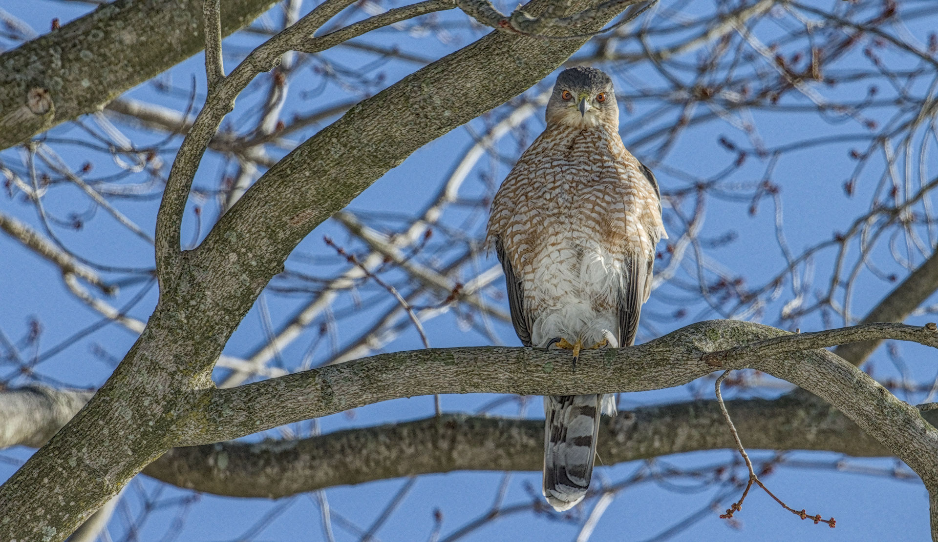
Vignetting
I added another instance of the exposure and contrast equalizer modules. I used oval drawn masks in both to reduce the brightness and contrast in the edges of the image. This helps remove interest from the edges of the image (like details tree bark or just business) so the viewer eyes naturally linger on the hawk more. This method is really useful because it is reasonably realistic since this is something that naturally happens with lenses.
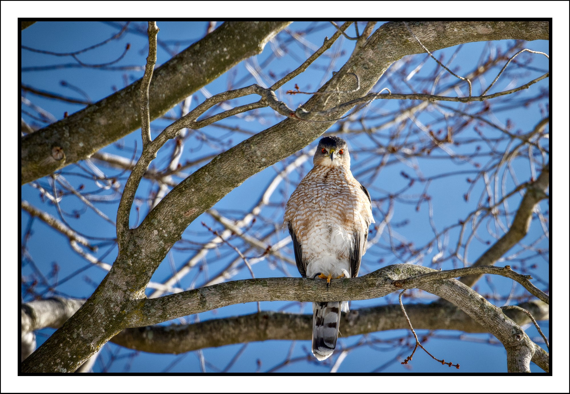
Etc.
I started this edit by making the image quite bright, which naturally reduces the impact of the blue sky, since AgX desaturated the highlights. I also added grain to help hide any unnatural, selective edits. I could have pushed all the components of this edit much harder, but I am a sucker for natural-looking edits, and wanted to do what I could to increase pop without sacrificing the beauty of nature.
This was a super fun image to edit. Thank you for sharing!
IMG_5406.CR3.xmp (104.2 KB)