And that base curve has some color preservation modes too…if you set it to none…maybe the color is not better but three is more range in the petals or contrast…
I definitely understand the trepidation. I’ve only been using darktable for 2-3 months and all the different tools and options are overwhelming at first. But for the most part I stick to a handful of core modules that I use most of the time and have a pretty simple process that works for me.
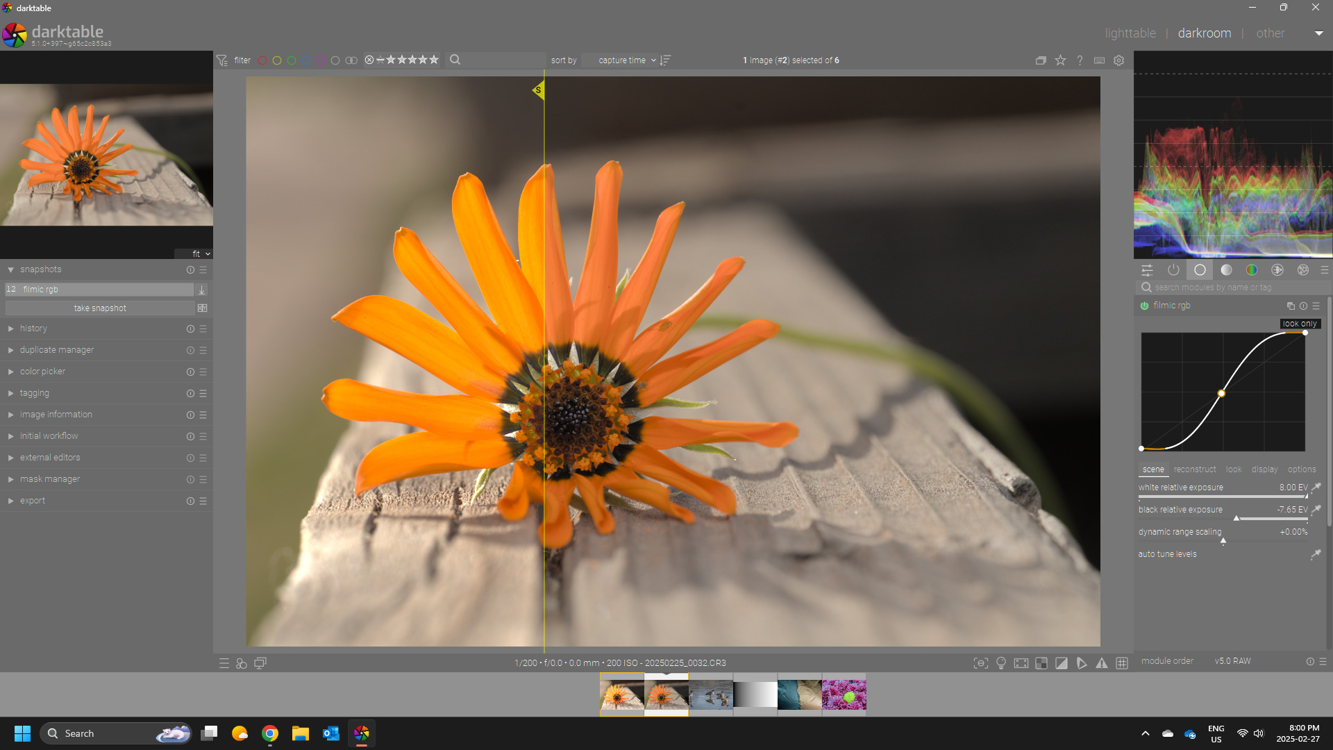
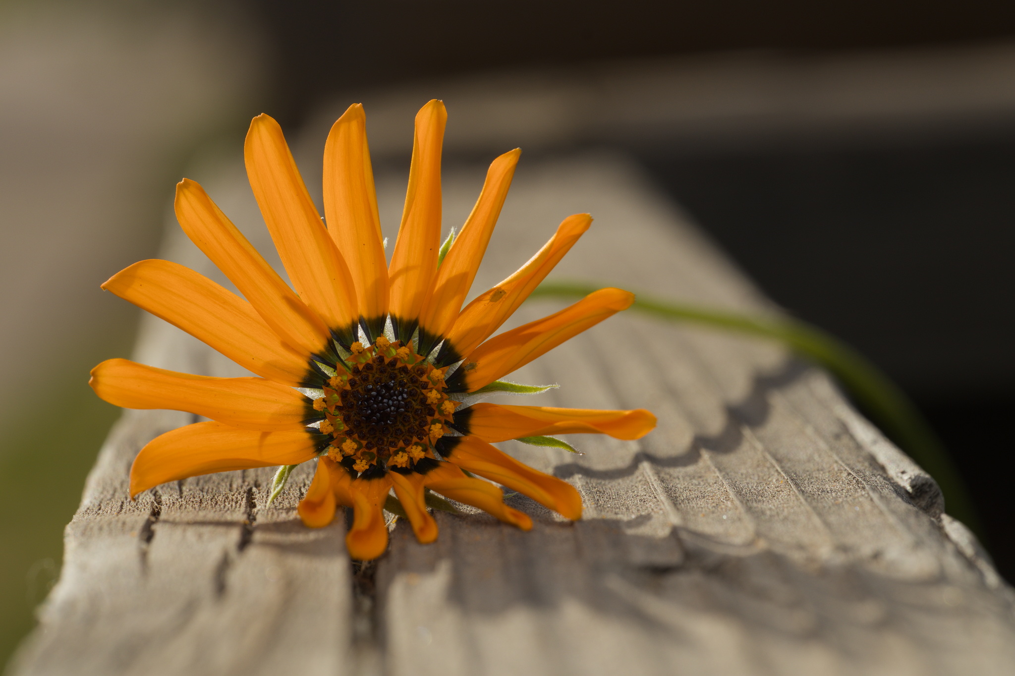
This is one of two photos that has given me some sort of issue. The other was one I took along the Boise River and the water had a ton of highlights issues. This flower was shot in midday Arizona sun, so not exactly the friendliest lighting.
I don’t think I’m much closer to understanding what’s going on here exactly, but I certainly appreciate everyone taking look and giving me some pointers!
I spent a little bit of time playing with it and came up with this. It’s not amazing but I learned some things along the way and that’s what really counts, right? I maybe went to hard on lightening up the flower, but it was illuminated by a flash so maybe that’s ok. I could spend a lot more time fiddling with it but I’m not too concerned about getting this one perfect.
I used the sigmoid smooth preset as the base. The rest was mostly multiple instances of color balance rgb to do various adjustments.
Shout out to @nwinspeare for his recent video where he shared a diffuse & sharpen preset to add clarity in the highlights. It’s a subtle effect but can add just a little crunch in the highlights.
All my (naive) attempts to preserve hue result in pink fire and sunflowers: LCH_ab, LCH_uv, LCH_ab_in_oklab, applying a curve to Y in xyY…
I think none of those spaces are perceptual, not even OKLab. I suspect some kind of saturation effect also goes on in the eye (in the cone cells), and that happens ‘per channel’ (L, M and S cones).
This is the chart from the page linked above: [broken image placeholder]
(Ah, it worked in the editor, but it’s not visible in the view…)
If that is the case, then applying tone curves per channel may approximate human vision (and its hue shifts, which we perceive as natural) better than trying to preserve hue.
And then it may not be the root cause, as our LDR displays have probably no chance to drive the cones into saturation…
From what I see in your xmp It’s your drop in exposure from the default that minimizes the difference…if you set it to higher then you see it… I had left that at the default and others might be using even higher…
Ok, I can see that if I drive the exposure way too high, the petals start turning pink, but with no loss of detail. Maybe that’s why I didn’t set the exposure too high to start with. I had it at +0.152. 0.179 is what the Auto exposure picker chooses, wwhich is pretty close. At +0.179, they still look yellow.
It’s important to remember that many in this community are enthusiasts who enjoy picking apart the science, math and programming. It’s certainly not a requirement to go down the rabbit hole to use the software. Advice I always want to give, especially in some places like Reddit, is not to get too caught up in all the options and complexity offered by Darktable. It’s not a requirement to use and understand all options available.
I really enjoy the discussion, even though I can’t always contribute to the very technical stuff. But just picking up things here and there, I’ve learned a lot about colour science and image processing, which has also helped with the artistic side of my photography.
Yes I say the same thing, if you’re just starting pick a few of the more complex modules and just learn those (I usually recommend tone eq and color balancea rgb, i feel those are the most “bang for your buck” modules). You absolutely should not twiddle every knob in every module, that is a path to madness.
Thing is, there are a few fundamental things that need to be done, and every thing else is just a variation on that theme:
black subtract: most sensors don’t record down to zero, so that bias has to be taken out.
white balance: there’s actually two reasons this is done: 1) adjust for the non-continuous (wavelength-wise) light energy of the scene, and 2) the unbalanced sensor sensitivity. I put it ahead of the next thing because some of the next thing’s algorithms require white-balanced data.
demosaic: turn the raw measurements into RGB for the eventual rendition
color conversion: the camera’s spectral response is so much greater than the color gamuts of rendition media we currently have available, display or print. This is the compression of the color gamut.
tone curve: this is where the image data is taken out of its scene-linear energy relationship and skewed so that it looks good on rendition media.
Everything else is a variation on these fundamental tasks.
My measure of orange is the Hue angle in the HSV color space. Yours was 31° and pure orange is 30°, so close. Many of the OP’s hues are more than yours, i.e. less orange and tending toward yellow.
The OP’s Hues extracted with Value set at a global 212/255.
I extracted the embedded JPEG. The JPEG has clipped reds and some bottomed blues which perhaps explains the remarkable variety of petal color appearances posted in this thread!