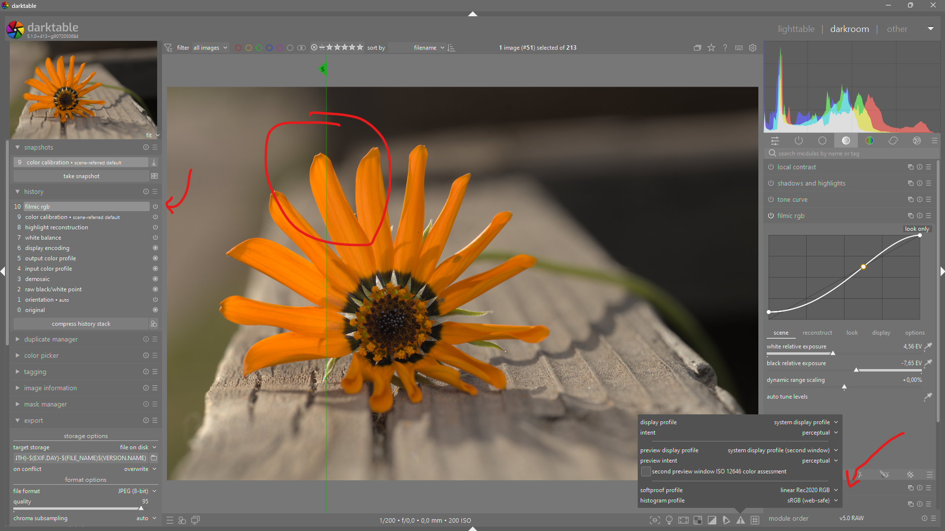
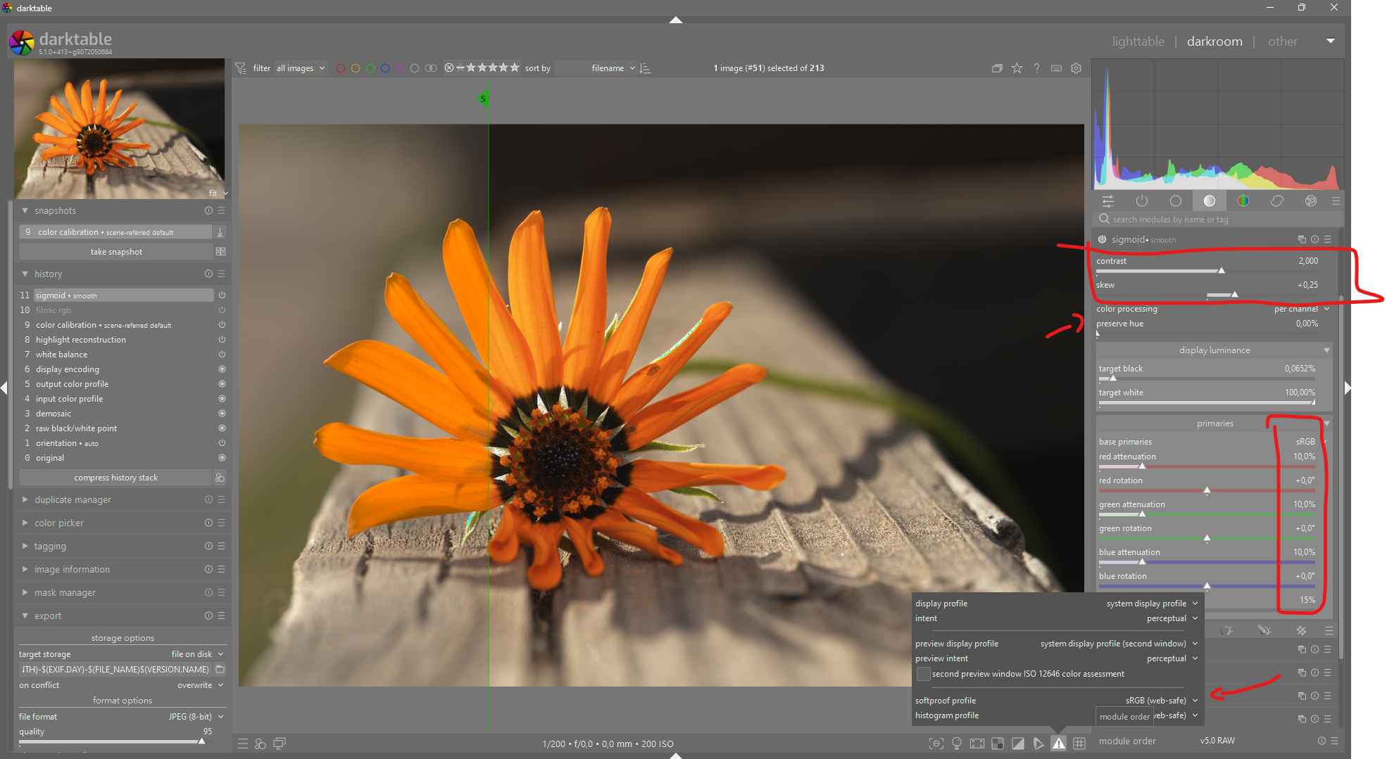
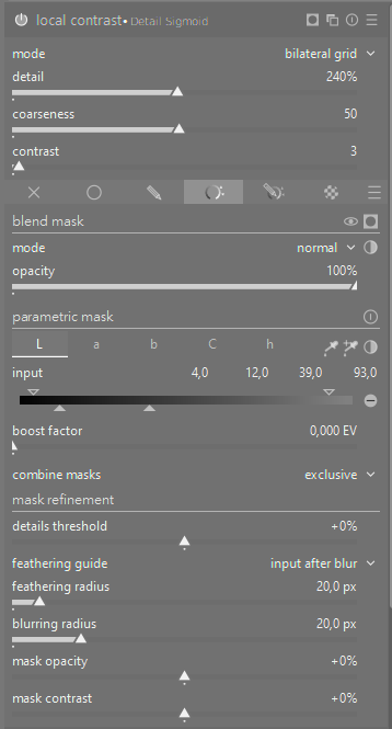
Conclusion: I’m a fan of the Sigmoid module, its only fault is the loss of detail in high and low light, which I correct with a D&S preset to add texture, and a local contrast preset.
You can export a JPEG encoded in ProPhoto, but it won’t render well. There’s no display I know of that has a gamut close to ProPhoto. Even more so with print media. Not only that, the 8-bit channel values in a JPEG don’t really give enough bits for hue resolution in extreme colors encoded in a colorspace like ProPhoto.
The whole point of an export profile is to transform the image gamut close to what the destination display can handle.
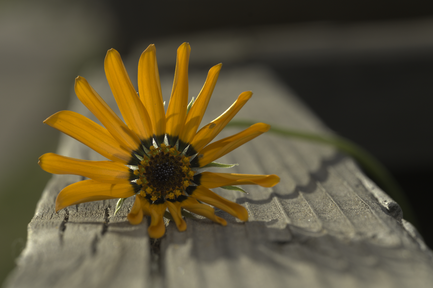
I just did so in RawTherapee and it rendered well enough - as can be seen.
It was an image from this thread which was opened in RawTherapee, ProPhoto 32-bit floating point working space, not adjusted, then saved with the Kodak ROMM a.k.a. Prophoto RGB embedded ICC profile.
The only point being made was that it can be done and it is up to the user to not exceed the color space of the destination device. Of course, I agree that there is no point in using ProPhoto for posting here for example - unless everybody is now using 8K Rec.2020 monitors.
Yeah, a lot of images won’t tell the difference, if all of their colors are already in the destination gamut. It’s only with extreme hues, and sometimes it’s hard to tell which are that without an out-of-gamut tool.
I don’t think I’ve given it its due yet. I think I got it in my head that filmic = better, and I just stuck with that. Looking at your sidecar file, I think I have an idea of what you were going for. Or at least, if I wiggle the sliders, I have a better sense of what that setting did
Thanks a bunch! I’m gonna go read the docs on sigmoid and look up some videos or something.
Besides the resolution problem (wide spaces can lead to posterisation, as the steps between 8-bit values are too big), the viewer used to display the image must still convert it to the space of the output device. If that is done using the relative colorimetric intent, all out-of-gamut colours will simply be forced to the gamut boundary, which may not look pretty. You may get better results by managing compression (e.g. slightly desaturating or changing brightness) in the editor.
I am well aware of that effect, thank you. However, the example I posted looks pretty enough because I did not edit the sRGB input image, thereby retaining it’s xyY values inside the sRGB gamut; and I did say that it is up to the User to not exceed the color space of the destination device.
Sorry, I misunderstood you. I don’t understand what you meant to achieve by converting sRGB to ProPhoto, though. It’s like saying ‘I can use a lorry to transport a matchbox’.
The conventional view of ProPhoto is that it is always assumed to contain pixels outside of sRGB gamut or even Adobe (1998). But that is not necessarily so.
I only opened an sRGB image in ProPhoto and saved it in ProPhoto to make the point that ProPhoto is a valid color space in a JPEG image.
Thank you for quoting me, but let’s give credit where credit is due.
All I did was adapt it so that it also worked in low light.
With the addition of the primaries and its gamut mapping in sigmoid, we were able to reduce the power of the detail. For everyday use, I leave it at 240%, but depending on the compression, I set it between 150 and 300 (for a portrait ± 180). bilat_Detail Sigmoid.dtpreset (1.1 KB)
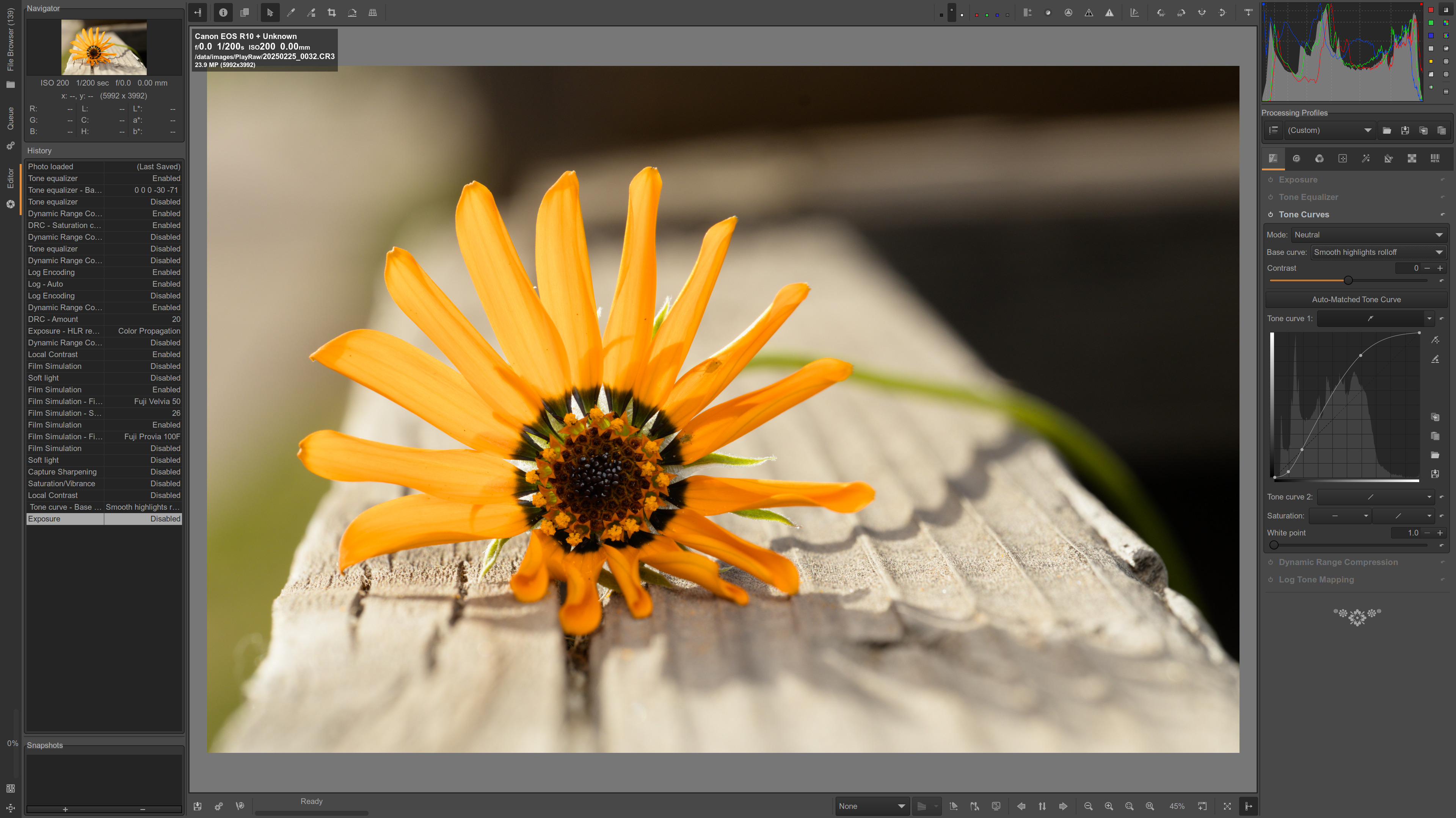
I would have one comment about this thread. I found it impossible to edit correctly because I hadn’t seen the original. It seems to me that DT is capable of a pleasing rendition but knowing the true original color would be essential to achieving this for the original photographer. Some great suggestions in this thread about how to achieve the look and the details. Thanks for the original post and the answers provided here.
I’d rather use the word ‘allowable’. ‘Valid’ implies ‘proper’, and the 8-bit resolution of JPEG is indeed at odds with the wide-gamut goal of ProPhoto.
I’ve got quite a few JPEGs encoded with ProPhoto, Rec.2020, and other wide gamuts, all for testing and education. I would never use it on images intended for distribution.
Hi @cedric that presumes the cameras JPG is correct. I meant to say it was challenging for me to edit a flower which I hadn’t personally seen. But I appreciate the JPG you extracted and your analysis of that JPG. Thanks. It was all very informative.
Can anyone explain this pls? Filmic is a smooth curve, you might well have the central part linear, so it’s shape and slope will obviously affect contrast throughout the image, but I can’t see how it could particularly affect local contrast, which is an exaggerated localised adjustment.
edit: its not it’s !
I believe it is simply from the tonal compression that you introduce and its likely why the local contrast module also comes after the tone mappers so that it can be used to then restore some of that back to the image… I have heard of people using it before in a certain situation but I can’t recall what the purpose was to move it there…