Do you ever use the a* or b* curves?

If so, how? Why?

I’m doing my best to wrap my head around what can actually be achieved with these tools, but even as my understanding improves, I still find it hard to believe someone would choose them over other options.

I understand that if I fix the a* curve at the midpoint and shift the lower half downward, I increase the chromaticity of “greenish” pixels. However, shifting the upper half downward decreases the chromaticity of “magenta-ish” pixels, and if pushed too far it can even flip hues, making some colors appear green.

I’ve managed to use the b* curve once to get a nice blue sky, but overall the process feels so obtuse that most of the time it’s far easier to use something like the CH curve or the HSV equalizer.

What I find interesting is that LH/CH/HH/CC/LC/CL curves often get criticized for being hard to use (and ART even drops them, as far as I understand), yet they feel much more intuitive to me than the a* and b* curves.

Is there a secret sauce here that I am not seeing?

In DT I used to use them with the color picker set to LAB to adjust skin tones…it works pretty well as you get a sense of the values that work…I am sure there are lots of other uses for color casts and tints etc in RT…

2 Likes

I see that is a cool and smart use of it.

One use I found in RT is to increase chromaticity by steepening the slopes of the a* curve and b* curve. How much or how little is a matter of taste of course. One way to start is to simply slide the top-right control point straight left, say 1 grid square, then drag the bottom-left control point the same distance straight right. Do this on both curves, then go from there to taste.

Terry

1 Like

I love the LH/CH/HH/CC/LC/CL curves in RawTherapee and i relay miss them in Darktabel
Especial CL/LC curve!
I would love to have more Curve options in Darktabel.

Wonder if something like the RGB primary modules could have Curves so Purity and Hue can be set depending on Luminance, Hue, purety
(I work around this with Mask to apply different amounts of desaturation or hue rotation to different brightness values, But this is cumbersome, i cant adjust the curve shape)

Curves might be non Intuitive to work start with but in my opinion they are the one of the best and strongest tools once you have a nice curve they transfer nice to apply the style to other images.

My dream is to have:
curves ,“scene referred linear” and Node based editing together in an Open source editor.

The only UI for this in DT is color zones I believe…not scene referred but it let’s you work in those combinations…

1 Like

Pretty sure that’s vkdt.

2 Likes

Sometimes I use the *b curve to remove a blue color cast from the shadows.
Just lift the lower part of the curve without moving the upper part.

1 Like

Before discussing the curves a* and b*, I’ll return to the ‘Lab’ module. I think I can speak about it (somewhat) seriously since I was (90%) responsible for developing this module starting in 2011.

The curves were added gradually; I don’t remember exactly when it took on this appearance, but around 2013 or 2014.

You’ll find essentially the same thing (except for the a* and b* curves) in Selective Editing > Color & Light (advanced), with the advantage of being able to define precise areas and use deltaE (It’s present even though it wasn’t broadcast as early as 2017.)

I’m going to start by clarifying Lab. Some say it should be thrown in the trash, that it’s crap, for a whole bunch of reasons - both true and false.

The only thing that is 100% true, but has nothing to do with Lab, is that even today, the output to our screens (which dates back to the 1980s) is still (by convention) using ICC profiles with 8-bit Lab… It’s a problem of standards and hardware compatibility, but has nothing (or very little) to do with Lab.

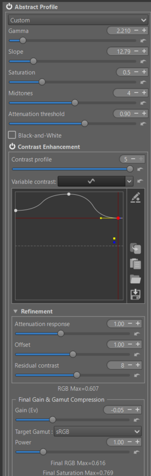
Lab is a transformation of XYZ (which no one disputes) by adding a gamma to Y. Simply put, Lab corresponds in Abstract profile to a choice where ‘Slope’ is 9.03 and gamma = 3.0. We work with 64-bit or 32-bit real numbers… There is no loss… Of course, the reference frames change, and this must be taken into account.

I tried it on images with a 25Ev Dynamic Range (I couldn’t find any with more), commonly the best cameras, pass 14Ev. There is no problem.

The major problem that emerged as early as 2011 is that of color shift when changing the saturation (an inaccurate term, but understandable). There is a strong shift of colors towards reds/oranges, blues/violets, and to a lesser extent towards greens. This can wait in extreme cases for a Hue change of 0.05 radians, which is huge.

I proposed a solution, which at the time caused some people to howl with indignation at its complexity. I created 195 tiny LUTfs (based on Munsell comparison) , loaded at RT startup (I thank Ingo for improving their handling in terms of ‘speed’).

Without you even realizing it, unless you disable it (it’s also found on some RT forks), as soon as you use Lab (including any Selective Editing), the correction with Munsell LUTs is implemented. The time spent is almost negligible. Admittedly it’s not ‘perfect’, there are still tiny discrepancies imperceptible to the eye.

One note: as soon as you use Cam16 or JzCzBz, it is deactivated because these modules compensate for Hue variations.

The other real problem, though it shouldn’t be a deal-breaker, is that if the user pushes the settings too far, nothing prevents the generation of imaginary colors. So what? In most cases, the conversion to output works correctly.

But these deviations are mere trifles compared to those introduced by exotic lighting (LEDs) or by manipulating the primaries (if you’re using Rec2020), when you adjust the ‘Attenuation’ (or lower the saturation), you enter the realm of imaginary colors. Nothing serious, but it’s good to be aware of. So, in summary, the potential imaginary colors of Lab are the same issue as in other cases.

I’m returning to the problem of using ‘a’ and ‘b’ . Personally, I don’t use them, nor do I use curves. I take very few personal photos. I focus on the most complex images to find, and I try to innovate by creating new algorithms.

There are several types of tools to do this (non-exhaustive list) :

  • Gamut compression (Leds, Sunset…)

  • of course curves Lab

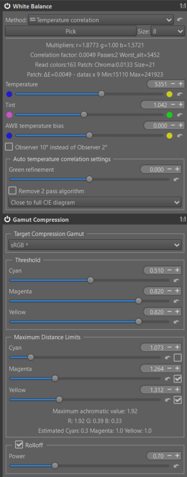
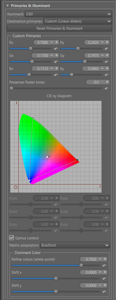
  • Primaries & Illuminant in Selective Editing (with to see the CIEXxy diagram)

  • Primaries & Illuminant in Abstract profile - more complete with the possibility of working directly with the CIExy diagram (you can see that you are going outside the diagram, unless you are blind),or in ‘linear’ or in ‘polar’…The problem with primaries beyond imaginary colors is that they are not intuitive (at least for me). But I’m old…

  • These 2 ‘primary’ modules, because we work with a virtual (or internal, or abstract) ICC profile, allow us to easily adjust the illuminant, for example, going from D65 to D50… or something else), or the dominant color.

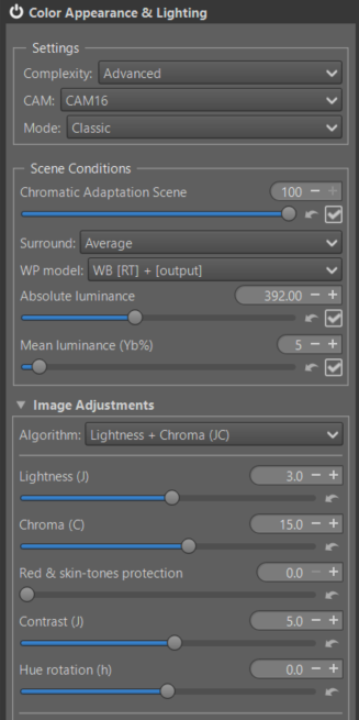
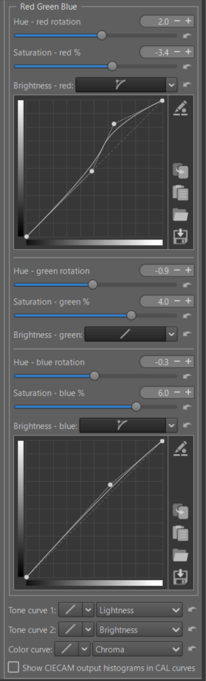
  • The new module that was recently merged is the one I called ‘Red Green Blue’ in Color Appearance & Lighting (CIECAM). Basically, seen from a distance in a tunnel, it does similar things (I’m not saying the same), like primaries or film simulations. In addition to the lesser-known capabilities of CIECAM (try it!), for each R, G, and B channel you can modify the hue rotation (h), the saturation (s) in the CIECAM sense, and the Brightness (which is only remotely related to Lightness) using a curve. As a reminder, when you modify the brightness curve, the apparent chromaticity changes according to a simple formula: C = saturation * saturation * Brightness. Of course, if there’s demand, I can improve it, but that will complicate the currently simple use. The risk of these imaginary colors is minimal because they are managed by the three processes (‘scene’, ‘image adjustments’, ‘viewing’) of a CAM (Color Appearance Model).

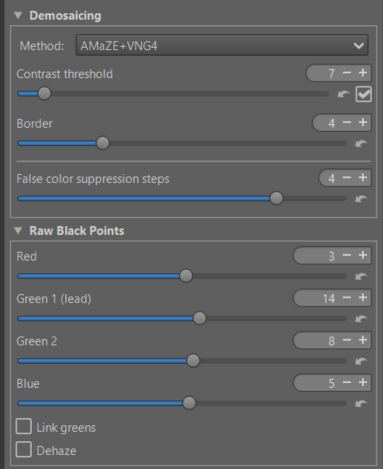
  • And finally, often overlooked, is the module that must be handled with care, “Raw Black Point,” which alone can solve difficult cases. However, its use is risky.

  • etc.

Jacques

5 Likes

Thanks as always for your comments. Those of us with little to no background but with an existing interest always profit from you taking the time for explanations with context and details…Thank you…

4 Likes

To give an example of how to try to remedy artifacts and other defects, this image was provided to me.
Raw Image
This file is licensed Creative Commons, By-Attribution, Share-Alike.
Thanks to @thumper for this beautiful image

The image is difficult, and the question is: what should be done with it? Emphasize the dramatic aspect? Lighten or darken the shadows? There are as many answers as there are people.

I’m not posting this image to compete in Playraw, but for educational purposes. I might make a tutorial out of it.
Key points to note, some of which are unusual:

  • Raw Tab - Demoisaing: Amaze + VNG4 , false color suppression step=4

  • Raw Tab - Raw Black point with different settings

  • Raw Tab - Chromatic Aberration Corection

  • Raw Tab : Capture sharpening

  • Color Tab : White Balance - Temperature Correlation (Close to CIE diagram)

  • Color Tab : Gamut Compression (set to sRGB)

  • Exposure Tab : Graduated Filter to gradually darken the sky

  • Color Tab - Abstract profile - first part

  • gamma / slope , attenuation threshold

  • very very big ‘Contrast Enhancement’ with very strong values - only Wavelets (This isn’t a portrait, nor an architectural photograph). If your preview is large enough, we’ll amplify details in 2x2 pixel increments, up to 1024x1024. This makes the sky effect more dramatic.

  • Gain (Ev) and Target Gamut Compression set to sRGB

  • Abstract profile : Second part


    Note : Illuminant D80 and Refine Dominant color. Try StdA 2875K or other

  • Selective Editing : 4 RT-spot

  • The first with Michaelis Menten - Global

  • The second : GHS Normal Spot - to brighten the shadows

Of course, the settings are arbitratry…

  • and 2 RT-spot - Excluding.

  • Advanced Tab : Color Appearance & Lighting
    First screen shot (general settings)

Second screen shot : Red Green Blue

You can also change in ‘Viewing conditions’ - Surround - Try : Dim

pp3 File :
1Q8A5461.CR3-w.pp3 (25.2 KB)

Image at the end of processing

Of course, everyone will have their own opinion on the result; that’s not the point. But how do you control a difficult image where artifacts easily appear? I simply wanted to create a dramatic effect. Naturally, I didn’t use any masks or primaries.

And of course, nothing is perfect… I may have gone a bit overboard with some settings… but that’s the goal.

Jacques

7 Likes

Thanks @jdc , once again a very informative set of posts; I played with the image and then back to some of my files… using the latest RT-dev package and I find/think I am improving in my processing skills. I ask myself questions about decision making, i.e. when to use different (type of) spots, when to apply a tweak here and there… but as I continue my journey I will gain that experience… thanks for your posts and informative approach. Thank you!

2 Likes

Hey nice! Good to see my play raw image getting used for a demo like this!

1 Like

I completely echo the comment by @SCHA . Your posts and tutorials are a steep hill to climb, but I’m enjoying the ever better views on the way up. Salut!

2 Likes

@tbransco @SCHA @thumper , and others, those who ‘liked’ it, as well as others who didn’t comment, make me happy.

@thumper I added you at the beginning of this thread (tutorial), it was an oversight on my part, excuse me.

A few additional points.

Lab is a system like RGB or XYZ; it has its advantages and disadvantages. Its main advantage is that it produces an image that corresponds ‘almost’ to human perception. However, it is not a CAM (Color Appearance Model) as Cam16.
Cam16, It’s not perfect either, which is why it needs help with pre-tone-mappers (like GHS or Michaelis).

Abstract profile, It was very controversial 5 or 6 years ago and yet it performs at least as well as concepts I see elsewhere in other software.

I would like to emphasize the concept of linear black points and linear white points, made just as they are being used. Saying that the black point is at 0.02 seems more explicit to me than -5.2Ev (compared to what? a hypothetical middle grey?). These two values, ‘linear BP’ and ‘linear WP’, are the key to the entire system.

Thank you

Jacques

2 Likes

Hello @jdc

Thanks indeed for all your insights on these topics (CIELAB etc)
I always bookmark your posts, in my browser, in order to not forget them.
Often I also copy and paste them to save as PDF files :slight_smile:

As regards the LAB options I discovered them by reading the “Photoshop LAB color” book, by Dan Margulis. In the long past, it was a suggested reading.

As you explained in many posts, there is not a “silver bullet” for every picture.
In short a method which pretty much works well with every difficult picture.
You can easily confirm this by reading this forum.

There are often new methods proposed (e.g. for darktable).
At first, there are often many users quite happy with these new results. However, after further much testings, the limitations of these methods pop up.
For darktable I could mention: filmic, later on sigmoid, now Agx.
Every one of these methods are great, do not get me wrong!
However, each of them, has some limitations.
As usual, you must “choose your poison” and hope for the best…

As regards the LAB method I am hopeful it will be fully implemented, without the current workarounds, on GIMP as well.
It is currently in their roadmap and It will allow this software to leverage this very useful option.

Sorry guys for this long rambling of mine and thanks again to Jacques :slight_smile:

3 Likes

@Silvio_Grosso

Thank you for this positive review.

It’s clear that the process described in the image isn’t mandatory for all images, and thankfully so, because retouching RAW black points is a difficult task.

However, it’s more important to understand principles than tools (in sociology, this is called a meta-rule). I’ve also worked extensively on systems theory (simply put, the modeling of systems). The key takeaway is the importance of using effective practices that often work, rather than focusing on a tool that’s often just a fad. We use it because it’s being discussed elsewhere - that’s the principle behind forums and social networks (I wouldn’t go so far as to call it fake news). And just because it’s not widely discussed doesn’t mean the method or tool isn’t good.

That’s what I try to do (and make clear) in the tutorials.

There are principles that can be described as “recommended”, and others that should be “avoided” (I’m not saying prohibited). Sometimes, simply due to a lack of communication or a question of vocabulary, the method is not, or is rarely, accepted or used.

Jacques

Please don’t apologize! I was genuinely glad you used my image for the tutorial!

1 Like

Well, IMHO, your English, on this forum, as usual, is extremly good and easy to grasp.
I suppose (?) that, even in French, your native language, your final text could not be much better since the topics about photography that you cover are quite difficult to convey, even for specialists.

In my view, whatever on-line translator you are currently taking advantage of, e.g. Deep Translate, your end results are quite good in terms of clarity.
Needless to say, later on, it depends on the users to “do their homeworks” by experimenting with their pictures :slight_smile:

1 Like

@Silvio_Grosso and others…

When I talk about communication, my comments and tutorials are just one aspect of things, certainly an important one (I’m flattered you find my English good…), but relatively minor compared to the documentation, videos, demonstrations, and forum discussions. This takes into account the product’s reputation.

To give examples (I have both installed and use both): what accounts for Windows (paid) accounting for 90% of installations, and Linux (free) for only 5%? Reputation, marketing… (Windows is not 20 times better than Linux). Another example: if I look at the photography forum in France, there’s a Lightroom section, a DxO section, a C1 section, and a nearly impossible-to-find miscellaneous section where you find open-source software (which, in my opinion, is at least as good…). I saw a comment from a participant, “if it’s paid, it must be better…”. It has to be said that those who pay have a lot of publicity through the press, etc. As Ingo said, a few years ago at Adobe there were a thousand of them, at RT there are only four of us.

If I compare it to Darktable (keeping in mind that in 2017/2018, RT was more talked about than DT), their team is larger, more people are watching and commenting on DT’s new features than RT’s, the documentation is up-to-date and comprehensive… and I repeat (I’m not criticizing DT), the more it’s discussed, the more the movement grows (developers arrive, volunteers make videos, etc). The AgX phenomenon is remarkable (I’m not talking about the product itself), but the entire process: initial setup, development, improvement, communication, etc. I’m simply trying to do something similar… but it will take time.

In other words, talk about RT around you (at the baker’s…), on forums: when I receive a message from someone who says they have tried GHS on a forum, it makes me very happy, but above all the reputation of RT grows…, on Playraw, etc.

Jacques

3 Likes