I really appreciate the input. I will look over these suggestions when I have extra time to see what can be pulled into my proposal.
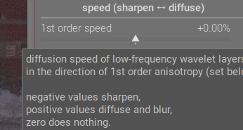
The sharpen <--> diffuse tooltip shows that pulling the slider to the left (negative) does sharpening. Moving things to the left to get negative values is common in darktable. So I’d say that the outlier is the actual module name. Rename it to Sharpen or Diffuse, and everything becomes consistent (and I bet people go to the module much more often to sharpen things than diffuse them).
2 Likes
Fully agree here. The module is named opposite to the direction the sliders go, so it makes more sense for it to be called Sharpen or Diffuse, left to right.
I don’t want to get involved in the little spat you two seem to be having, but while AP perhaps understood this module best and chose the most accurate slider names, very few people really understand how to fully use it. So in my book, the module’s interface is a bit of a failure. The underlying code is certainly powerful and perhaps even brilliant, who knows, but ultimately users should be able to know how to use the module and maybe even enjoy using it.
I would be much happier with it being dumbed down if it can become easier to understand and use. It is a tricky challenge, and I agree that we need to be careful with the naming to ensure it isn’t inaccurate. But I don’t think we should be wedded to the idea of it being technically accurate above all else.
I can see this going through many more iterations yet. But everyone hang in there!
7 Likes
Probably repeating myself: I don’t care about the maths. Perhaps I would if I could! To change that would require going back to school, with different attitudes, and maybe even different teachers. Filed under If I’d known then what I know now…
I do care that there are people who do care about the maths and are able and willing to bring their gifts and abilities to make available to us a wonderful suite of photo processing tools. That, mostly, make it unnecessary for me to worry about the maths.
I think it would be a failure if the label names were inaccurate. And I have no wish to see our scientists here offended by labels that they know are just not right, even if they express something that is useful to me.
There’s a balance to be struck. I know this: the current presentation of DoS is not it!
Back to iterations. My vote: do not rename.
All of us are computer literate to an extent, and even without that, I feel that iterations means that, by doing something several times, its effect is increased. Coats of paint; number of times we press the blender button, etc etc. I think we’ve got this concept.
@thumper, you know it is not the first time, and probably not the last, for this topic. But you have moved things on in a positive and practical way.
3 Likes
I agree. I don’t think the current UI is a failure. It probably makes sense to the dev and maybe a few other very mathematically literate people, and than is enough to make it a non-failure. Besides, this is open source. We aren’t looking to get a certain amount of revenue or new subscribers or whatever. It’s a passion project.
I have been thinking about why DorS seems so technical, even compared to agx, and I think I figured it out.
AgX is a tone mapper. The goal of it is to covert scene referred data to display referred data. That is the primary “effect”. In order to do that, it sometimes has to compress the highlights and/or the shadows. That is a secondary “effect”. Also in order to accomplish the primary effect, it has to manage the colors of the image, which is done with the primaries controls.
So why is it ok for the controls in AgX to be primarily “technical” sounding, rather than more simply named?
Its because the primary goal of the module is technical, and when your goal is technical, you need technically controls. Note that the less technical side effect of AgX are not named as technically (the whole look tab).
By contrast, DorS is meant to be primarily used for effects that are not as technical. They are specifically visual effects, rather than a technical effect like tone mapping. So perhaps the control names should use more visual-based abstractions in order for the UI to feel right
I don’t know… just a theory.
7 Likes
Ok, it’s semantics at the end of the day. I think it’s a failure because “most” people don’t know how to use the module properly. And personally the module actually irritates me. It’s my own issue because I can’t master it, and that bothers me.
If it were Lightroom or some other commercial program, it wouldn’t have got past the focus group or testing phase.
But, yes, this isn’t a commercial program, and the sliders are probably as accurate as they can be to what the module does. So, I get your point.
But ultimately I just want a module that makes me want to use it. Even though it’s probably the best tool for the job in many cases, I will always choose Contrast Equalizer, Local Contrast, Bloom, Soften, Low Pass, etc. before DorS because they don’t make me want to smash my computer monitor ![]()
I’m actually a pretty chill person most of the time!
4 Likes
IMHO the controls in AgX are named just about as simply as they can be. They manipulate the characteristics of the tone curve, and most can be understood without digging into doc and/or the math. Most of us know the purpose of a tone curve, so most of us can grok what various manipulations of a tone curve will do.
I’d argue that the effects used in DorS are indeed technical. The difference is that it has numerous controls whose names are closely related to the algorithms in use instead of what effect they have on an image, and are pretty meaningless if you don’t know anything about the algorithms. I don’t have any idea how “speed” or “anisotropy” sliders relate to any effects upon an image, and the last thing I want to do is delve into the math after 12 hours at work.
So that it doesn’t
I stick to the presets, which are named for the effects they have on the photo. Much better for my blood pressure.
4 Likes
For sure, I think it is valid to have our own opinions about the semantics. That’s ok.
I think a lot of photographers have probably opened DorS and thought, “Wait, what is this? I don’t understand any of this.”
And that is an issue, in my opinion, if you are trying to design something to be used by photographers.
I don’t think it has to be this way. I am going to post the next iteration of my proposed changes tomorrow. I think if we can make progress on these little UX issues, darktable’s awesomeness will be much more appreciable.
7 Likes
Maybe…
We got it all wrong. Maybe we should think of the developer saying, “Hey, there is stuff called speed and stuff called anisotropy, and we can use it to great effect in sharpening our images, so it’s worth learning.”
Not necessarily mine, but… it’s a point of view!
![]()
When I first looked at parametric masking, it looked difficult. But it soon became indispensable to me.
I don’t want to discourage this effort, but there may be some illusion of simplicity here. It’s seductive to think if the right words or the right analogies are used, we will understand. Occasionally that’s true, but most of the time a difficult subject needs to be studied.
Personally, this conversation has suggested a new workflow for future usage:
Pick a preset. Increase the iterations and decrease the speeds to see if that improves the result. Adjust the radius span if the detail level is too small. Snapshot. Pick another preset. Repeat. Save a preset you like. The main thing I want and don’t have is to know the right way to make adjustments.
2 Likes
I’m not sure anyone on this forum is under the illusion that the module could be simple if only non-technical language could be used. It’s a highly technical module with abstract concepts. The idea here is just to demystify the controls as much as possible so it is easier to understand (not easy).
I actually think that relabeling the sliders is really just a band-aid fix that might help somewhat. But fundamentally, I think the UI is too complex. There are lots of sliders that all interact with each other, and this makes predicting effects very hard to do. Modules like Contrast Equalizer tried to solve this by using a completely different interface: you can visualize the central radius and radius span on the graph as nodes, and the detail levels and iterations are the X and Y axis respectively. This visualization already helps to put all the various sliders into 2D space, even though a 3D space is probably needed in the case of DorS.
(note that the author of the module was on record as saying the he did not like graphical UIs and instead much preferred sliders. Whether sliders were the correct solution or not, it does show that the module was designed according to the developer’s preferences rather than necessarily the “best” or most user-friendly way)
But I don’t think anyone is ready to tackle a complete UI overhaul, so slider labels is a small step to perhaps improving usability.
I agree that you need to study a difficult subject to understand it properly. I have actually spent a lot of time learning this module and doing background reading, as have many others. I understand most of the underlying concepts and have got to the stage where I feel I know what most sliders do (if not how they all interact). But I still encounter the problem where I forget how to use the module if I spend any time away from it; and more importantly, I still find it hard to predict what effect I will get as soon as I move away from presets or from any effect I have already tried and tested (which is what I think you alluded to in your last sentence).
As a comparison, when I use another module that has a diffusion effect, such as the Soften module, it’s immediately obvious what effects you are going to get from each slider. I realize that the underlying math and concepts are different, but when you have an idea of what effect you want to create on your image, you simply want to use a module that will create that effect and that you know how to create that effect.
1 Like
@thumper : When I saw the notification I had no time to look… I’m back on this thread, but now I don’t have the energy nor the time to read the 100’s of messages. Sorry too many things to do. I’ll try to come back when there is some summary and a kind of agreement between all participants.
2 Likes
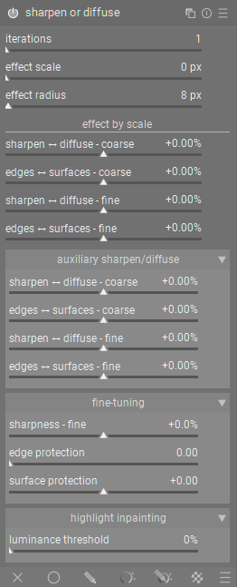
Ok, here is the next iteration of my proposed DorS UI rework.
This change reflects a lot of feedback I have gotten, and I am very thankful.
Primary changes:
- I changed the module name from “Diffuse or Sharpen” to “Sharpen or Diffuse” to better align with the effect controls which are “Sharpen ↔ Diffuse…”. I know this is a major change, but it doesn’t break anything as far as I can tell and aligns with the directionality of controls.
- Removed the header to the “properties” section. The section name is so generic that including it only take up space, instead of explaining what the controls inside do.
- I changed “base scale” to “effect scale” to better convey that the control scales up the entire effect.
V4
“sharpen or diffuse” (Previously “diffuse or sharpen”. This is experimental and I am not sure I would actually propose a name change)
(“properties” section title now removed)
- Iterations (no change)
- effect scale (previously “central radius”): After additional testing, this control appears to function almost as a zoom, which increases the “size” or “scale” of the effect applied in the module. This seems to be primarily useful for images with much higher resolution, to make the effect scale up properly.
- effect radius (previously “radius span”): This makes it more obvious that this modifies the radius of the effect. “Span” does not convey much meaning if “radius” is already being used.
effect by scale (previously “speed (sharpen ↔ diffuse)”)
- sharpen ↔ diffuse - coarse (previously “1st order speed”): Add sharpening for diffusion to the coarse wavelet layers of the image.
- edges ↔ surface - coarse (previously “1st order anisotropy”): Adjust the coarse detail effect to target edges, or surfaces more.
- sharpen ↔ diffuse - fine (previously “3rd order speed”): same as “broad sharpen/…” except it operates on high frequency wavelet layers
- edges ↔ surface - fine (previously “3rd order anisotropy”): Adjust the fine detail effect to target edges, or surfaces more.
auxiliary sharpen/diffuse (collapsible box)
same as the primary “sharpen/diffuse by scale” section. I think it is well accepted at this point that 2nd and 4th order operations are used for fine tuning the operations of 1st and 3rd order operations. In the first video I posted above, I show how they can be used along with their bias controls to diffuse surfaces while sharpening edges.
fine-tuning (collapsible box)
- sharpness - fine (previously “sharpness”): I changed the name to make it clear that this is works on the fine details.
- edge protection (previously “edge sensitivity”): This is very good for fixing issues around edges: fringing/haloing/over-sharpening.
- surface protection (previously “edge threshold”): This is very useful for correcting the overall effect on smooth surfaces. Reduce to increase effect in smooth surfaces. increase to reduce effect in smooth areas.
highlight inpainting (collapsible box)
- luminance threshold (previously “luminence masking threshold” under “diffusion spatiality”): This control is used to select the luminance threshold at which gaussian noise is added to the image. This is used for adding texture into clipped highlight areas for further diffusion.
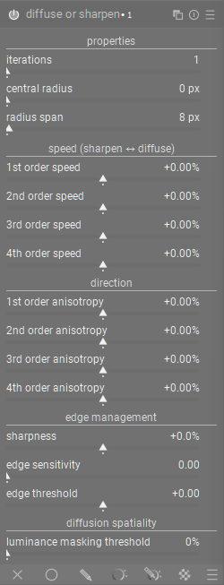
Here is a after and before of the module (There are some small differences in contrast, because the before is using the current version of darktable, and my edit uses the master branch. There is also a small difference in width, because I had dragged the panel and then tried to make it match again.):
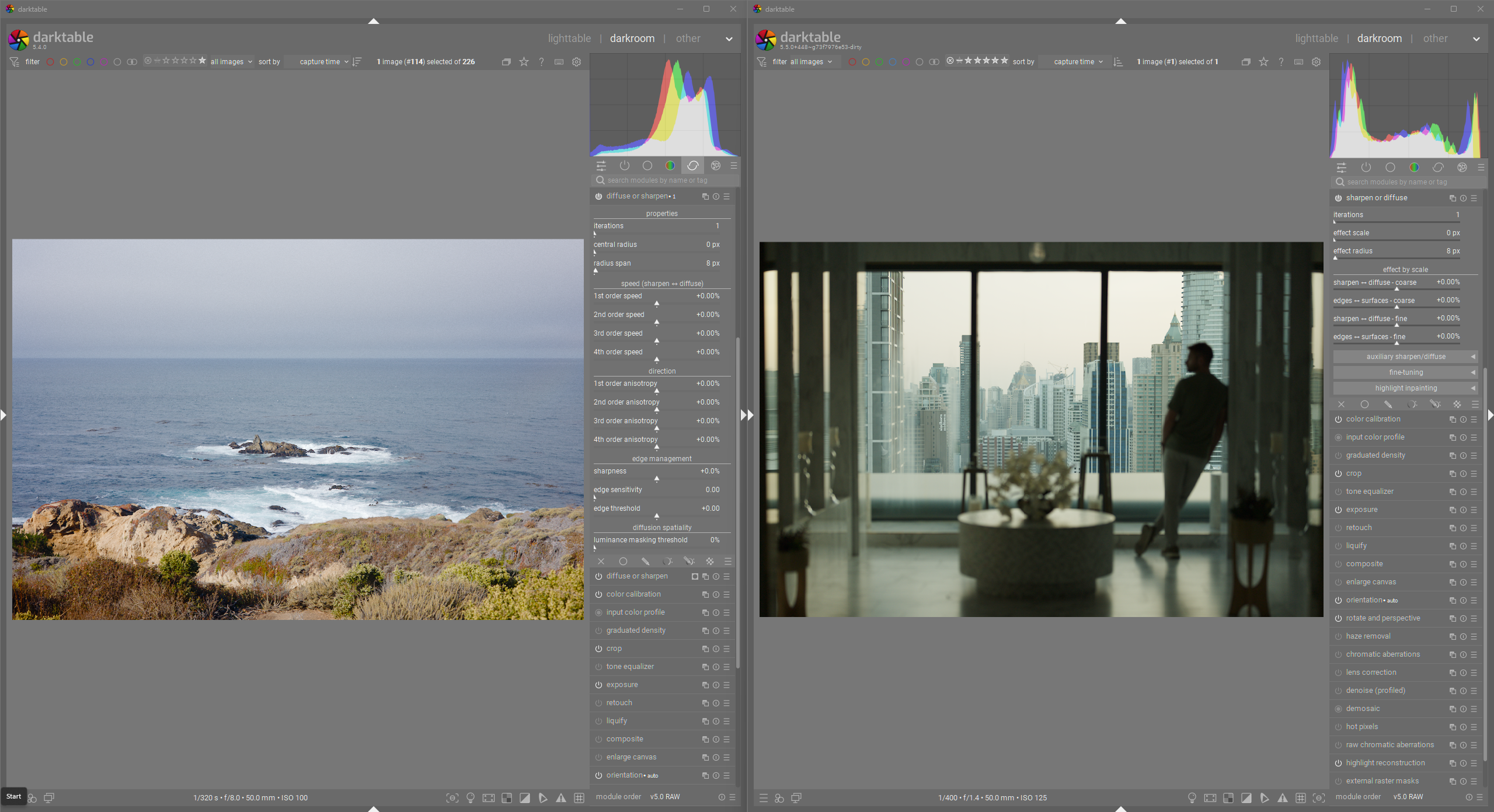
And here is a screenshot of both uis with collapsible panels collapsed.
4 Likes
I absolutely understand ![]()
This discussion has become quite complex and several people have now added suggestions which I have tried to include in my “V4” post above.
Please don’t feel like you need to check in right now. I think we will continue progressing and hopefully come to some kind of miniature conclusion that we can then present.
I don’t think changing its name is a good idea, everyone already knows the module by its name, ‘Diffuse or Sharpen’ is sort of ingrained in the community by now. I think the rest is good
2 Likes
Yeah, it is an experimental change. A couple people mentioned that the name should align with the effect sliders, so I wanted to add that change to see how much outrage it would bring ![]()
1 Like
I can see the logic in the change, it makes perfect sense. But I agree with the reasoning not to change it.
Also, when abbreviated, DoS looks better than SoD ![]()
By the way, I have had some difficulty with the word ‘protection.’ Am I right in now understanding that it means protection from the effect of the module?
3 Likes
Sharpness fine is not accurate I don’t believe…
It’s a gain applied on all the wavelet scales…so the effect is going to depend on the wavelet settings…
1 Like
From the existing code (I swear I didn’t change it ![]() )
)
slider = dt_bauhaus_slider_from_params(section, "sharpness");
  dt_bauhaus_slider_set_digits(slider, 3);
  dt_bauhaus_slider_set_soft_range(slider, -0.25, 0.25);
  dt_bauhaus_slider_set_format(slider, "%");
  gtk_widget_set_tooltip_text
    (slider,
     _("increase or decrease the sharpness of the highest frequencies.\n"
       "can be used to keep details after blooming,\n"
       "for standalone sharpening set speed to negative values."));
This is also a screenshot from the current darktable version
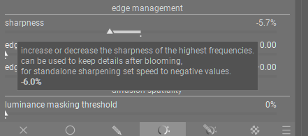
I think therefore that the sharpness is only operating on the high frequency wavelet scales.
Technically I think it would be SorD instead of DorS or “Sword” instead of “Doors” ![]()
2 Likes