editing landscapes to get the Val Timmermans / New Topographic "look"

Yes, dt 3.6.
Have fun … my current usage of filmic is rather unconventional.
The roof has been enhanced within the color look up table tool.

1 Like

Great info. I know many of the shots are film, while others it’s not stated and either film or really nice emulation. Of course composition and lighting are key.

Nice that you pointed out Portra NC. Less contrast and softer compared to velvia. Had a look at the Portra Flickr group and a detailed look at some of the photos that attract me and immediately found one that was Portra. The Portra film LUTs available for DT look pretty ok too.

Not Darktable unfortunately but did something in Rawtherapee. Tried cleaning up the composition a bit applied Portra 160 NC lut, tweaked contrast a bit.


IMG00069.CR2-67.pp3 (17.6 KB)

The light, subject and colours of your shot is quite good imho. To get into the topographics thing the framing has to be much more rigorous though. The way you’ve caught the person smack bang in the shutter is great. All elements should lock in like that.

The building in the background left with the bay window has been cropped so that the wall space at either side of the bay window is approximately equal. Ideally you can do lots of stuff like that on site by taking tiny steps back and forth side to side an observing how the lines and layers move with the perspective. You can then construct lines space and surfaces that get flattened in the image. The right edge of the pink building lines up with the false windows of the grey background building. This sort of stuff can be exploited further in the manner you’ve done with the person.

Many of your examples are desert situations where there is much less to force into the composition. It’s more difficult in messy urban locations but it’s also even better when it falls into place.

Did a landscape version as well but it’s less rigorous.

IMG00069.CR2-WIDE.pp3 (17.6 KB)

Super quick edit of the boats. A bit muddy and overly filmy but anyway.


IMG14354.CR2.pp3 (17.7 KB)

1 Like

Not exactly the look you were looking, but it’s my own impression processed with ART


IMG00069.jpg.out.arp (10.5 KB)

The verticals are not perfect because that Sigma lens in not in my current lensfun database. It should have taken in consideration the top corners. This could be finished and corrected in gimp

I’ve always wanted to visit Japan, hopefully a couple of years after the current “unpleasantness”

1 Like

To me, this is a scene that screams BW :innocent:

2 Likes


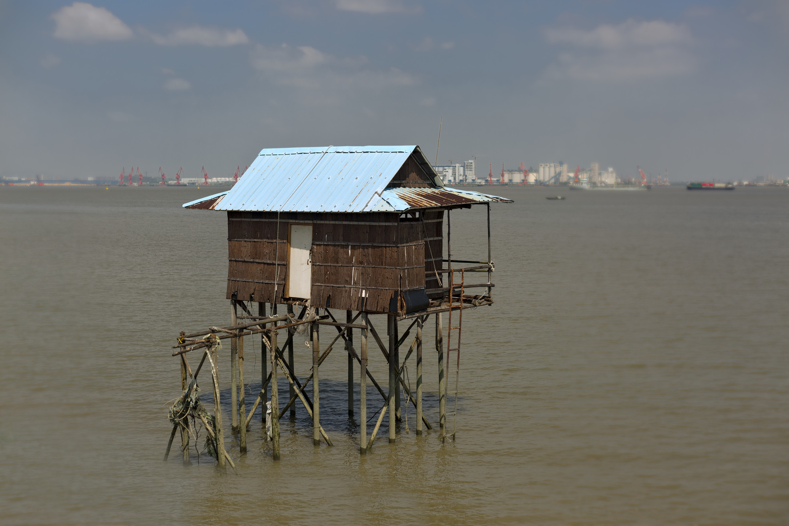
IMG12420.pp3 (26.8 KB) RawTherapee 5.8 Development

Another non-darktable edit.

Have been trying out some new stuff lately and decided that this would be a nice opportunity to use it. Not able to help you with the look you are going for, but others seem to be on the case.

Anyway: Thanks for sharing!

1 Like

IMG00069.CR2.xmp (21.8 KB)

1 Like

You should study how they expose on flickr. They normally use something around f11, never f3.5 as you did. And you definitely need a tripod.

1 Like

I’m still not satisfied but hope this maybe helps you.


IMG12420.CR2.xmp (29.7 KB)

1 Like


IMG00069.CR2.xmp (11.7 KB) darktable 3.7

Intention: Emphasis on the main colours, rest is toned down while keeping the details, blacks and whites.

1 Like

And just for fun (I hope fun is allowed)…

2 Likes

IMG00069-walker-street-scene-V3-SSN-sRGB.xmp (76.9 KB)

(reminds me of the iconic Abbey Road pic)

1 Like

Thanks for sharing, very nice pictures.

My take.


20210912_0003_01.CR2.xmp (15.8 KB)

1 Like


IMG12420.CR2.xmp (12.5 KB)

1 Like

I don’t. But I am really impressed at what you did. Look at the definition in the sky! Such nice colors also!


IMG14354.CR2.xmp (11.0 KB)

Yeah not the look I was going for. But you did a nice treatment, especially on the third. I have not used GIMP for raw processing for a while! Nice to still see it’s capable.

thanks!

This is a great assessment. Thanks for taking the time to write it.

I really like how you cropped the first one. Really nice.

This is pretty nice. For some reason the way it is sharpened and compressed looks really bad in small size, but much better expanded. It’s a nice crop and contrasts here.

Dt lens correction plus the perspective correct usually gets the lines near perfect for me.

Japan is simply heaven for photography and anyone interested in design. Go when you are able for sure.

IT took me a second to realize what you did! nice! It looks a little ghosty in the corner, but I think anyone not seeing the original would not notice.

I like the foreground, But I find the sky color unrealistic. But, still more color and definition that I got!

This is a good point. For many years I was “that guy” who would wander around in broad daylight with a tripod, and everyone would wonder why I was doing “night photos” during the day. I currently don’t but perhaps I should again.

The contrast is good but I think the wood color seems too saturated. What do you think?

This a good take. I need to study this one closely as well.

No fun allowed! Why does everyone want to remove things from this photo. haha Maybe someone will remove the building and only leave water next.

I suppose we could duplicate the walker a few times and put him in the crosswalk.

Thanks. Very nice take as well. It’s hard to keep the background buildings from fading away.