Hello,
It seems to me that there exist two approaches to editing shots illuminated by light with a strong color cast:
- white balancing technically, and then re-introducing an artistic color cast (mainly for the midtones),
- keeping the color in the pipeline, but desaturating highlights in the tonemapper.
I would like to better understand these approaches, when to choose them, and how (perhaps) to mix them.
Here is my motivation: In a recent discussion, @priort linked to an interesting article by Aurélien Pierre on technical vs artistic white balancing.
In his article, Aurélien makes the point that photographs are constrained by the native white of the display medium: warmer (or colder) whites can be represented, but at the double cost of (1) diminished contrast, and (2) clash with the surrounding white (e.g. of the wall, if the photograph has been printed and is hanging on one).
I think that Aurélien’s approach must have limits of validity. Let’s imagine the extreme case of an interior scene illuminated by monochromatic colored light. What would be an appropriate “technical white balance” in that case? One that turns the color into white? I would say that the correct approach in that case would be to leave the color, but then desaturate the highlights in the tone mapper. (Isn’t it that what AgX sets out to be especially good at?)
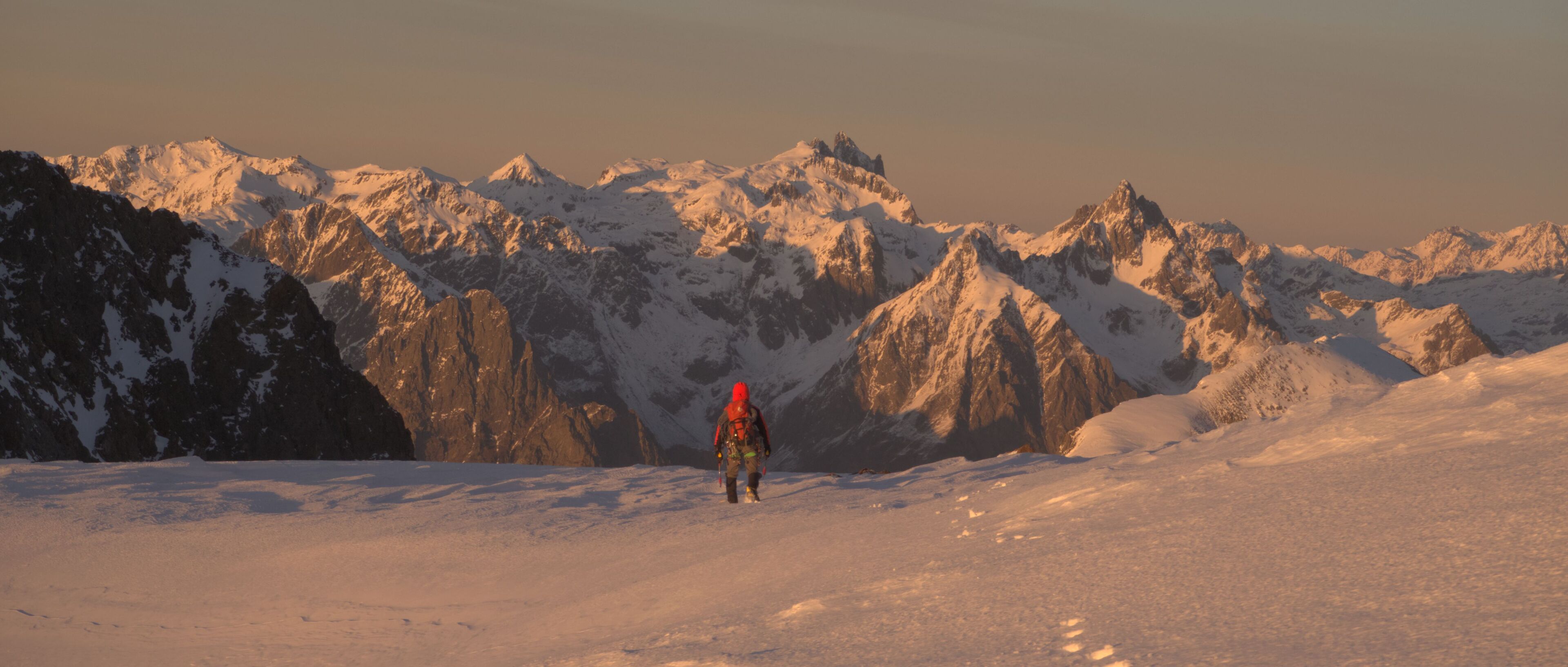
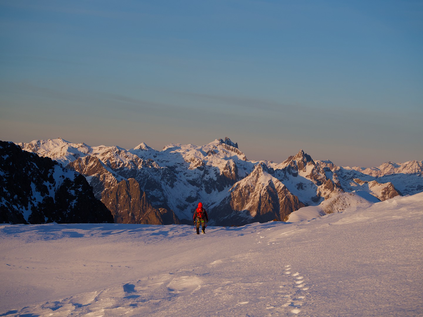
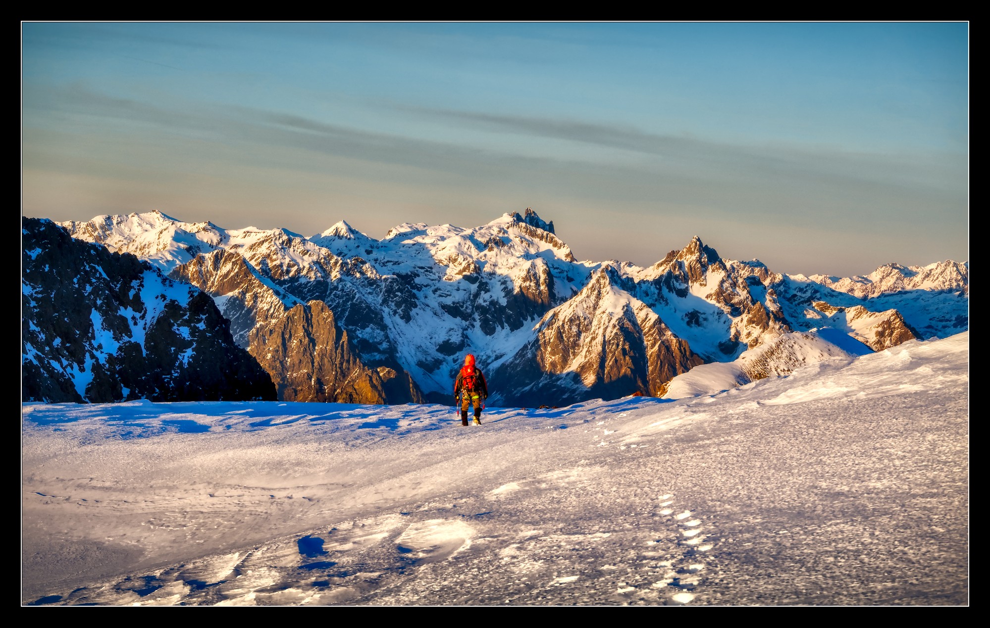
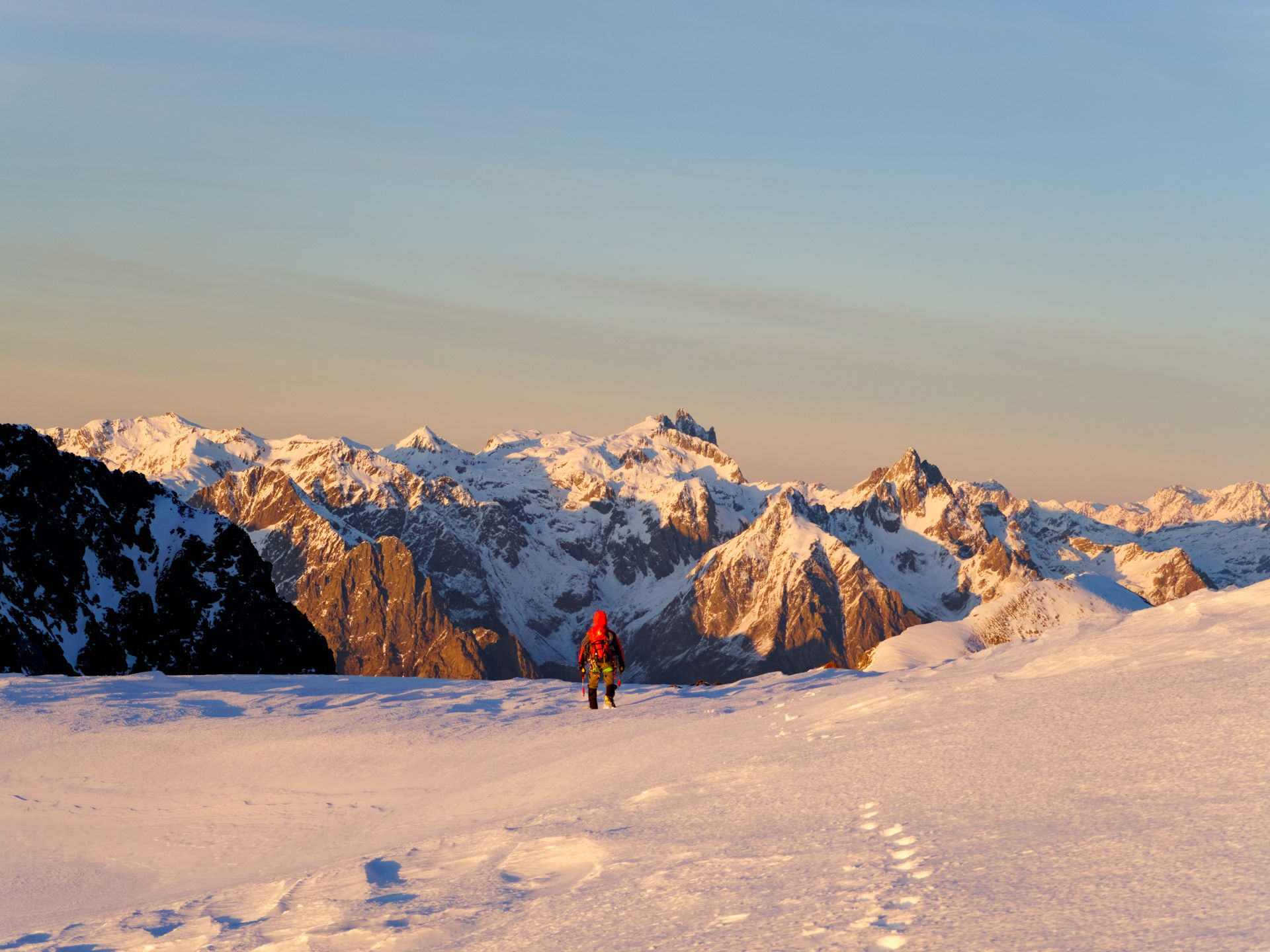
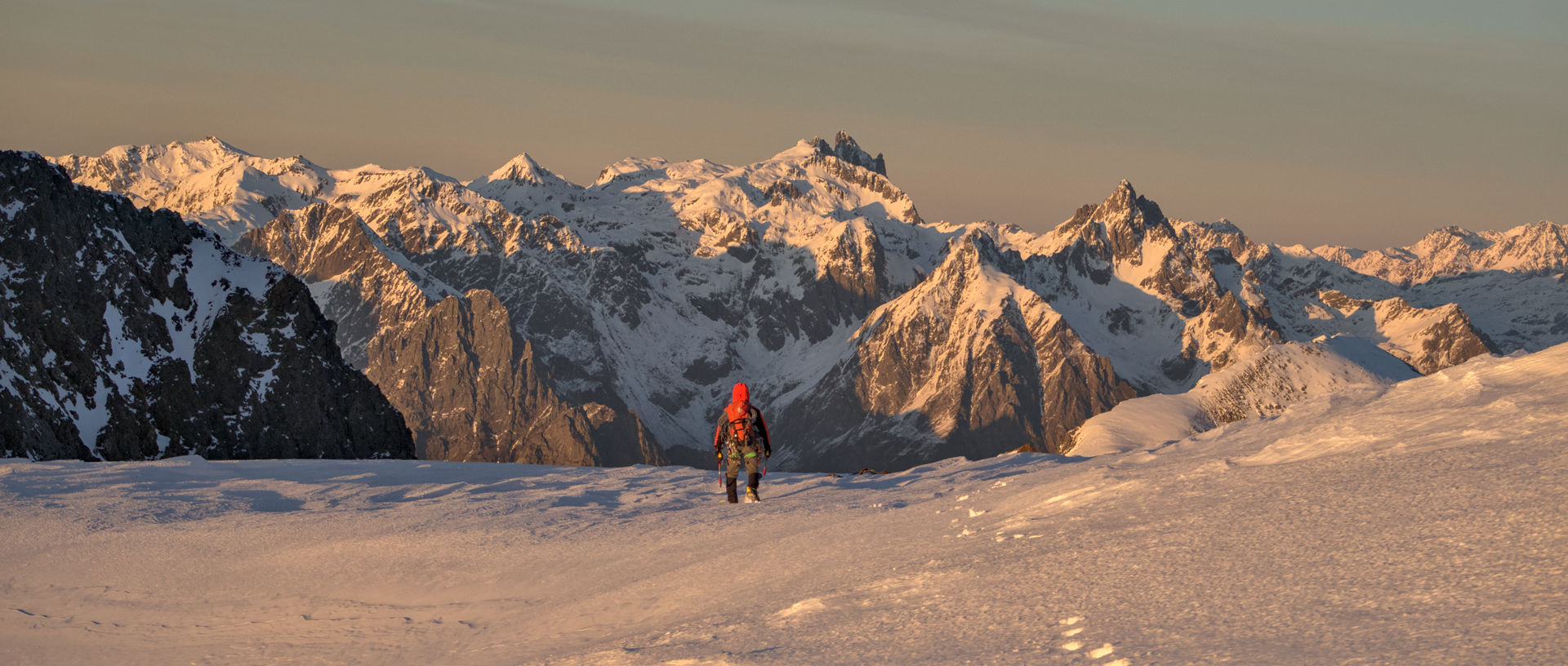
The above made me think about one of my most treasured shots, a print of which hangs on a white wall in our house. Here is a downscaled version of the file that was actually printed (followed by the raw file and the Darktable xmp file):

141221_164425-cg-orig.orf (13.6 MB)
141221_164425-cg-orig.orf.xmp (10.7 KB)
The image files are licensed Creative Commons, By-Attribution, Share-Alike.
(By the way, this was shot using a compact micro-four-thirds camera with a mediocre kit zoom.)
I still think that my edit conveys the colored glow quite nicely, but I guess that AP would say (quoting from the above article): ‘The conflicting white references between “paper” and image content make it look like a clumsy amateur shot.’ I remember having doubts about the lowered contrast when I made the print.
With the insights gained from Aurélien’s article, I tried to re-edit the shot in a way that separates technical and artistic white balance. But what would an appropriate technical white balance be?
If I want the brightest parts of the image (i.e. the mountain tops and the sun-reflecting chunks of snow in the foreground) to roughly have R=G=B after the “color calibration” module, I have to set the illuminant to something with a CCT of about 2700 K (where 5000 K is white, since this is the white point of Daktable’s pipeline at this point, see the first link for a discussion of that). But this completely removes any orange glow from the image and makes it very blueish.
So I tried to follow Aurélien’s advice and used the module “color balance rgb” (four-way tab, in particular “power”) to bring back the orange glow, and on the plus side this indeed preserves the brightest parts of the image as white. But overall I was not satisfied with my results: the brightest parts of the scene had a strong orange glow in reality, but in this shot there is just nothing that is bright but could be displayed as pure white (like the sun disk in Aurélien’s example).
How would you edit the above image in the spirit of Aurélien’s article? Please don’t simply suggest to modify the white balance of my above edit (it might well be that it’s overall too warm). I’m interested in particular how Aurélien’s suggested technique of (1) applying technical white balance, and (2) artistically correcting the image using “color balance rgb” could work when applied to the above image.


