My original edit seems to be a little more focused on the mid tones / colors while yours has a bit more definition and shadow (which may be why it’s more defined). I’d have to look for long time before I could start to lean one way or the other. It would be easy to believe they were shot moments apart as the light changed slightly.
They’re kind of different but equal approaches. Nice edit!
Looking side by side, I see a few differences but I can’t say for sure which one(s) make the most difference.
I intentionally raised the luminosity of the yellow tree at the back of the scene, where the water bends to the left. I also painted in a little extra brightness on some (but not all) of the lighter trees on the left hand bank from the midground to the background. My intent was to add a little more 3-D to the treeline. In general I tried to guide the eye from dark(er) in the foreground to bright(er) in the background.
I added some subtle local contrast to the trees to help with definition.
In the water I lowered the shadows but (relatively) raised the mids a bit. The mids are still down but they’re relatively higher than the shadows. This makes the reflection looks deeper to my eyes.
I cropped off some of the distracting sky.
I added a vignette and also (I think?) an additional gradient to the bottom left to help make a “tunnel of light” to a small degree.
I cleaned up more than a few (too many?) imperfections in the water’s surface.
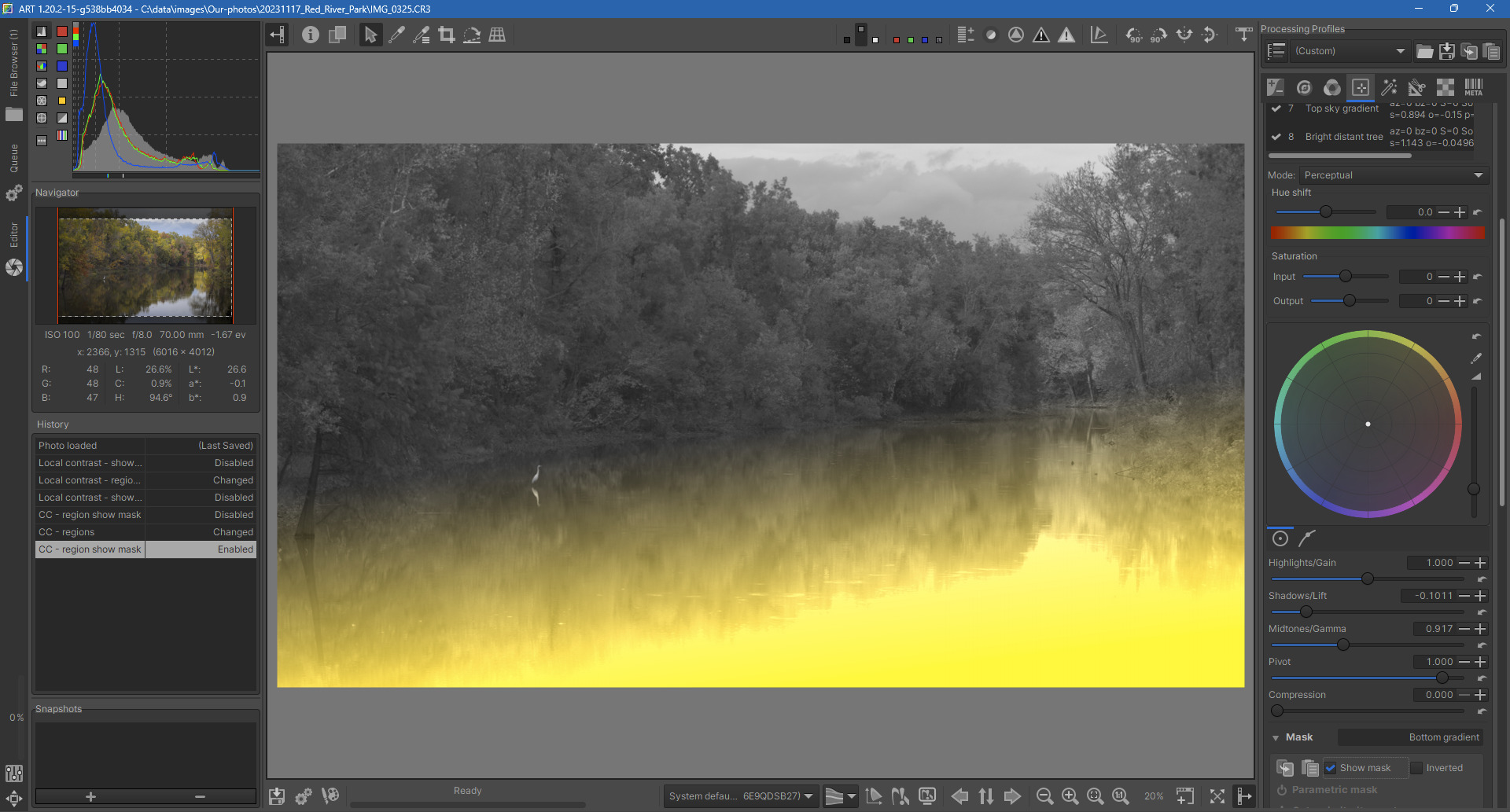
All in all there were a number of masks in ART and even a few more in Affinity Photo. For example, here the darkening gradient for the water in ART:
This is a beautiful picture. So rich in color and details!
It was tempting to change the whole atmosphere in a single touch: should I emphasize the greens? should I emphasize the browns?
I tried stick with the real look of it, stay balanced, but still make the colors “pop” just a little, and to keep it simple.
I Put the effort on the sky, exposure and overall tones.
I love nature, and I love autumn. This picture is heaven! So serene!
It’s hard to make such a dreamy picture feel any “more” real.
Thank you for the practice!
Done on ART.
This is my first play raw, such a cool concept. I tried for two different looks. I don’t feel like I have the eye for color grading just yet since I’m very new, so I’m open to constructive feedback!
First I went for bold, punchy colors and contrast. Tried to add depth to the image with a gradient at the bottom of the water.