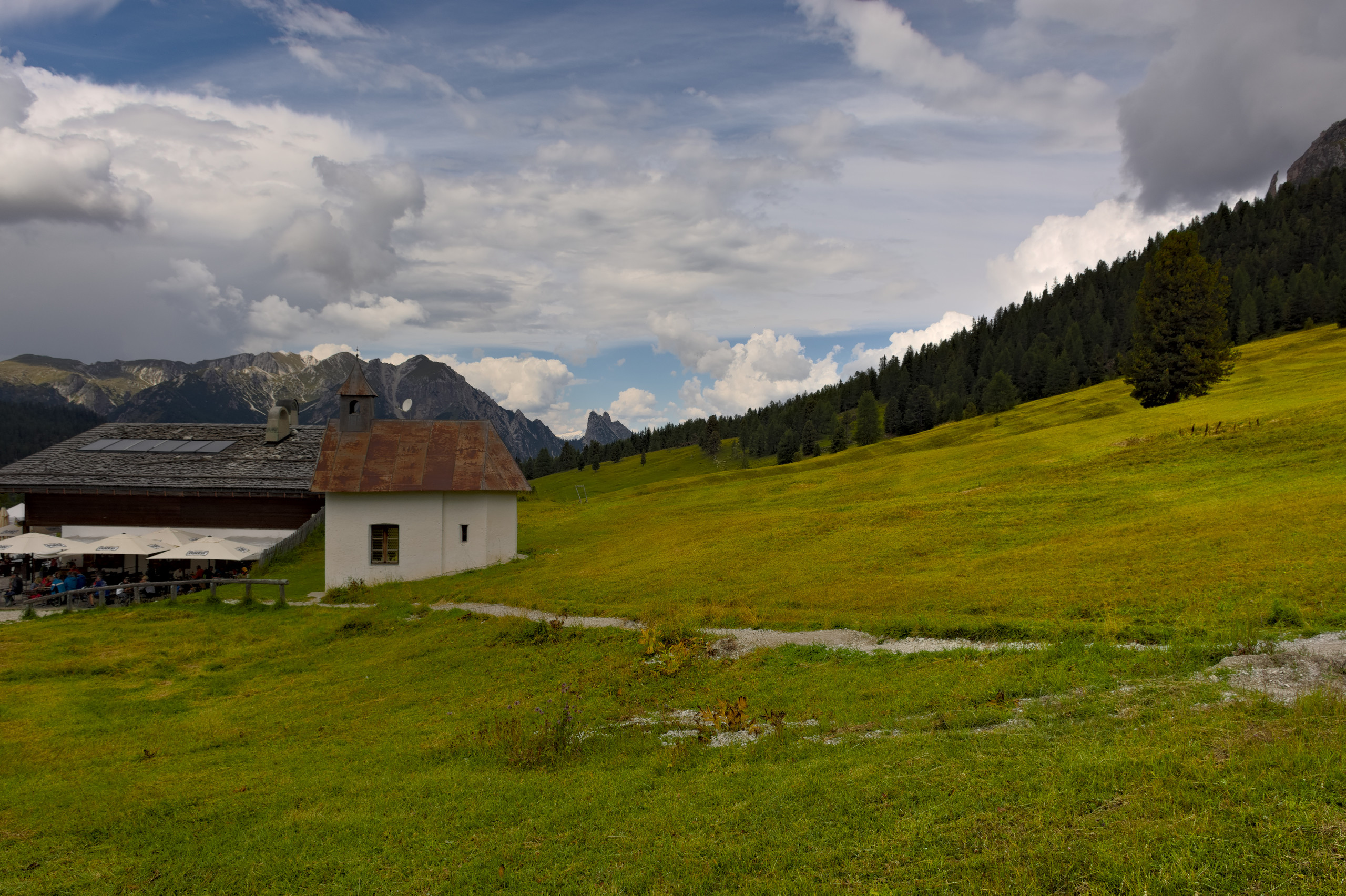
I am fighting with images like this. From one side I would like to avoid blow out clouds … but on the other side I would like to keep quite a natural look and some contrast. But if I increase white-exposure in filmic the image becomes flat and easily an artificial look. If I decrease white-exposure the clouds blow out …
You can try in filmic but really just use filmic for the DNR…add contrast with other tools…Tone EQ etc…contrast eq , up the contrast in the low frequency detail…it give a nice boost to clouds but you will have to mask it…lots of tips in Boris’s latest video if you have not watched it yet…Darktable Episode 46: Substitute for curves and contrasts in highlights. - YouTube and his earlier ones on contrast…
Well, it’s exactly the issue I am running into … increasing contrast resp. decreasing white exposure … will increase contrast but unfortunately decrease structure in the clouds.
I had a view at his video last week … there are some really useful tips but I was not really able to apply them to those kind of pictures with a relatively high dynamic range.
If it’s just the highlights, what I do :use the local contrast module after filmic (so above it) and use a parametric mask to only select the highlights.
For clarity in highlights, I still find the bilateral mode of local contrast easier to dial in.
Set local contrast to bilateral. Set contrast low (as in 3 or something) and move the detail slider up way high, towards or over 300%. It may look a bit overdone.
Enable the parametric mask, and enable the little button somewhere in the middle to view the mask. You get a yellow screen.
Now love the ‘l’ range of the slider up (both of them) and you should see the mask change. Keep going till you have only selected the highlights you want. Move the mask feather slider up a bit and/or blur up a bit to fix the sharp edges of the mask.
Now disable the yellow mask preview. Toggle local contrast off and on to see the change, it should only work on the highlights /clouds. At the top of the mask section there is also an opacity for the overal blend effect. Lowering that is a nice way to make the effect less strong if you think it’s too much.
It is absolutely flat, there is hardly any difference in brightness.
Only when you increase the contrast very high, the structures and shadings stand out:
So there is a combination of two things here: not only is the main subject in the shadows, the shadow itself has hardly any differences in brightness. Both elements are, so to say, diametrically opposed to the absolutely contrasting, dramatic and very dynamic sky, that is, the third element that mercilessly attracts attention.
Here, so to speak, the “three-dimensionality” of the field that could counter the sky is missing.
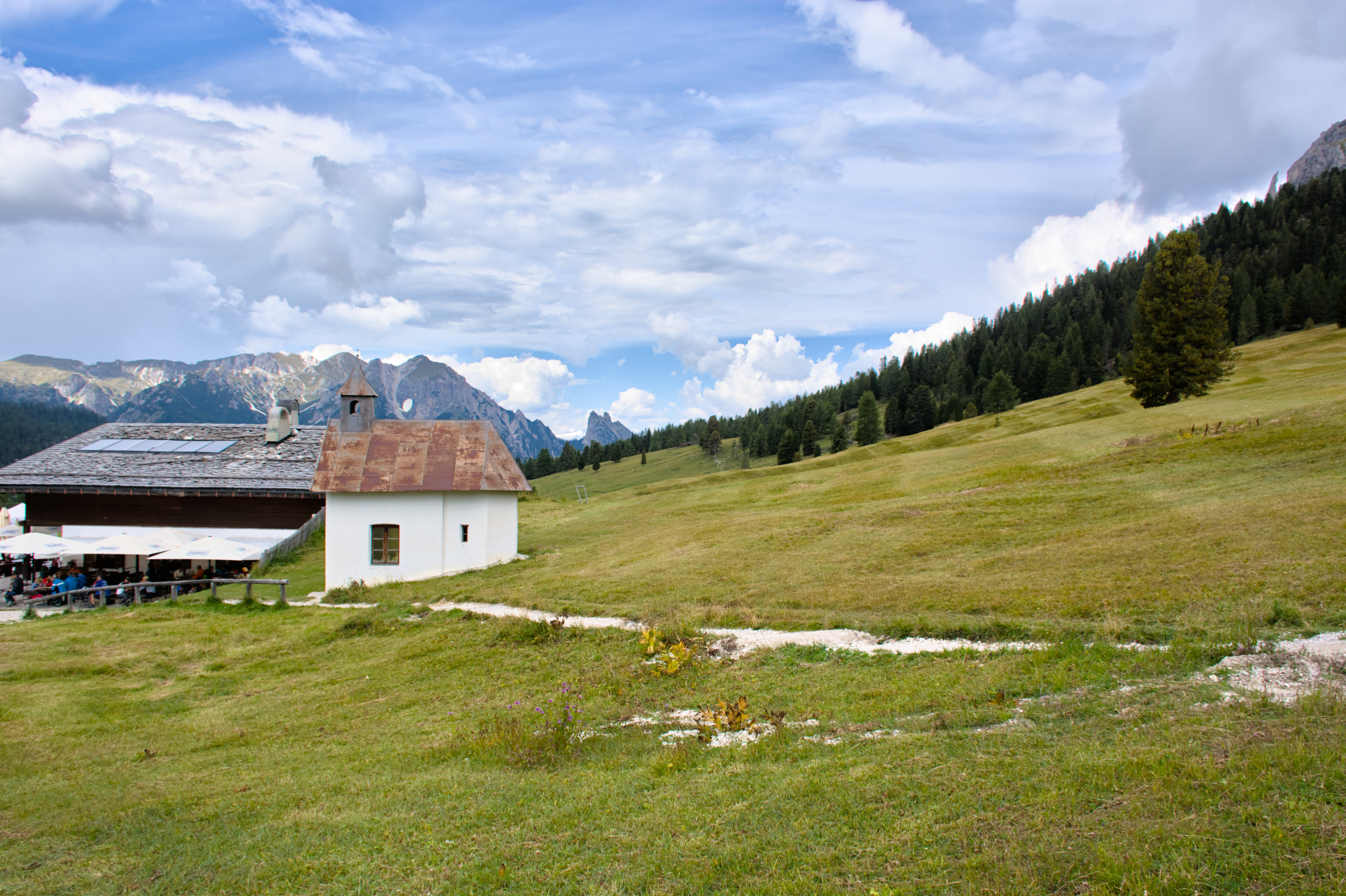
This can be partly solved by using the technique of dodging and burning, by artificially creating the “three-dimensionality” through local modeling of the lighting conditions. For example, you can gently lighten this area here:
Thank you very much for your analysis and hints. You are right, when doing the shot I didn’t want to blow out the highlights so I exposed on the sky so that the rest of the image is almost underexposed and with very low contrast. So exposing on the highlights is probably not the best in those situations.
No! You did everything right, it’s just the scene itself that is so ungrateful. It has nothing to do with the dynamic range. Unfortunately, the scene has two very separate areas that collide with each other. One flat and one very contrasty. One could think - I know this is not the case - that the scene is composed of two different photos; flat field and high contrast sky.
To darken the picture for the details in the clouds would ruin the feeling of fresh air for which people go up a mountain. I’m not sure I am successful in representing it though.
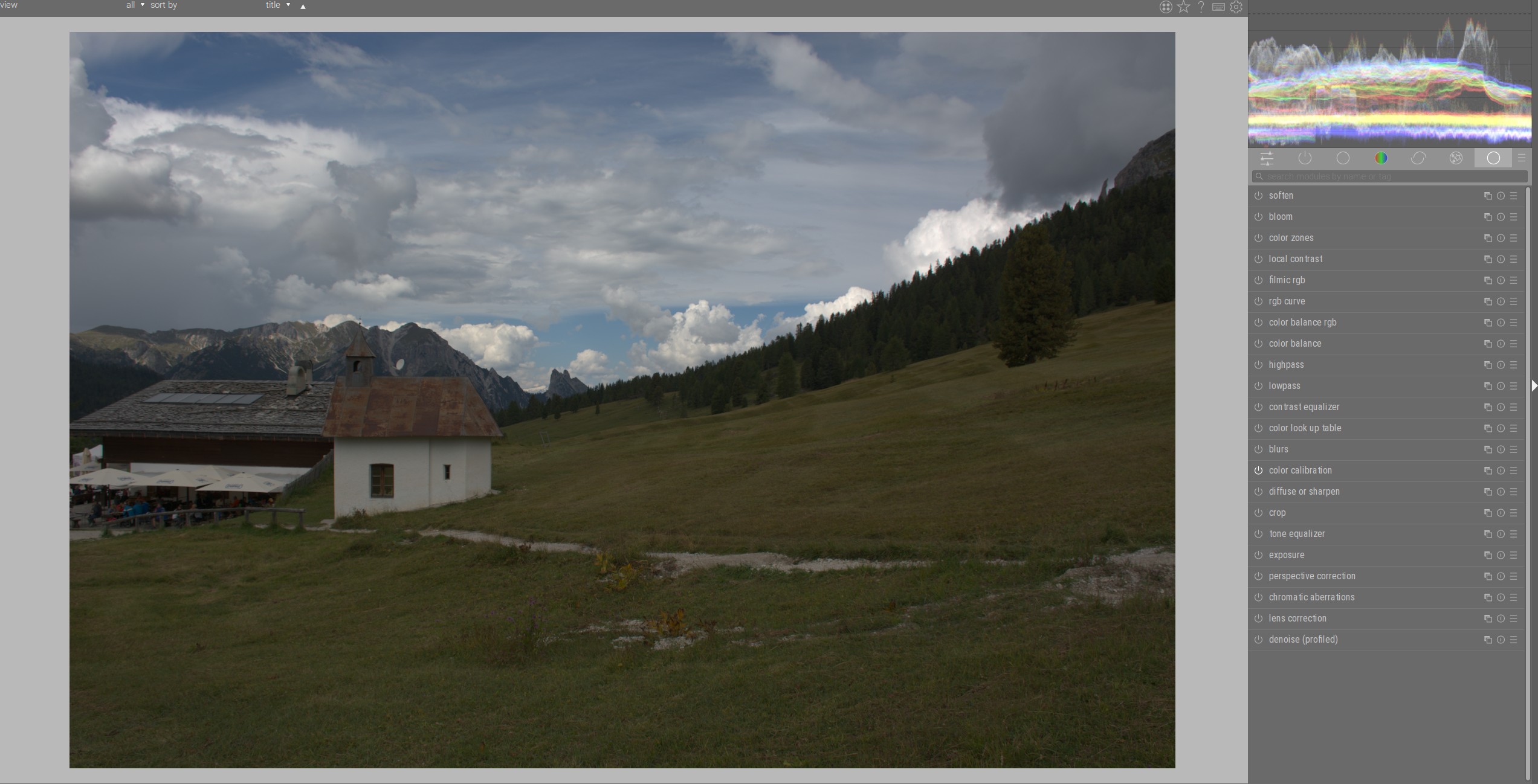
I did include a sidecar for this one but this edit uses a new, not yet available, Local Adjustments tool (basically an improved CIEcam16) I’ve been testing. The flatness in this image was partially tackled with this new LA tool and also the Colour Toning tool. Both modules are capable of targeting specific areas.


 .
.