The smooth one behaves weirdly for very low values. The black dots do not stay on the sRGB edge, but move erratically inwards. But since they’re black, it probably doesn’t matter much.
What features shall it not have? (what is breaking a rendering?)
A nicely designed “path to white” with some abney-effect sprinkled in seems to look pleasing.
Also: gamut clipping seems like one is loosing differentiation in highly saturated (high purity) parts, so are smooth gradients (no matter which gradients) paramount?
I’ve been staring at these sRGB sweeps for a while, and failed to understand what I should be looking for. These above plots, inspired by this wonderful article, have finally brought me closer to understanding some things.
we’re looking for a path to white. Increasing exposure must increase brightness, and thus even pure red must eventually become white if it’s bright enough. All of the above variants achieve this, as they all converge to the white point in the center (but the base curve doesn’t). Classic example: light sabers are white, with a colorful halo. The core itself should not be colored.
we’re looking for continuous colors in each row. Colors should not collapse to the notorious six, otherwise color differentiation is lost at high exposures. Whenever the graph lines converge in the center into three distinct directions, some color differentiation is lost. That’s what the smooth preset improves upon the AgX default. Without it, we get cyan skies, yellow skin highlights, and magenta roses (looking at you, Capture One, and iPhone)
we’re looking for a hue twist at high exposures, to mimic the Abney effect. Pure straight lines may measure well, but they don’t look right. Without the twist, you get salmon sunsets and orange-white fire (both should twist yellow). The straight lines in filmic and 100% hue preservation are missing that crucial twist.
There are plenty more desirable attributes, though, that these graphs can’t show.
For example, reflective surfaces can look luminous if they exceed a certain ratio of brightness and saturation. This looks subtly wrong, and can happen in e.g. filmic.
All transitions should be smooth and gradual. Sunsets in particular have a very smooth gradient from sky-blue to sun-white. Similarly, spherical surfaces have smooth gradients. Any discontinuity will show up as an ugly line that breaks these gradients.
Brightness perception is not linear, and not the same for each color. Full-green looks brighter than full-blue, even though both have one channel maxed out. Yellow is perceived brightest, blue is darkest. This can lead to problems, for example a yellow-white gradient can look like a brightness decrease, as yellow looks brighter than white. I see this everywhere, and it drives me nuts.
I’m sure there’s much more. Please do correct me if I got something wrong, and please do add to this. I’m just trying to interpret what I read elsewhere, and do not claim to understand things fully. At all.
I agree for my use case but… Do strong coloured lights like lightsabers really look white to the eye? Or is it because film is the look we have learned to prefer?
I know I prefer film like looks but i think it should be stated what goals and assumptions are behind decisions.
Not at all. But our screens have limited brightness. We can’t make them arbitrarily bright. Any saturated color can at some point only get brighter by reducing saturation, e.g. bright red (1, 0.5, 0.5) is brighter than pure red (1,0,0) since it additionally contains some green and blue.
Yes but you can wrangle your tones and colours in other ways as has basically been the norm in digital imagery . That the current solution is the correct one is an aesthetic decision. There are other compromises one can choose to make. Sacrificing brightness relationships for colour is one.
No long ago people were arguing for the mathematical correctness of hues whilst anyone with eyes could see that the results were unnatural. (the salmon wars)
The problem was the assumption that hues shouldn’t change. The brightness thing is a similar assumption/choice. One I agree with but still a goal/assumption.
Writing this from the passenger seat of a car on pitch black northern roads. The complete redness of taillights is probably worth preserving in some images.
Here’s another fun one. I’m still trying to better understand how hue changes with lightness.
This is the Oklch color space, and we’re looking at Luminance vs hue. These plots exactly mirror the sRGB sweep row by row, except with lines and circles instead of colored rectangles:
Disregard the hue angles at the very left and right border, that’s black/white anyway, so hue has little meaning. But the transition towards black and white is interesting. For reference, I added the notorious six at their appropriate hue angle at the right end.
You can see how the hue traces bend as they get brighter and darker. I find these plots somewhat easier to read than the chromaticity diagrams, especially towards the dark end.
I would start by adding that we need a consensus of some sort of what looks “wrong” or “not the best rendering”.
My starting points would be:
every clipping is bad.
Every clip is a discontinuous rendering of something that was smooth before. Therefore smooth gradients need to stay smooth at all times.
If one throws out of spectral-locus cameraRGB values at a DRT, there should be a smooth displayRGB representation, no matter which cameraRGB value this is since the sensor itself clips hard anyway, which looks awful as we know (and reconstruction happens to make it less awful looking).
bending of straight in cameraRGB gradients probably sometimes need to happen to fulfill 1.
I don’t think it is an aesthetic one.
I think it is the only solution to convey “more light” when your display has a boundary. Our displays do hard-clipping. Clipping is the loss of differentiation.
Hue preserving DRTs were an idea to solve the notorious-six problem of per channel hard-clipping DRTs iirc.
I must admit that hue-preservation doesn’t look pleasing, but it looked a whole lot better than the notorious-six/ hard-clipping to CMY. Desat-ing preserved hues is a simple form of managing a path to white.
Introducing nice skews (what those are needs a definition, for sure!) seems like a logical next step, avoiding salmon colors as a nice side effect.
So all this talk here about filmic giving the ‘best’ blue skies got me to open this landscape image with blue skies and compare filmic, sigmoid and AgX. Hmmmm…filmic did give the best blue skies.
However, I have previously made a preset in the color equalizer module that I call blue skies. It raises the saturation of blue and darkens the blue. In the comparison here is filmic on the left with a reasonably nice blue sky. Here is AgX on the right but with my blue skies preset employed. I feel it now compares favourably with filmic’s sky. Yes, blue skies does seem a weakness of AgX based on the discussion here and my quick experiment. However, I still love AgX as my new go to tone mapper.
I think the various gamut compression topics show that the camera itself does not necessarily clip; it’s the camera matrix that takes values out of the spectral locus.
This is a rendering on a display, though. The display has a limited brightness, and thus must clip to white.
But bright colored lights in the real world (not a display) do not look white to a human eye. Neon signs stay colorful, cars’ brake lights stay red.
I think this is only half correct. There is a limit. If your eyes are dark-adapted, and suddenly a bright colored stimulus hits your retina, it stands to reason that multiple cone cells will max out immediately. So for a short instance, you will indeed see something approaching white. Then the cells will adapt, and color will come back. However, our vision is not a camera. We perceive our mental world model, not the raw sensor feed from our eyes. So it is likely that our perception will still be colorful, even if the eye’s response may not be.
It is my understanding that that’s actually why the light sabre image works: it mimics the eye’s response to maxed out cone cells, even though the cells aren’t even close to actually saturating. Therefore it fools our vision system into a perception of “bright colored light”, even though the light isn’t actually all that bright, and not actually colored. And thus the light sabre does look red, even though it actually is white.
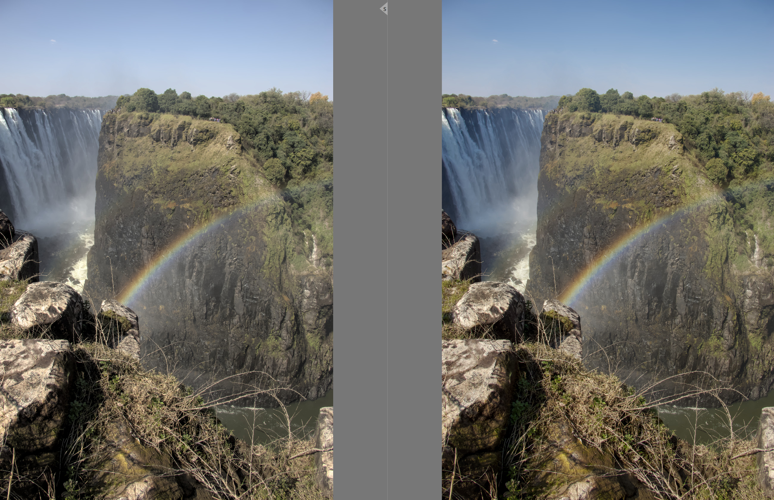
Not to me: that waterfall is in the shade, so I’d expect it to be bluish. But in such situations, we “know” that the water isn’t blue, so our brains correct for that. A photo/camera can’t do that. A typical “mixed lighting” situation
I wonder… we use the inset before tone mapping, to spread the load of highly saturated lights. That’s probably a simulation of our cone responses? After all, even single-wavelength red laser light would always stimulate all three cone cell types, as their spectral sensitivities are very wide. So in reality, a true “all-red” signal can’t exist.
For simplicity I removed the sentence where I said that I might choose to localise the blue skies preset using a mask. But for this image I didn’t use a mask.
I am also wondering if playing with the primaries could counter balance the weaker blue skies from AgX. Or maybe the saturation/chroma sliders for highlights in the color balance RGB module. BTW, color balance RGB module was not used in conjunction with filmic in my posted image and it was certainly AP’s intention that these modules work together.