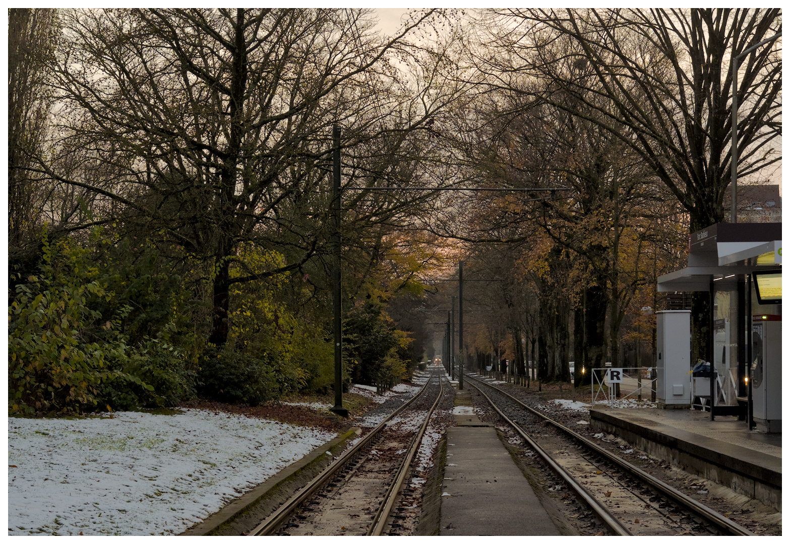
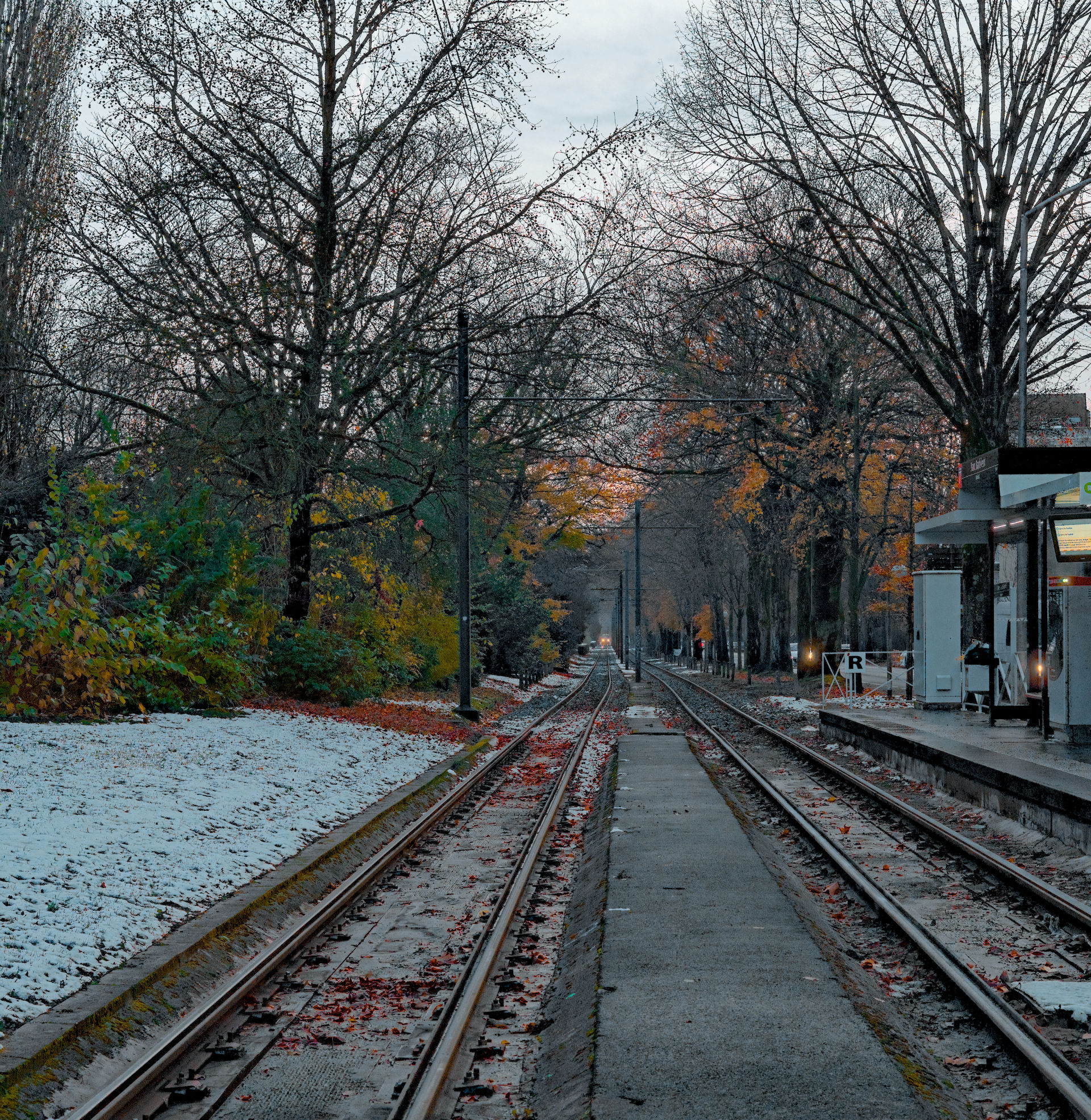
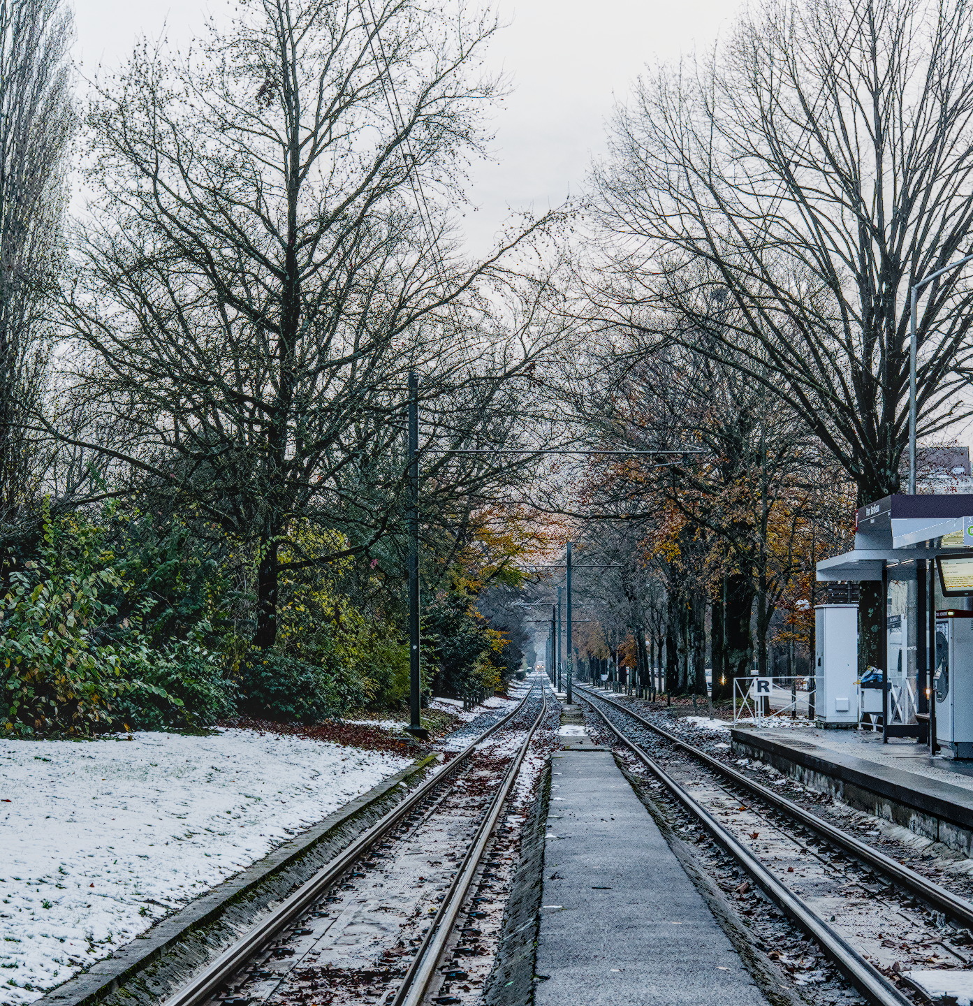
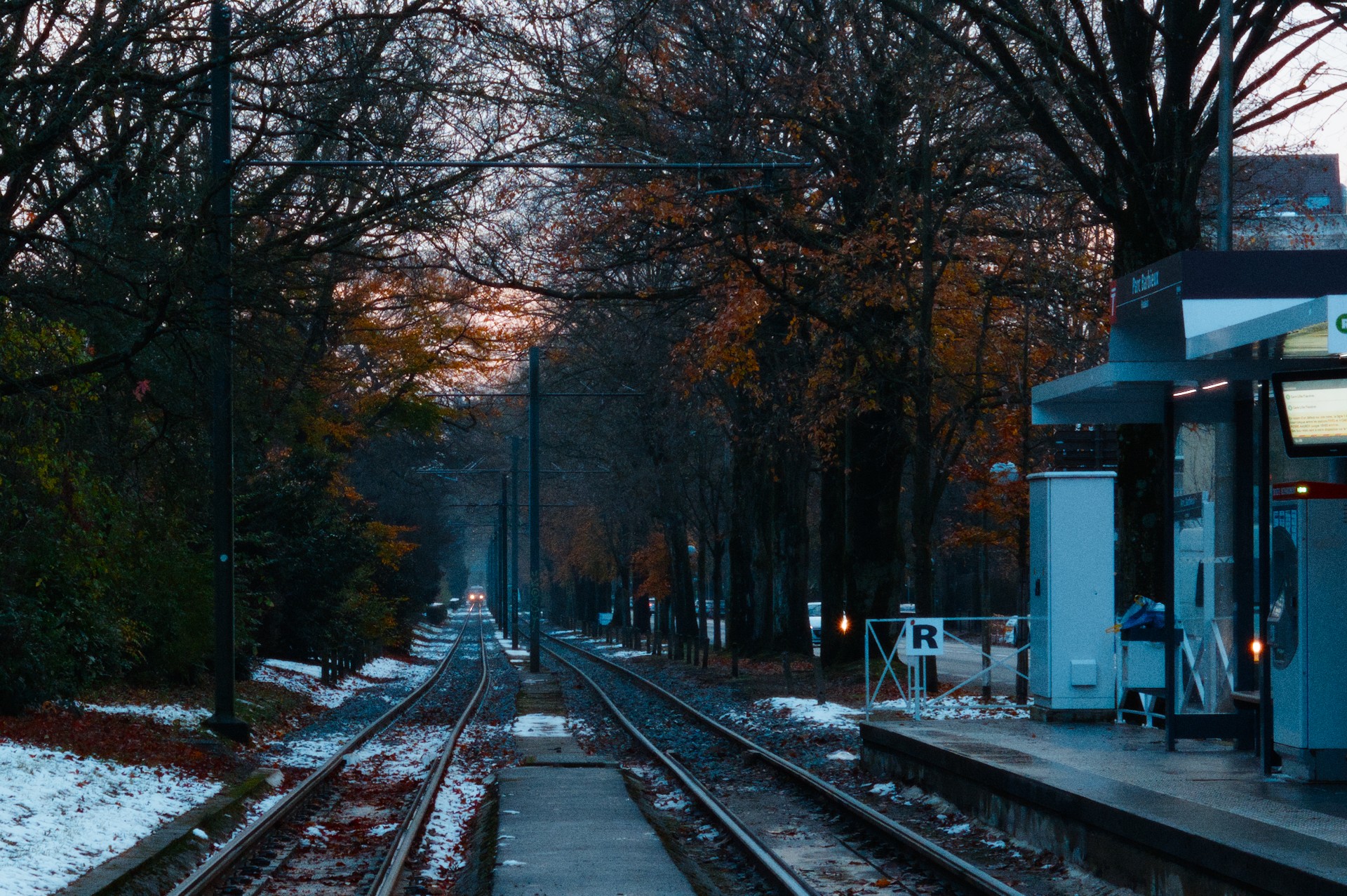
Lille - France
I came out with two different edit for this RAW file. One might be a bit overcooked. Feedback and other edit welcome.
A7C01725.ARW (24.3 MB)
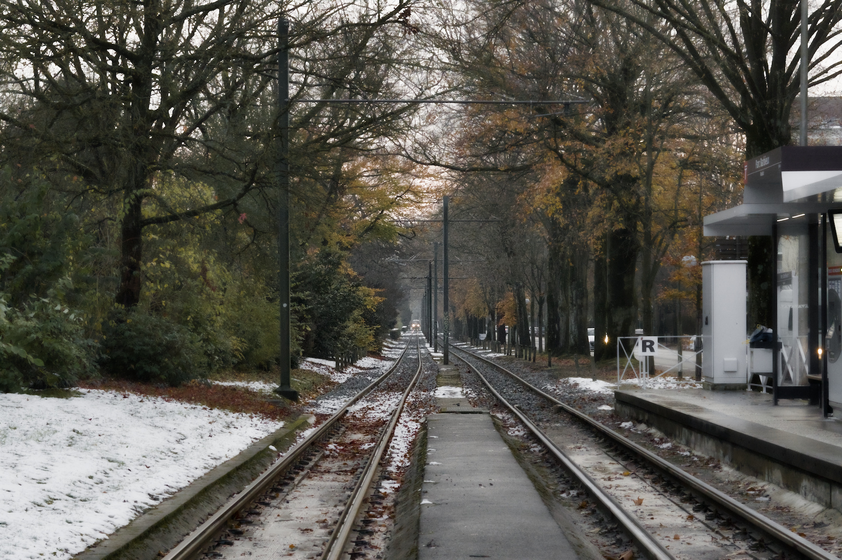
Lille - France
I came out with two different edit for this RAW file. One might be a bit overcooked. Feedback and other edit welcome.
A7C01725.ARW (24.3 MB)
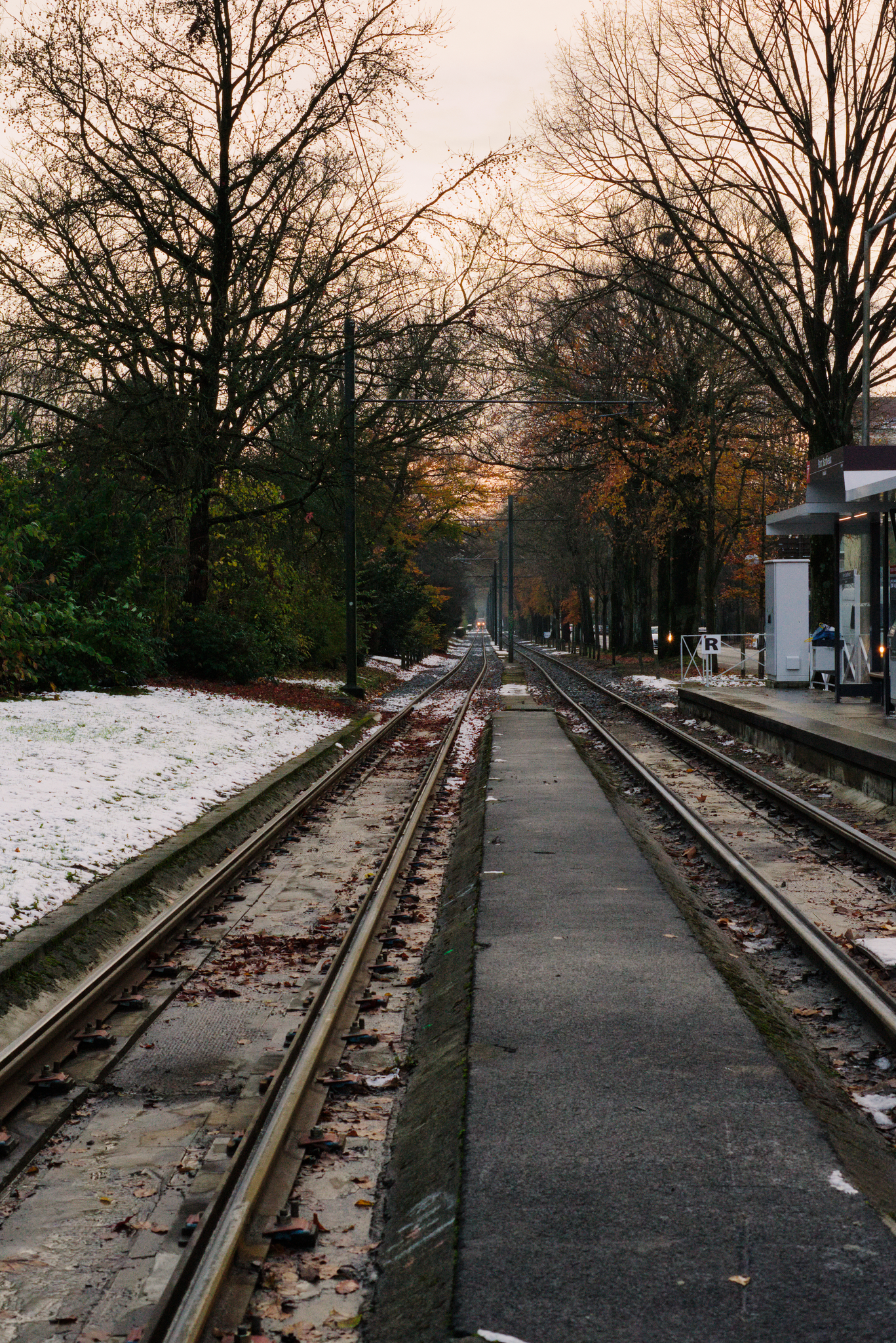
Welcome to pixls.us, Lucas. I prefer your top edit.
If you want others to post their edits, please add a license allowing sharing. See other Play Raw posts for examples.
Damn. I do not see an edit button.
Well, the above files are licensed Creative Commons, By-Attribution, Share-Alike.
Welcome to pixlsI
Great capture of early winter light! This scene can be interpreted in many different ways, as I am sure you will find out.
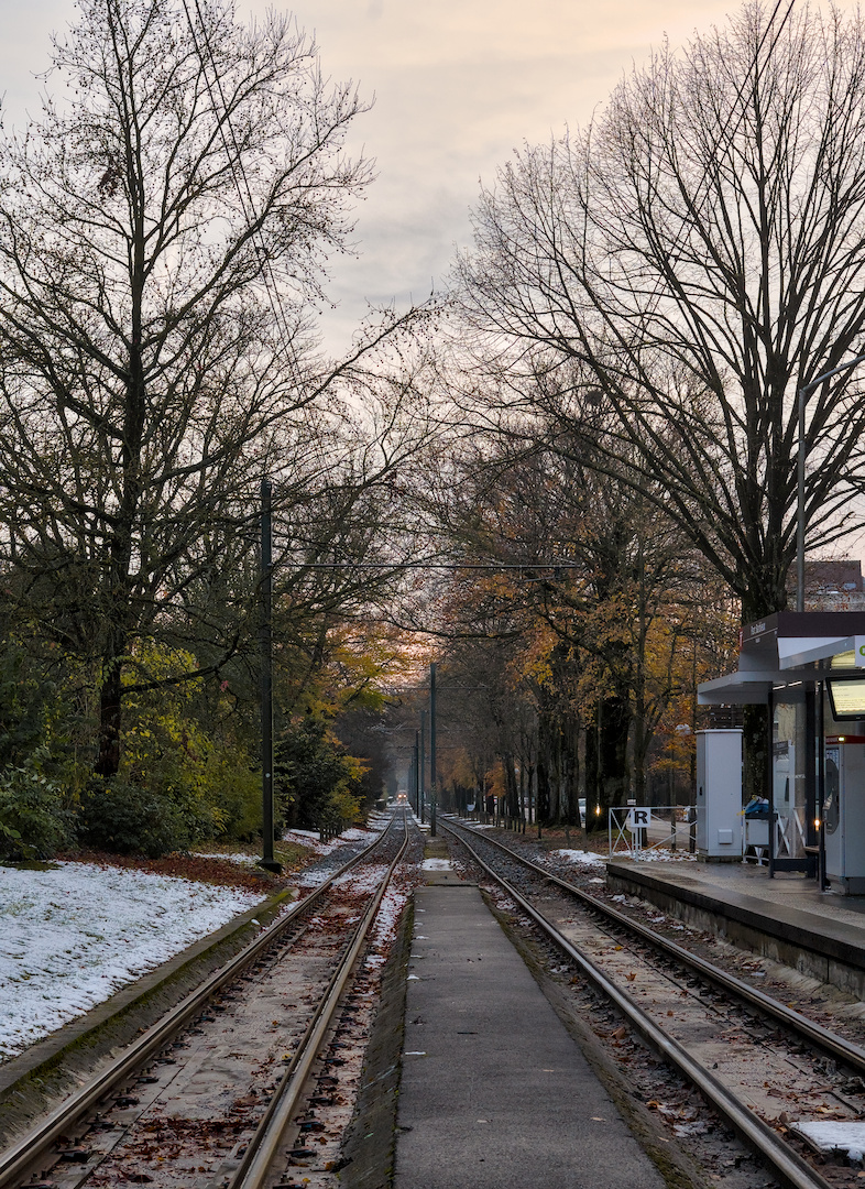
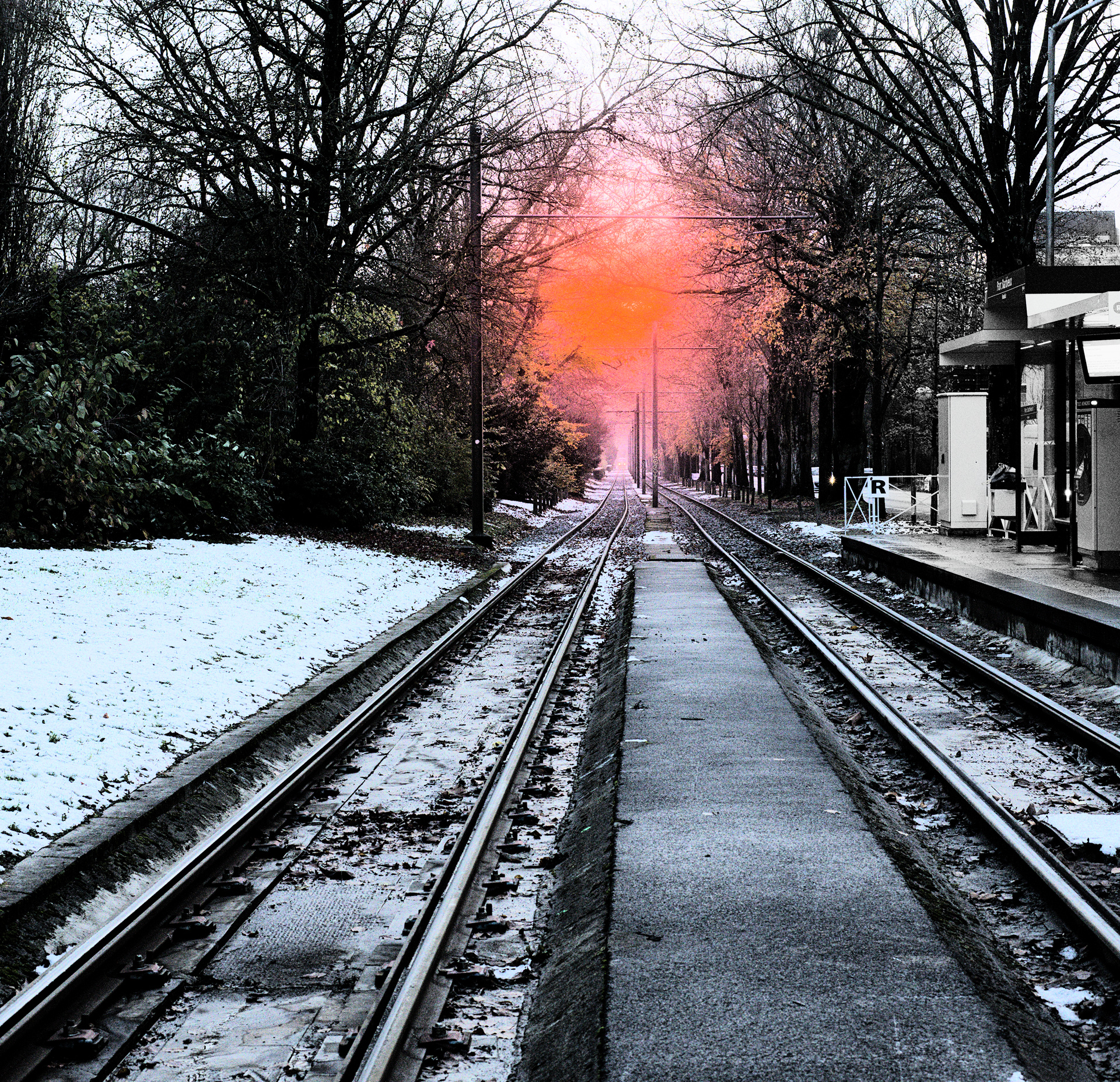
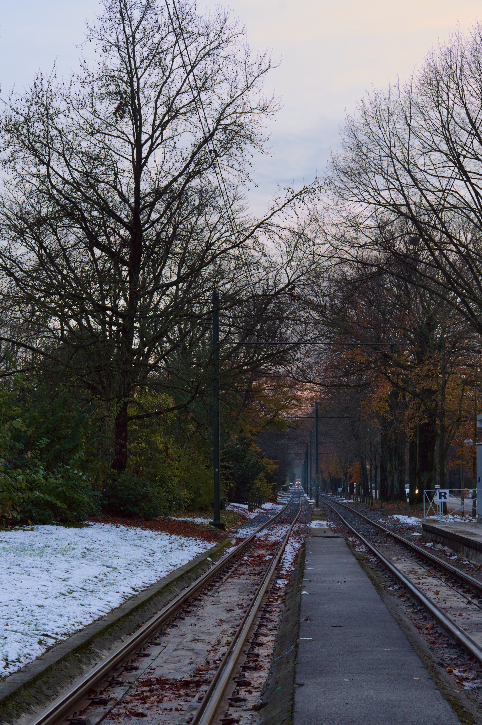
I went for a radical crop/reframing of the capture. This was done on my laptop with no monitor calibration (sorry if colors went strange) using DT 5.2.1
Another, cooler, with something like the original crop:
Ok, here’s my edit with darktable 5.2.1. I honestly think I like your top one better.
Hi @lucas.caron
Welcome to the forum. I think you need to use the site some more to elevate your privileges, which includes the ability to edit your posts. So, keep posting!
You have a fine photo here. ![]()
Welcome…thanks for sharing…
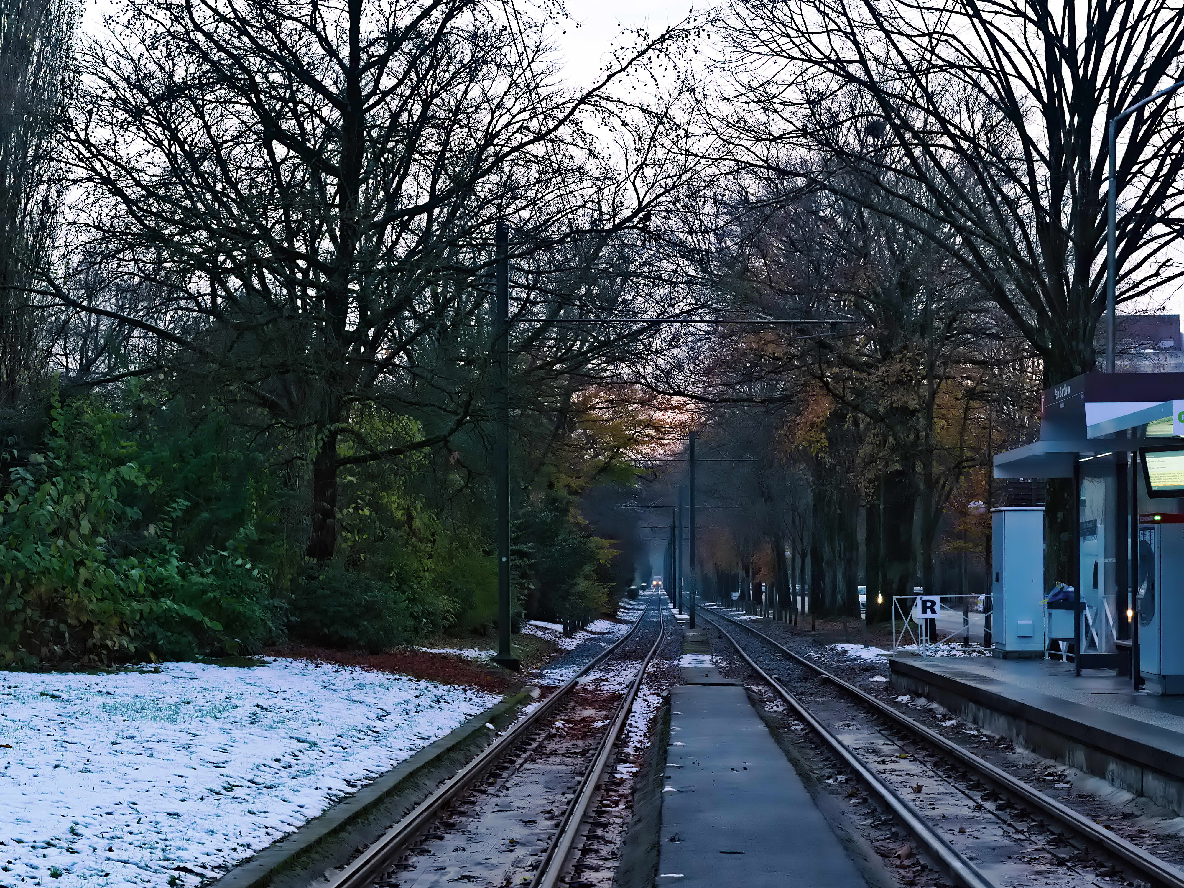
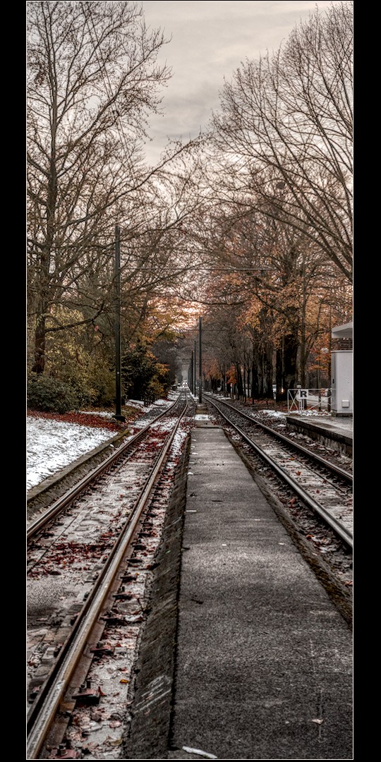
I wouldn’t follow this edit or at least what I did for tonemapping, I have been messing around with good old filmic and using settings not likely recommended…
A7C01725.ARW.arp (13.8 KB)
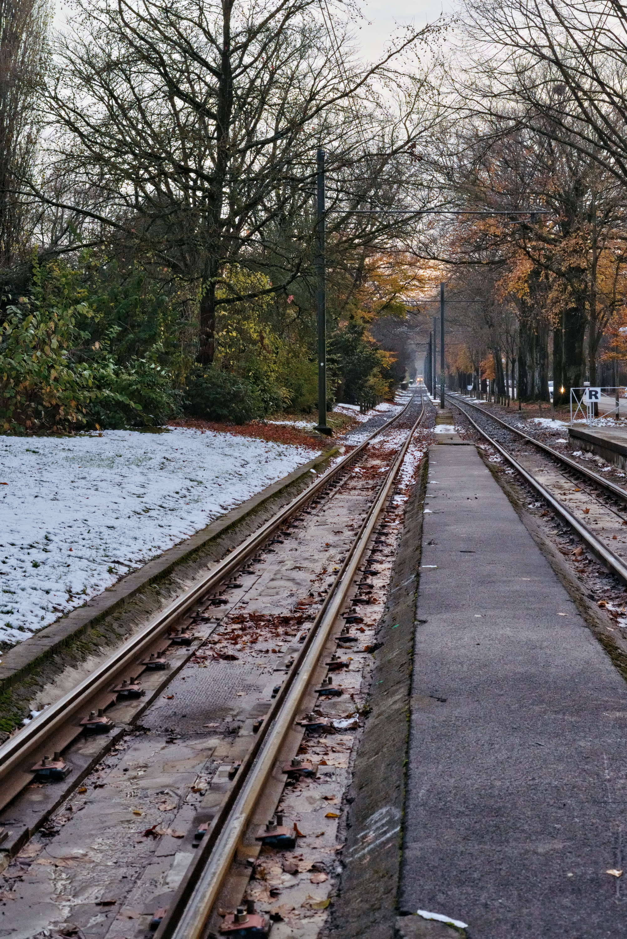
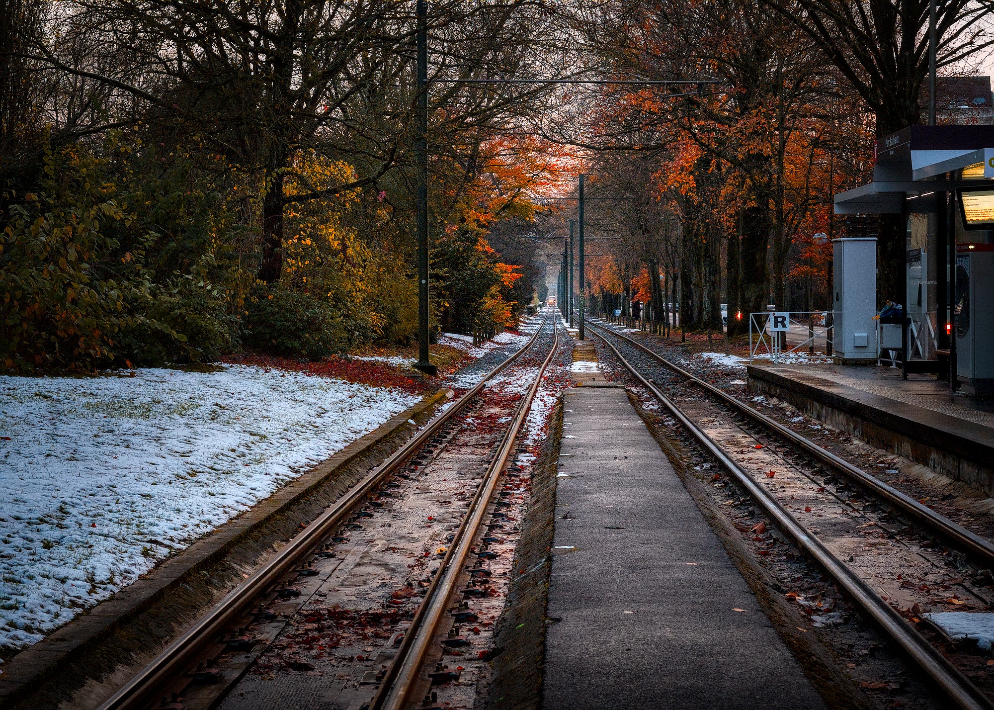
My try. The base picture is quite good, no major transformation was required, just tweaking. The only major was the crop. I process with the objective “what the eye would see”, so I thought the tracks in the foreground would be ignored by the eye.
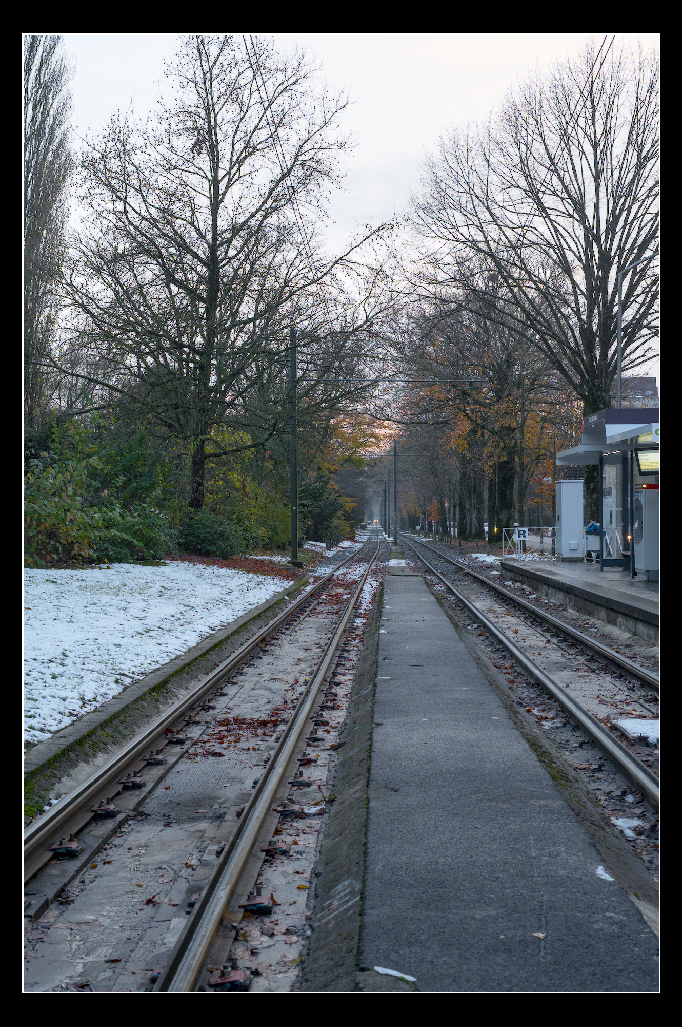
Welcome to Pixl.us, Lucas. Here is my try with darktable 5.2.1. I see that the A7c handles high isos very well.
Hi, welcome to the forum. I preferred your first edit. In my edit I decided to keep the daylight white balance, but lifted the saturation of the warm colors using the color equalizer module.
Here’s my play with it. I usually go for more “filmic” and stylized edits.
I prefer the moodier look of your second.
I think the kink in the rails is challenging creating conflicting leading lines. Emphasised red and orange. And softened contrast everywhere except the middle, though might have gone overboard with the Vaseline.
I see no “conflict” as I zoom inwards, just an adjustment.
I would rather say that the kink is an element that makes this image a little different from the many images of similar kind where our view glides very (too …) smoothly.
This is often a dilemma in image composing/editing. Images can become too smooth, too easy to look at and too easy to discard. If a picture is too easy/obvious and don’t leave anything to the viewer to work on, (“a stone in the shoe”), it will likely be forgotten more easily.
I did not perceive a conflict of sorts when I viewed this image with its kink. Rather I found it interesting (in a positive sense).