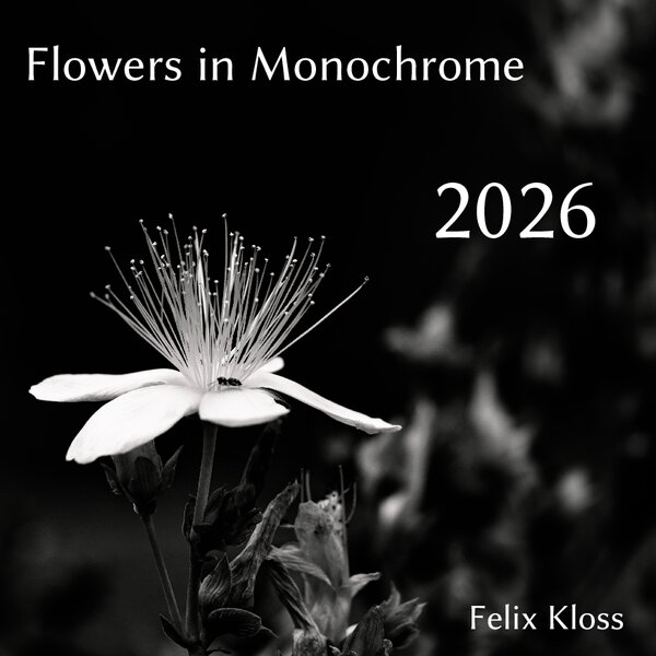
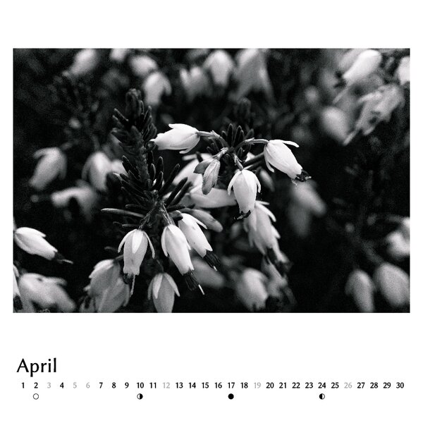
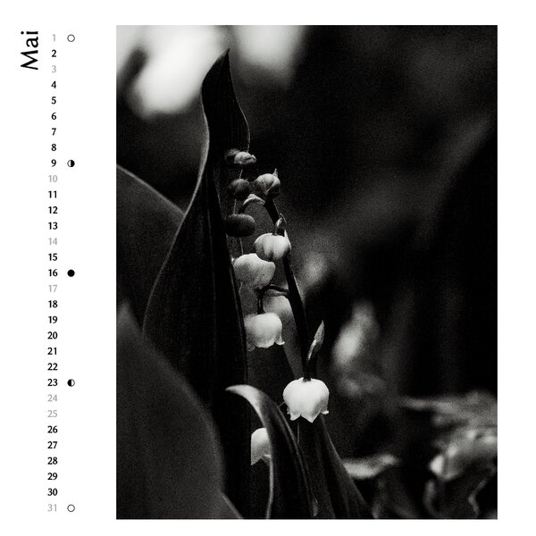
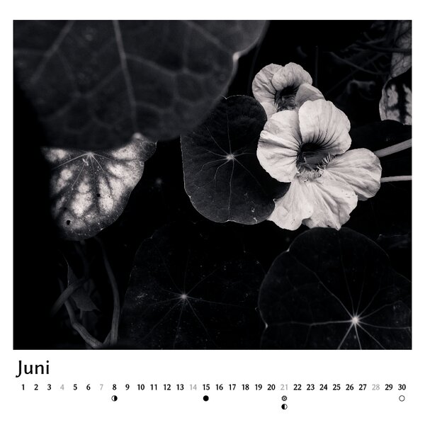
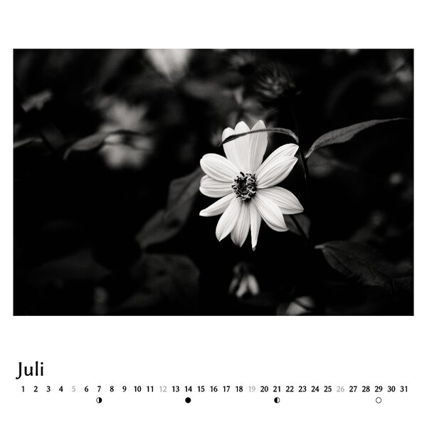
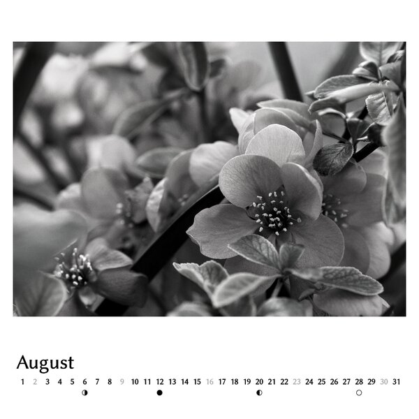
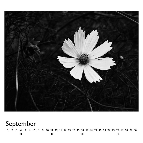
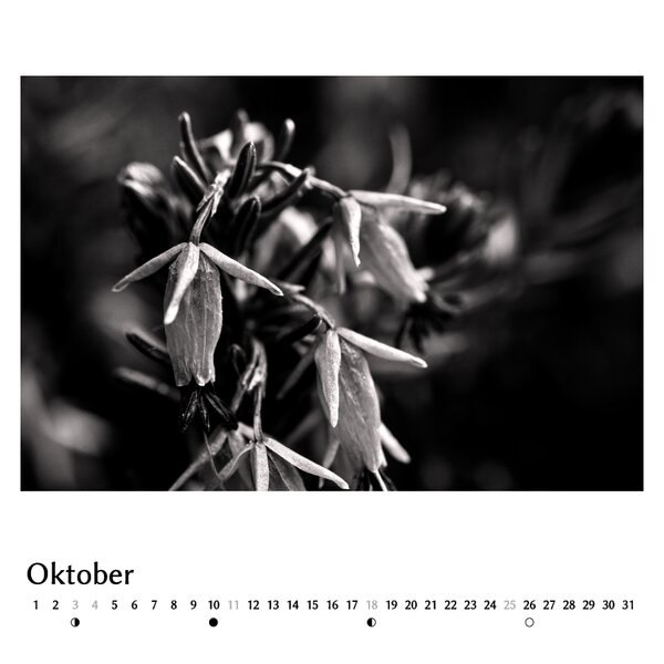
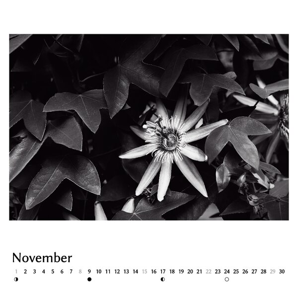
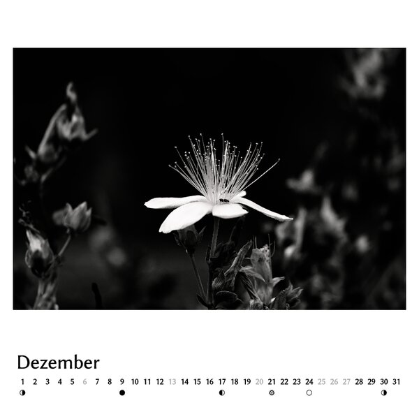
I already posted some of the photos here but now actually finished the calendar that I had planned. It is already printed, so I can’t change anything anymore but would still be interested in your opinions on the images and the layout.
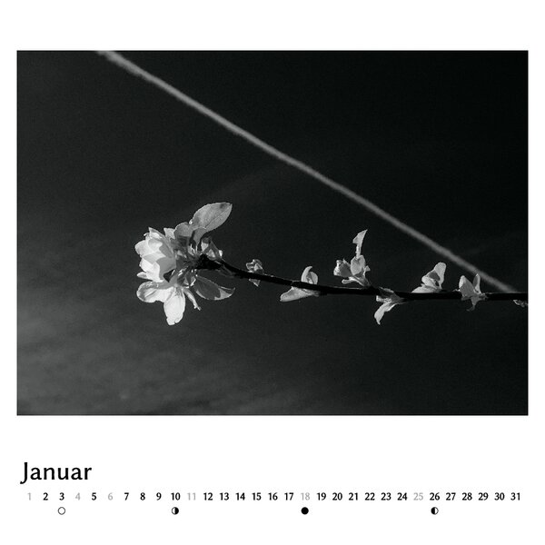
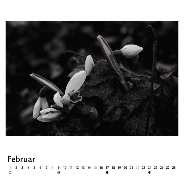
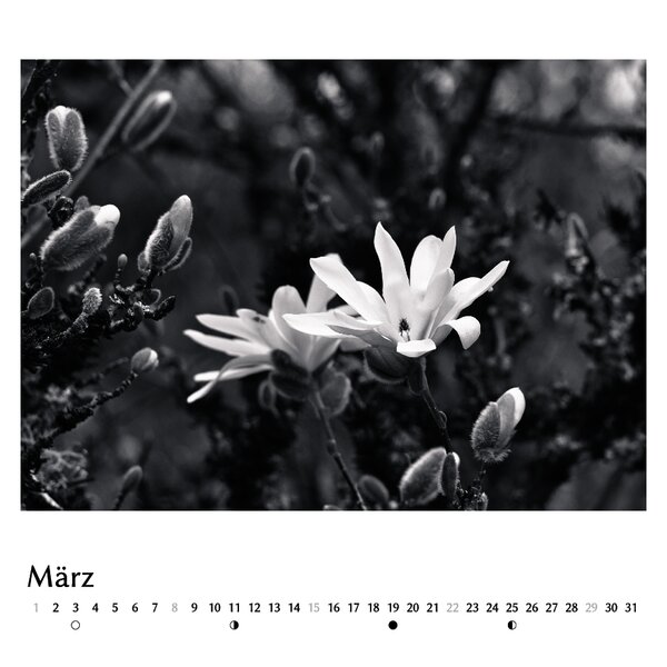
Since I wanted to be able to mix images of different orientations and aspect ratios, I used a square shape and did the layout myself in Scribus instead of using the (rather limited) software of the print shop. Thanks to @chris for the scripts to generate the calendar strips, I just did some small modifications.
(cannot upload the last three images right now, is there a limit of images per post?)
I’m making calendars for my family for several years now, but so far it always has been a random best-of selection from the past year. This year is the first time that I actually did a planned, themed project for this, something I wanted to do for a long time.
Hello Felix, beautiful images on the screen. Please let us know how they turned out in print!
For me and my workflow the difference between what I see on the display and what I get from printing is still the biggest obstacle / the area where I see the most potential for improvement. Even though my printing service provides profiles (which do not really reflect the printed outcome) and my screen is calibrated. Please share your experience especially since your images look very dark (which is a printing nightmare in my experience).
Indeed, very dark areas are difficult for printing. I learned this a few years ago when I wanted a print of this image and ended up with 8 different test prints from 3 different companies. Most were too dark, losing details in the shadows. Those where I forgot to disable the “auto-enhancement” were completely crippled :D.
Back then Saal Digital was the only one that was close to what it looks on my (calibrated) screen, so since then, I’m doing all my prints with them and have generally been happy.
They do provide soft proof profiles but somehow they are only compatible with Adobe products, so when using them in darktable, it looks completely wrong.
Regarding your question about this calendar: I’m very happy with the resulting tones (i.e. shadow details are good) but the very subtle colours in the highlights (“Monochrome” is a lie ) do not really come out in all of the images. Most of the images look less saturated as on my screen.
Unfortunately, test-printing with calendars is rather expensive because you can’t order single images with the exact same paper as is used for the calendars. I did one test print and since I considered it “good enough”, I didn’t bother with more iterations to improve the colours.