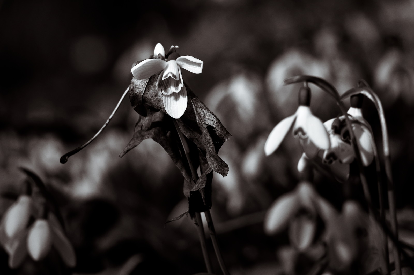
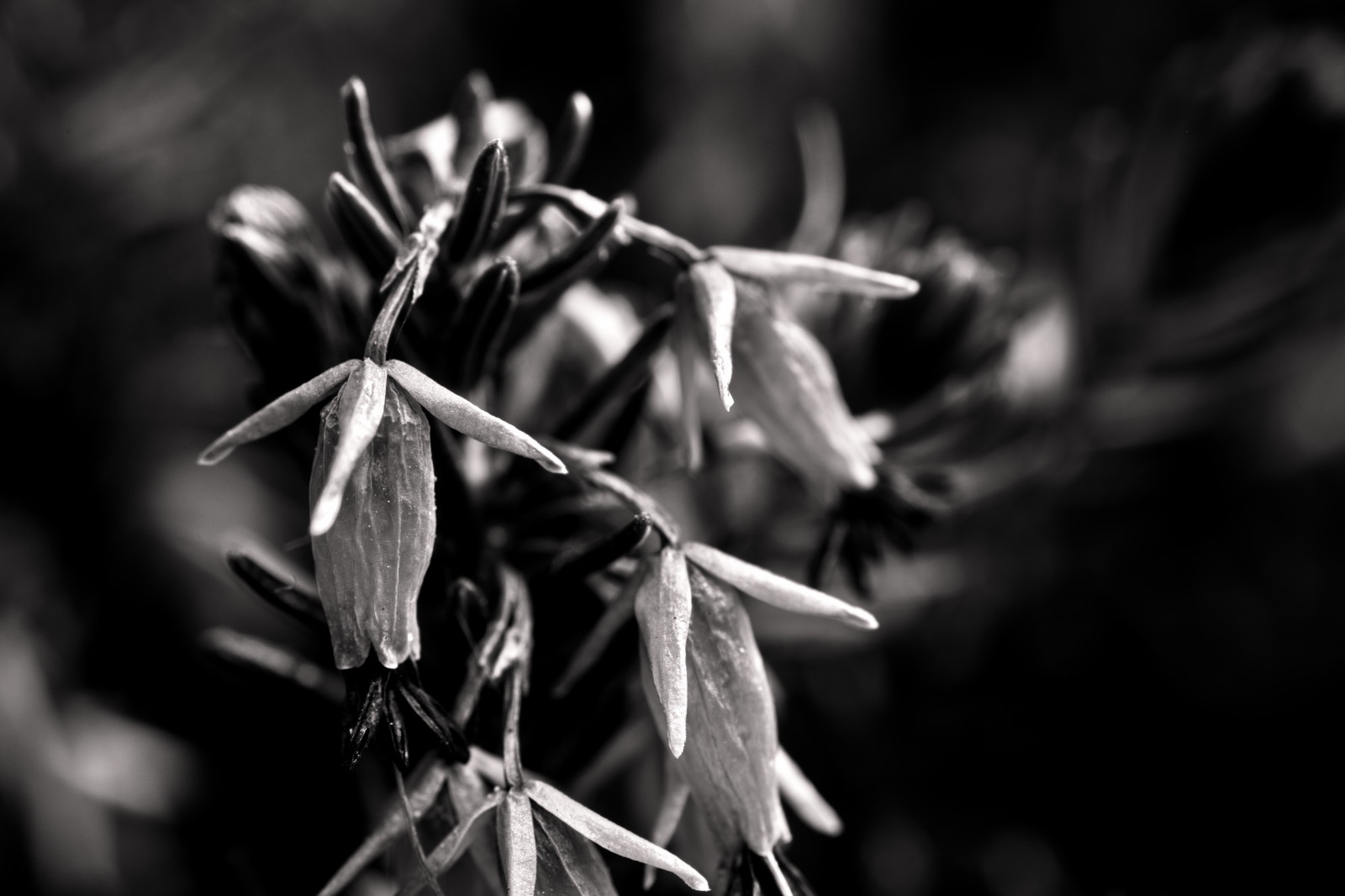
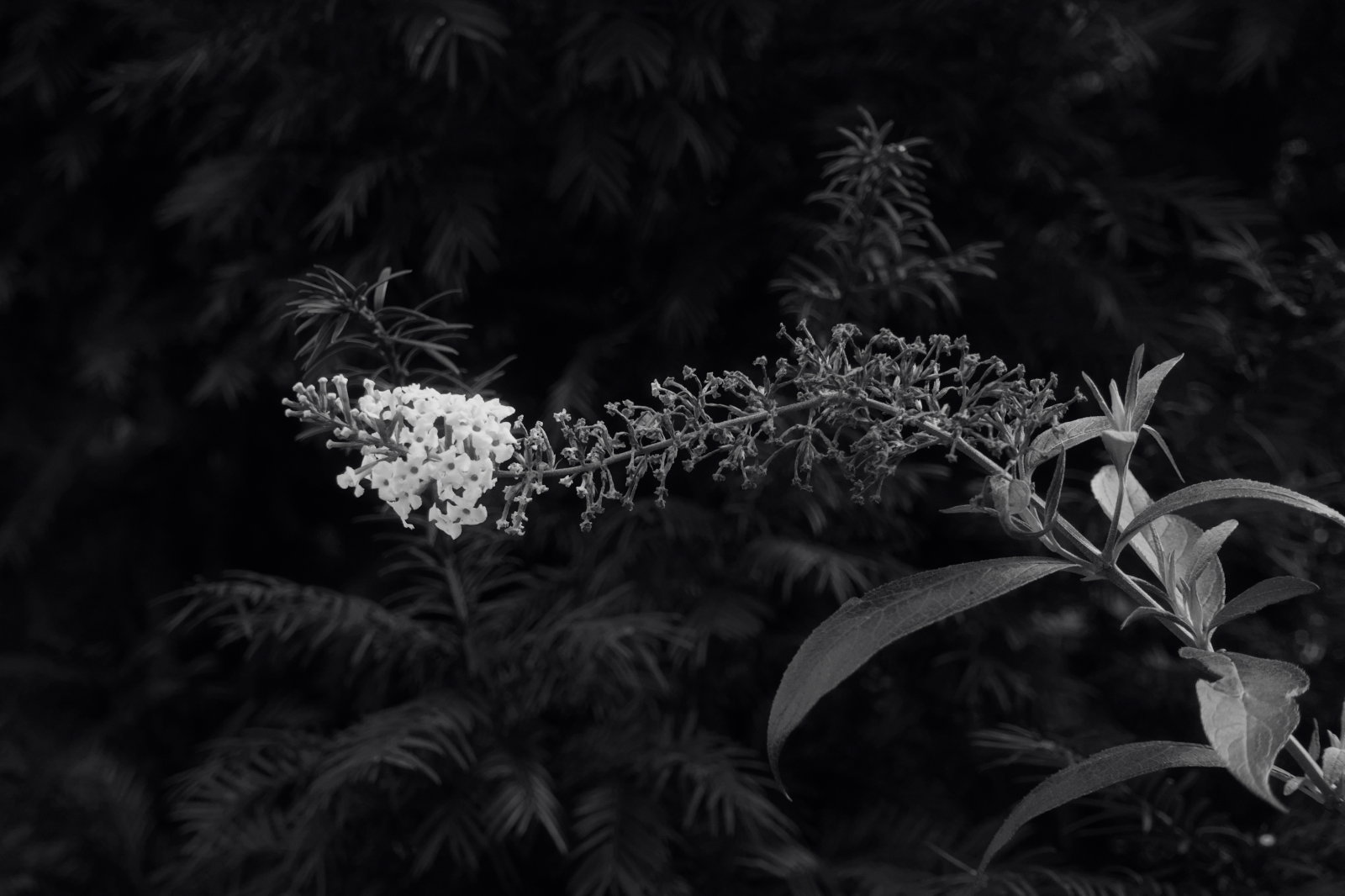
Earlier this year, I started a little series of monochrome flowers/blossoms (more correctly, I started with one, then came another and suddenly I found myself doing a series :D).
It is somewhat inspired by a talk of Kevin Holiday, which someone posted in this forum. Especially the first one (the apple blossom), was an experiment, trying to emulate his style. The key elements I adopted are the somewhat dramatic look and idea that I don’t always need to stick to reality (mostly affecting the channel mixing during b&w-conversion).
The title is actually not really true, as the images are not fully monochrome, but I slightly tinted them after the conversion or in some cases kept a tiny bit of the original colour. I just couldn’t come up with a better one yet…
Now my goal is to collect more of these over time, so that I have a good Top 12 selection for a calendar by the end of next year.
Right now, it’s still in a rather early stage (not fully settled on the style), so I thought it would be nice to get some feedback now, while I might still change things a bit. I’m interested to hear your opinion, both about the individual pictures, but also on how well they work as a series.


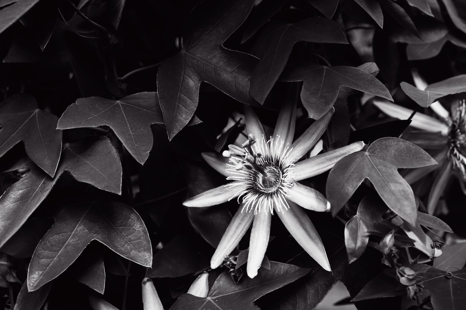

For legal reasons I have to mention: The last two shots have been taken at Wilhelma Stuttgart (Germany).