I’ll pass on that. lol
![]()
I’ll pass on that. lol
![]()
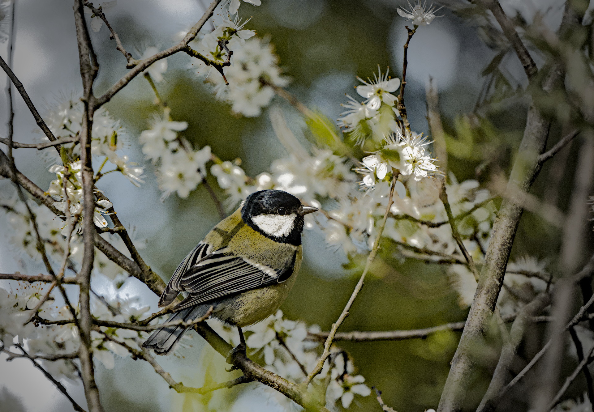
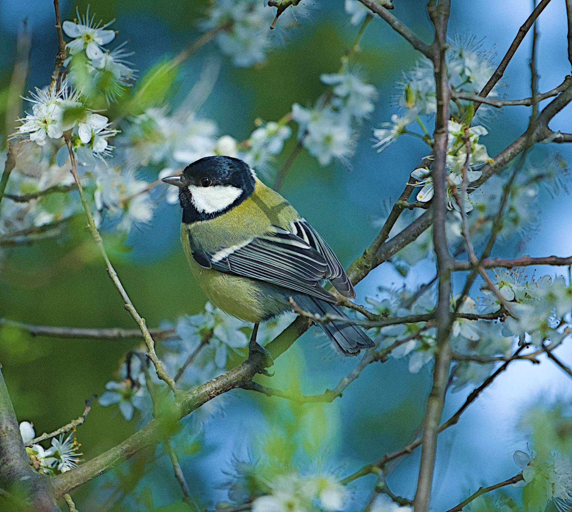
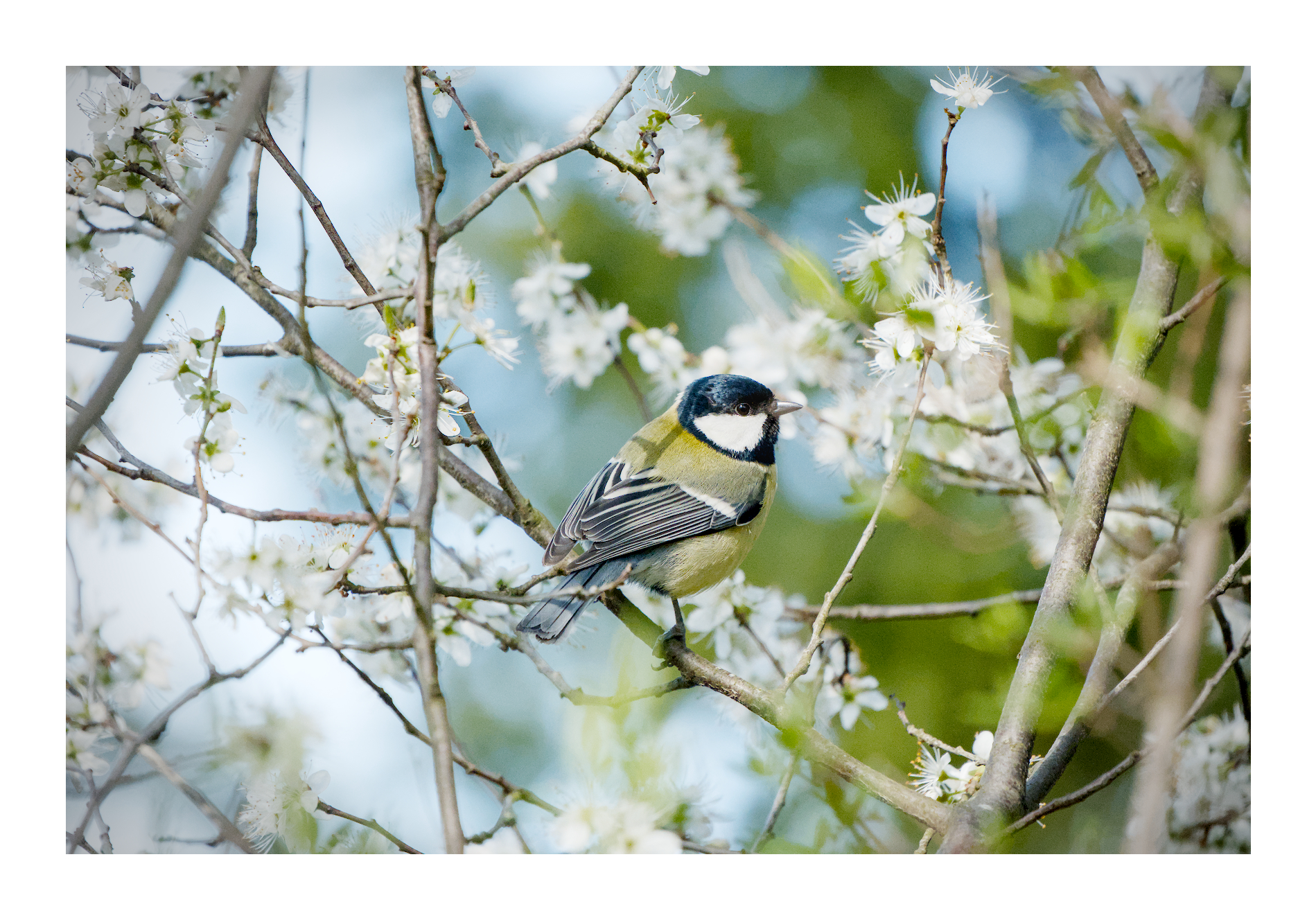
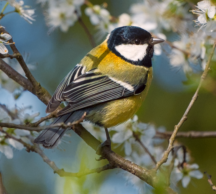
I also edited without knowing what the color is actually supposed to be. This edit uses the proposed contrast & texture module, but that aspect of the edit wasn’t dramatic and could be accomplished with other modules (probably less easily)–mostly pulling apart the bird and the background with respect to color and contrast. Then I did a bit more of the same with color equalizer.
It’s more saturated than I’d like. My lights were too bright while editing.
20260314_0007.NEF.xmp (19.8 KB)
I also had trouble separating the yellows from the green…I threw everything but the kitchen sink at this, and that’s only because it isn’t a module yet.
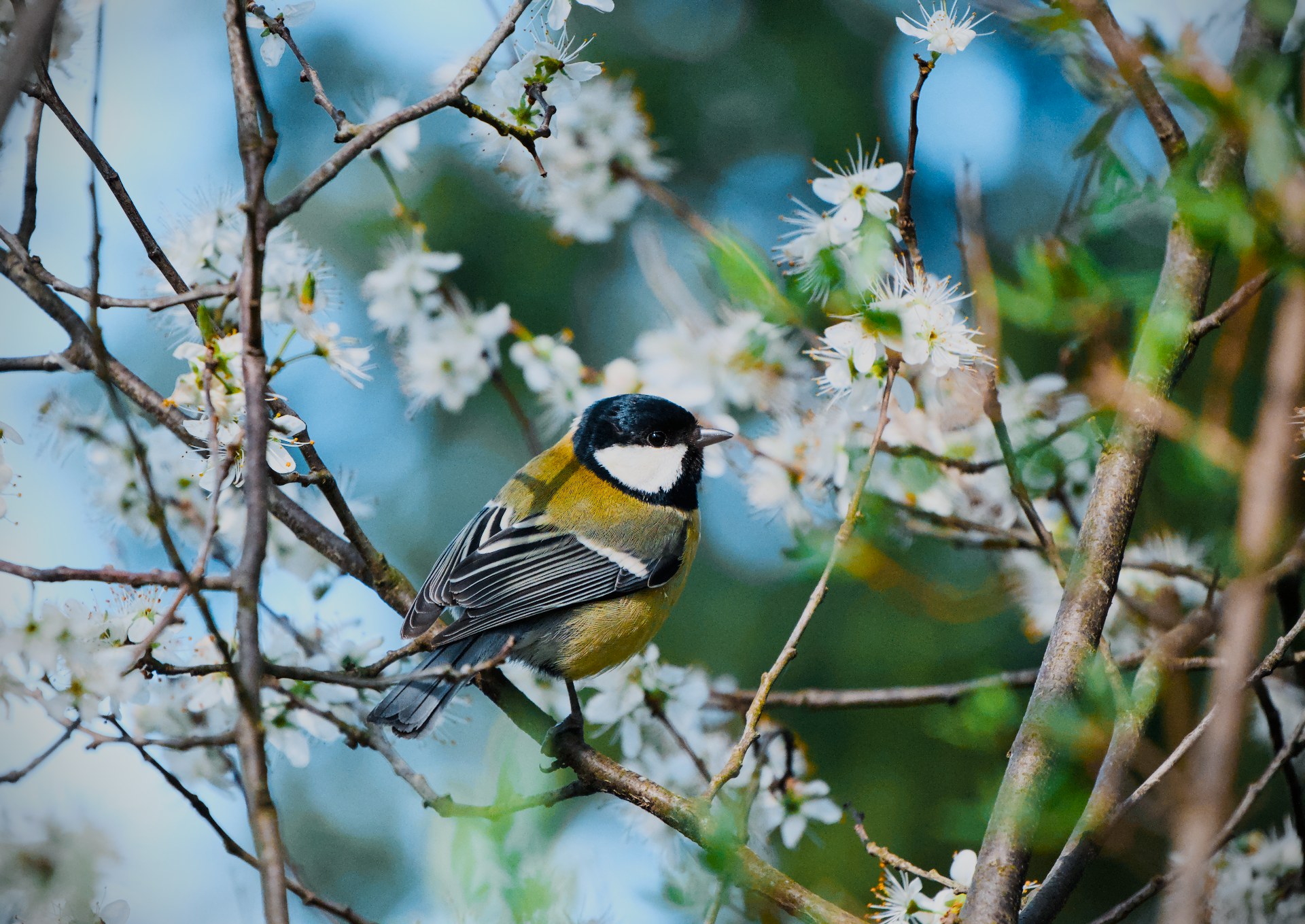
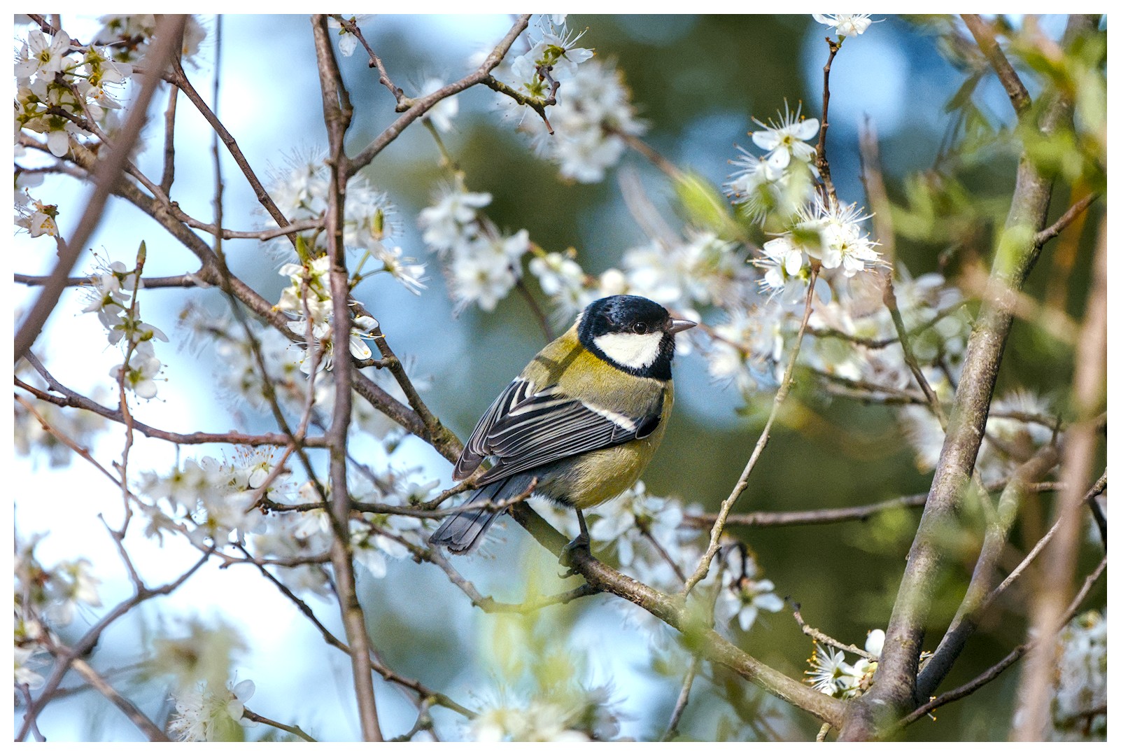
Most of the work was done with the Color eq and Look Up Table for the color work, with some minor adjustments in the color primaries, started the image off with local contrast eq adjustments, then AGX, Capture sharpening and mild exposure tweaks. Cropped and tone eq’d until I had just enough of the tit’s cheek well enough pronounced…and then got to work on the sharpening with the contrast eq, and diffuse and sharpen. Just for a test, I attempted to localize a “light source” just up and behind the tit’s head with a reversed graduated density filter…though it may look funny on other monitors.
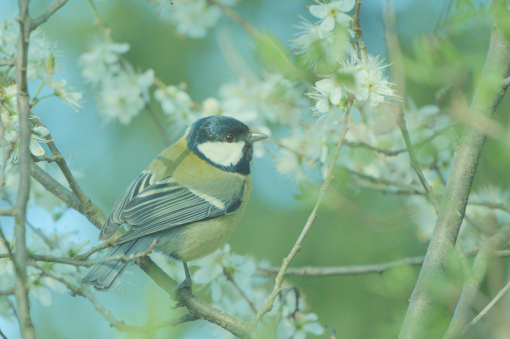
Great shot, thanks for sharing it and letting us handle your tit.
20260314_0007.NEF.xmp (15.4 KB)
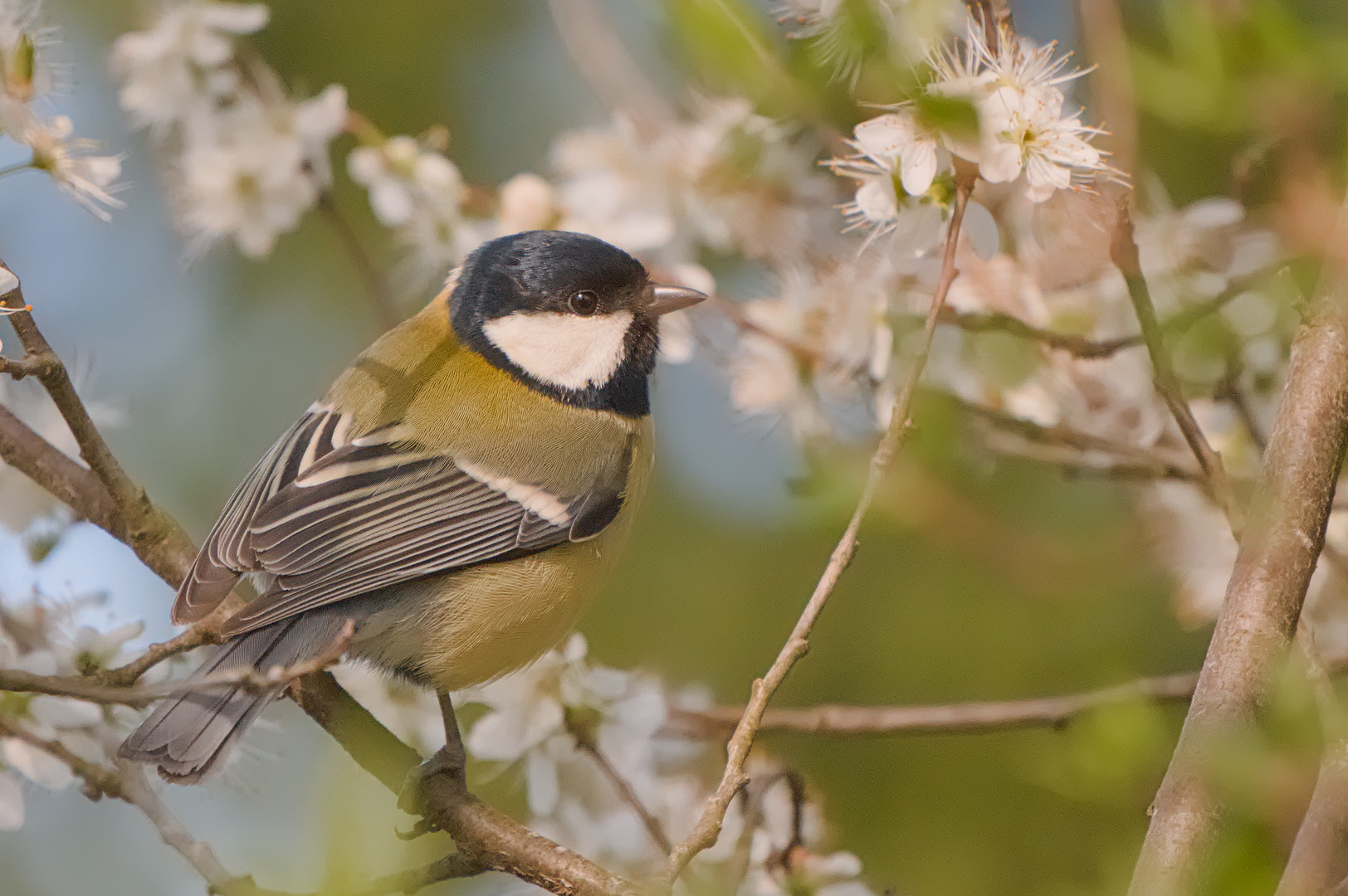
Great shot… a Squeaky Wheel bird! (at least that’s what we call them… think of a neighbour pushing a wheelbarrow down the road).
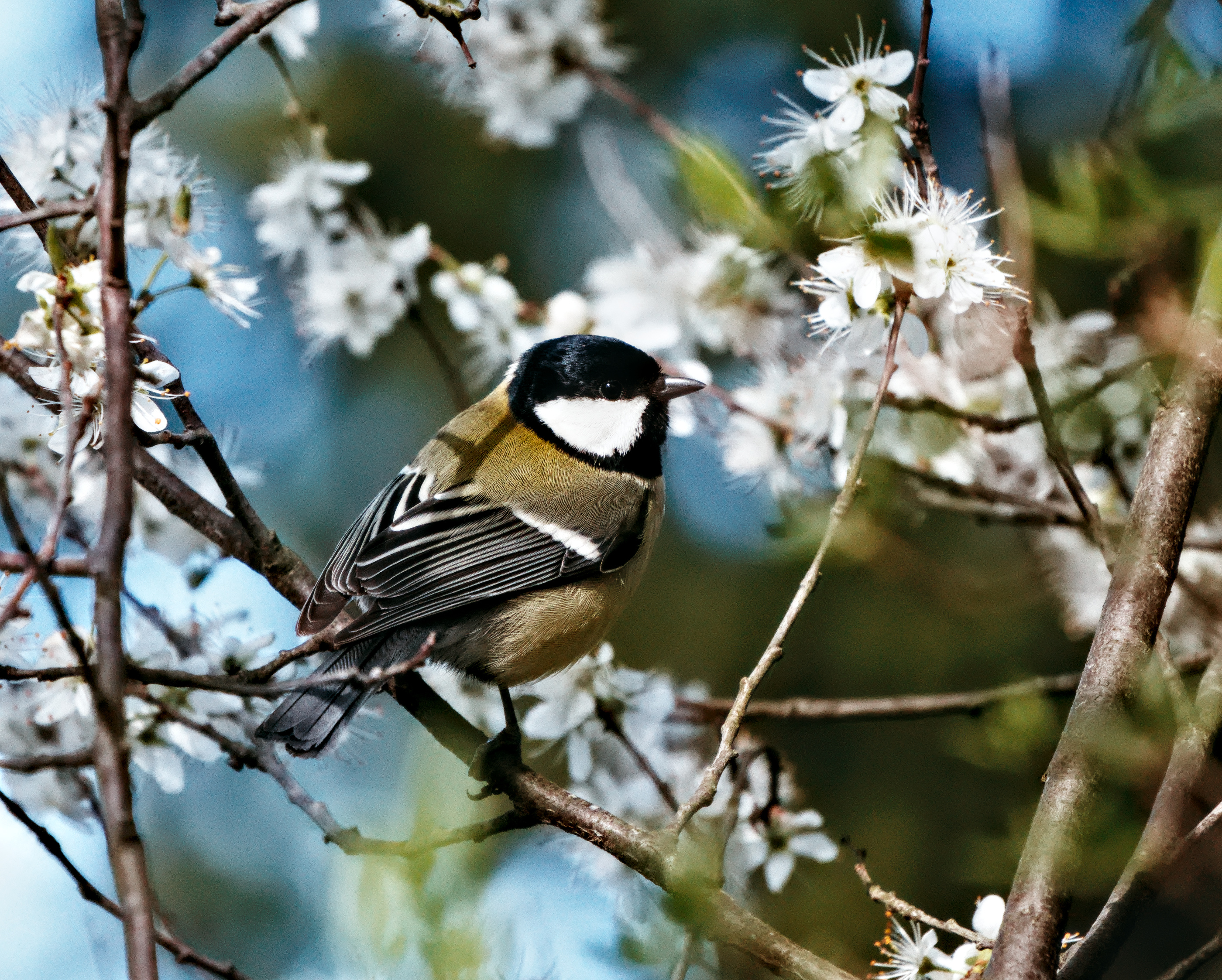
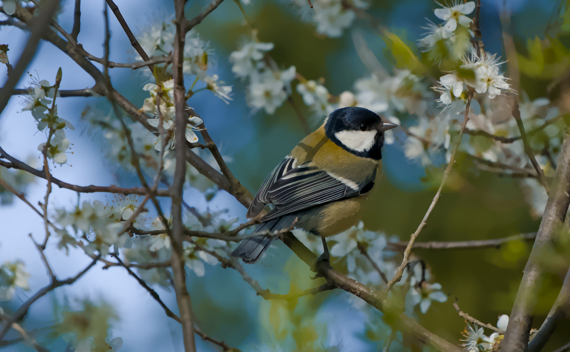
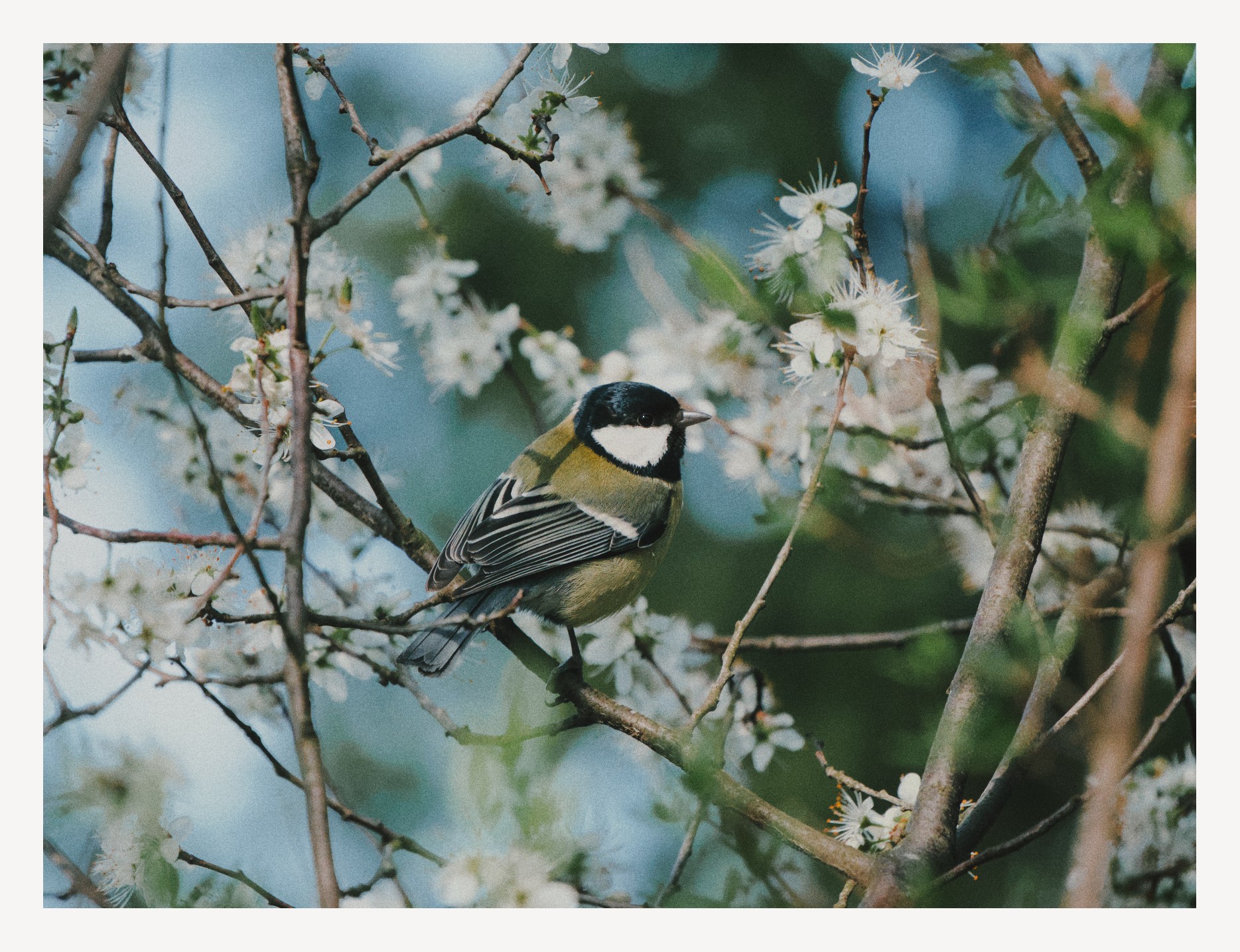
Edit: So I had another go at this, after the first attempt that I now realise I did in an office with no natural light… This one looks better I think/hope…
beautiful shot! My version:
20260314_0007.NEF.xmp (52.3 KB)
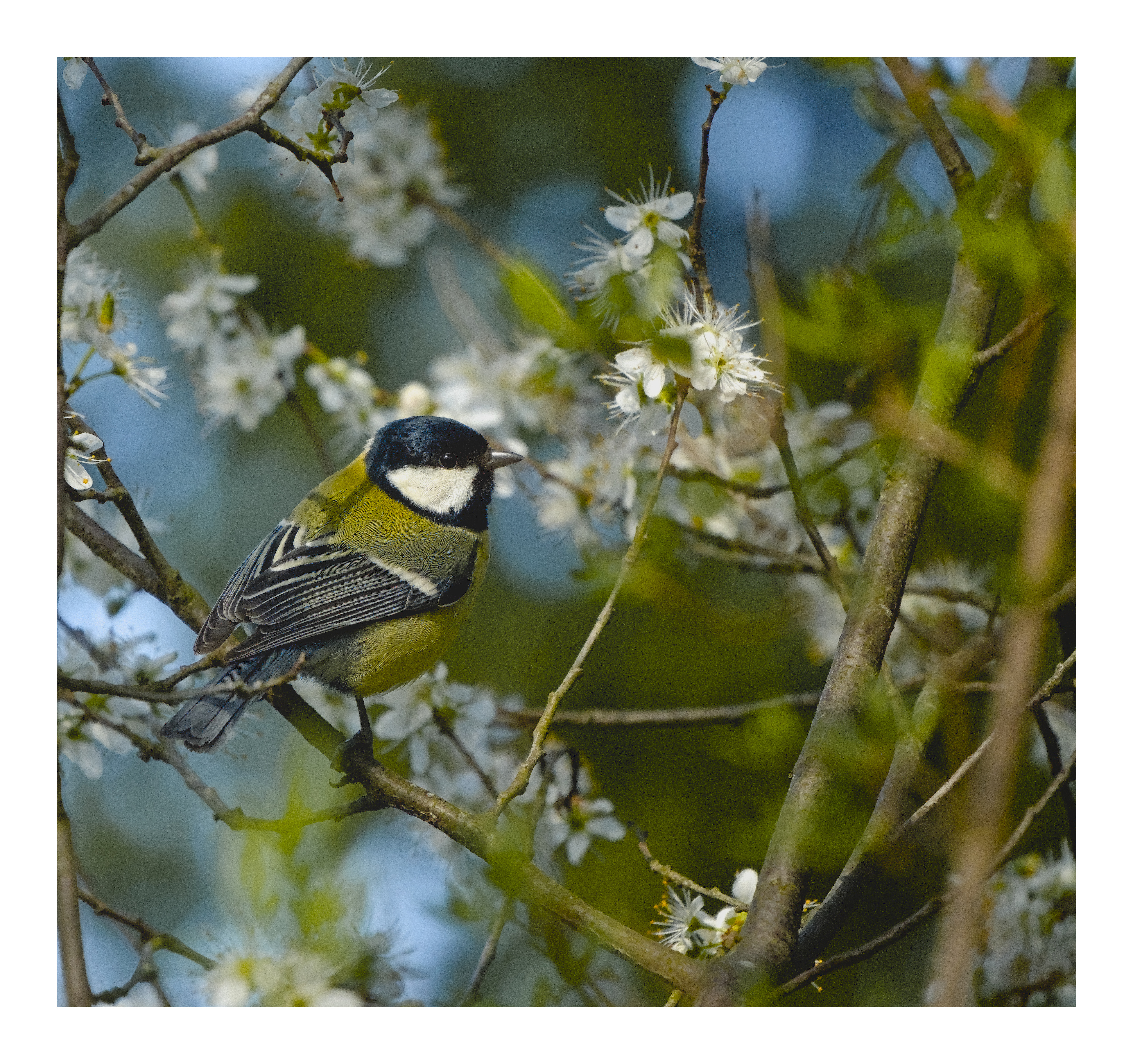
really lovely shot! couldn’t help but want to give it go in my typical style
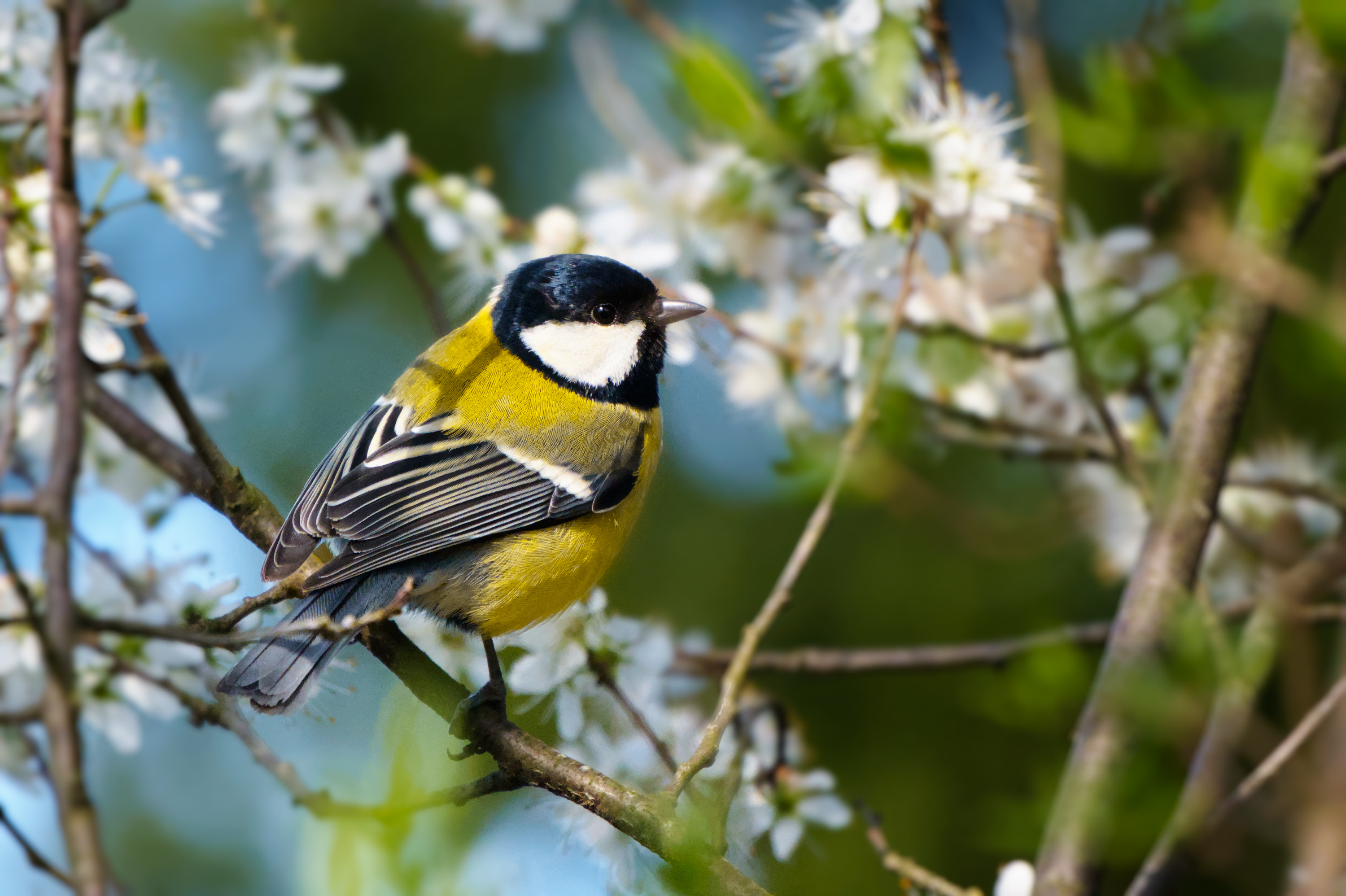
I especially like the more warm and yellow-ish tones @Popanz @AtaraxicShrug and @Alyx came up with. I think that’s the kind of colors I had in mind.
I’ve been looking at all your sidecar files and… oh do I have much to learn ^^" So much modules everywhere x) I’m taking special notes on denoising the background and sharpening the feathers.
Thank you all for these versions!
Hello. I think that your original edit, as well as many other edits in this thread clearly show the the problem you describe as “can’t find natural looking colors for the blue and green”.
For me, this is a white balance problem and I think the fact how many edits here also appear to show a colour cast shows that darktable white balance tools are very difficult to use. I, for one, certainly have no clue how to do so and I avoid the colour calibration module like a plague.
I am not a lightroom user, but I think lightroom’s approach of having temperature (blue-yellow) and tint (green-pink) sliders make white balancing much easier. I replicate this in darktable with the curves module set to independent LAB channels and moving the midpoints of a and b channels up and down VERY gently - usually 2-3 points is enough. This usually lets me get rid of unwanted colour casts.
For example, in here I am nudging both a and b channels up a bit to get what I think is a much more pleasing white balance:
Curious to hear what does everyone else think about darktable WB tools and simple approach to remove colour casts.