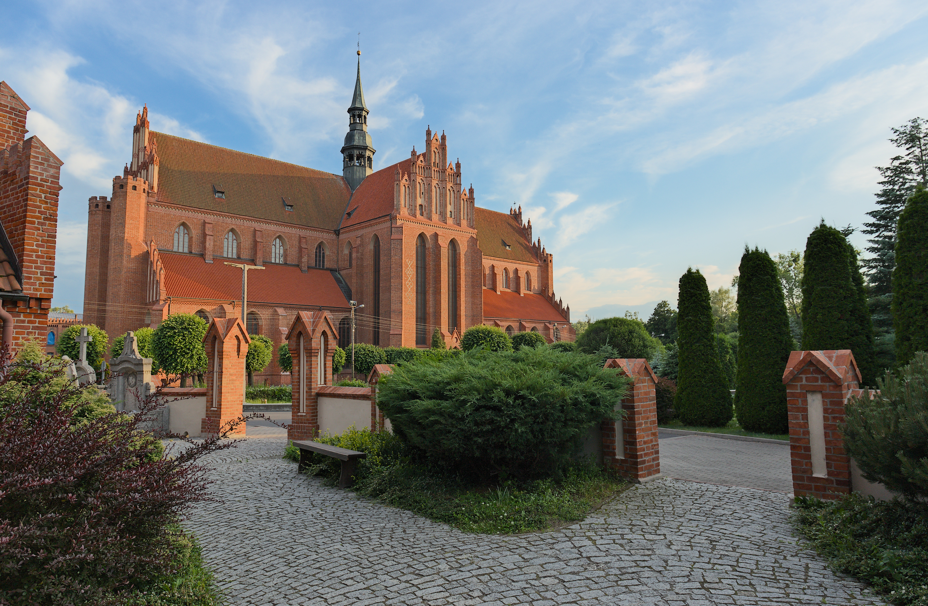
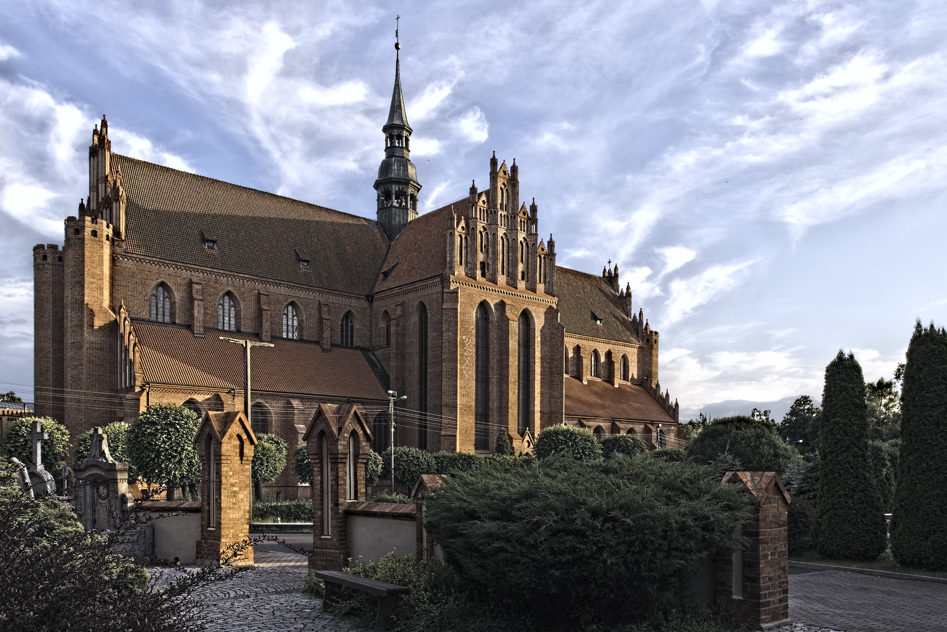
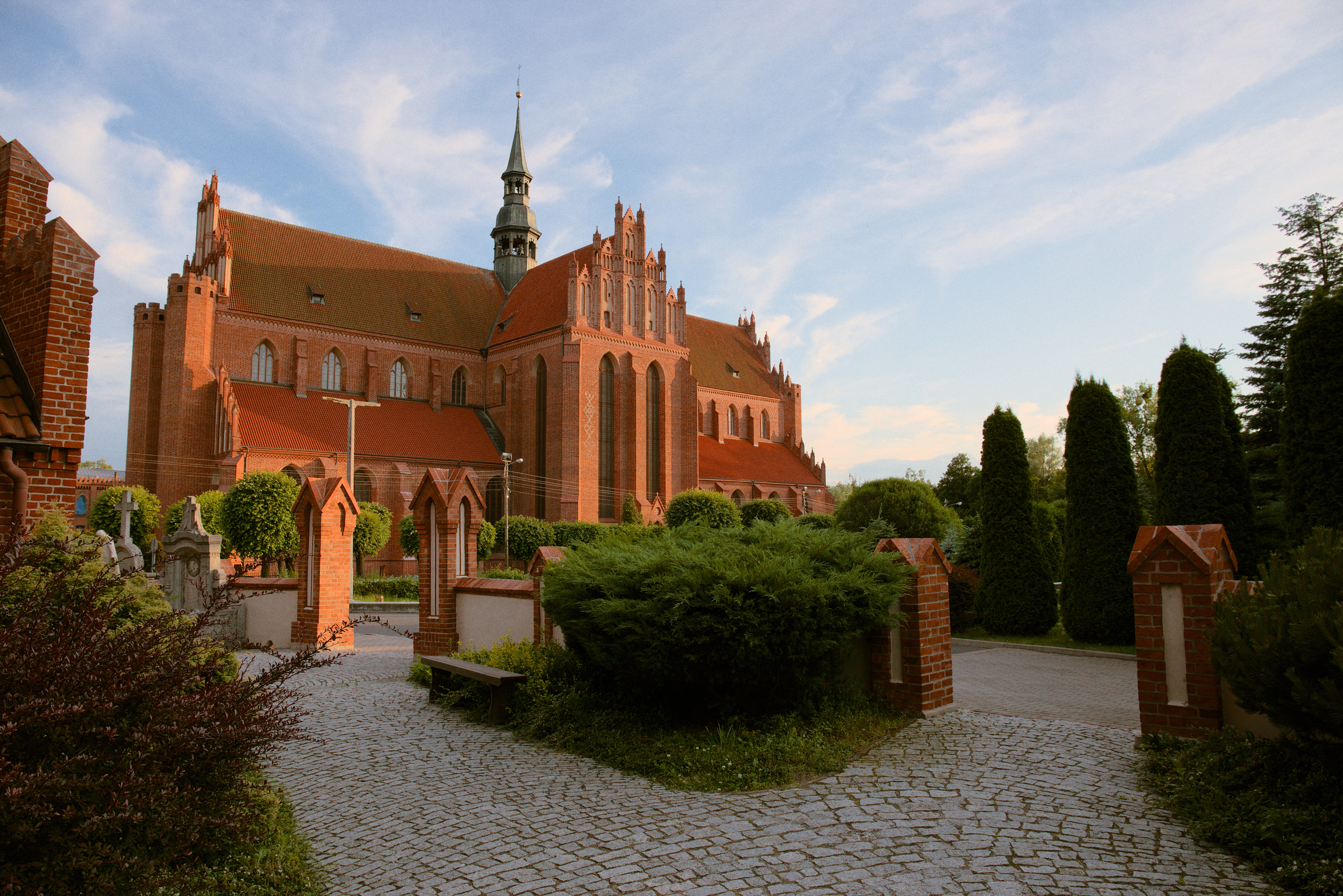
Long story short, my original edit in darktable 3.0.2 display-referred workflow was nice, crunchy-punchy rich in contrast, however, using base curve to give it so lovely boldness resulted in clipped areas, so a lot of masking was involved.
I revisited the image in 3.6.1 scene-referred and it doesn’t look as powerful, but controling white and black point, as well as clipping, was a piece of cake. Notwithstanding, bringing the colours and contrast back to life required few instances of Color Balance RGB + Tone EQ. Still, the image is not as lively as my original edit
Some like the more punchy version, others that calm one, and some would like to have something in between, so… do your thing
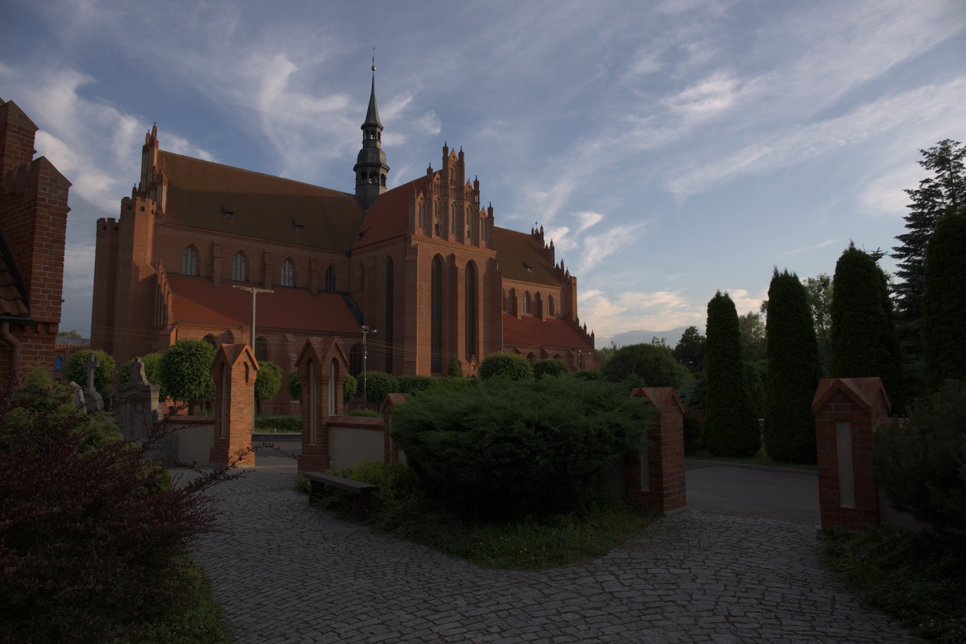
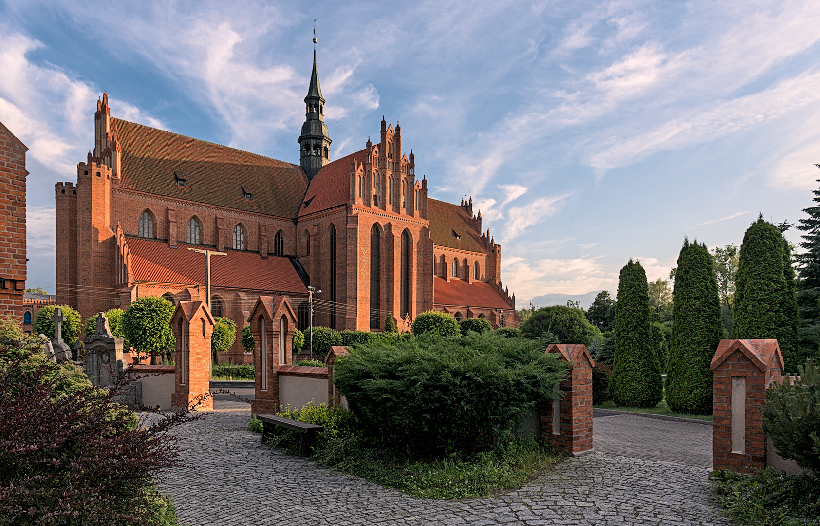
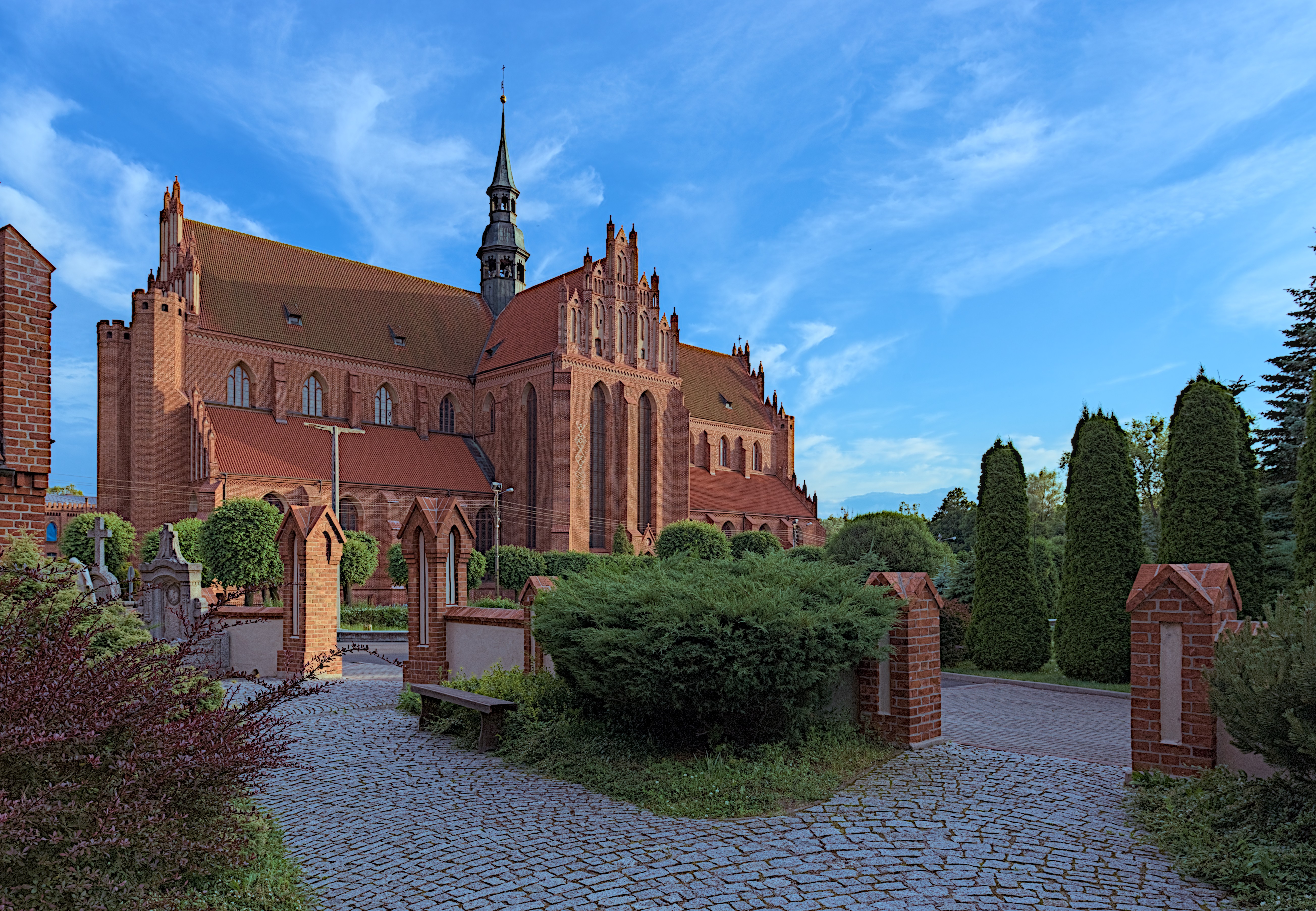
Three exposure values made in UfRaw. One standard, Second to avoid clipping of highlights, the third to avoid under-exposure in the dark parts. Blended with Enfuse. Scaled in GIMP.
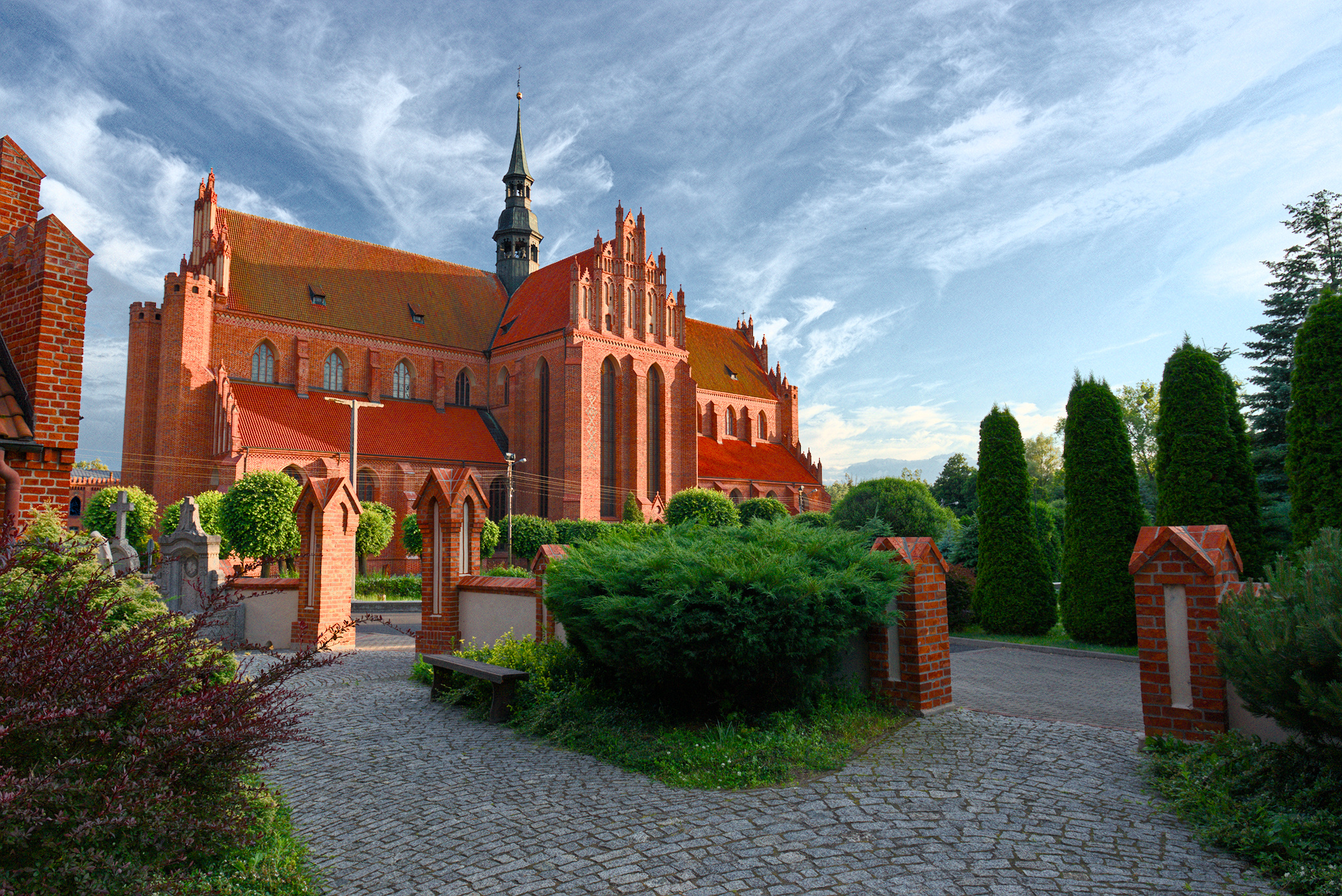
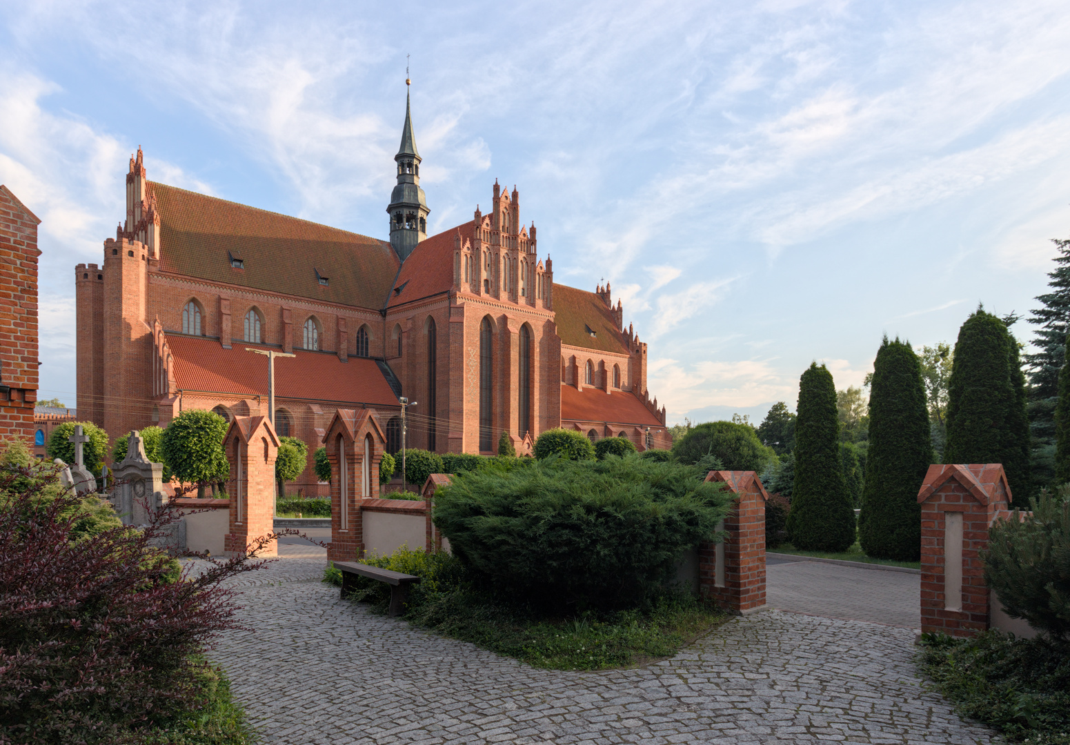
I think you should reconsider and go for a softer more subdued edit. Looking at the “raw” I think you have very good ingredients and should cook them very gently.
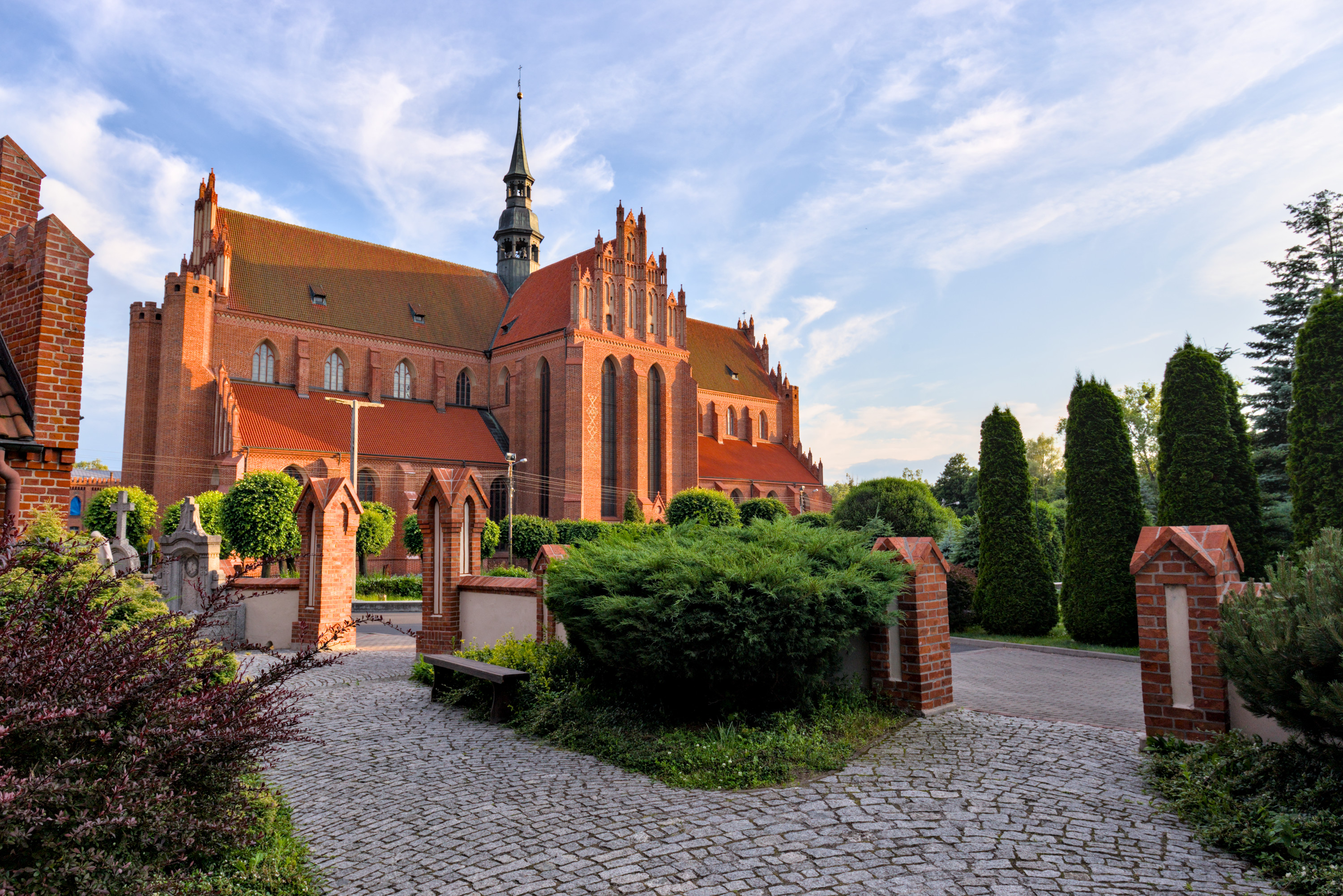
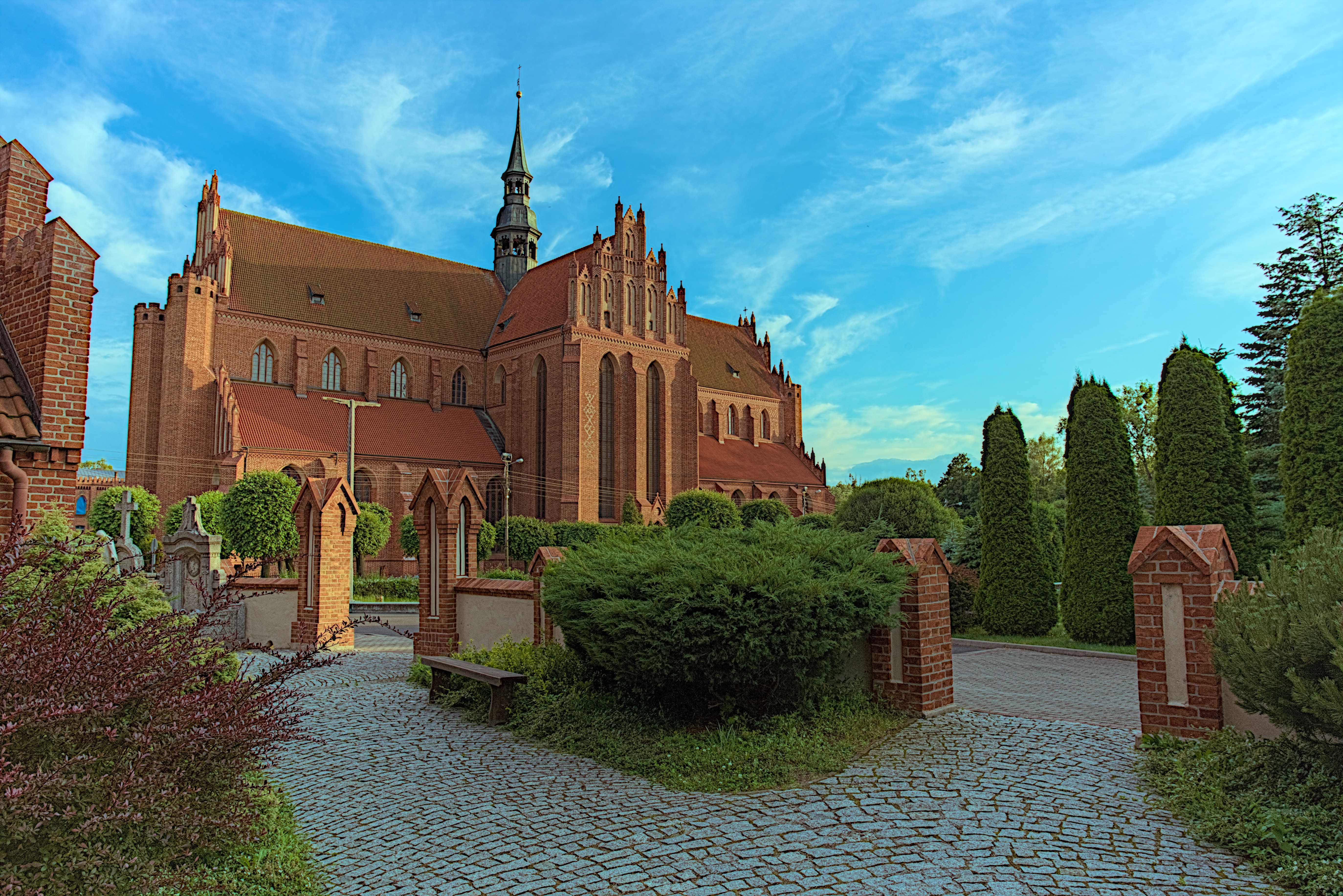
I tried to get back details in the sky. This rendering is more colourful / contrasty / has more ‘detail-enhancement’ (local contrast and sharpening-like operation) than I’d normally use; I don’t know if this is something like you’re looking for.
So many responses and different looks to choose from - thank you for that and nice words, as I see some of you must like my picture quite a bit
As for @kofa 's question, indeed, having my past experience, I tend towards that punchy and lively look. So far your edit, and that made by @baongoc124 warm my heart, becasue they say: “Yeah, it can be done in scene-referred!”.
I see that great deal of that powerful look from @baongoc124 lies in the “Color calibration” tab, very informative!
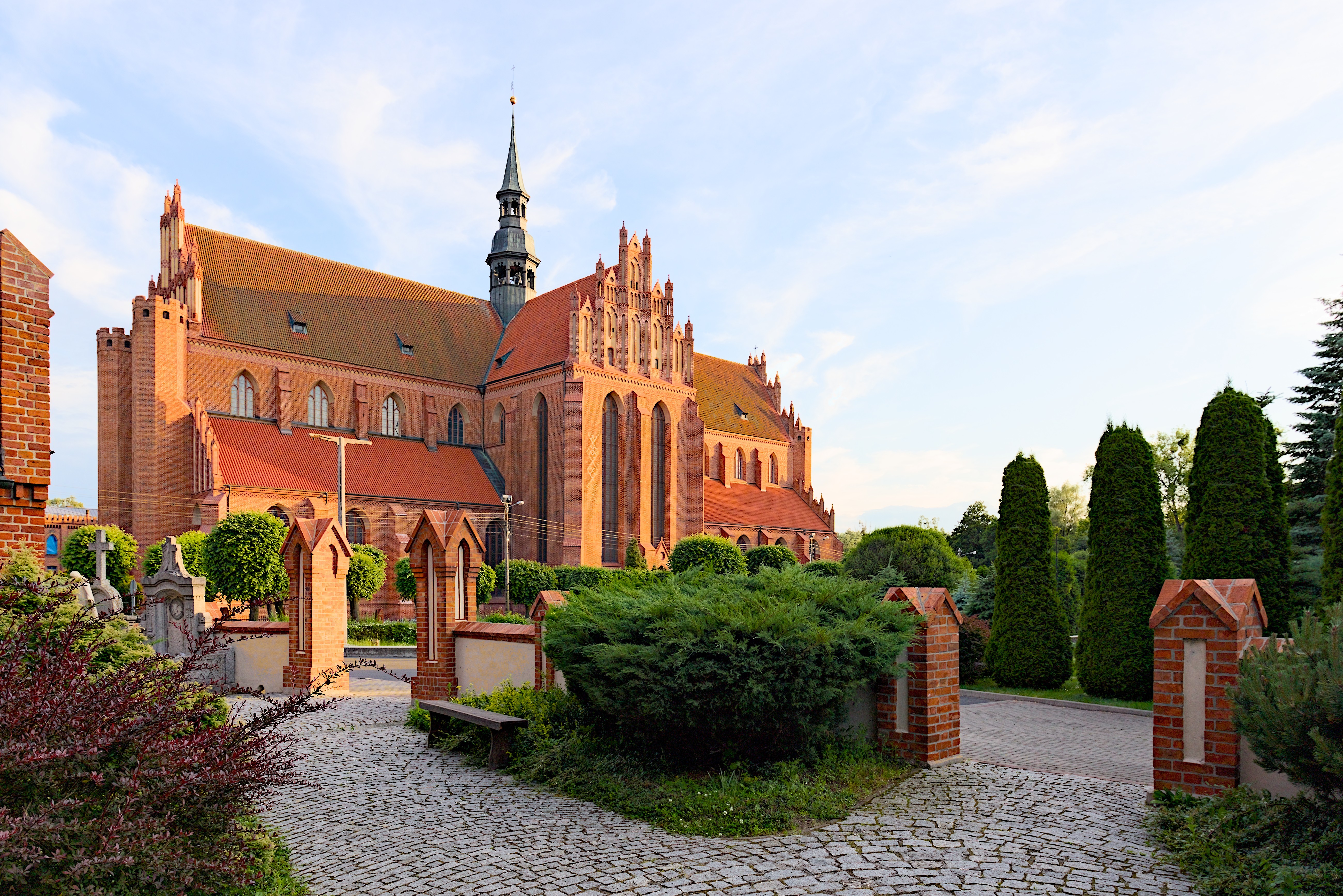
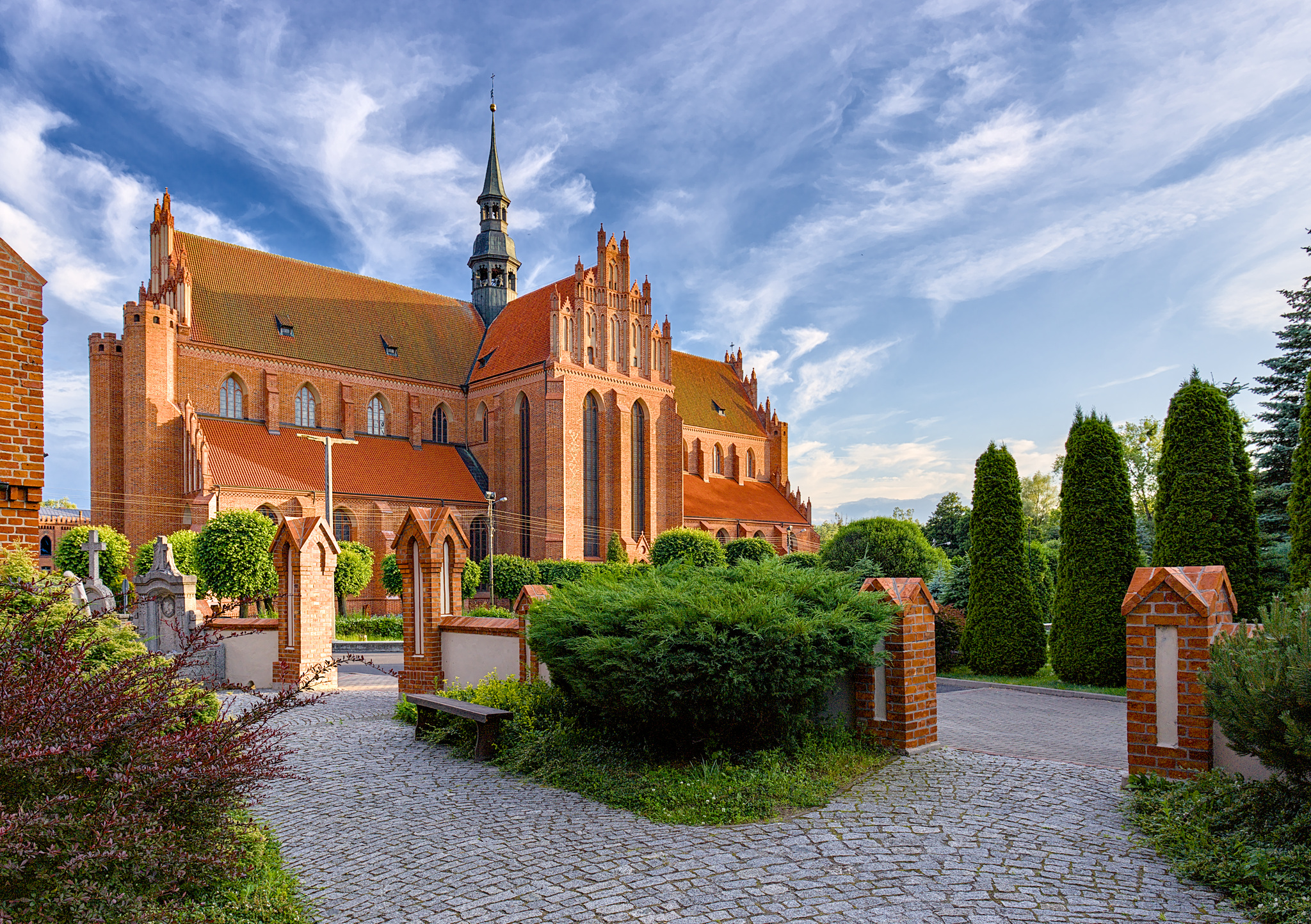
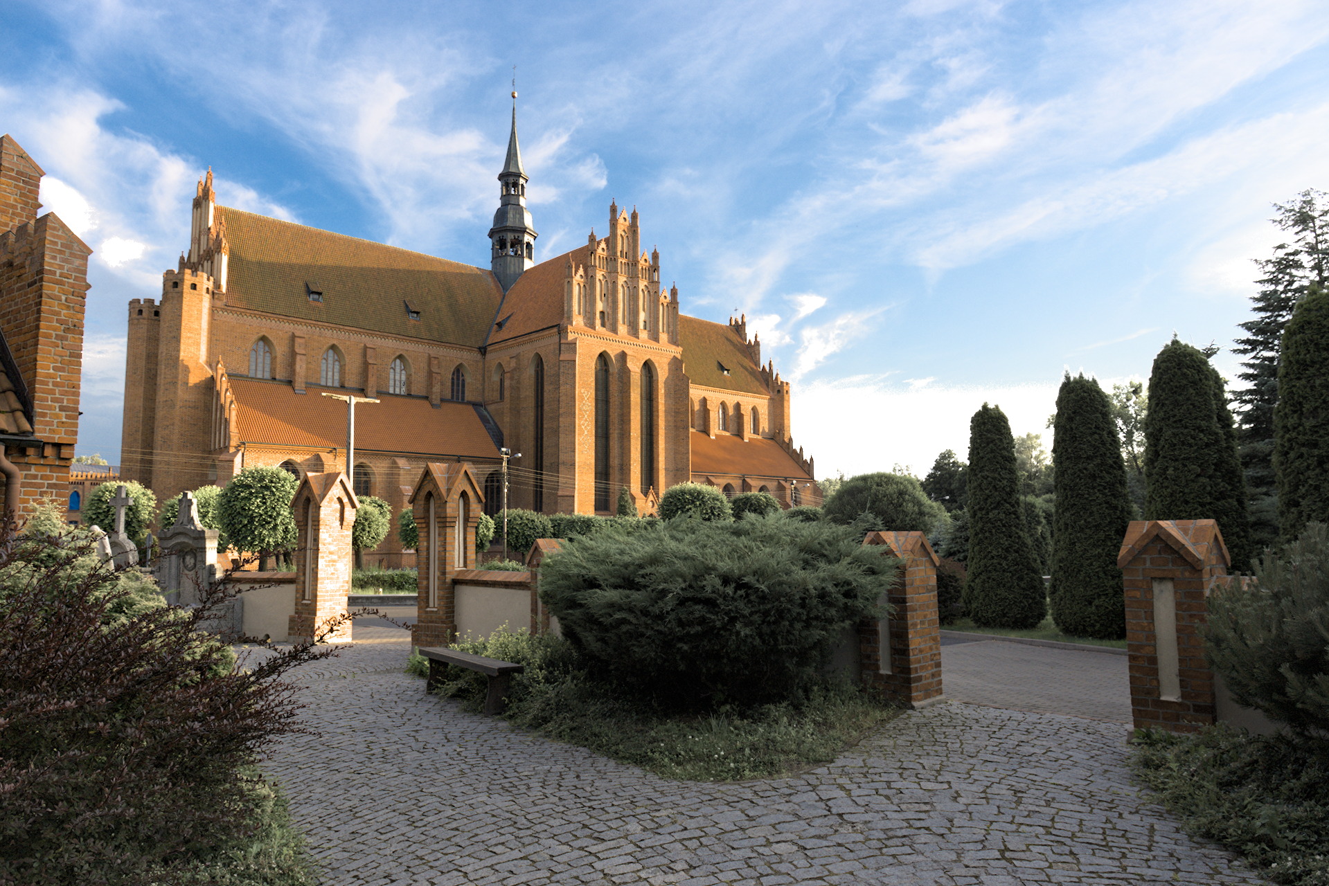
All the edits have something to offer…not being there the raw gives me the impression that its a bit later in the day…one problem I see is gauging the correct amount of shadow on the roof which I think is important…in the edit by @baongoc124 I think that has been altered a bit too much, ie almost removed…but maybe the shadow is not as strong as I perceive that it should be…though it seems like a pretty strong shadow in the foreground and lower right quadrant…I think you have captured a photo that lends itself to punchy HDR really easily making it almost harder to make it more realistic as that could look drab in comparision…
I much prefer the color/saturation level that you have landed on in this edit using your style but I do prefer the detail of the first one…maybe not so much even with the sky but on the bricks/building…there is a lot of detail that can be had noted esp in the brick gate posts the one just left of center…some edits have blown it completely and others have considerable detail…I guess just reinforces the great thing about having access to a raw file that you are far more able to bend it to your individual taste…actually of the lot including for sure my own I prefer the tonal look of @arturoisilvia 's edit…other than for me the foliage is a bit stark but I love the deep dark shadows on the building… @gaaned92 's edit is a bit the same…in how it treats the building…