Here’s a short tutorial on the using the development version of RT for colour negatives. I would certainly welcome corrections or suggestions from @rom9 and @paperdigits.
Before shooting the negatives, set the camera white balance to the light source, in my case this is an LED light panel.
Important note: Do not use the white balance eyedropper tool in the top left of the screen. It’s not meant for negatives and will revert the image to a negative. Instead, you can use “Pick white balance spot” in the “Film Negative” tool under the color tab in the right panel.
This image was processed without using the adjustments available in the “Film Negative” tool, although there are times when the sliders and “Pick white balance spot” are useful. I rarely use the “Pick neutral spots” because it’s hard to find two neutral spots (one lighter than the other) on these historical negatives. If you’re shooting film, however, you could shoot a gray scale or Macbeth chart with each roll to get these neutral spots.
Slide 1.
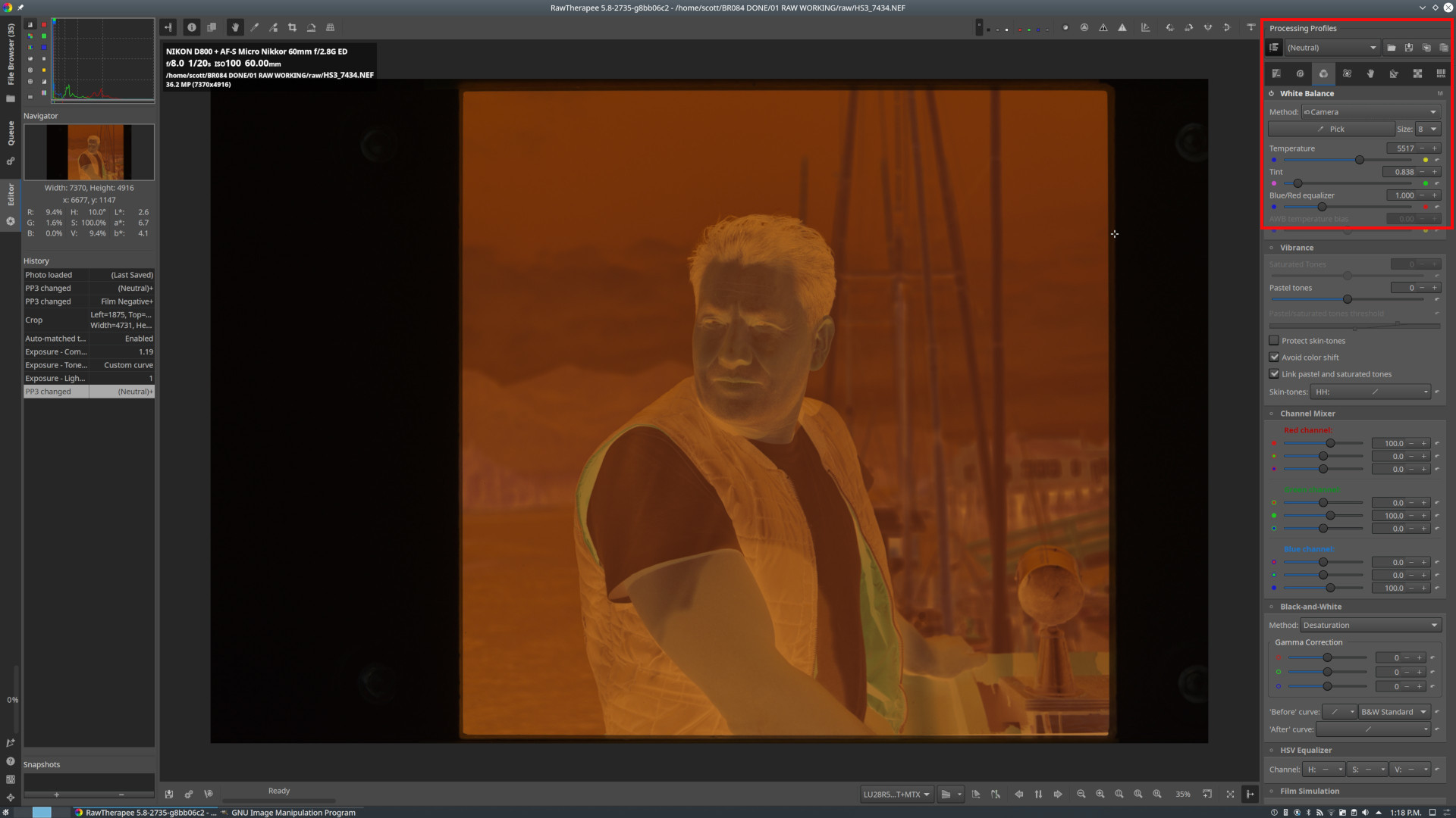
At the top right of the screen the White Balance is set to “Camera”, which shows the color temperature and tint of the light panel. Don’t adjust this.
Above that, where the screen shot says “Neutral”, press that and navigate to “Bundled profiles”, then “Film Negative”.
Slide 2.
“Film Negative” is selected. The image is now a positive, but needs to be cropped and is too dark.
Slide 3.
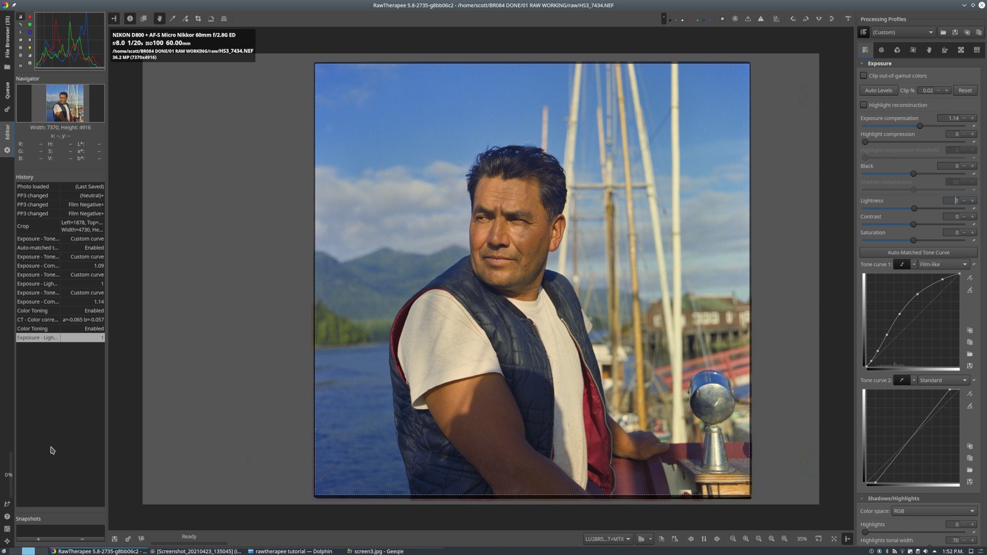
Adjust the “Exposure compensation” slider so that the histogram in the top left of the screen is approximately centered.
In “Film curve 1”, try “Auto-Matched Tone Curve” first. This can also be set manually if it works better for a particular image.
In “Film curve 2”, move the bottom left and top right of the curve so that the histogram in the top left of the screen goes to the left and right edges, without clipping.
If needed at this point you can make further adjustments to “Lightness, contrast, saturation” and “Shadows/highlights” if desired.
Slide 4.
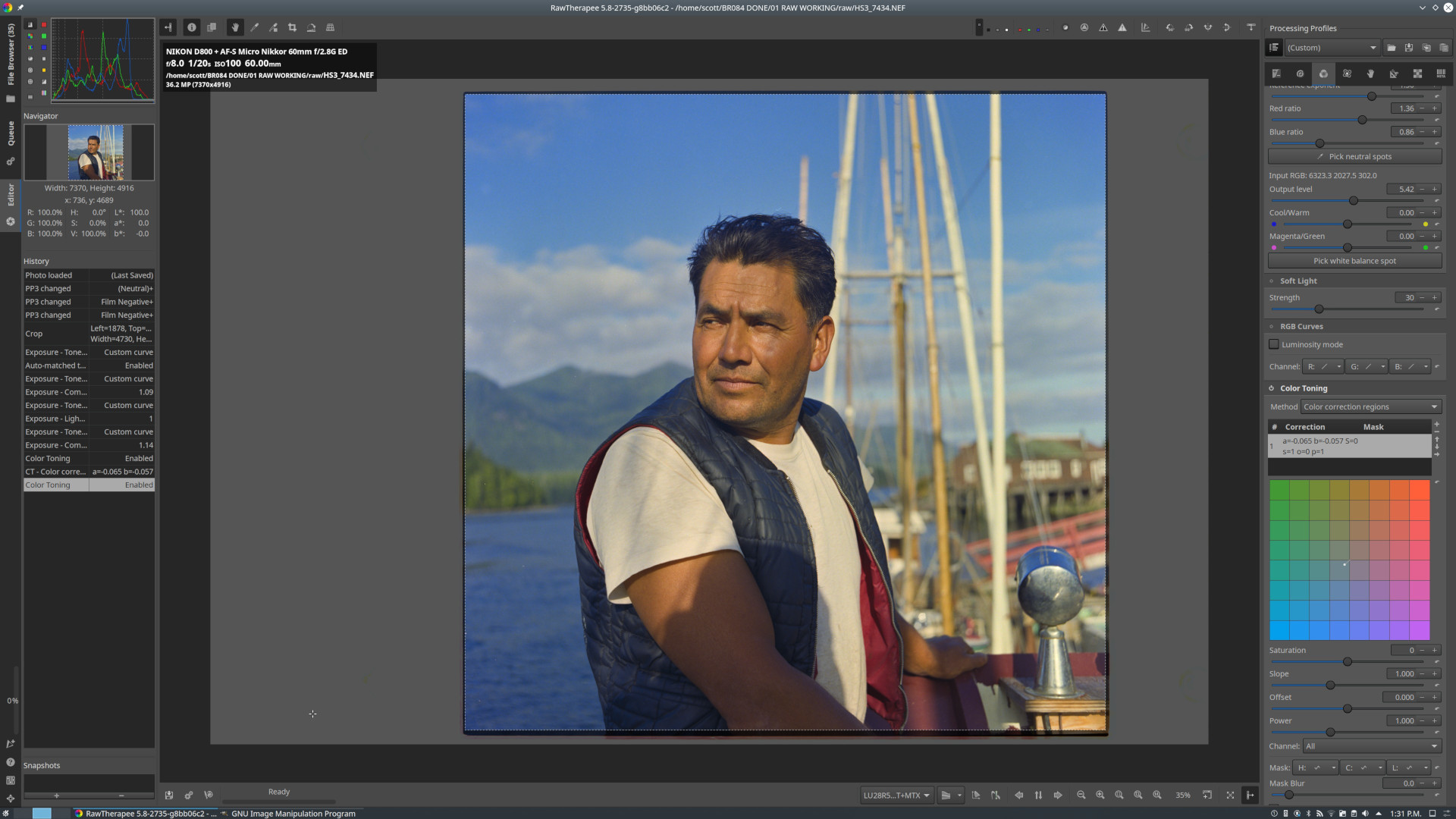
The photo was taken late in the day with warm light. I wanted to preserve that, but I used “Color Toning” to cool it slightly.
Final version. I brightened it a bit more in curves and increased blue in the highlights, then in Gimp cleaned up a few specs of dirt and added a bit of sharpening.