I’ve been looking at some photobooks taken on color film and I really like the color space and look of the images. How could you go about recreating the look of color film photography with raws in darktable?
@s7habo has some videos on achieving film looks.
One option is using a LUT. I have several LUT that come close to the classic film look. What color film do you want to mimic?
Nothing in particular, I’d be interested in taking a look at anything you have to show.
This is quite nice.
In macos where can you place the .dtstyle file to have it appear in your styles menu?
I think the installation guide should also work under macos.
Had you seen this??
Check site like (for Kodak LUTs):
https://uppbeat.io/luts/asset/cinematic-kodak-lut-pack-4934
Which film look are you after?
Remember with LUTs it is very important that you have processed the photo correctly first. Correct white balance, correct colours, correct exposure.
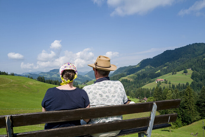
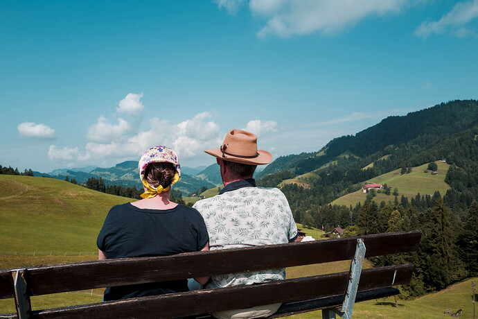
Example for the Kodak Elite Color 400 film:
Without LUT:
With Lut:
You have to import it using the styles module.
Getting a film-look usually revolves around changes in the following areas:
Color Shifting
This is a technique that is used to move individual colors closer to their film stock counterparts. Generally, this is accomplished in the Color Equalizer module. Some examples: In the Hue Tab, shift blue towards cyan, green towards yellow (most daylight balanced film stocks are shifted in this direction just a little) or toward cyan (another common color shift), red toward orange, etc.
Color “Space” Compression
This is more of a broad-spectrum adjustment, and I have found that this can be achieved in the Primaries RGB module. Generally… shifting red towards orange, green toward yellow, and blue towards cyan, will cause all the resulting colors to “compress” towards a complementary hue distribution. This can be seen quite nicely with the help of the vector display up at the top right (it is one of the options, along with the regular histogram). This is not as drastic of a change as using the Color Equalizer module to do individual hue shifts, but can be more natural
Tone Mapping
Tone mapping is a process of taking all of the image data available during the editing process and squishing it into the proper format for the target display (print, digital, generic, etc.). This often requires specifically compressing or just truncating the portions of the image that are too dark or too bright, so that it can fit within the ouput media.
In darktable, the tone mapping is exposed to the user. We have various options for this, but the most recent addition, the AgX module, does the film look very well. The fastest way to use this module to get a film like shadow and highlight behavior is to bring up the target black to 0.25-0.75 to give it the faded blacks look that film has, and then to bring down the target white to 99-95 to give the softened look to the ultra bright areas. You can also reduce shoulder power and increase toe power to emulate the characteristic curves of film.
Grain
Use the Grain module. It is fairly simple, but don’t go too crazy ![]()
Highlight Bloom
Use the Diffuse & Sharpen module with the bloom preset (found under artistic effect/bloom), and then dial in the uniform mask to modify the strength of the affect.
Contrast/Softness
Open up the Contrast Equalizer module. Reduce the middle points of the eq ever so slightly. Use the mix slider to make this dial in the affect.
Etc.
There are other areas that can be modified to help get something to look like film, but these are the main methods I use. I know a lot of people use luts, which is cool, but I haven’t ever used them. I also just enjoy having extra freedom to move the colors around myself ![]() Have a good time editing!
Have a good time editing!
I try to think about what film is doing and try to emulate this.
It’s 3 mostly interdependent layers reacting to light in a non linear way
So i would say this is the “RGB curves” but this curves would need to be manipulated in the films color space.
Then It gets Inverted and the same thing happens with slightly different curves but now in CMY(k) and not RGB.
And then there is things like Halation
If you are curious you could take a look at ART. It supports 2 film simulations external programs: AgX (not the one in DT) and Spectral Film Simulation. A bunch of Kodak and Fuji films/papers are available to choose from.
I strongly recommend using the spectral film simulation ctl script in ART or the film som in vkdt that is based on the agx filsim.
Most other luts and recipes are considerably less good.
Not a great option for color photography as it has the same limitation as Lightroom: It only offers monochrome grain. Also, grain should come after any upsizing/interpolation in the processing order, which darktable does not support without round-tripping.
I think halation is the most interesting property. I’ve tried simulating it with D&S, but failed. I can recommend taking a look at the properties simulated by Filmbox (even if not all of them apply to stills).
Right now, the best open source film simulation is probably in agx emulsion by @arctic, which has been ported to vkdt by @hanatos.
Can you explain this more? Are you saying that idealy grain would be added after the output module in darktable? like on export?
Halation is very cool, especially for nighttime shots, but adding bloom with D&S can be really good at simulating the way details get blown out in film. I would just say that it is very easy to overdo it.
Adding grain after upsizing is really efficient way of masking any interpolation artifacts. Upsizing after adding grain (like darktable does now) is really good way of crapifying any grain simulation. vkdt can do it the right way.
The problem is that it does not shift color. Diffuse or sharpen can go a long way when it comes to simulating a mist filter (an optical effect), but is does not simulate film halation.
Where in darktable does it upsize the image? I know you can choose to upsize in export. Is that what you are talking about?
I know bloom and halation are different things. I don’t much worry about halation, because it is not a look that I generally need for my photography. I do like to add a bit of bloom.
Yes.
Maybe merging only the red channel could provide an approximation?

