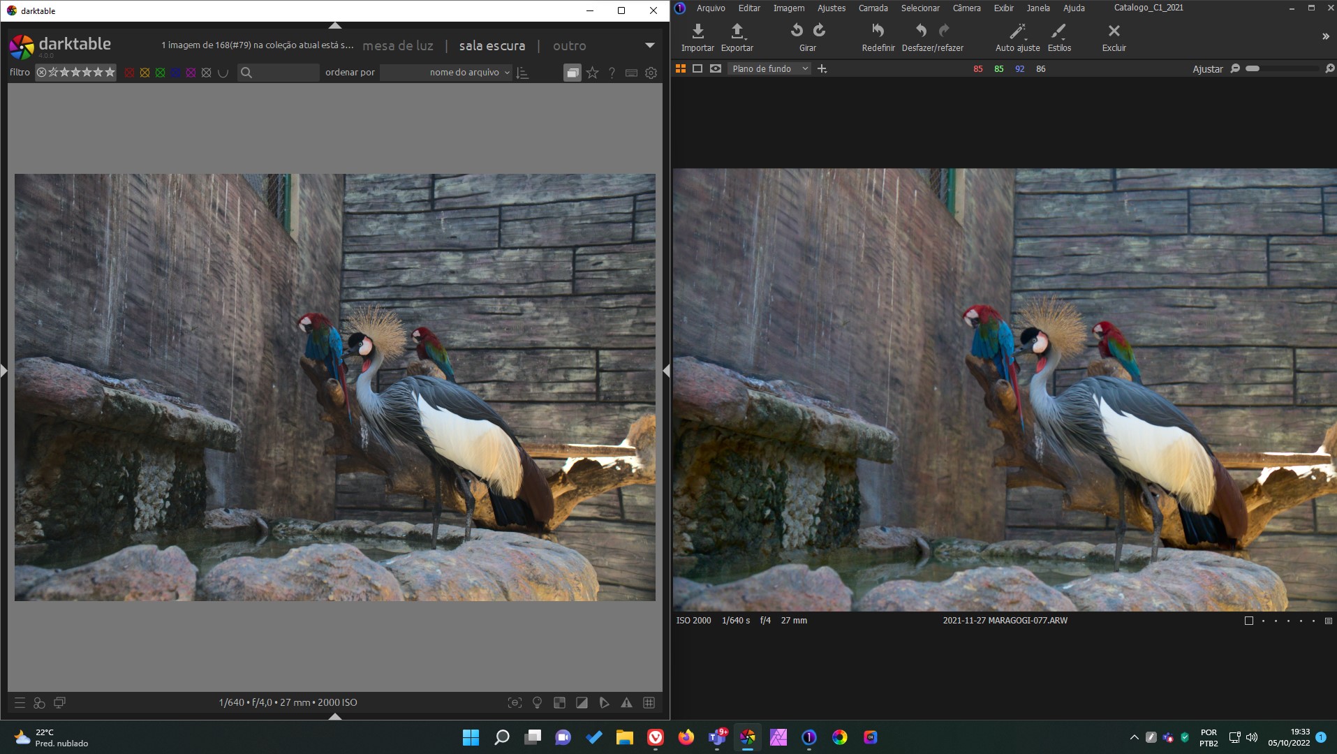
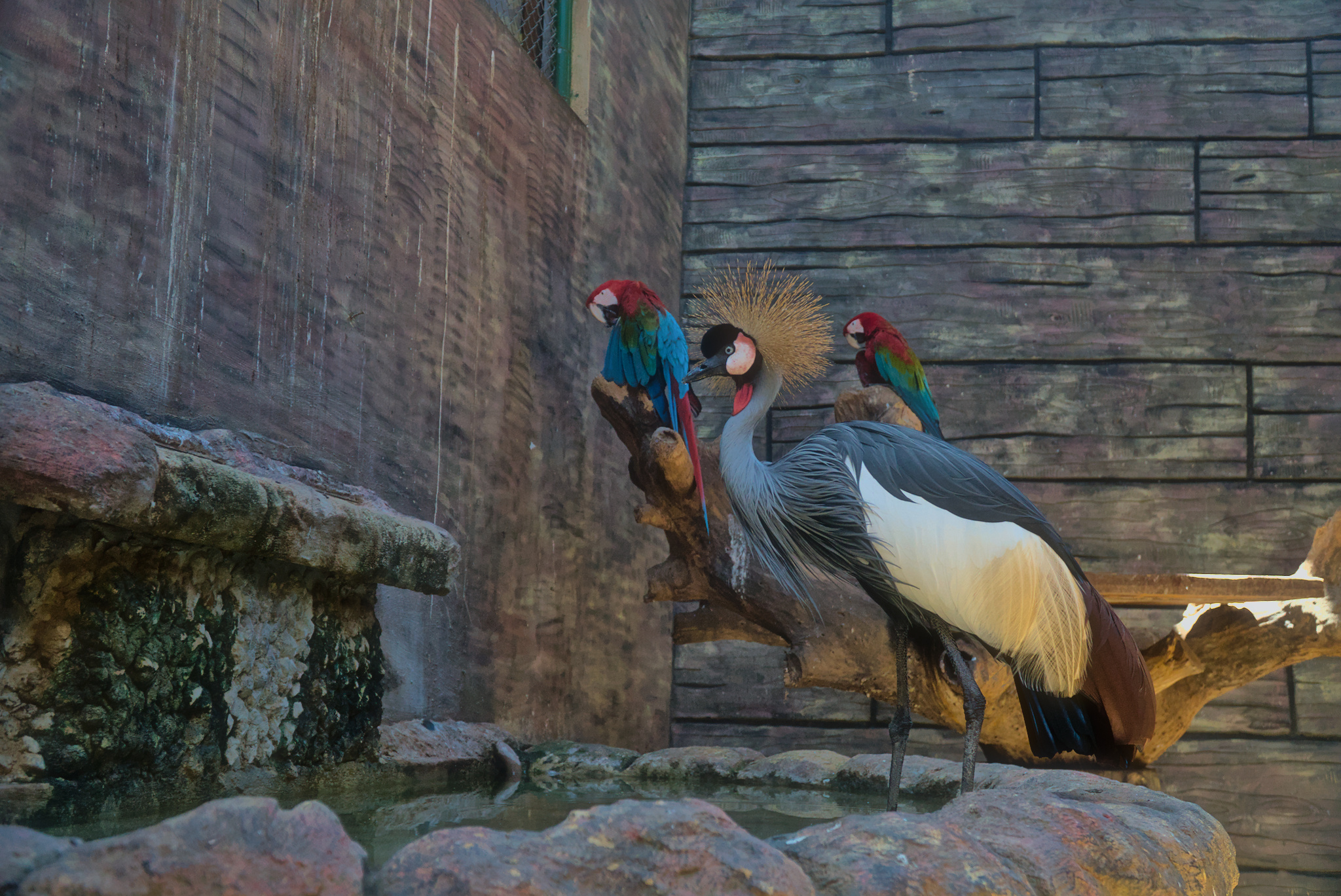
Friends, according to the attached image, the colors, contrasts and definition of my RAW file (sony A6300, ARW file) in Capture One are much more beautiful than in DT, even after applying the base curve module. Someone knows how to improve this?
It looks like Capture One has a better reading of the RAW file.
Note: in the attached image, I made no adjustment. They are in the way they are opened by default in each software.
In addition capture one does some processing to the image it doesn’t really tell you about. I’m sure C1 has also tuned their ICC profile to either be pleasing or to try and match the SooC jpeg. Darktable does none of that.
In the attached image, there are two comparisons. In the first, the files as they are loaded. In the second, I created a preset in the DT to try to simulate the treatment applied by C1, but it was not very good …
Try this approach for a base…if too punchy then dial back opacity. Add to taste in additions… lens correction and denoise and sharpening as you would like and maybe you will need the tone eq if you have deep shadows or some highlights to correctlll
You will need to be aggressive with DT for exposure and tone and color…
Save yourself some time and upload a raw…you are allowed… just add a creative commons license so people here can edit it… This will quickly show you how people use the software and what can be achieved…
Also accurate is not the technically correct you are asking for a match to C1 which is known to do a pretty good job but unless everything in your pipeline with any software is calibrated then there is no guarantee of any accuracy…simply changing one of the color profiles in any raw editor can drive the color to point where it may be pleasing to the eye but not really accurate at all…
This is common…search playraw on this forum…you will see all the threads…many raw files and tiffs are larger… of course no one goes out of the way to make files larger than necessary but that is perfectly acceptable…
Nice. Direct uploads are fine One last thing you just have to add the cc text stating that you allow others to work on the image. explained here… Hopefully collectively the users will help you attain your goal of a good starting style. PlayRaw stuff to keep in mind
Downloaded your raw and loaded it in my hack software to look at the “linear” data before discretionary processing, and that is consistent with what you’re seeing for the darktable starting point. I had to add a tone curve and some color saturation to make it look like the Capture1 rendition.
Very few softwares let you look at the raw starting point; they start you off with “look-good” processing that you then fight with doing what you want.
FWIW… I don’t have C1 so cant try to match that…but basically a very std edit mostly defaults gives the results below…included is your raw untouched exported, extracted camera jpg, edit using basic recipe mentioned above from Mark Adams …onecameraonelens… and a fourth one with the CB module disabled from the edit…
I threw in something I do to make some of the edits less harsh/sharp: Soften module is great in small doses IMO, darktable can look overly sharp compared to CaptureOne or Lightroom. Not that I mind it, I’d rather start with a sharp image.
Anyway, I got it pretty close to CaptureOne in 10 or 15 minutes maybe, starting from scratch. Maybe slight Chroma/Saturation adjustment to taste needed.
2021-11-27 MARAGOGI-077.ARW.xmp (7.1 KB)
Here’s a style you can apply which should come out like the jpg above, as long as you apply it on the darktable default image. base curve must be disabled (as it is by default if you have the ‘auto-apply pixel workflow defaults’ set to scene-referred in the preferences). test_style_to_match_C1.dtstyle (3.3 KB)
You can import the style through the styles tab on the right in lighttable view.
All this is assuming that you like my version! Which is not quite the same as C1 but to me looks similar.
Edit… just adding that all I used was filmic, colour calibration, local contrast and color balance rgb. (As well as the default modules of course)
Others have skillfully demonstrated that darktable can achieve good results.
I’d just like to add that the title of the post is ‘How to get more accurate colors in DT for Sony)’; yet, you write
Beauty is not the same as accuracy. In general, our eyes are attracted to contrasts and saturated colours.
One point that I would like to mention: images for me look more contrasty and saturated on a black background like in Capture One, than on the middle grey background of darktable.
I sometimes cycle through black, white and grey, and each background gives a different perception.
you asked for accurate colors (at least that’s the caption of the thread)
Can you explain, why you think the poppy colors are more ‚accurate‘ than the flatter darktable ootb processing?
If you want that color rendition you might define a colorbalancergb preset with increased vibrance and contrast based on colourful preset. And then let it be applied by default


 Which is not quite the same as C1 but to me looks similar.