Hue of colors from RawTherapee with 90D seem wrong

Two years ago, I made a post complaining that I was not able to reproduce the color tones of my Canon 90D’s JPGs using RawTherapee on my raw files. I was given a lot of good tips, and have improved my raw editing since, but over time, I have also become convinced that something is off with the colors of my photos. I just installed the new version of RawTherapee which promises better color profiles for a variety of cameras, including the 90D, but I was unfortunately left disappointed. It really seems like RawTherapee is getting the hue of the colors wrong.

Here are some pictures from a recent trip to Mexico in Xochimilco to illustrate the issue. I show you the JPG out of the camera, call it the “Canon” jpg, and a jpg made from the .CR3 raw file with RawTherapee, where I try to match the Canon jpg, call it “RT”. While I can match the saturation and exposure alright, the hue is a different story.

Left: Canon jpg. Right: RT jpg.

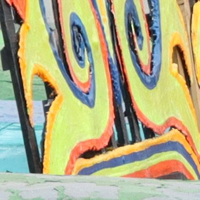
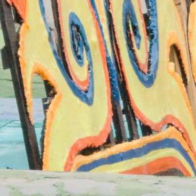
First, let’s look at the reds:

IMG_5211_canonjpg_detail1 IMG_5211_rawtherapee5.9_auto_sat30jpg_detail1

You can see here that the reds in the RT jpg are more orange than the Canon jpg. Next up, the greens.

IMG_5211_canonjpg_detail2 IMG_5211_rawtherapee5.9_auto_sat30jpg_detail2

Here, the RT jpg has more yellow greens than the Canon jpg. Finally, the blues.

IMG_5211_canonjpg_detail3 IMG_5211_rawtherapee5.9_auto_sat30jpg_detail3

Here we see that the blues in the Canon jpg are redder, and give a more purple color.

In order to have an idea of what image is more “correct” I also show you here a photo taken by a friend of mine with his phone.


Look at the reds of the boats. It seems to agree with the Canon JPG!

Is this an issue of the color profiles? Does anyone experience the same issue with their Canon camera with RawTherapee? Will I have to make my own DCP files with a color passport?

Thank you in advance for the help!

I don’t have a Canon, but it seems like RT doesn’t have a camera specific profile for the 90D. And I too don’t get usable colors with Camera standard from my Nikon. But I’m lucky to have a specific profile available.

Have you tried the CANON EOS 90D.dcp from ART? This seems to improve a lot.

https://bitbucket.org/agriggio/art/src/master/rtdata/dcpprofiles/

Or get Canon EOS 90D Camera Standard.dcp from Adobe.

Edit:
Have just seen that Alberto already attached the ART DCP in the old thread from 2021. So I wonder if you were using it so far.

1 Like

I remember trying this profile back then, but being dissatisfied with it. Here are the comparisons using the 90D DCP profile. Left is Canon, right is RT.

Reds
IMG_5211_canonjpg_detail1IMG_5211_rawtherapee5.9_auto_dcp_detail1

Greens
IMG_5211_canonjpg_detail2IMG_5211_rawtherapee5.9_auto_dcp_detail2

Blues
IMG_5211_canonjpg_detail3IMG_5211_rawtherapee5.9_auto_dcp_detail3

Indeed, this does improve a lot! The purples look much better, and we also see the proper green rather than a yellow. The red does not look as good, although the hue is much closer, I now found it to be slightly too cold. It is also much grainier, but I notice that the Canon jpg has been denoised.

I suppose it is difficult to get a perfect match, so I will have to say myself satisfied with this for now! Thanks for the help! Here’s a quick edit to close the thread:

Two stupid questions…is the wb exactly the same in each scenario and are you using the automatched tone curve?? If so the model used in that feature greatly changes the color… I don’t use RT as a daily driver but you can toggle the options and see… its a bit like what you see with the color preservation modes in DT and the way that they can impact color when used as part of the processing… you may have checked both and if so ignore… or on the other hand you could try that and cycle through the options and see if one comes closer…

EDIT

I Just went back to the old post… I guess I suggested this already but I didnt’ see a reply to confirm if you tried or it was an issue…

1 Like

For the WB, I believe so. I used the “Camera” white balance, which I can only assume is used for the Canon jpg too. I did used the auto-matched exposure curves. Just went back and did some tests, you’re right! The different types of curves do affect the hues slightly! I will have to study a little bit what the different options mean, I’ve always treated them as modifying the brightness only.

Y’know, you might check whether a color saturation was applied to the in-camera JPEG. I downloaded the first RT image and applied a simple HSL saturation and was able to duplicate the Canon hues.

If you want to compare colors, you need to establish the same starting point…

1 Like

Can you explain a bit more? What do you mean by an “applied color saturation”?

I am using Darktable for raw development of cr3 files from a Canon EOS 850D. In general I do not expect DT (and also RT) to produce the same output as the camera jpeg. However, profiling the standard D65 white balance coefficients as described in [EN] Make the most out of darktable color calibration features - YouTube helped a lot to get a closer-to-reality starting point. I don’t know if you can do similar profiling with RT, too.

However, you should check the image profile used in camera (standard, landscape, neutral,…) because this has a drastic influence on the colors produced. You can open the raw in Canon’s DPP software and go through the different options.

Best,
Till

1 Like

Then you can still try the Adobe DCP. There’s quite some difference compared to ART’s DCP. Maybe this serves more your taste.

Adobe DCP:

ART DCP:

But all in all I would recommend not to be too much after the Canon’s JPG look. The best and only reasonable way to get this is shoot OOC-JPG or use Canon software. All other softwares are not even remotely trying to get the manufacturer’s JPG look, but to be as accurate as they can. Even if you get one photo to look close, you will have to mess around again with the next one.

2 Likes

In addition, nearly every camera applies its tone curve on a per-channel basis, which can lead to a phenomenon known as “hue twisting”. Sometimes this is highly detrimental (it can sometimes do really weird things to non-Caucasian skin tones for example), sometimes it’s “not technically correct” but winds up looking subjectively favorable to most viewers.

RT’s default film curve mode is to perform a hue correction so that hue is always preserved. Changing the mode from “film-like” to “standard” will make it behave more like most camera JPEG engines.

(and yeah I know you know this Glenn, but many people don’t!)

1 Like

What @Till80 says…

Now, the camera color matrix of RT may indeed not be optimal. But you can’t really determine that in reference to what your camera produces unless you eliminate as many of the other variables as you can. This would include rendering the camera JPEG with whatever Canon provides as a “Neutral” ‘picture control’ (Nikon term) , or ‘image profile’ as specified by @Till80

1 Like

One other thing is unless you zero out every setting that impacts the jpg in camera then you might be moving it away from what the std development of the raw will issue… Say you are applying an in camera profile or some color setting… the raw processor wont be accounting for that… something to check as well…

Edit … sorry you guys hit on this I replied from email… Adobe does have a dcp profile called camera faithful…you might want to try that one and see how it works and try with and without the look table and tone curve just to compare how it responds to standard RT processing…

That comes actually pretty close to DT default development using white balance instead of Color calibration.

Thanks! Where did you get hold of this Adobe DCP?

When you download and install the free Adobe DNG converter you get a folder with the full suite of Adobe DCP files

2 Likes

Sweet, thanks!

Like Todd wrote: if you are on Windows, install the software and look at C:\ProgramData\Adobe\CameraRaw (you need to show hidden folders)

If you are on Linux, you can simply extract the macOS dmg-file with 7zip to get to the data.

1 Like

Sorry for digging out this thread but I’m also struggling with this problem on Darktable.
I’m not much into image editing. (Yes, this is also a problem) I normaly use darktable only for comfortable working in similar way on sequences of hundred or thousand of pictures made in a single timelaps. This means crop in video ratio, scale it and convert it, so that a video software can eat it.
I wrote a bash script to automize my workflow a little bit. This means, a Windows or Mac Software ist not a solution for me. I also testet RawTherapee with the same problem. Both use the same library to read the CR3 files. Maybe the library ist the cause? With my old Canon 350D the process works pretty good. So what is wrong with the 90D? It’s long enough on the market. I look for the example picture on pixl.us and open it in darktable. What I first see, simply sayed is, that the histogram uses the hole scale from left to right in the histogram at the example picture. But on my pictures, taken under normal conditionen, this is not the case. The histogram doesn’t reach the right area in the scale. Is my camera broken or have I driven the default settings against the wall? So I looked for the exif data. At the time, I made the investigation, not available for CR3. So I took the example and put it into my camera to get the data. Long story short, the example picture is taken against the sun, covered by the clouds and partial overexposed. The exposure automatic was manualy corrected to avoid a complete overexposure.
I think, not a got base for image processing software. What did you experts mean?

I am having a little problem following your post but as for DT the histogram has a profile. By default it is rec2020… This also feeds data for the colorpicker… So I am not sure how you can compare this to the jpg histogram on your camera but maybe if you post your image people can continue the dialogue … in RT what if you use the DCP profile and or look at the raw histogram vs the processed one??

I compared only the histogram in darktable several of my pictures and the uploaded example. The difference was noticeable. I’m not able to reproduce the lightness from the example. So all pictures look like behind a gray curtain. (And there is a additional problem with red, like discriped in the first post.)
This is the reason, why I think, there is something wrong.