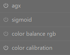
Another screen shot reveals sigmoid and color balance are inactive but it shouldn’t be this subtle in my view. Not everyone has 20/20 vision
7 Likes
I agree with Terry. The low contrast UI has its benefits, but it can’t be so to the detriment of the user’s visibility.
5 Likes
Perhaps use different icons/characters for the off and on states?
E.g. ⏻ / ⏼ or (“power” and "power on/off "symbols)
⦾ / ⦿ (circled white or black bullet). Those four symbols are unicode characters.
3 Likes
Totally agree!
I don’t understand the push back against coloured buttons when some of the themes have coloured icons?
The small Lua scripts that have been shared are a godsend to me as rightly @Terry said I suspect a good percentage of dt users don’t have perfect vision!
3 Likes
Wait a sec, you built a web app for creating darktable themes? ![]()
Would you be able to package this as an AppImage and/or host it on the web for others to use?
Would be really cool if this theming app was available at a theme repo like @Masterpiga’s mentioned here:
An even better place for such a tool would perhaps be darktable.org.
2 Likes
I understand your problem. I have really no problem is seeing that sigmoid and color balance rgb are off. For me that is really obvious. For me making it coloured is very disturbing.
I would suggest that you use css to make it collared (can’t look it up for you right now how to do it)
Maybe this would be an idea? (Not exactly like it but pure the concept)
Color shouldn’t really be necessary, just a little more contrast between the grey text and background, like lightroom, capture one, and every other raw editor on earth do ![]()
1 Like
I checked out my LR6 version and it is no better than DT. I like the on off switch above but maybe just a solid circle for on and the current icon for off. Anything to make it easier. Obviously this is not a big issue but I don’t understand the push back against a small change to make something clearer for all to see. The decision against use of color has been explained but a minor icon change shouldn’t be a big issue. It only needs to be a theme option and if people like the current they could stick with it.
1 Like
We have 2 themes that have 9 options between them, is that really a good use? IMHO surely they could be cut to 3 each and a new more modern theme added?
Again IMHO this as a snippet looks so much easier on the eye to see sections and what is on/off
This change was recently merged on master. I think suggesting (a PR with only this) something like this would be acceptable. It brings better contrast without making it a Christmas tree.
3 Likes
Maybe its my eyes sight, but on my calibrated screen I can see virtually bugger all difference between the 2 screenshots posted on that thread? ![]()
Me neither, Specially if it would be optional.
If by that thread you mean here, it looks to me like the after image has a white border round the active icons. But you maybe mean somewhere else.
1 Like
Yes thats the one, TBH for that little of a change it doesn’t seem worth it to me?? The main Achilles heel with dt IMHO has always been how hard change is, it has the turning circle of the titanic…
Thankfully we have mercy in the form of clever people producing hacks & full makeovers via lua
1 Like
Currently, priorities probably lie elsewhere (GTK4).
With the current capabilities, almost all problems can be solved. Exceptions like icons aren’t a dealbreaker.
I think we can help developers identify the current problems. Some of them are obvious, while others depend on taste.
No matter how many suggestions come in, if no one feels responsible or lacks the design skills to evaluate suggestions, then it will stay that way. Responsibilities need to be clarified.
2 Likes
Any change has to pass through github and the release cycle. Why? Because a seemingly innocent change can have unexpected consequences elsewhere in the code. Finding what broke is very hard without tracability of changes…
Also, you do not want just anyone to modify the master code. But of course you can fork the code and do what you want with it (at your own risk)
With Lua scripts the situation is a bit different: the scripts are not an integral part of the code, so any one can add any script to their installation of darktable, at their risk, without influencing any other user.
I understand why it happens like it does, but dt feels like China to me, if those at the top don’t want change then it ain’t going to happen and you will be silenced if you continue to question why
Nobody has ever given a real answer as to why updating the UI from its retro 80s look is such a bad thing? - I’m not talking about changing the default skins only why an updated skin is so frowned apon, god forbid using a little colour???
As I & yourself have said thankfully small scripts can be used to get around this (IMHO) nonsense & each to their own as there is no right or wrong answer.
3 Likes
There is no push back, make your own theme. Just that the default is to avoid color as much as possible.
3 Likes
Please spare us your xenophobia.
Yes that’s the way it works. In the last decade, I’ve found our maintainer, @Pascal_Obry to be pretty open minded, so many things and ideas make it in.
No but continually asking why when there is already a reason is annoying.
The default middle gray theme is there to give you as neutral a pallet as possible to do your edits. Any color or darker or lightertones influences how you perceive your image on screen, and we don’t want that so we avoid color and stick closely to neutral gray.
4 Likes