Do you the font installed in your system? On Mac, you do that called Font Book (if I am correctly).
And then use the css tweak. Also see:
Do you the font installed in your system? On Mac, you do that called Font Book (if I am correctly).
And then use the css tweak. Also see:
Thanks I’ll have a play 
I want to try getting the ball rolling on this, spending some of my spare time implementing these UI changes in the actual codebase. TurboGit seems to be on board. It would be great if you got involved on the GitHub repo; Not necessarily writing code yourself, but making sure that the design language is consistent and matches the overall vision, reviewing and commenting on PRs, etc.
Essentially, a lot can already be achieved with little effort.
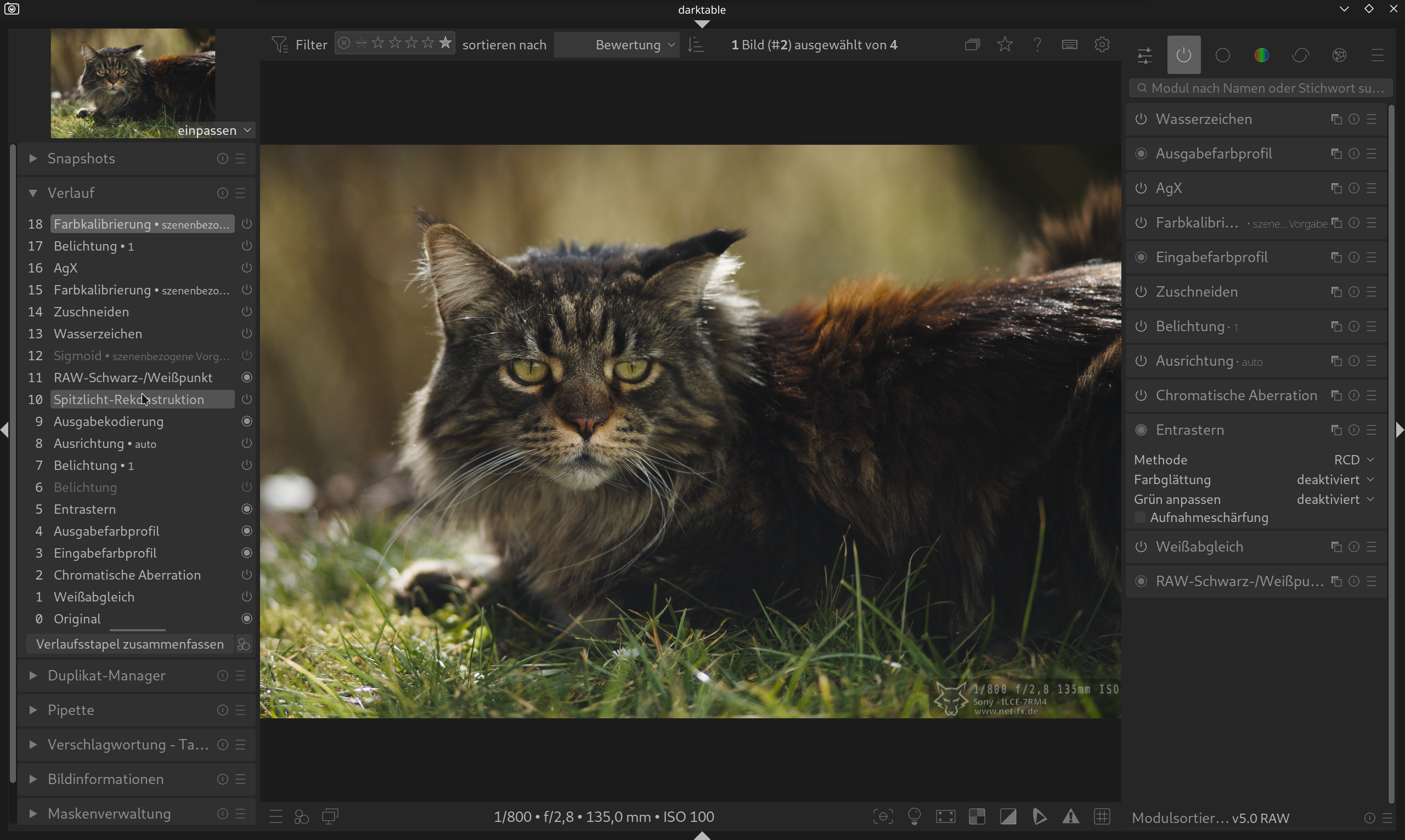
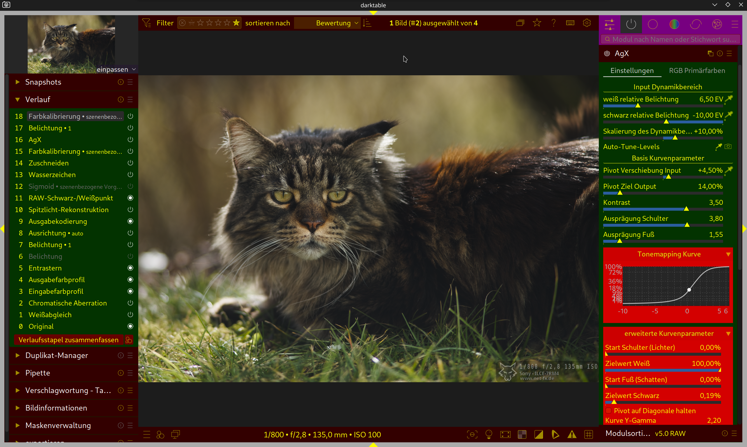
The current problem is that some elements cannot be clearly distinguished from one another, or the connections don’t become apparent automatically.
I’ve highlighted a few places in the first image.
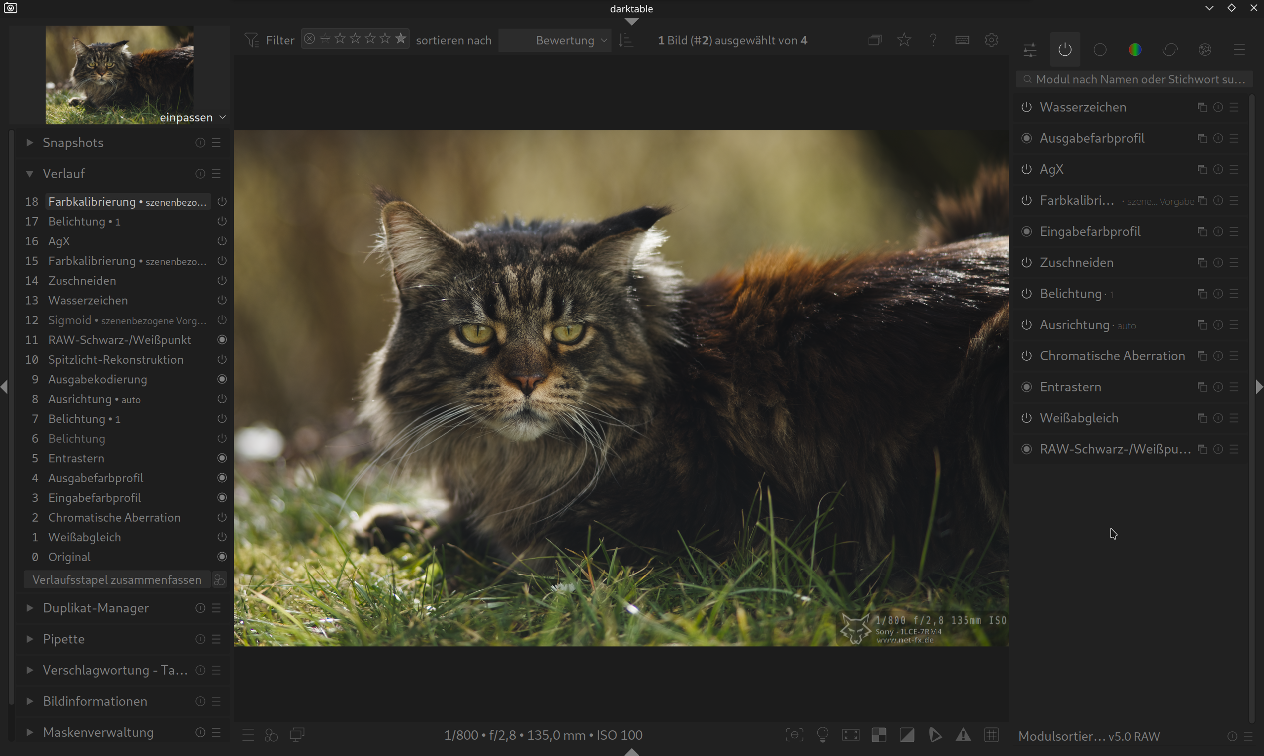
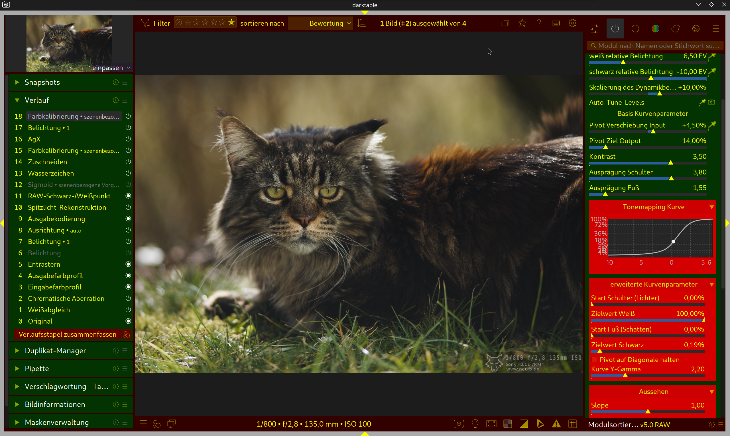
The second image shows how this can be easily improved.
Here’s another version with fewer distracting elements. These include the scrollbars and the outermost border.
This is all a matter of taste, of course, but I’m firmly convinced that a “simpler” interface with fewer distractions and fewer nested elements looks significantly more modern and cleaner.
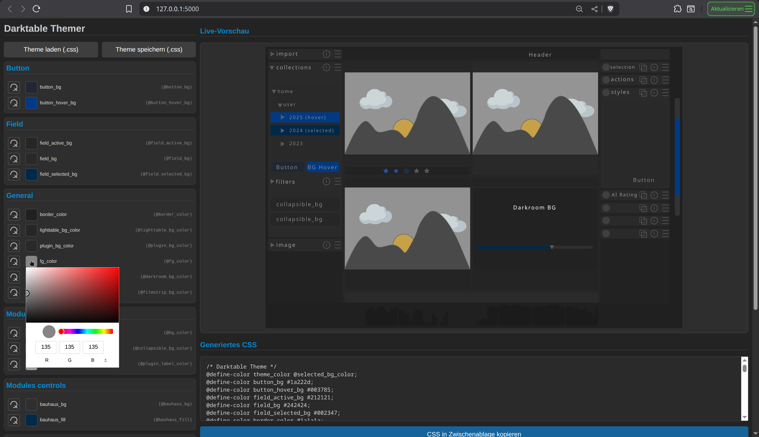
Where can I view your CSS? Looks clean!
Darktable is open source, and everyone is free to tweak it to their liking, but thing is, I think its very important to have a clear goal to work towards if we want an improved UI to be merged into the Darktable codebase. If everyone branches off, making their own improvements, each tailored to their own taste, you end up with just that… lots of improvements that don’t come together in a coherent manner.
I think all the work done on rudantu’s penpot page is a great, clearly defined goal to work towards.
you can finde my themes under Darktable Themes – Arch Linux – für die Welt, meine Freunde und mich.
rudantus design is very good. i would make clear that the options in darktable to change things with css is very good. the standard themes are good (not bad) but a clean and modern look would help.
i build my one themer. it reads all data like @bg_color from a single svg-file i created with inkscape. it is not perfect but it works.
it also helps to understand how darktable color scheme works.
with custom css.
If changes can be made in CSS only that’s great, otherwise you should heed his advice and wait or contribute to the gtk4 migration. I’d assume the gtkr migration will change a lot of the CSS, as GTK4 is themed quite differently than gtk3.
Yeah it’ll definitely be best to avoid changes to the GTK code and focus mainly on the CSS. Any CSS that ends up GTK3 specific can always be adjusted once the migration is further along.
Do you think its still worth seeing how far we can get without disrupting any of the work being done on the GTK4 migration? or would the work be “wasted” because it’ll likely require major changes for GTK4 support.
I’ve never worked on this code, but from using GNOME, GTK4 seems to theme itself quite differently than GTK3. DT has a lot of custom widgets anyway, so not sure how impactful it’ll be.
If it were me, I’d make CSS only changes for now and wait for GKT4 to be closer, unless you have a lot of free time on your hands 
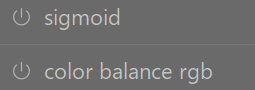
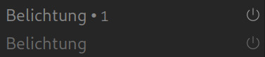
What about changing the icon for module activation to a x for off and a tick for on? This wouldn’t require any color and would be well defined.
If you would ask me, a ‘x’ to tick off/on a module is kind of confusing as ‘x’ in all most all software means that you close something. And you are not really closing the module, are you?
the “power on” icon is perfectly fitting, x would be very confusing
the current power icon is not clear in my view. a tick or very distinctly different icon would make it clear. the x may not be the best idea but something clearer for on would be an improvement
Can you explain why it is not clear? What makes it confusing for you? Just trying to understand better the problem you are facing with the current icon.
Are these modules on or off? It is not immediately evident at first glance. I often find myself turning the module on and off to work out the status. If on was a tick or something else it would be so obvious. Why the resistance to a simple icon improvement (in my view)?
your are right, but it is not only a problem of the icon.
a active module should have a slightly other brightness of font and bg then a module that is off.
I prefer simple small dot/circle, with on is bright, and off is dim or grayed out. The On icon/symbol is not as obvious at least on my screen.
My point being is that there is room for improvement so it is obvious which is off or on. I would find a slight change to the icon rather than just change brightness would be clearer. I am not fussed what is used but I find this current system is too subtle.
in history it’s is how it should be in the modules.