Let's learn Filmic RGB! Your one stop shop to understanding filmic-based approach to edits!

That does not seem to be using my preset: your black relative exposure was set to -3EV; your display/target black luminance was set to 0.0152%, not 0%. Those two meant that blacks were crushed.

Without filmic:

With filmic, using my preset (split view):


Not identical, but close to ‘neutral’.

2 Likes

Yes, of course !

1 Like

This definitely looks better. Maybe I messed up with the preset? I imported it as a style and then applied it.

Do you mind if I translate it to Spanish (an other messages from below) to be included in https://foro.darktable.org.es/ ?

Of course, with all the credits to you and linked back to here.

1 Like

Sure! Do it please!

2 Likes

Since many are still very overwhelmed with many functions of filmic I will try to show an example of how (and why so) I will proceed in the processing.

I thank @pass712 for the raw file!

Let’s see how the raw file looks like without filmic:

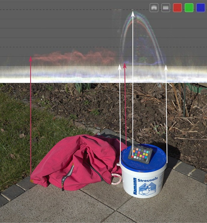
It’s actually almost perfectly exposed. With the raw file there is no overexposure and with the histogram profile you can see only a little overexposure (white patch on the checkerboard and on the white rope).

Since we will look at histograms from time to time in the next steps and I use waveform histogram because it shows the spatial distribution of colors and brightness, here is an illustration of what the values refer to:

Back to the subject: Now I will make a snapshot with unprocessed raw file that we have a comparison, then I turn on fimic and see how it looks now (left side is the original and right side is the processing):

As you can see, the overexposure is gone now , however the red jacket and blue lid of the bucket are oversaturated (you can also see that very clearly in the histogram).

We now go to the “look” tab and reduce the saturation with the “middle tones saturation” slider:

Now the saturation is good but the photo has lost a little contrast due to the compression. From the histogram you can see how much compression has taken place and that we have a bit of room to bring back dynamic range of photo and thus increase the contrast again.

So, we go back to the “scene tab” and with the help of “dynamic range scaling” we increase the dynamic range of photo again until we reach the desired contrast strength without sending the highlights back into nirvana.

Of course, we could have done this with “white relative exposure” and “black relative exposure”. But I find it easier to move only one slider, especially since it expands the dynamic range symmetrically:

It actually looks almost very good but we lost a bit of detail in shadows (you can see this in the shadows of bucket).

We now use “black relative exposure” to bring back the details in shadows:

Photo already looks very nice and we do not need to do any further processing. Brightness and contrast is very good, we see the details in shadows and highlights are not overexposed.

But I am very eager and I want to squeeze the last out of the dynamic range that is available to us. Lets se if I could use that little bit of headroom that I still have to increase the contrast in the white part of the bucket. :upside_down_face:

So, we’re going to go back to the “look” tab and play a little bit with the contrast options that we have there.

I’ll now increase contrast there with “contrast” slider and look at my bucket:

Contrast on the bucket looks good now but I get the warning that I overdid it (orange part of the curve in the graph). I also lost a bit of detail in shadows again.

Now I have two options: either I reduce the latitude (the linear part of the curve) and make the curve more “flexible” or I use “shadows/highlight balance” to shift the weight of the compression towards shadows or highlights.

Since I lost some details in the shadows, let’s use “shadows/highlight balance” to “relieve” the compression in shadows a little bit and see what happens:

I relieved the shadows a bit (compression is now stronger in the highlights - you can see how the latitude was shifted towards the highlights) and the details are back, but now I have orange warnings on both sides of the curve. So, if I want that extra contrast, I can’t avoid lowering the latitude a bit. Let’s do that and see the result:

Perfect! Now look at the histogram. I am now using almost the entire dynamic range, have very nice contrasts in the shadows, mid-range and highlights without overexposure and loss of details, colors are correct and I have not created any artifacts!

This is possible with filmic. but you don’t have to go that far, it’s enough to use filmic also as a simple tonemapper and rework the photo in later steps. But you can do it if you want to.

And, as you can see now, in many cases filmic can be the last link in the processing chain after the usual image corrections, especially if the photos are already well lit in advance and you don’t have to fight with extreme dynamic differences.

35 Likes

Thank you for that excellent, step-by-step explanation and demonstration. I’m bookmarking that post.

1 Like

Wow, filmic in a nutshell. This is awesome !

2 Likes

I was just thinking that your screen shots would have been really cool with the ev map shown beside the curve display to reinforce your edits and changes to the mapping… I think being able to see these simultaneously might really help some people…

Edit If I have time I will re do what you have done and try to post that type of matching screen shot…

1 Like

:+1: :+1: :+1: :+1:

As per my comment above the matching ev mapped plots for the edit as completed by @s7habo are

image

image

image

image

image

image

image

4 Likes

Thanks a lot Todd!

Hey NP you have really provided a great resource here…I think if people can link this mapping to the curve that they see or think of this mapping when approaching the image it might start to make sense what is going on and how to manage it…I might to a quick little screen video where I move all the sliders so people can see how the ev graph changes…I think its a good exercise for people to do…ie move each slider with this display of filmic active…

3 Likes

I’ve been a long time lurker but have just signed in to say “Brilliant, and thank you very much for taking the time to explain this so clearly and, above all, patiently”. Any chance this (or something similar) could find its way into the online darktable manual?

Thanks again

5 Likes

@lockdown Welcome to the other side! :slight_smile:

1 Like

I don’t get it. How is the last version with filmic better than the first one without filmic? The only differences I can see right now are:

  1. very tiny regions of the ropes are no longer overexposed (hardly worth all the effort)
  2. the sheadows became darker and have lost visible structures

Indeed. You could have left it as it is or used Tone Equalizer to quickly adjust the highlights. What do you think could be the reason why I used filmic anyway?

The shadows are darker but the textures are still there. If you think shadows got too dark, what should be done to get more detail in shadows based on my explanation?

A hint: Both the raw file and darktable are free for you to use.

1 Like

I have another question about filmic:

Is Filmic meant to define a “look”, i.e. preset a certain contrast and dynamic range, and use other modules to fit the image data into that dynamic range, or

Is Filmic meant to be used creatively, with iterative tweaking of dynamic range and contrast and reconstruction instead of modules such as the tone equalizer?

I realize it can be used either way, but I wonder which way is the one intended?

1 Like

It’s thought as a technical module. Its main purpose is explained in

" the filmic RGB (or the base curve ) module, which translates between linear space (proportional to light energy) into non-linear (perceptually compressed) space,"

Yes, that is indeed a good question. @Lander_corleone has already given a good hint.

I’ll add that I don’t see filmic as a pure “transfer” from linear to perceptual space, but already as a creative element, because it already tries to reproduce “the tone and color response of classic film”, that is, to adapt the photo already in a way that we perceive it pleasantly.

In other words, this would already be a good “starting position” that, in some cases, is already enough to get good results (with some possibilities of “readjustment” in the module itself) or in other cases, as a good basis for further processing with the help of other modules that darktable has available.

This “flexibility” also makes it difficult to decide when I have exhausted its capacity of readjustment to then include other modules in the processing accordingly.

3 Likes