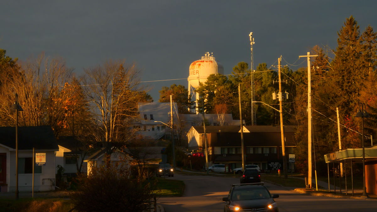
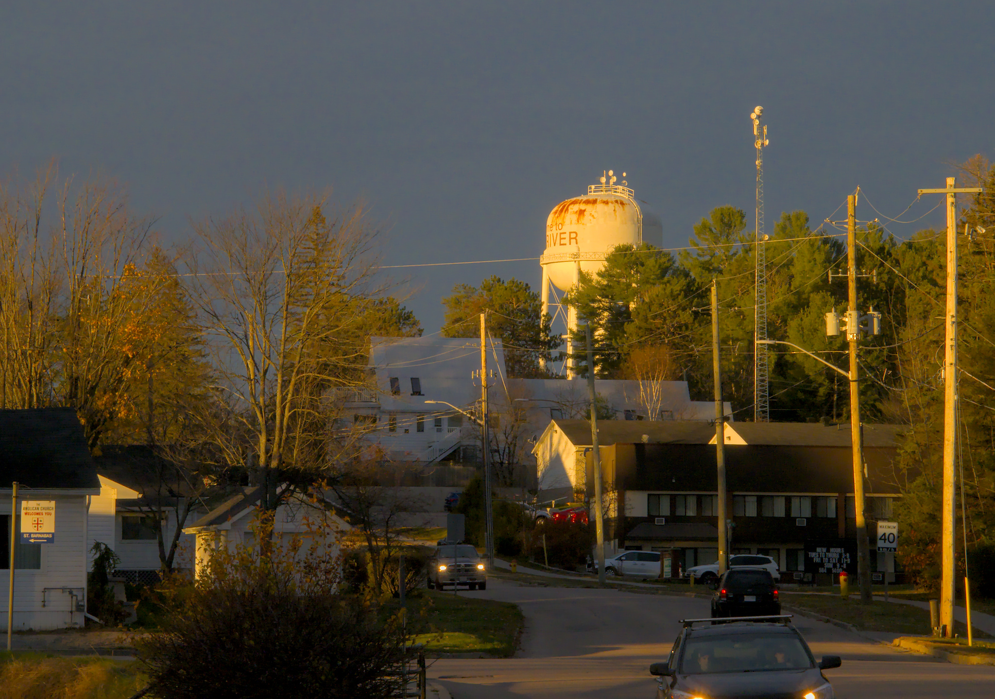
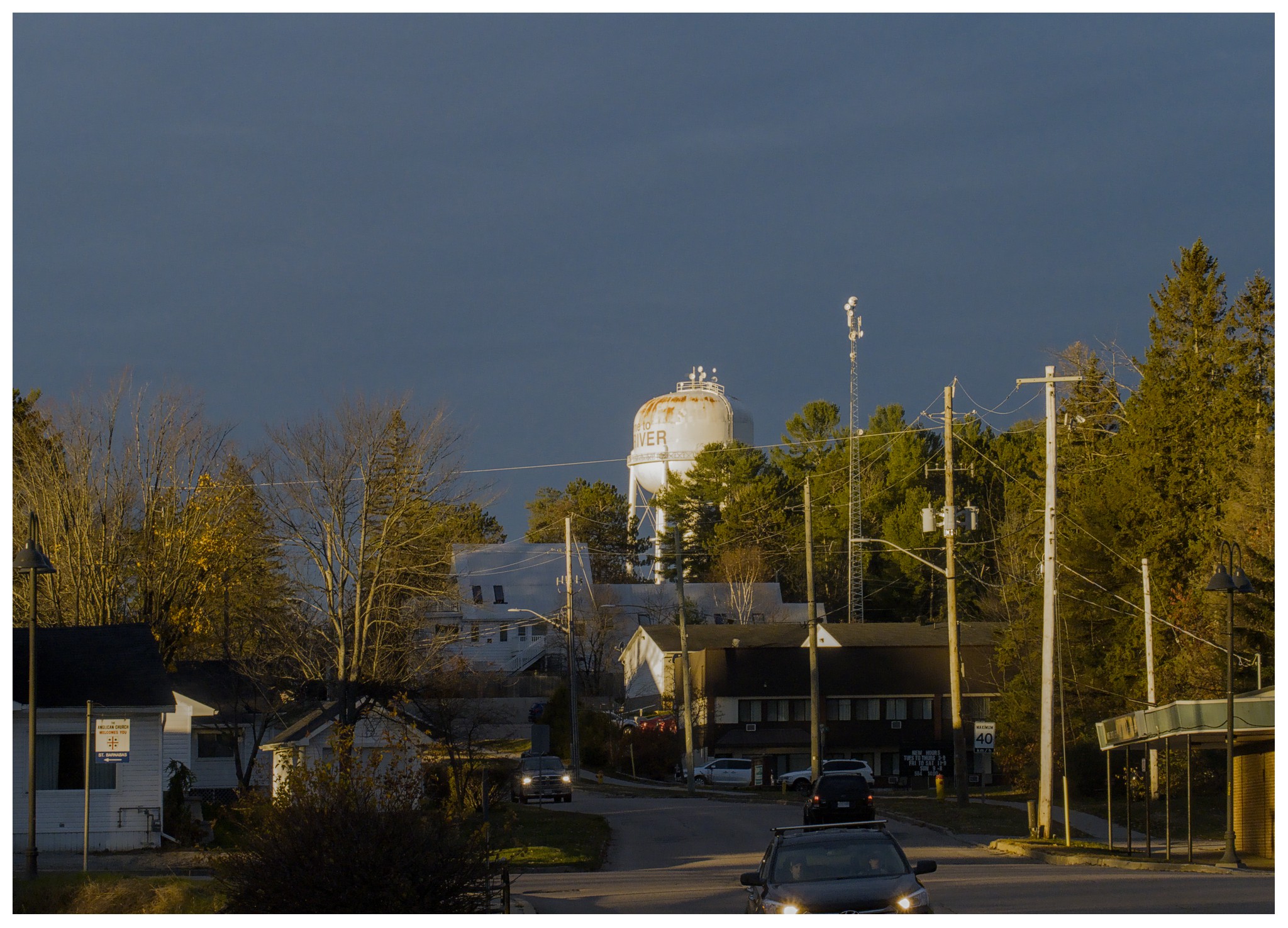
There was some really spectacular but fleeting light the other morning and I managed to grab a few snaps. I like this one the best. Since I was rushed, the framing and tilt are not the best.
But this photo has been frustrating me ever since. I think my edit is O.K. but I feel it could be much better.
Thanks for sharing! Morning and evening sun give a beautiful warmth.
BTW, you might have chosen a larger aperture what had resulted in lower ISO and less diffraction.
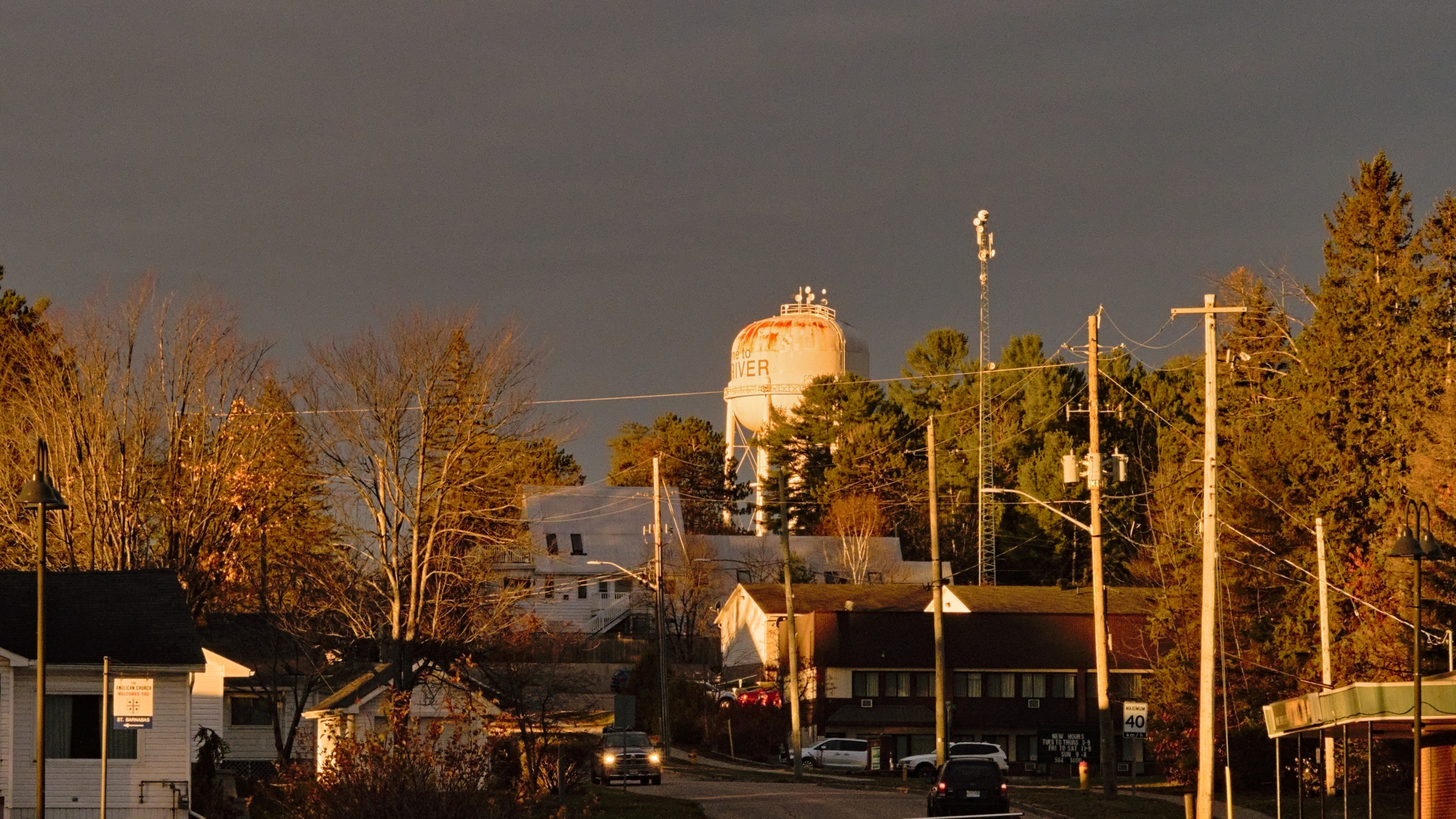
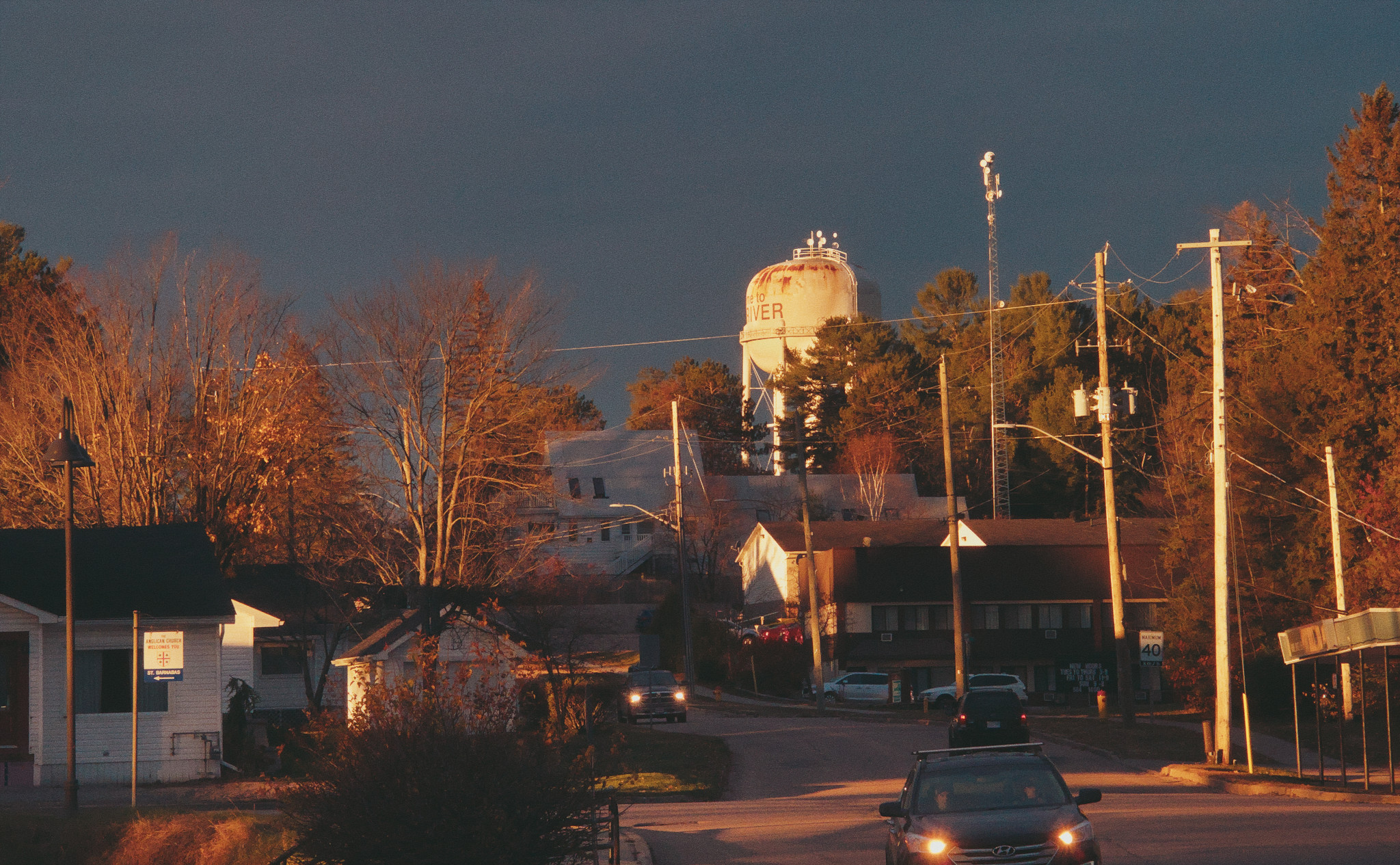
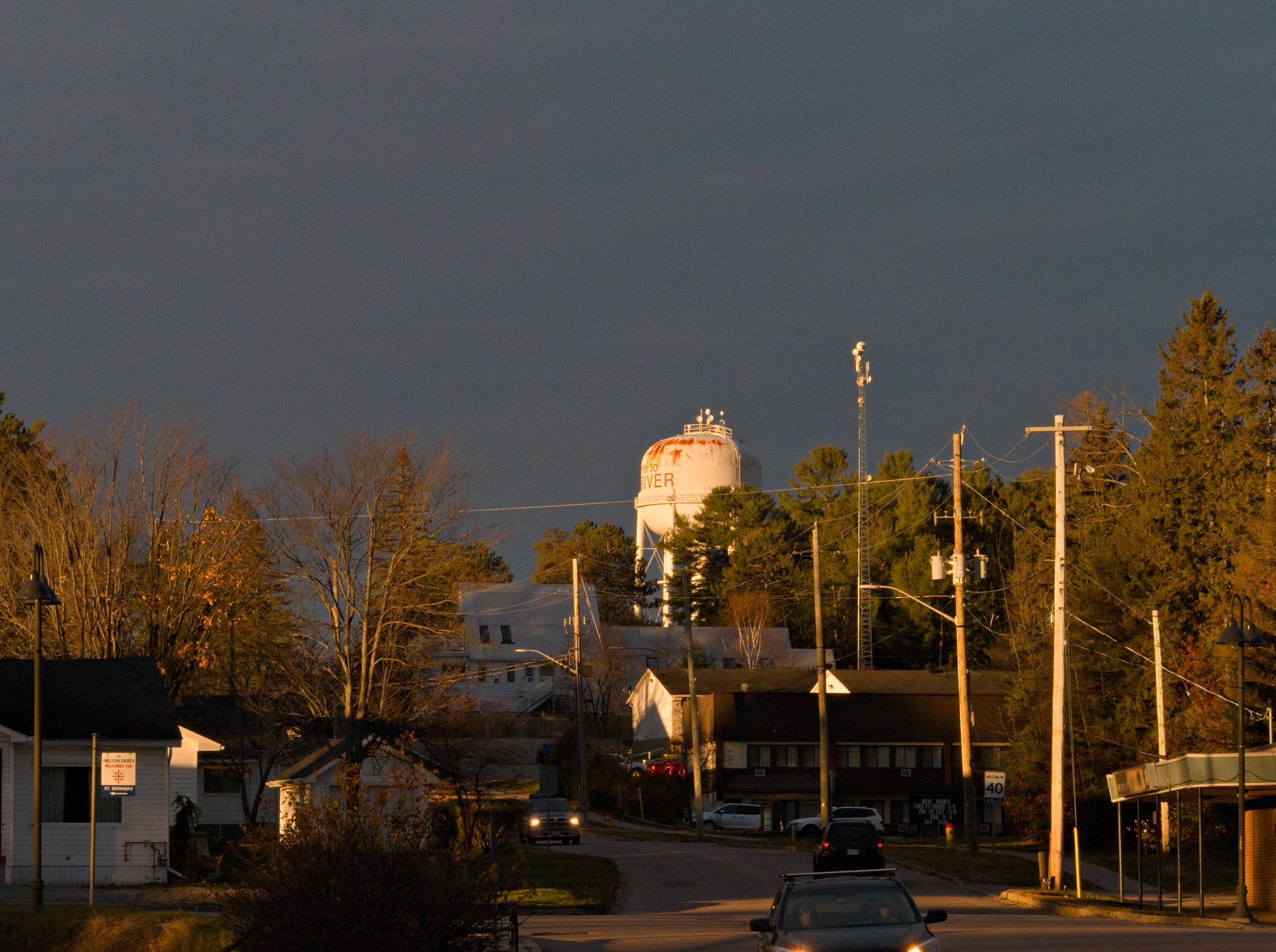
Here is my try, quite similar to yours. I chose a Fuji-X Provia LUT. Can’t get rid of some red haloing
This image exposed a rawproc logic flaw in my black subtraction selection from libraw data, took me a bit to sort it out, still not sure it’s the right thing…
Anyway, morning light is a great thing, and it’s usually not too cluttered with humans…
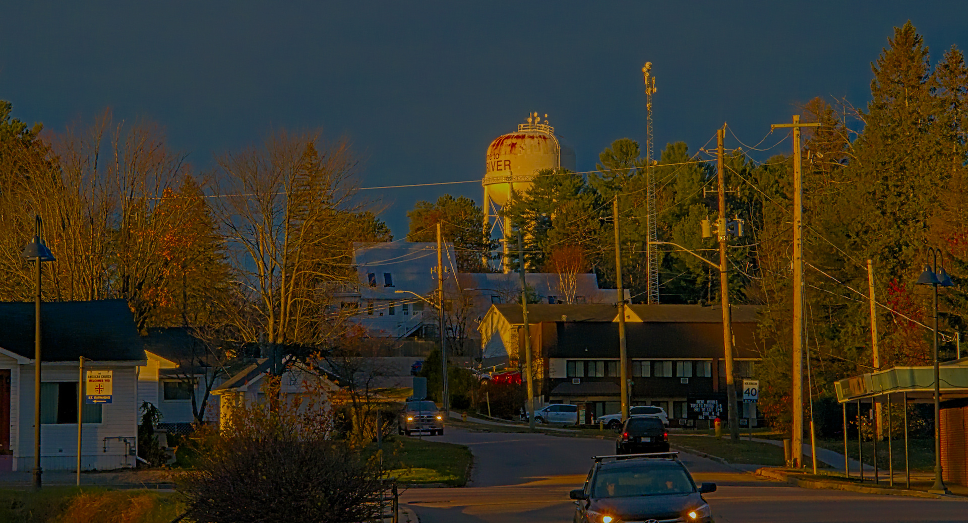
The only things extra to my normal filmic processing were a light denoise and a crop to try to make the road lead into the image.
Edit: updated the image, uploaded the wrong render…
tricky image, I will echo the sentiments of @Sunhillow above, probably could have been at f/4 for this one, a lot of noise to deal with leads to a loss of detail in the trees as well. Still a nice shot though!
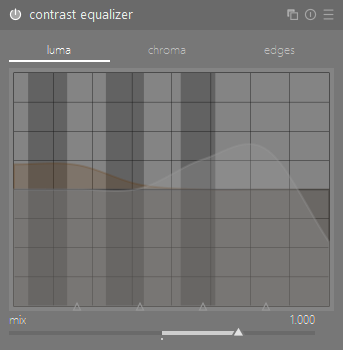
to that end, having a quick poke looks as though the first contrast equaliser might be the least agreeable part for my tastes:
I find that any adjustments to the luma curve in the bottom 75% of that graph really starts to damage some of the tonal relationships in a lot of images and sometimes create a haloing effect as well, but I’m sure it has its uses.
Also interesting however is the use of local contrast before filmic, I’m curious to know more about the rationale there if you’d like to discuss it @Thomas_Do, I’ve never really experimented with moving modules around all that much.
Hard to tell if its the tilt, or nobody knows how to build straight poles in your area. They all seem to be leaning at a different angle. I tried to line up the two lamp posts, and building verticals as best I could.
White balance was interesting with this one. If you spot on the white buildings the road turns blue, but if you spot on the road the white buildings turn yellow. It seems most went for the yellow, while I went for the blue, initially because it better kept the highlights in check. I suspect the scene did have more yellow than my version portrays. Is there some rule of thumb here, like when should spot pick shadows vs highlights, or is it all just artistic interpretation?
I rarely concern myself with getting accurate “true to life” colours in photography, but I do want to consider the reality of the scene - which in this case is the low sun, which generally means warmer colours.
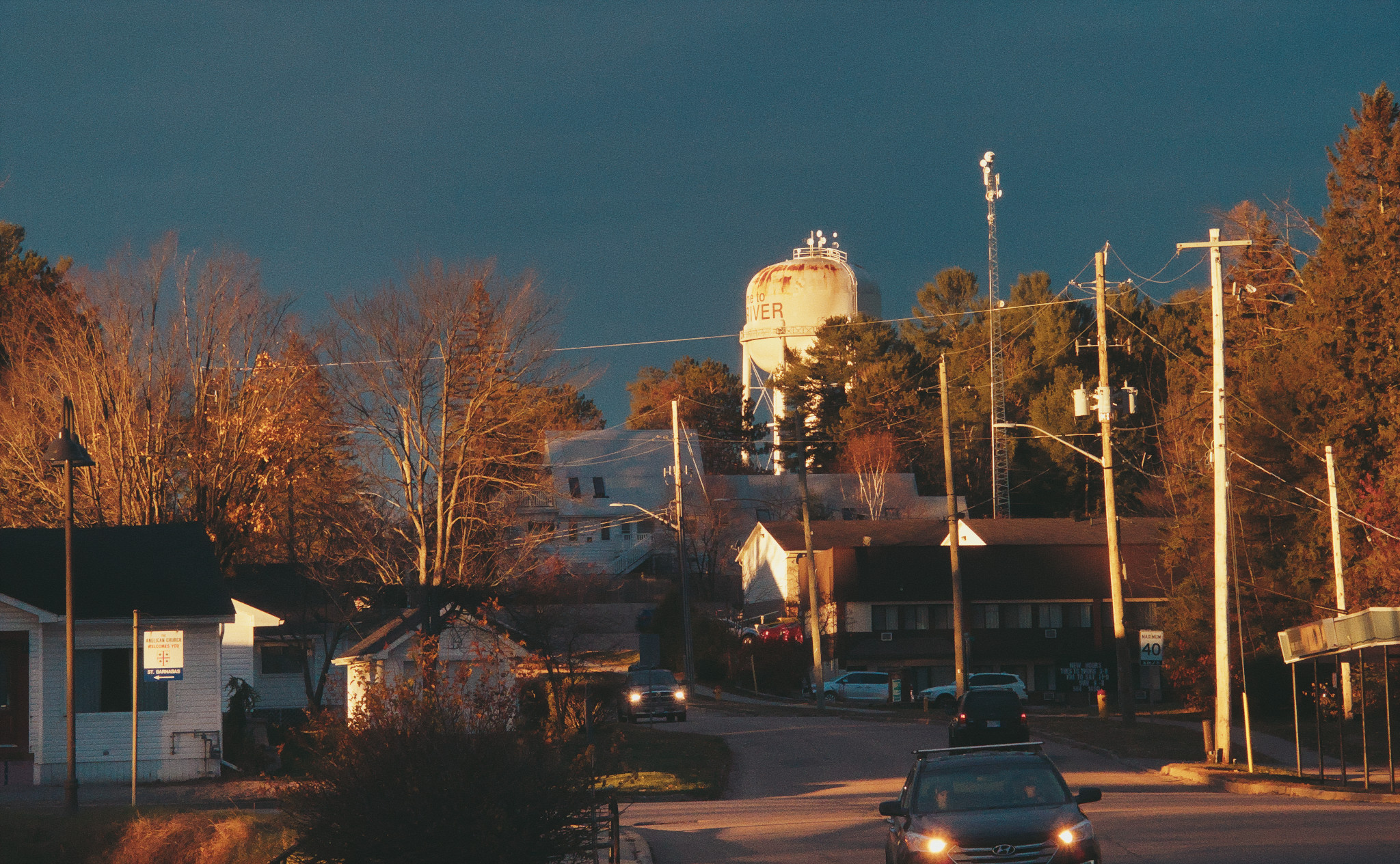
the combination of areas in direct sunlight and areas in shadow in a single photograph are notoriously difficult to deal with though. I just tried cooling my image off 500K and much prefer it actually:
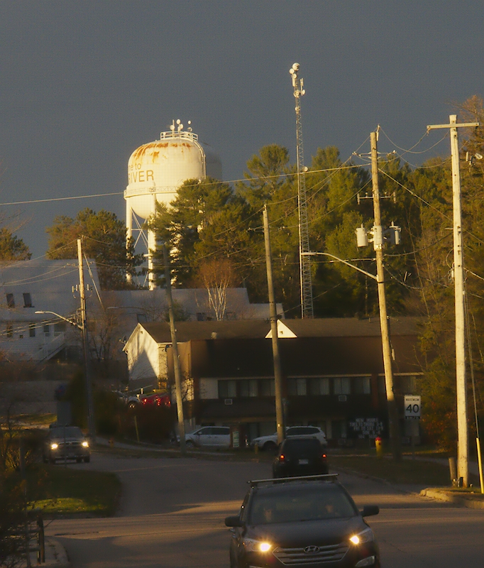
Yes, I guess I meant more in terms of process. When using spot picker I have two initial thoughts, 1) set for white, 2) conserve highlights. But I don’t properly know how the code of spot picker works. So perhaps I should change 1 to set for lightish grey, or mid grey? Thus potentially retaining a natural cast in the highlights.
Edit: realised my process was wrong. No need to conserve highlights in wb as filmic can bring them back. So here is a version with a much better white balance.
I would like to start by thanking everyone for their time and effort in replying. There were many good renditions that will take me a while to analyze in detail.
@Sunhillow and @black_daveth both advised that I would have been better to choose a wider aperture so as to reduce diffraction and noise. I was in my car when I saw this scene. I parked, grabbed my camera and just used its current settings. I took four quite different shots in a little less than a minute. And then the light was gone; the sun disappeared behind the cloud bank. But even if I had more time, I probably would have chosen similar settings. I usually prioritize depth of field over absolute sharpness and I’m not overly concerned about noise because my target use is the web with an overall width of less than 1200px. But I agree that f16 was excessive, especially for the light levels in that photo.
At least a couple of the renditions – @KristijanZic, @Soupy – have chosen quite low color temperatures. While I believe this choice results in the most “accurate” color rendition in the sense that the color of the light has been effectively neutralized, that is not my preferred direction for a sunrise or sunset photo. (It is also interesting that both the camera’s auto color balance and rawtherapee’s auto color balance choose a higher, close to daylight, color temperature.) I agree with @black_daveth in this regard, that you want to consider the reality of the scene. That said, one doesn’t have to look very hard for examples of excessively high color temperatures for sunrise, sunset and fall foliage photos elsewhere on the web.
@Soupy commented on the verticality of our local hydro poles: One has to remember that this is the Ottawa Valley. Just wooden poles stuck in a hole in the ground. They were probably close to vertical when they were installed but even that is not certain. The communication tower in the background is probably vertical but you need to take the centre line as reference rather than the edge. But like the color balance, I think it is more important that it looks right than it rigorously is right.