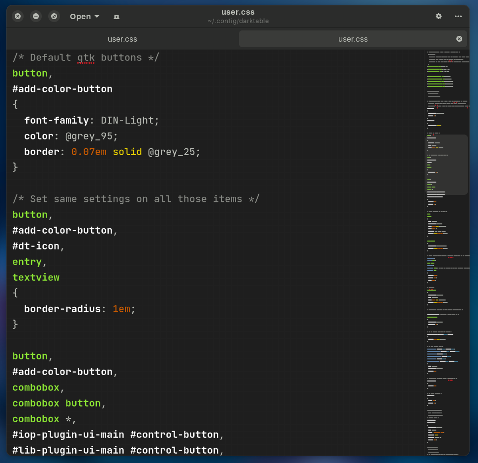
I don’t think the individual elements are documented as such anywhere. In the css there are comments and those familiar will likely read it very easily but the best I could do was scan it and make some changes and see what the result was… the core stuff is defined in darktable.css and the rest are modifications…
You can enter any modifications in the preferences css window…
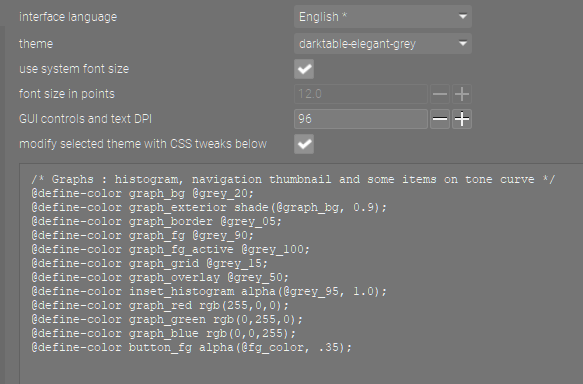
For example here are some I have to tweak the histogram
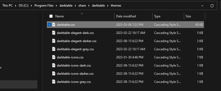
the css file in windows is in the program files directory see below…likely something similar for linux
I’m glad you liked the theme.
As Todd said it is quite difficult to select by elements, they are not defined that way. The changes I made to the .css is more like trial and error.
There are some that are easier than others, like changing font families but there are others that can’t be changed.
By instance in my last version I changed to DIN-light some buttons of the UI and to Square721 BT the side panels and modules.
I have made an update to my personal darktable theme, some subtle changes to the colors with respect to the previous theme, the border radius of some buttons. The background color of the scopes (histogram, vectorscope and waveform) is no longer black, but a #141414 gray.
The most important change is that I replaced the previous font with the Inter font (OTF) because the readability it offers is excellent. I made this decision after seeing the typography as a fundamental part of the UI of Blender 4.0 that has just been released.
Here is the link to the typeface for those interested in using the theme. The typography is downloaded and installed in the locations determined according to the operating system.
Inter typography.
To install the theme, unzip the user.zip and copy/paste the content of the user.css file in the darktable configuration window (general tab).
The dark theme customized to my taste has given me rest to my eyes, a big thanks to the developers, who have created this excellent program, and who have provided a guide to follow regarding the predefined UI theme providing the necessary information about the risks of not working with the predefined theme, the negative effect in terms of optical illusion and still offer the ability to customize the UI even if you do not follow the guidelines.
Really for lack of the necessary knowledge in terms of programming and .css I can’t go further.
Thank you! This has opened my eyes a bit regarding what customization is possible in darktable. And agree with @hatsnp that Inter is a good choice for a font. I’ll also try Lato to see how that looks, as I like that font too, even though I suspect Inter looks better in the UI.
Hey guys! I am pretty new here and also just started using Darktable (left the Adobe universe). I’ve been pretty impressed so far with the software but I was looking for ways to optimize the UI a bit to make it clearer to understand. There’s clearly so many more options and functions compared to Lightroom which brings me to my question. Disclaimer: I haven’t tried this theme but reading through the discussion, I feel like I will definitely try it. However - is there a way to make the individual modules clearer? I’m imagining a bounding box with a thin border for each module. Going deeper, some modules have primary and secondary settings. Maybe secondary settings could get a differently tinted background color (maybe semi transparent to still fit the overall theme color) and lastly make the masking section equally stand out by giving it a uniform color throughout all modules that offer masking. I don’t know if it’s clear what I mean. Right now Darktable to me is pretty overwhelming when I have a long stack of modules without being easily able to differentiate where one ends and the next one begins.
Any thoughts?
I am relatively confident with CSS but I didn’t find any in depth documentation about what controls what. I’m hoping to get a better idea of it looking at the user.css file offered here.
Oh and thank you Franklin for the time you put into this!! That’s amazing.
Welcome to darktable and to this excellent community. Congratulations for leaving the Matrix (Adobe universe) I can assure you that every moment you spend using darktable will be a great experience. For the customization of the modules I recommend that you review that .css file although there are things that I could not achieve at the time and right now I have not been able to devote the corresponding time.
Always keep in mind that this theme was something very personal that I did for my own work and to avoid visual fatigue, but this theme does not comply at all with the established standards, that’s why there are the default themes. In my case I started from a dark theme and made a few modifications, replacing the typography was one of the last changes I integrated to this theme.
Thank you Franklin! I appreciate your answer. I did check out your css and for now I’m using it as is - I just changed the orange and the background color of the modules. But I couldn’t figure out how to separate the content from the module header (just some padding around the controls). It seems like there is not many module related classes. And I don’t know how to inspect a program the same way I would do with a website in chrome.fot example. But no worries. That’s ok for now and I’ll check into it when I have more knowledge!
Darktable’s gui is made with gtk(3 I think) so unless there’s a gtk debugger/inspector I doubt that would be possible. I was surprised to learn that other frameworks besides web were also using css for their styling.
Yeah - my knowledge about how to use command lines and such is close to zero. I tried to open the inspector but nothing happened and so I gave up. However I managed to sort out the styles but trial and error with the darktable.css file and got it somewhat to where I wanted it.
I’m on windows 11 so maybe it’s a bit different. No idea where to start looking. Google didn’t give me much at least nothing I understood. It fascinates me that you guys seem to understand a lot more about all that.