Negatives and color profiles

C’est! Everything you’ve said is true—for color reproduction. But scanning film isn’t about reproducing how the negative looks to the human eye/brain. In the world of human vision referred color appearance reproduction there is no difference between a portion of the negative that appears orange because it transmits a specific proportion of 540nm (green) and 640nm (red) wavelengths of light and portion that appears orange because it transmits only 590nm (orange appearing) wavelengths of light, but for scanning one of these is the orange mask, and the other becomes blue in the inverted image.

Here’s an excerpt from the Bible of digital color, Digital Color Management Encoding Solutions by Edward J. Giorgianni, that does a better job explaining it than I can:

In previous system examinations, standard colorimetric measurements were used to quantify the trichromatic characteristics of color stimuli produced by the output media. It was logical to make such measurements because the media involved formed positive images intended for direct viewing. But since negatives are not meant to be viewed directly, it would not seem logical to also measure them using methods based on the responses of a human observer.
If standard CIE colorimetry is ruled out, how else can images on negative films be measured? Is there a different type of “standard observer” that would be more appropriate for negative images? Answering these questions requires a closer look at how photographic negative films are designed and how they are used in practice.
In typical applications, photographic negatives are optically printed onto a second negative-working photographic medium (Figure 8.4). The second medium might be photographic paper, in which case the final image is a reflection print. Negatives also can be printed onto special clear-support films, such as those used to make motion picture projection prints from motion picture negatives. In either case, the resulting print is a directly viewable positive image.
What is important to appreciate is that each photographic negative film is designed to be optically printed onto one or more specific print films or papers, using specific printer light sources. That fact provides the key to making meaningful measurements of color-negative images.
Optical printing is an image-capture process that is quite similar to several others discussed earlier. As shown in Figure 8.5, there is an object (the negative image) that is illuminated (by the printer light source) and “viewed” by an “observer” (in this case, a print medium). The print medium for which the negative film is intended, then, should be considered the “standard observer” for that film, and measurements should be made according to the particular red, green, and blue spectral responsivities of the intended print medium. In other words, measurements should be made based on what the intended print medium will “see” and capture when it “looks” at the illuminated negative in the printer.

Photographic print mediums “see” light very differently from the human eye, and therefore also very differently from digital cameras and profiles, which are designed to mimic human vision.

Here are the spectral sensitivity curves of the human eye:
image
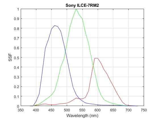
Here are the sensitivity curves for a camera (for those who aren’t already familiar):
image

And here are the responsivity curves of the specific combination of light source and print medium sensitivity that film is designed to be “seen” by:

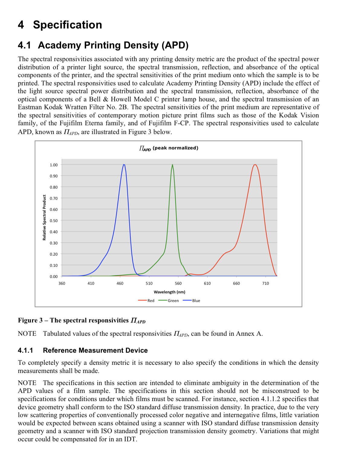
So film is designed to be seen by an “observer” with much more deep red (even near infrared) and much less yellow/orange and cyan sensitivity than the human eye or cameras. Because we can’t change the sensitivity of the sensor we have to use the light source to shape the overall system responsivity to be as similar to that which film is designed to be seen by.

Here are a couple other resources that really helped me start to understand the interplay between light source, negative, sensor, and digital profiling/processing:

I read the post of @NateWeatherly in the parallel thread, and I hope I understood most of it correctly, specially the section about the problematic orange mask. But aside this theoretical condiserations my personal experimental findings differ in the point of the “optimal light source”. I found in my experimental investigations :

It is extremely difficult, sometimes impossible, to get well balanced colors over the whole spectrum if one uses a light source with (more or less) sharp peaks and deep valleys in it’s spectrum.

For this reason I switched to the LED panel with a high CRI. This panel “builds” it’s spectrum mixing the emission of two different types of white LEDs (one reddish, one bluish). Unfortunately I do not know, what LEDs they are using for the panel, but from Wikipedia I get spectra shown below :
grafik
Spectrum of a white LED showing blue light directly emitted by the GaN-based LED (peak at about 465 nm) and the more broadband Stokes-shifted light emitted by the Ce3+:YAG phosphor, which emits at roughly 500–700 nm. (source : Light-emitting diode - Wikipedia)

Superposing the spectra of two types of such diodes (one reddish, one bluish) results in a broad spectrum much smoother compared to the spectrum of an ipad (or any other tablet). And my experimental findings show that I get the most pleasing results if I set the color temperature to the middle of the range the panel offers (in other words : using both types of LEDs and mixing them fifty-fifty).
Another point : to avoid changing conditions by diffuse light I take the shoots in a darkened room. I spent some time to optimize the lighting conditions but now I save a lot of time having well definded conditions and an easy and very fast work flow.

My initial tests I have done with diapositives.

Choosing the camera white balance you will use the algorithms of the camera, resulting in corresponding entries in exif metadata. Choosing the manual white balance of dt you will use dt’s algorithms and you are free to select any area of the image. In most cases the results will be different.
The screenshot below shows the results of all the available wb settings of my camera, the second last is my custom setting, the result of the experiments, all shoots taken with LED panel at 4300 K.

Hm, for further experiments I wonder what light source would be narrow band, tuneable over the whole visible spectrum but not a laser … To me the theory sounds valid that 3 distinct narrow illuminations would reduce orange spill over into red and green channels, but experiments seem not to clearly proof it.

And I wonder what light source my reflecta crystalscan 7200 is using, how can I measure the spectrum without a lab? Any thoughts?

I think we have to distinguish between two problems. The first having the orange (or brownisch, or whatever color…) mask. The second having a light source able to reproduce all the colors of the negative (or positive) without pushing /supressing part of the spectrum. The first problem one can address the way @NateWeatherly described, to address the second we need a broad and flat spectrum.
For me focusing on the second problem gave better results. I never had a real problem to compensate the mask using negadoctor after setting a correct white balance and adjusting the exposure in a way that the histogram of the negative takes approximately 5% - 95% of the dynamic range before activating negadoctor.

I’m afraid there is no way without having access to a spectrometer. Perhaps the manufacturer of your scanner could help by supplying sprectra of the light source he uses. But in my experience most manufacturers handle this information as a company secret.
But please take into account, all my experiments have been done with a DSLR. I have no experiences using a film scanner and I do not know which kind of light sources they use. And in addition the spectral sensitivity of the sensor (scanner / camera) has to be considered.

If you haven’t already bought a colorimeter to “calibrate” your display, trash that idea and just get a spectrometer. It’ll do that and read yoru scanner, and a few more useful things, although note the struggles at the low end @JackH pointed out in another thread. I’m about to procure the X-Rite i1Studio for my endeavors even though I already have a ColorMunki Display, because I need to measure spectra for both reflecting things (mainly patches) and lights.

Knowing light turns out to be a big thing in photography, go figure… :stuck_out_tongue_closed_eyes:

I still struggle to understand how the bias that is added to the r and g channel by the orange mask is to be seen by a system theoretic point of view. On one hand, it sounds logical that omitting the orange mask entirely by using narrow-band light sources would give the best results. The information is encoded (more or less) in the magnitude at three different frequencies, and the orange mask would spill into the neighbouring channels (due to bandwidth of the CFA). However, given a white illumination (flat spectrum), it would add a constant bias from the orange mask on r and g, and therefore probably it does not harm - the bias is constant and any real r or g value is added to this bias.

As there is no access to the light source in the scanner, there is hardly a practical way to measure the illumination spectrum. But …

I am dreaming of medium format (non-digital) since a while, and my go-to solution would be “scanning” with my DSLR. Therefore I am very interested in this topic. And understanding colour science is for sure not too bad in general.

Unfortunately I already got 2, one by supporting Richard Hughes, but the ColorHug 1 was hardly usable. I then purchased a Spyder 4, but it was not of much help so far as the gamut of my laptop screen is too low and the additional calibration additionally steals some colours. Now I am searching for a new laptop, but this is a hard business as computer industry deviated from my personal requirements in the last couple of years … Unfortunately there’s no budget for a spectrometer these days, maybe in future. But due to my mixed results in printing images it would be extremely handy I must admit.

That’s what I try here …

This is my conclusion from the experiments done. darktable has powerful tools to compensate color casts resulting from flat spectra (e.g. color balance) wheras it is very difficult to compensate spikes or deep drops without side effects.
Another point should be considered : masks of negatives can exhibit very different colors. On AGFA, Kodak, Fuji, Konica, Perutz… I found orange, dark orange, brownisch, dark brownish, brownish-purple, reddish-purple, reddish… masks. One would need a different narrow-band light source for every type of film…

What lights do they use in lab quality dedicated film scanners like Noritsu HS-1800 and Fuji Frontier SP-3000? Narrow band or full spectrum? I’m no expert, but I have a box of negatives waiting… It strikes me their lighting methods would be good to mimic, if at all possible.

The only information I could find on the FujiFilm web site is “LED light source” and that can mean everything…

Hello Chris,

I asked the manufacturer for the data sheets of the LEDs (optical and IR) as well as the response curves of the CCDs and I got them. This is certainly not as good as individual measurements but it gives a basic idea. So may be you can get this information for your scanner.

The above mentioned book by Giorgianni & Madden (chapter 8 on photographic negatives and part III on digital color encoding) may help you here.

Hermann-Josef

Judging from the post below, rather narrowish.

1 Like

The trade would be to go away from orange as much as possible but without losing too much SNR. But if the orange bias does not harm and can be 100% compensated, it would be better to go to the overall transmission maxima including the whole channel, i.e., film response and CFA response curves. Maybe …

I do not have a good relation to them anymore as my scanner was broken when I bought it but I thought it’s me and therefore only complained after warranty was over. They repaired for 80% of the scanners price. Then I bought a second one used on ebay to speed up my workflow, only to find that it has the exact same issue. As this is not a regular defect anymore I asked them off they could offer a solution, and their solution was the same repair for the insane price tag. As this is not a regular defect but more a wrong design, I expected them to offer some less expensive solution. I expected more a free product recall. Imagine it would have been a car … So I guess I am on their black list. After I started a friendly discussion with them, they never responded. I cannot recommend them for bad customer service and defective products. I do not think they would give me some technical information.

Hm, this looks very interesting. The local university has a copy, maybe I can get access, as it is very expensive to buy.

Revisiting this one with darktable 3.6 (actually 3.7 dev but not using anything new since 3.6). After color calibration and color balance rgb, this is the result I got, which I think is very natural, hopefully doing justice to the scene in real life.

The good news for @hpbirkeland is that the radioactive greens with negadoctor does not seem to be an issue any more.

image

I just noticed that the edge of the foreground rock face against the river is so uniform that it feels like someone cut it out from another picture and overlaid it.

All that is to say, I enjoyed the photo. Thanks for sharing @hpbirkeland. :slight_smile:

You’re right @afre, it is strangely uniform. We need a geologist to tell us why… Volcanic rock that flowed and cooled like this?

More like glacial activity. That is beside the point: I like the interesting effect it has on the image.

Thanks for sharing. Helps me learning something completely new.

1997_0001.cr2.xmp (23.3 KB)

Using only LinRec2020 was the most important thing I had to learn about DT, since standard-color-matrix has alway given me very bad colors.