Ha ! Just went to that searchbar again and typed Roboto and there are 4 packs, not just the one I downloaded but also Condensed (!!), Mono and Slab.
I’ll install Condensed tonight and report back.
Ha ! Just went to that searchbar again and typed Roboto and there are 4 packs, not just the one I downloaded but also Condensed (!!), Mono and Slab.
I’ll install Condensed tonight and report back.
Vote for more condensed theme. Even I have FHD display, I have lost a bit vertical space by last update. Modules with lot sliders (which became wider now) are very toll now
@nosle Thank you ! Roboto is indeed a set of 4 and out of these 4 probably just 2 are needed.
For me it settled the issue with the font not being found.
This is how it looks on the lighttable:
Is this the expected output ? I’m not quite sure. I seem to still have something going wrong : look at the datetime in the image information section… Also the font size looks a bit heavier to me compare to everything else on the system (I mean outside DT). Is there a way I could check which size is being use ?
Here is the terminal in front of it for font size comparison :
It almost looks like the right size for a screen with a 1920*1080 resolution that would have been stretched to fit… 
Yes, it seems to be, as you said, a bit heavier (or I would said here bolder). Maybe, you are using darktable.css theme, that use your OS font. This darktable-elegant themes (dark and grey) who use predefined fonts.
and also for and @Benja1972 : as homer, probably that. Or if you both use darktable-elegant with that, that’s maybe on darktablerc to see. Especially if you have, on old UI, modify dpi settings to have bigger font. I know for example than by default OS font size was really too small on MacOS and the tweak was to modify dpi setting on darktablerc. For best experience on the new UI, this tweak is obsolete, so think about reverted it back by default. See this line on darktablerc : screen_dpi_overwrite=-1.0 (-1.0 is the default setting)
So, to answer to @darix yes you’re right, on start with the new UI? the new default css was actual darktable-elegant theme and houz change that to let by default the view on default OS.
And as @Pascal_Obry, for photo editing, I really think that Full HD is the minimum to think in 2019. I use a Full HD since about 10 years. But, it just remains laptop for some editing, for example on travelling. A lot of them are now fullHD or event better like some retinas ones, but the size screen remains small ones for lot of them. Though, I’m not sure spend time on a css for that would change lot of thing (but I could be wrong on that). I use sometimes myself a 13" screen (my Macbook pro) which is Retina display and even with that, I prefer hide panels (left or right or boths for example) depending on actions I made, to have better experience of darktable on this smaller screen.
@Pascal_Obry : you have talked about a script to delete or revert back obsolete lines on darktablerc quite recently. You of course certainly have lot of things to do but an idea where propose that to users ?
In my case, I’ve selected Elegant as the theme and installed all the Roboto fonts needed. This seems to run smoothly, and I have never touched the darktablerc file (don’t even know where it’s located) so it’s not an old tweak that would still be active.
Some icons also are, imho, a bit big - bigger than some others ? like the one for the collection (and, or, except etc)
Where can I found this darktablerc file ?
Also, where is located the darktable.css file except in my source folder ? If I want to customise via another css, the original to override should be mentioned in an import command right ? I haven’t find anything in /Users/seb/.config/darktable/.
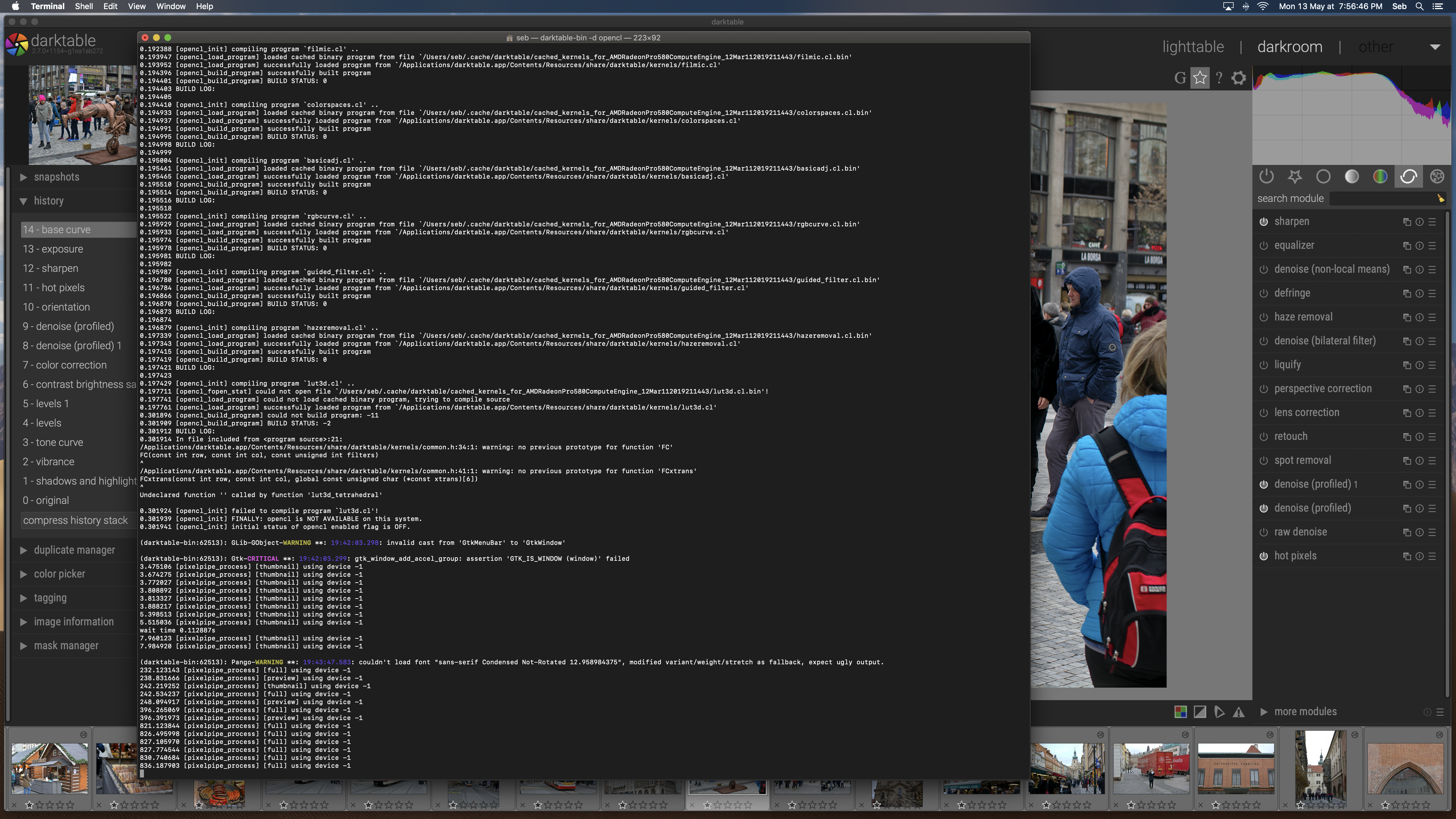
I have built from master, created the dmg file and installed it so I can run it like any other normal app.
See this post (seems relevant here):
That’s very interesting, thank you for sharing that! I wouldn’t mind being able to do such things actually. Right now I don’t think I’m capable so I would need some guidance as to how I would achieve that.
Right now I’m following the BUILD.txt instruction files up to making a .DMG file, install it and run it as any other applications.
What exactly would need to be different in order to start DT in “dev mode” with such instructions (export GTK_DEBUG=interactive which works also on macOS) ?
If someone would be able to provide some help that’d be great 
It’d be like another BUILD.txt but with the final goal not necessarily being to package it in a .dmg file but just run it out of the box.
Thanks ahead of time for your support!
No, please open a bug report on GitHub. Thanks.
Alignment (here not intended) and too big sizes of icons and text could be a consequence of screen_dpi_overwrite wrong setting. So it’s important to check if that or something else.
To see the correct alignment of these icons and sizes, you could also see the grey theme I made (I post a screen capture of modules icons rendering, same on dark and grey theme) from the dark theme by Aurelien here : Grey css themes for new UI on darktable 2.7 (dev), on with and the other without modules icons
darktablerc file is on this folder you mention : /Users/seb/.config/darktable/
Be sure to have -1.0 on the line I previously mentioned and of course, edit this file with darktable closed as this file store your preferences and state of last state of darktable.
For css, all default css are where darktable is installed on share/darktable/themes. If you want to customize some things, you indeed have to create a custom css on your .config/darktable folder.
On this folder, first create a “themes” folder.
2nd : create a file (for example Seb.css) and then add an @import line on the beginning of your file that point on the default css (full path of one of the default css).
Then you just add options you want to change (no need to copy all things as the @import section import by default all css and after you just write those you want to customize.
@homer3018 and @Pascal_Obry : I’ve just tested to change the screen_dpi_overwrite on darktablerc file. I put a setting of 110 instead of -1.0 (setting I’ve used when I was on Mac Os for darktable 2.4 and small OS font problem at this time on Mac OS). See what this setting change on dark icons theme as you homer. You could see that It confirm same problems as yours :

If I revert back to default setting, so -1.0, I see the correct UI :

@Nilvus, thank you very much for the in depth response, the associated reactivity and the detailed walk through for getting me started with css customisation. I appreciate that a lot.
Now I have check my darktablerc file (which I didn’t know where to find it until now) and of course it is showing -1 for that variable. It means that I’m getting this misalignment with the theme with icons that came from the very recent version I pulled.
It also means that the font size looks a bit big but it’s not because of this parameter.
When you have set this variable to 110, you icons looks bigger, and the misalignment is within the same order of magnitude as mine.
However with the variable back to its default value -1, the misalignment is less obvious nonetheless still there: the icons lay on the same line at their bottom, and are not centered vertically which, imho would look nicer. I also prefer the on/off icon having the same size of the module icon, but that could very well just be me.
Anyhow, I still find the font size too heavy for my test and this is what I would like to try and adjust on my own.
Would you please be able to advise how I would go about starting DT from terminal with the parameter export GTK_DEBUG=interactive ?
@Pascal_Obry I’ll report it now, thanks.
Just set GTK_DEBUG (with export as quoted by you) and then start darktable as usual, nothing special.
Thanks @Pascal_Obry. I’ll try and play a bit with it.
Glad that’s help you and resolve most of the issues.
About improving icons alignment, you’re right. I’ve seen that when make the test view for your issue (I don’t use icons theme). As I have worked on grey theme and have just make minor tweaks on darktable.css file (pull request not published at this time), I will see If I could make something better for this.
About font too heavy for you, if it’s on darktable.css theme, that’s the minor tweaks I’ve made so that would be better when I will publish my pull request. If it’s on darktable-elegant themes, please publish a screen capture. On these themes, heavy font could not be possible normally.
Yeah I don’t think I’ll use the icons either - I was just exploring the new UI and everything that came along with it. but yeah all your explanations helped a lot to figure out things, thanks again
For the font, I’m now using the elegant theme and my resolution is set to 3200x1800. Here is how it looks :
I found the left panel kinda awkward. The icons and fields of the collect module feel weird, and big. In the image information, it’s the same, everything looks quite big (again this is just a feeling, I love the slick look and I’m sure I’ll be able to tweak all this stuff to my taste). There is some funky stuff still going on with the font (look at the date time field). And finally have a look at the difference in size from this panel compared to the year in the very nice histogram below the lighttable. This looks like the size I have in my terminal.
What do you think ? Does that look normal for you ? Or is there something dodgy going on.
Your side panels seems small. Maybe your reduce their size too much. That could be change on preferences. By default it’s 350px, personally I use 320px, less make especially the left panel to condensed. By contrast, that could be seen bigger. That’s the only thing remaining that I see.
Only arrow icon on collect module remain quite big on the new UI (probably something to improve but by this time I’ve search a little how without success). The other icon is big only if side panel width is under 300px for the little tests I’ve just made on my system.
For other things, think about compare your views with screens capture from Aurélien on start of this thread or on my thread about grey css.
everything except the theme has been left to its default value ie the side panels are still set to 350px.
Is there a way of knowing which font size is being used ? Maybe with the inspector ? I admit I haven’t had time to look just yet but I will.
Thanks
Yes, you could see with Gtk inspector. Try also to decrease (to 1 or 2 points) your OS font size, as fonts size use emphasis sizes on elegant themes. And be sure to have all Roboto fonts installed.
Hi, as I’ve update css yesterday and it’s now merge on master, could you please update to last revision and test it. On your suggestion, i’ve made vertical alignment on icons module. As the height is related to label, It seems not possible to adjust height on other buttons like on/off one with just css. The difference is quite small and I don’t think would be a priority for devs by now.