New interface in darktable 2.7 (dev)

During the past 3 months, I have worked to improve darktable UI appearance and usability. The changes have been merged in master now, let’s go for a presentation:

New look

Inspired by Google Material Design, I have redone the visual appearance for something more minimalistic, cleaner, more professional and high-DPI-ready. dt’s use Roboto font by default, or falls back to the OS default font, and the OS font size is automatically used (and dpi-adjusted). Borders and drop-shadows have been removed to get fewer distractions and improve performance, and margins have been reduced to the bare minimum to make the most out of the tinier displays.


Slicker navigation thumbnail

Sliders have been reworked to be more readable : there is more space between the label and the baseline, and the cursor is bigger, better separated from the background and hollow for gradient sliders (to see the color through). The fillin bar is now drawn from the “0” value (more natural for balance sliders, which have a central neutral position), and the neutral position is emphasized with a dot.

Capture%20d%E2%80%99%C3%A9cran%20du%202019-04-13%2011-24-38
New sliders


New tone curve look with bigger nodes and more obvious hover effects

Themeable

All the styling rules have been removed from the C sourcecode and put in GTK’s CSS stylesheet, so dt is now fully themeable, and themes can be selected from the preferences. A grey theme is on the way. Most sizes are proportionnal to the OS font size, so you shouldn’t need to tweak the dpi parameter in darktablerc anymore.

New shortcuts

The outer arrows, allowing to collapse the top/bottom/side panels can be hidden to gain more room with the key B(orders). Then, you can toggle on/off the panels with Ctrl+T(op), Ctrl+B(ottom), Ctrl+L(eft), Ctrl+R(ight).

The navigation thumbnail and the histogram have been made full-size and can be hidden/shown too with Ctrl+Alt+H(istogram) and Ctrl+Alt+N(avigation) to gain more vertical room.

All the shorcuts can be user-set.


Enjoy the new borderless experience for minimal distraction and maximum use of the screen

New interactions

In sidebars, sliding bars have been made bigger and can be set to disappear when they are not needed. A new preference allows to expand modules when they are enabled, and collapse them when they are disabled, to keep the UI clean and tidy without sacrifacing productivity. When opened, modules are automatically sticked to the top of the sidebar (if the option has been set) so they use all the available height.

New history compression option in lighttable

A new button has been added in the lighttable to compress the editing history in batch for several pictures. This option will also remove disabled modules from the history (the button in the darkroom keeps them).

Under the hood

When users zoomed in/out on the image in the darkroom, if the scrolling took more than half a second, a full preview recomputing was triggered at the beginning and at the end of the scroll event, resulting in a major slow-down and one useless recomputing. This is now avoided.

You will need at least GTK 3.22 (> 2016), since GTK 3.18 and older (< end 2015) don’t accept CSS-defined margins.

Conclusion

I have tried to unify visually different strates of dt’s code, coming from several developpers at different times, to get a sleeker experience. However, this work is not entirely finished and some modules need more work. As I have tried to clean up stuff, I may have broken some features too… We will see.

Other’s work

AlicVB has added the ability to display custom metadata out of the histogram (top or bottom bar, in darkroom), so this was removed from the histogram frame for better readability:

You can define which metadata and formatting you want in the prefs:

He also has authored a very nice timeline in the lighttable to narrow the list of images in the current collection to a specific timeframe:

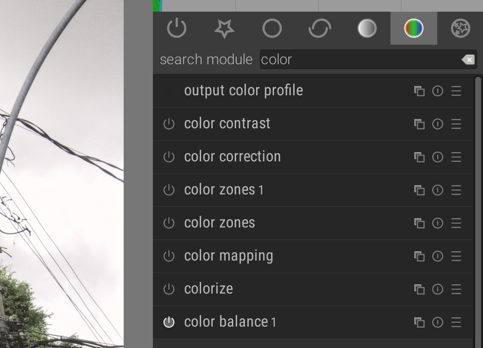
@Edgardo_Hoszowski has added a very useful search box to fetch darkroom’s modules by name:

And added the ability to detach the preview image to another window/display:

Many thanks to @Pascal_Obry for the reviews and debugging help he constantly provides.

Enjoy !

66 Likes

This looks fantastic! I can’t wait to get my hands on it. Great work all!

@anon41087856 generously donates his time and skill to enhance free software, and in kind you can enhance his stomach with coffee/beer by sending him a monetary thank you at https://www.paypal.me/aurelienpierre

7 Likes

Impressive, from reading your post and a quick look at these screenshots this looks like a giant step ahead for Darktable.

I could write a list of the things I like and that are improvements, but this would take too long. There are so many improvements…

Can’t wait to see it in a stable version. Thanks to you and the other contributors :love_you_gesture::grinning::+1:

Great job!!! :+1::trophy::1st_place_medal:

I can’t wait to try it out!

BTW, I am curious what the section with parametric masks looks like. :blush: The markers are always very hard to grab.

3 Likes

@anon41087856 this is brilliant.

Can I ask if it is possible to disable value change via scroll wheel when scrolling up and down the modules?

As I find myself wanting to quickly scroll up and down to adjust a value, only to accidentally change a value. Maybe only change value if cursor is over value for a moment? Or not engaged in a scroll modules panel event?

I notice that we can now only scroll the modules up and down if we are hovering over the scroll bar itself. I think a faster workflow would allow users to scroll up and down freely, then adjust values in an intuitive way. (Ie: users would expect to have module scroll up and down be prioritized over values.)

Otherwise this is truly remarkable & unexpected (suppose I should have been watching GitHub more!)

1 Like

WOW!
It looks too good to be true: am I day-dreaming? Nope. Since I have been following your commits on Github thes past months :slight_smile :slight_smile:

Joking aside, in the past I have tried Darktable several times on Windows 10 but, in the end, I have always opted for RawTherapee for my daily use since its GUIs is more polished IMHO.

Congratulations: judging for the screenshots posted everything looks much better now!

In fact it is ctrl+shift for all those accels because ctrl-t is used for tags since a long time. So I had to change that.

2 Likes

Wow, this looks great. Can’t wait to try out the changes. Thanks for all the hard work!

Outstanding. Jaw drops :slight_smile:

New masks/parametric blending tabs

(I forgot)

That’s specifically designed to avoid changing sliders values while scrolling.

That will need some thinking.

2 Likes

Just an idea: In RT adjuster values are only changed by scroll wheel when shift is pressed. I guess that’s for the same reason @alexmitchellmus mentioned

1 Like

Good work, thank you.

All options in the “action” icon are greyed out except rename:

image

EDIT: Now the options are enabled. I had the film roll visible at bottom and I kept going back and forth to compare two images. Not sure if this has, somehow, enabled the other options.

@anon41087856 having used Blender, it uses ctrl -scroll for value adjustment, while scroll by itself moves modules (panel) up / down.

It would be good to simply scroll up / down anywhere inside the modules, as depending on what a user is doing they can get big.

2 Likes

Fantastic work … thank you all. :clap: :bouquet: :trumpet:
@anon41087856, I particularly like how the “little things” that I have wished for without articulating those wishes have happened. They may not have been little to code robustly, however.

The “dot” mnemoic for the neutral position for example. (Although some of the dots are not correctly placed … unless there is intentionally a distinction between the reset-by-double-click position and “neutral” position).

Again, the compress history button for lightroom - I knew I wanted this functionality once I had edited a whole bunch of pics, but thought it a cosmetic nicety only. Fantastic to have it!!!

Once again, many thanks to all. This software is AWESOME!

1 Like

I kind of like that the regular scroll sets the sliders. Think of those who edit on a touch screen, that would make the sliders impossible to use.

The dot goes on the zero, not on the neutral position. If the neutral position is not zero… well the parameter is poorly designed.

One other change (is it only new in the most recent update?) - the “display second darkroom image window” feature now allows for image on one monitor and controls on another, for those of us with multi-head setups. That is frigging awesome!

1 Like

I understand the touch screen arguement. Could it not be a preference? Enable the current behaviour by default, (for touchscreen users, and users that prefer scroll value change), yet allow users more used to Blender, and other apps to ctrl-scroll values?

1 Like

@anon41087856
thanks a lot for that comprehensive overview. I am so amazed these days about opensource, yet again… :blush: especially one of my dreams (darktable on two monitors) somehow come true here gitHub-dt-PR #2365 :slight_smile:

Anyhow, we have a little flaw… for me the groups in darkroom disappeared as I discribed also here gitHub-dt-Issue #2400

2 Likes

On the one hand I miss not having my presets in each darkroom module. On the other, accessing them from the quick-access button means not having to even find the module!!!

please fill independant bugs report on Github so we can keep track of them. I’m well aware that I may have broken things, but they should hopefully be easier to maintain long-term.

2 Likes