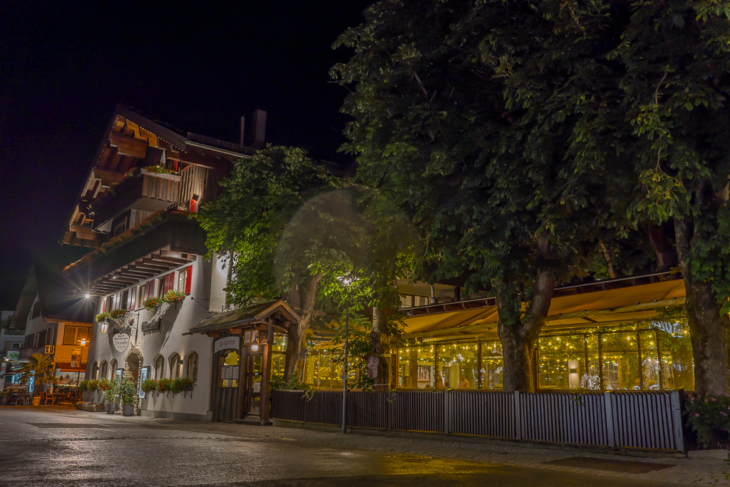
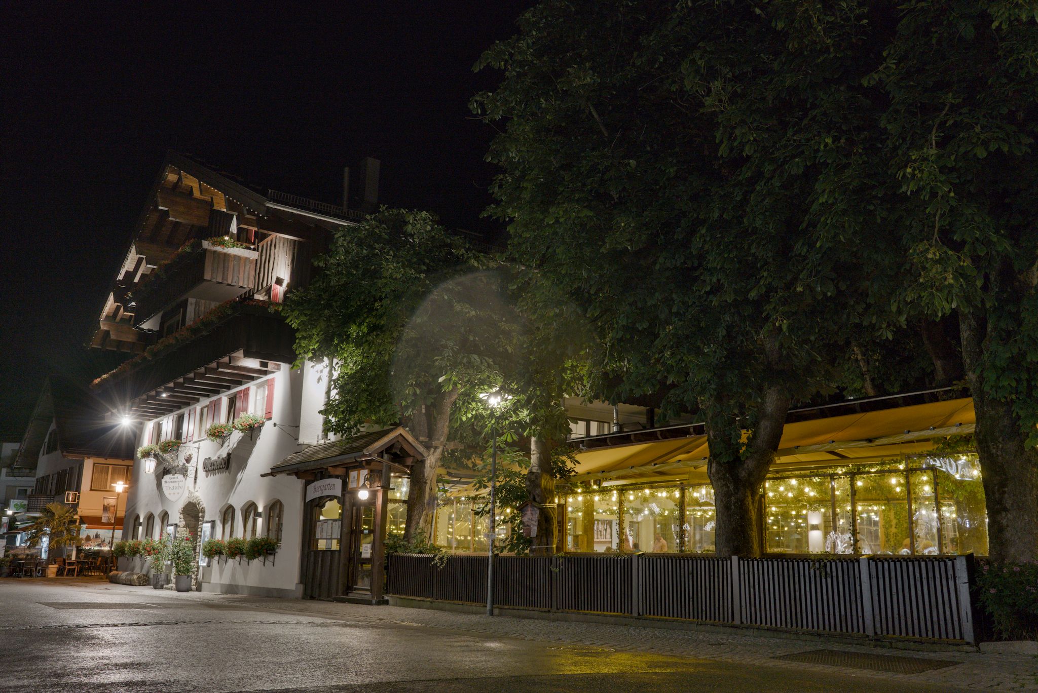
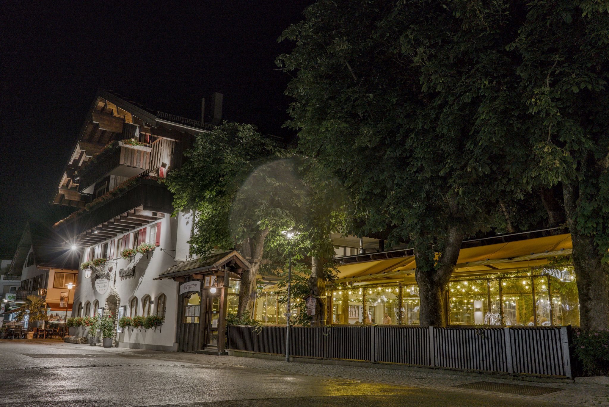
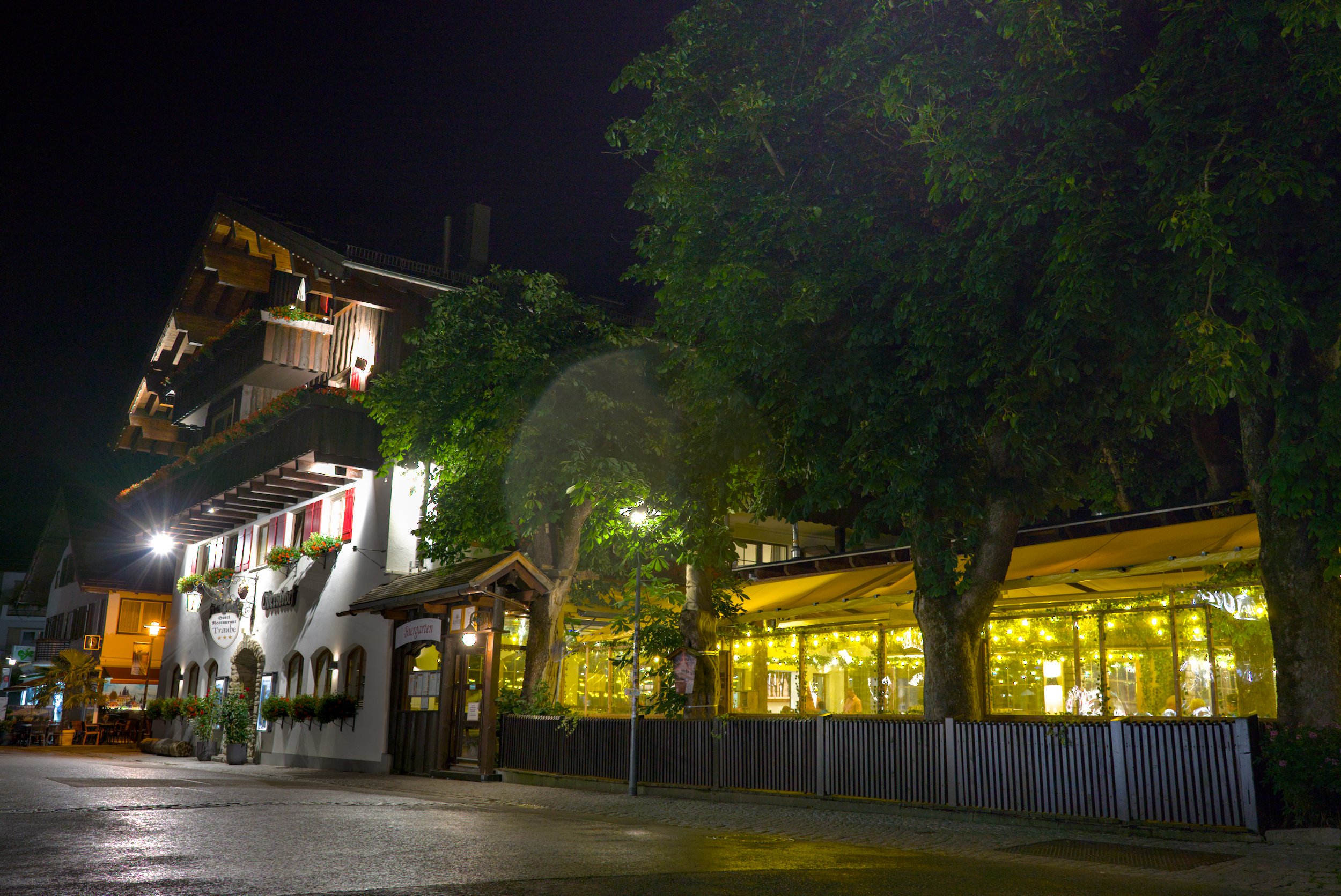
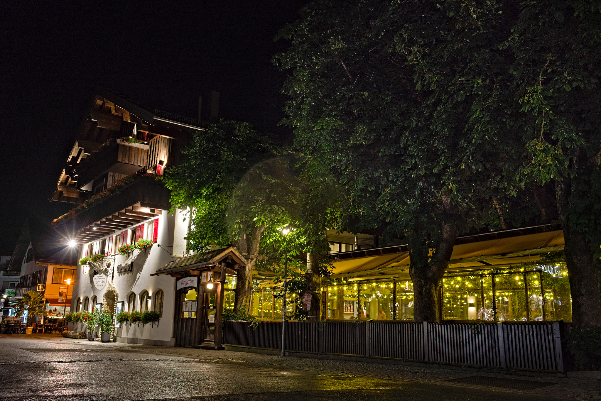
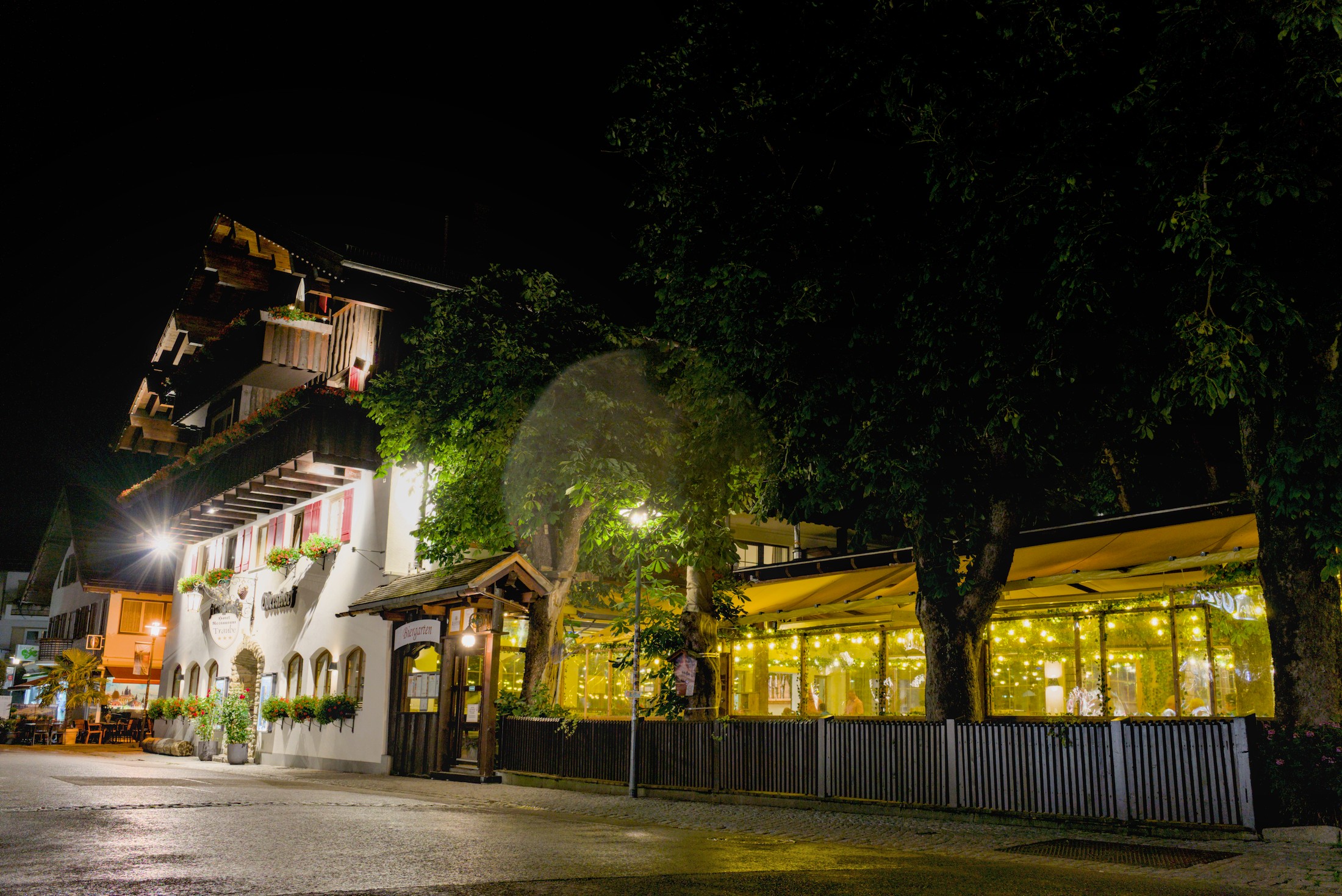
Making the switch from Lightroom to Darktable, I often encounter images that are really easy to edit with the former, but require hard work in Darktable. Somehow Lightroom often “looks good by default”.
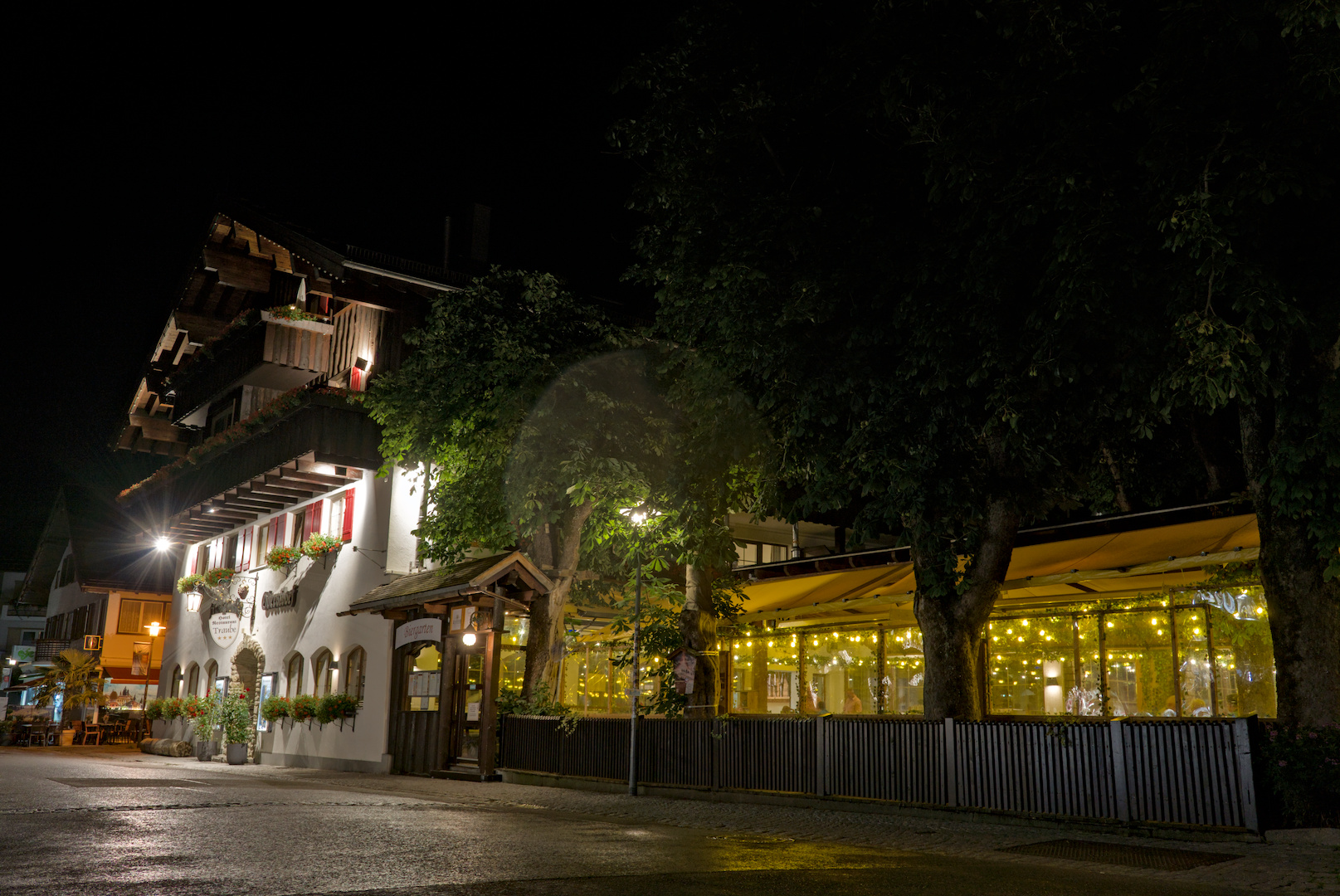
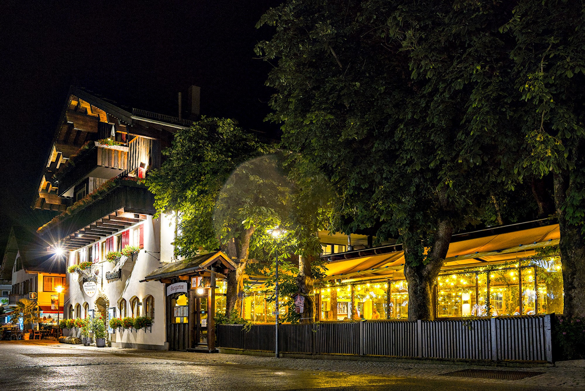
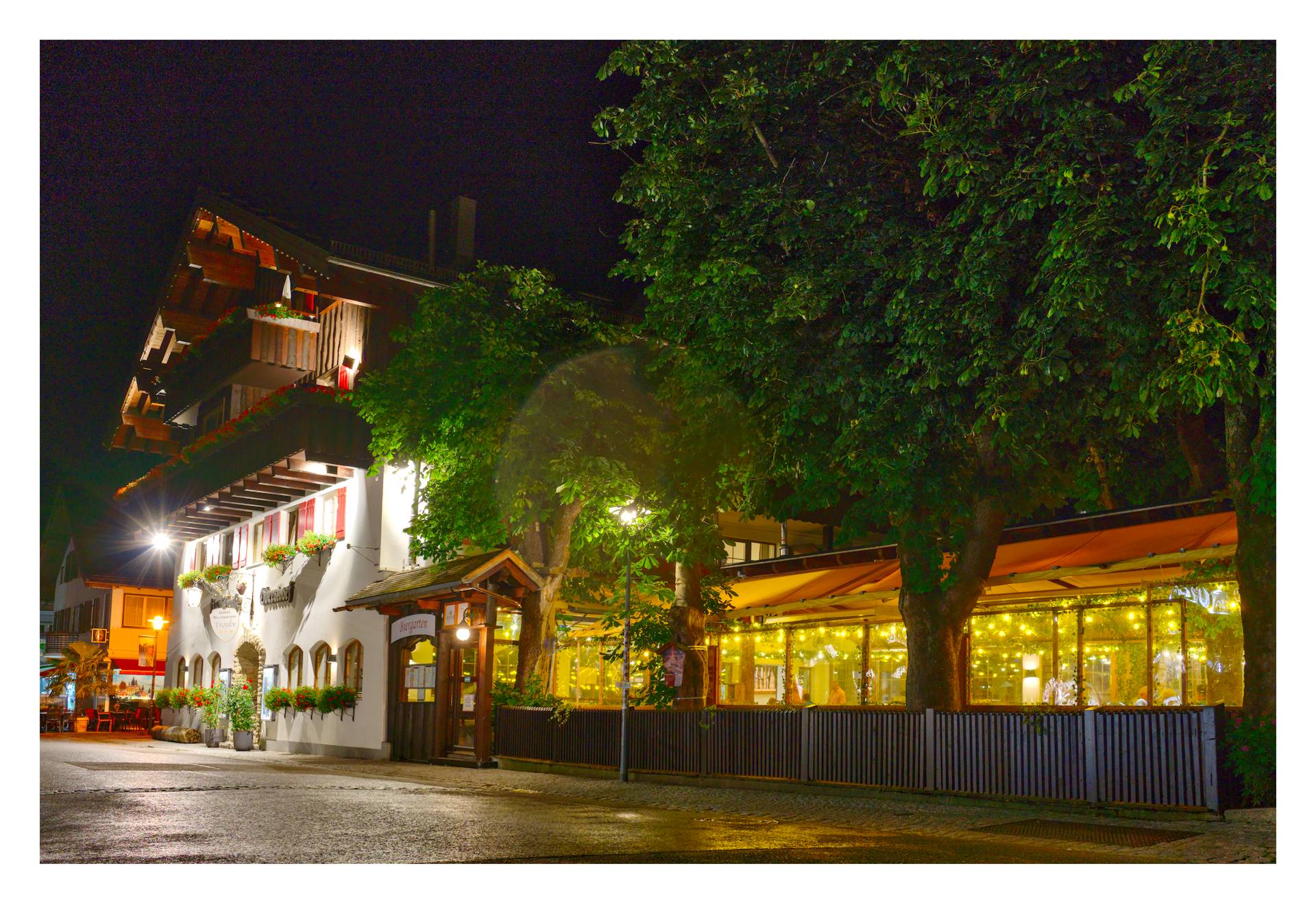
This picture is a example. While the Lightroom version is HDR-ish and would not be my final result, it was made with just 5 clicks (basically just pulling shadows up all the way, highlights down all the way and adjusting the black point a little, some denoise). 15 seconds of work.
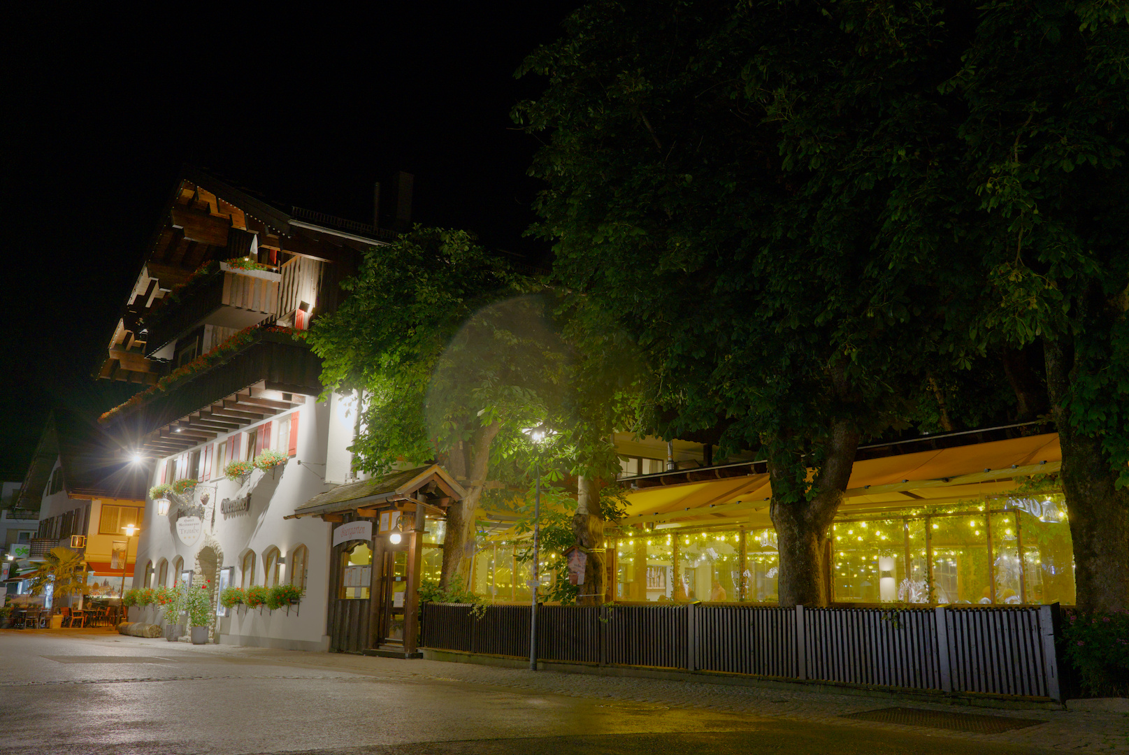
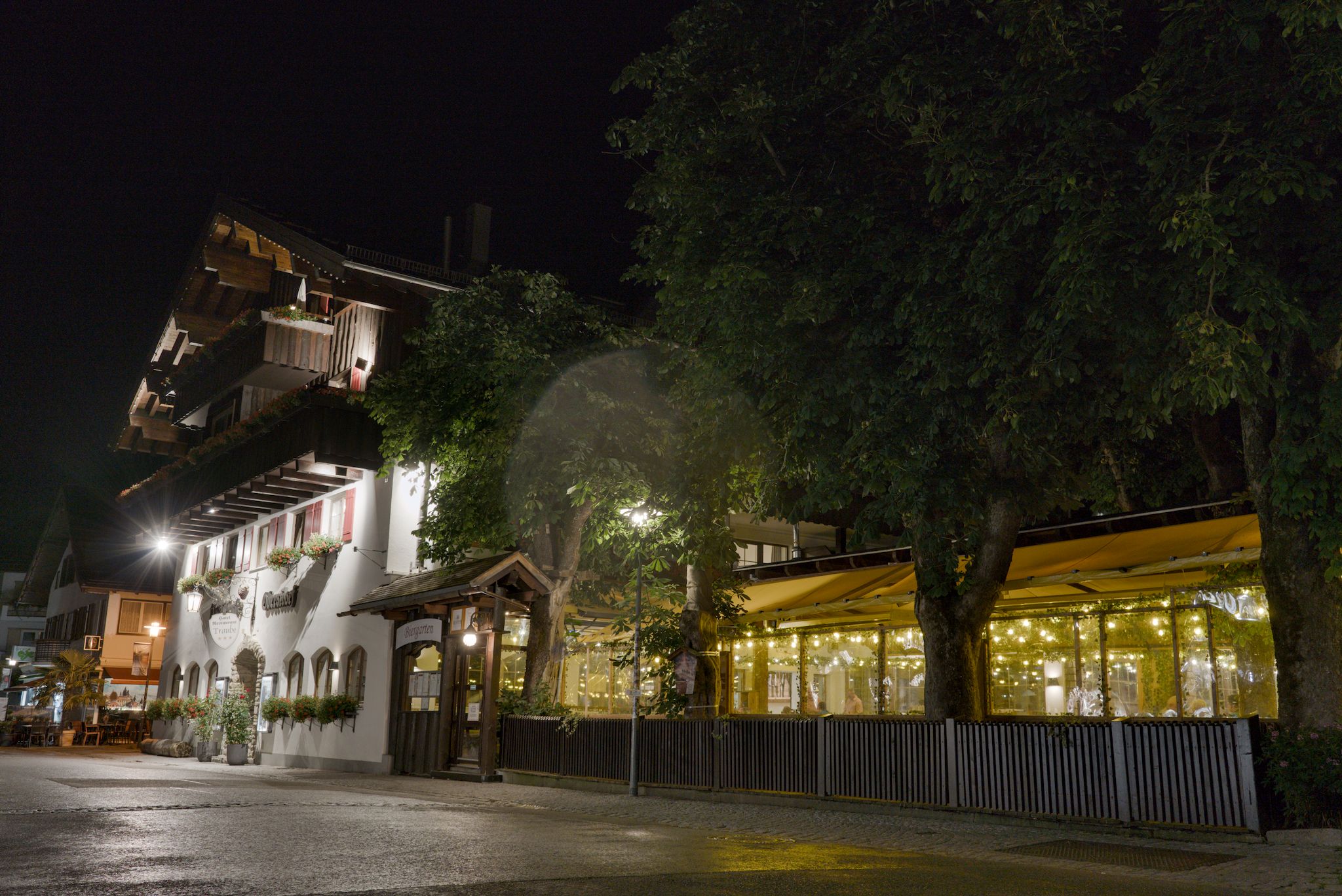
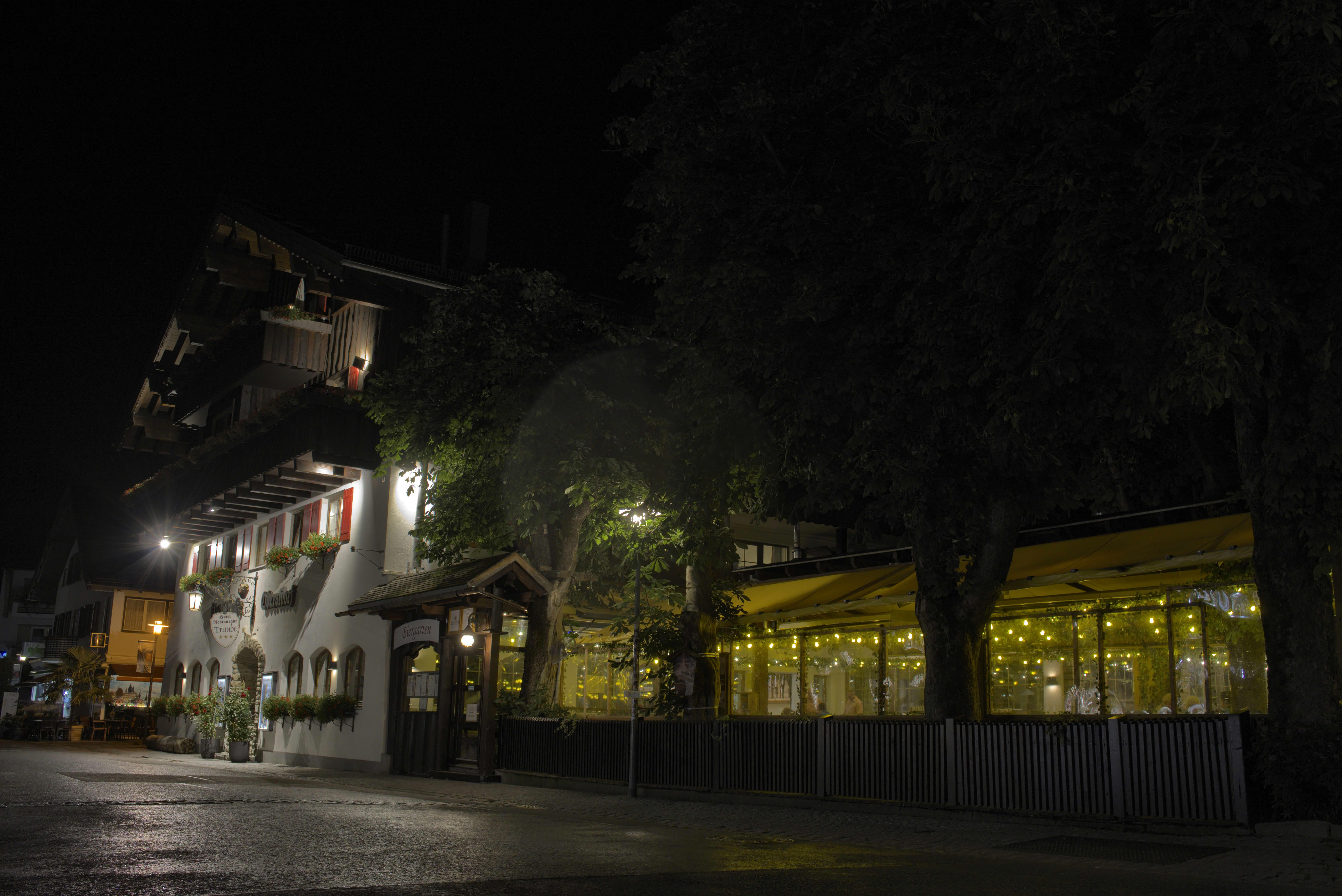
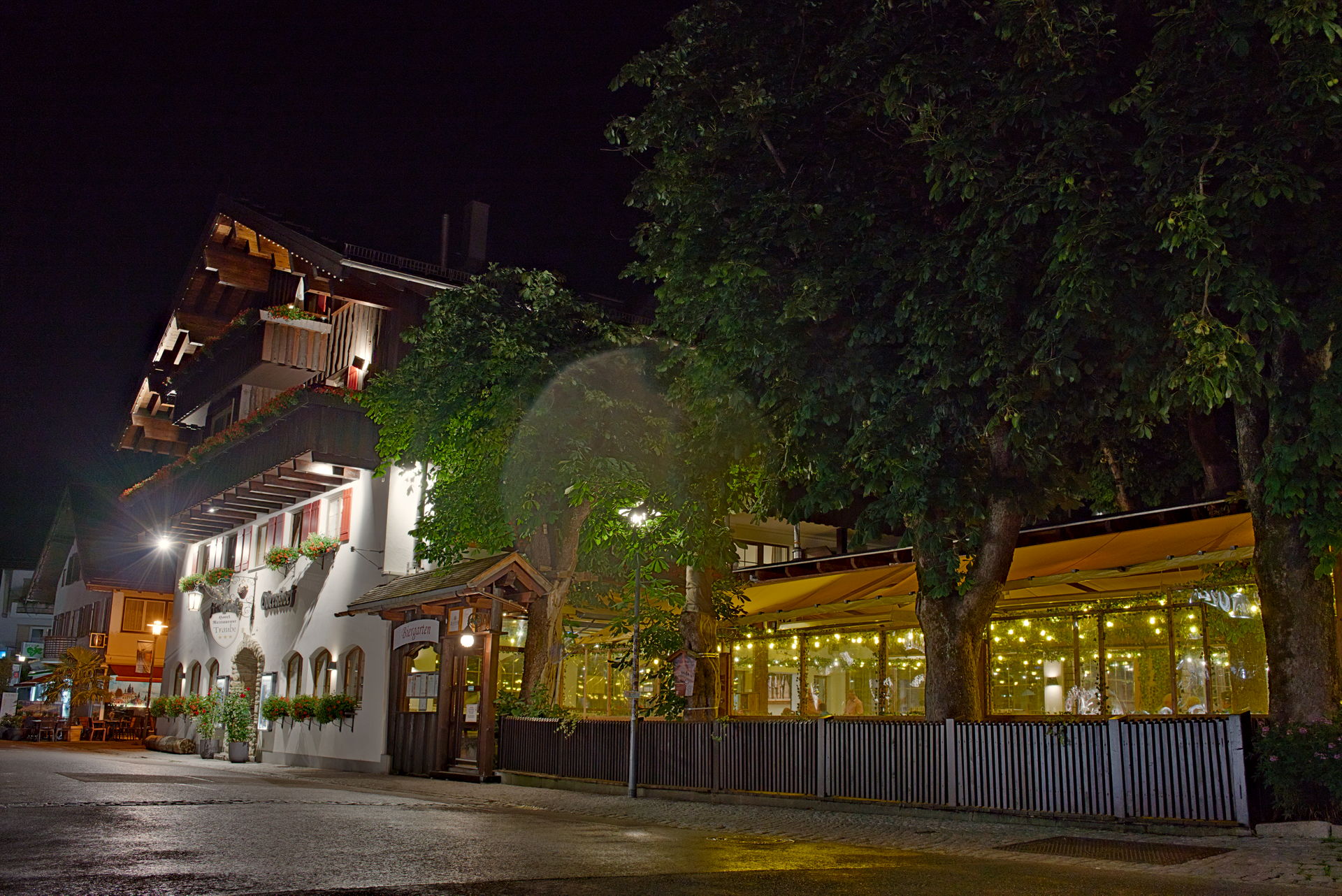
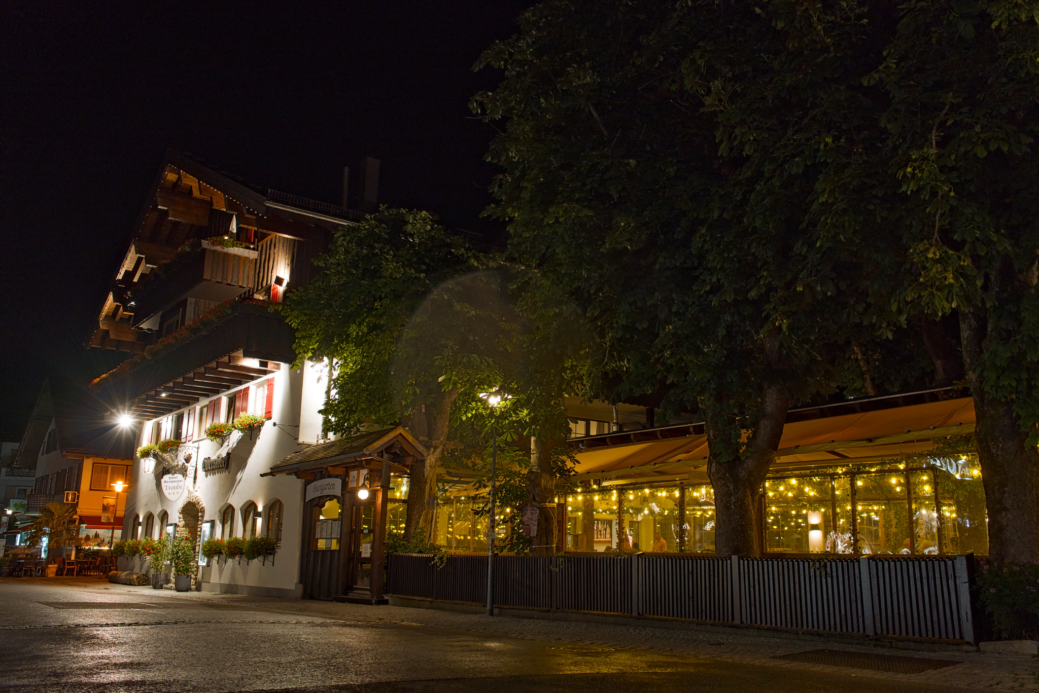
This is my DT version after messing around for something like 15 minutes. It involves a pretty extreme tone equalizer, diffuse or sharpen with “local contrast” preset, color balance RGB, an RGB curve, sigmoid and one local contrast module in the end.
It still looks worse though. The colors are off, especially the greens of the trees and the browns of the house look unplesant (white balance is “as shot” in both cases). The local contrast is also worse.
What I am searching for is a way to edit similar night photos with minimal-effort. Edits that look good but can be done quicky and easily.
I don’t want to sound rude or harsh, but I think the Lr edit has really serious issues.
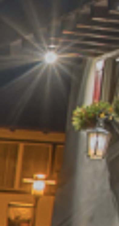
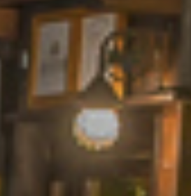
The brightest lamp in the image is darker in the middle than around it; the other two lamps also show a light grey spot, which then abruptly transitions into not that much darker areas of colour:
Tone mapping and local contrast enhancement are always tricky. Probably it can be done better in Lightroom, too, but it wouldn’t be 5 seconds. And I personally would prefer to spend time on an image and get better results over spending 5 seconds to get that look. Then again, I may be more sensitive to ‘HDR-look’ (= badly tone-mapped) than many. HDR is about high dynamic range, which, when the mapping is done well, does not have the ‘HDR-look’ on screen.
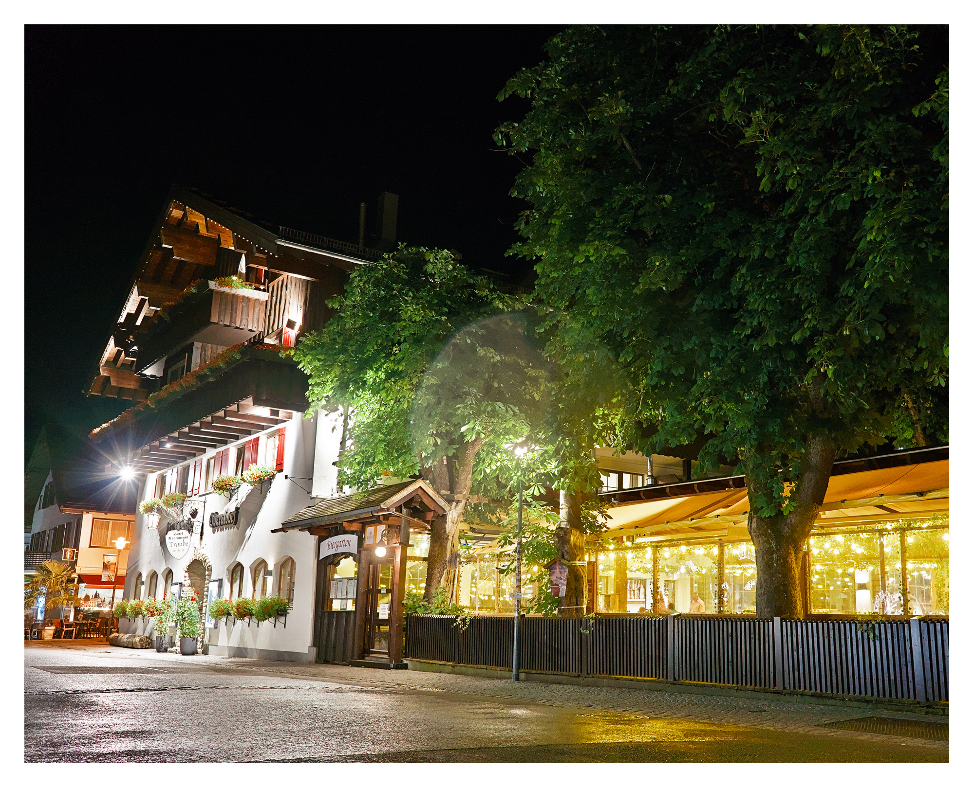
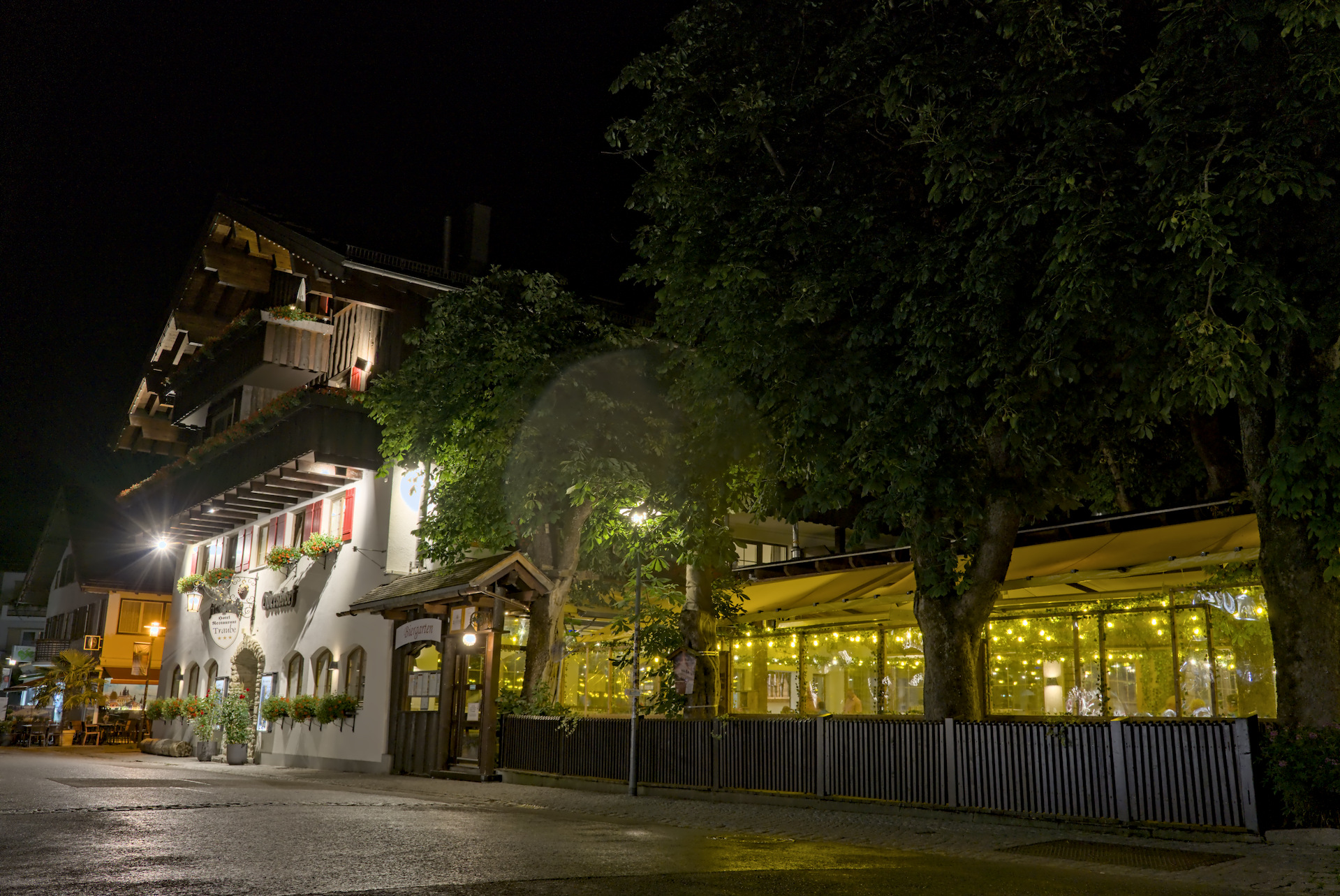
Here’s my play. I’ve basically done Sigmoid with a double pass of tone equalizer and double local contrast (one Laplacian, one bilateral) and then only tweaked the colors…
I think I got it well enough, tried to keep the blacks looking natural, so they’re not washed out.
*depending on browser the color management may not be applied as I see blacks a bit darker than they are in DT or XNView MP
I am not saying that the lightroom version is perfect.
I did not notice the issues around the lights, so I don’t think that they actually affect the image negatively.
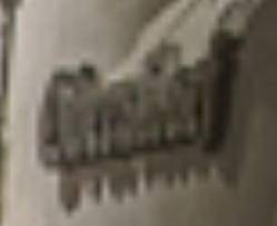
The brighter outline in the shadow under the sign is actually an interesting observation that might give some insight into how Adobe achieves this look. This seems to be part of their local contrast preservation.
Of course the HDR-look is too much here. But in night photography, I like a little bit of this direction in my images.
You can achieve this with Filmic by increasing the white point. Looking at the two images, the LR image seems to have lower DR and be much more compressed.
I will give it a try later, seems like a fun image to play around with
As I said, I meant no offence; I’m sorry if it came out that way. I know I’m very sensitive to halos and similar artefacts, and complain about them even when everyone else is happy. For me, the Lr version looks overly compressed, the brightest spots (the powerful lamps and the surfaces they directly illuminate) look too dark. But that’s personal preference, I guess, not something to judge.
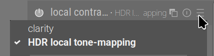
Now, to put my money where my mouth is, and to provide examples / advice: maybe the local contrast preset HDR local tone-mapping is more to your liking.
The same basic development (with tone equalizer used to lift the shadows, otherwise only basic exposure + agx (which you could replace with sigmoid or filmic rgb if you are not on a custom build providing it), with 3 different local contrast settings:
While the Lightroom version is HDR-ish and would not be my final result, it was made with just 5 clicks (basically just pulling shadows up all the way, highlights down all the way and adjusting the black point a little, some denoise). 15 seconds of work.
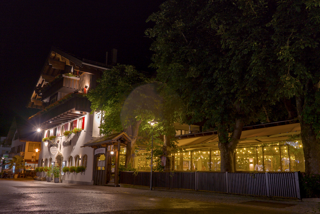
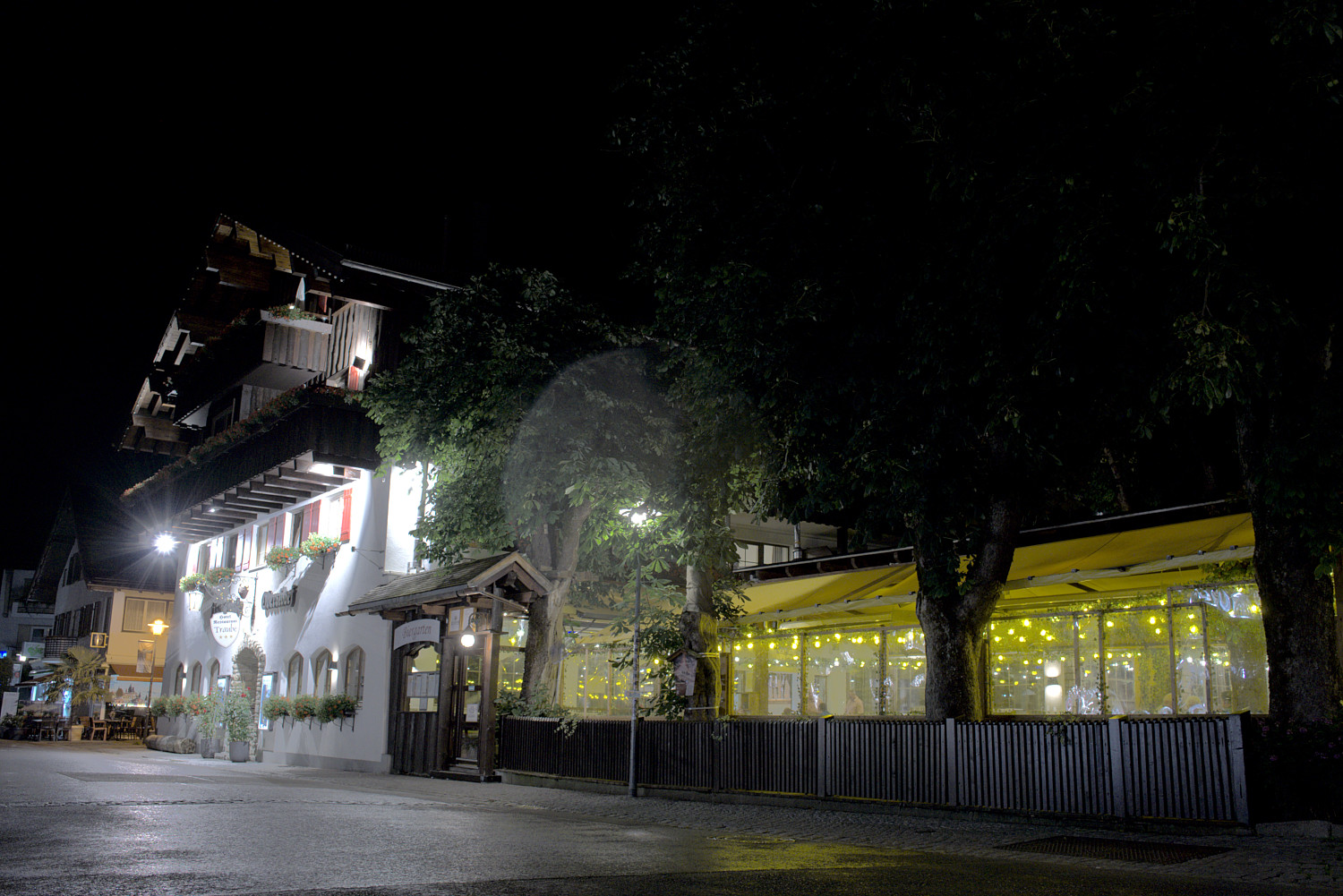
The result here is my 10 seconds of work, adjusting just the exposure and filmic modules dragging total of three sliders. As I said, it’s probably not the exact look you want, but for 10 seconds, it’s not horrible.
I’m not saying the final result I created is what you want, but when you have presets automatically applied upon opening an image, it can cut your work time down a lot. I do not own any Sony cameras, but because I have worked on several play_raw ARW images, I have some presets that automatically apply. So, upon opening your ARW image for the first time, the history shows 17 modules were applied automatically, the last 5 are Sony specific.
Besides presets, I have multiple styles that I have created for the most common camera/lens combinations and lighting conditions I typically shoot, based on what I want the final image to look like. After opening an image, I can then click on a style that I think would help the image toward my end goal. Presets and styles shortens overall edit time dramatically.
My guess is that another minute or so in color balance rgb and another module or two should get what you want. Once you have that, make some presets and styles, and then use those to automatically apply and shorten your edit time dramatically to get the look you want.