I’ve been editing my first batch of images in darktable and I’ve hit a snag at the final stage - exporting. The final jpegs are oversaturated. I’ve looked at other threads with the same issue, but haven’t found a solution.
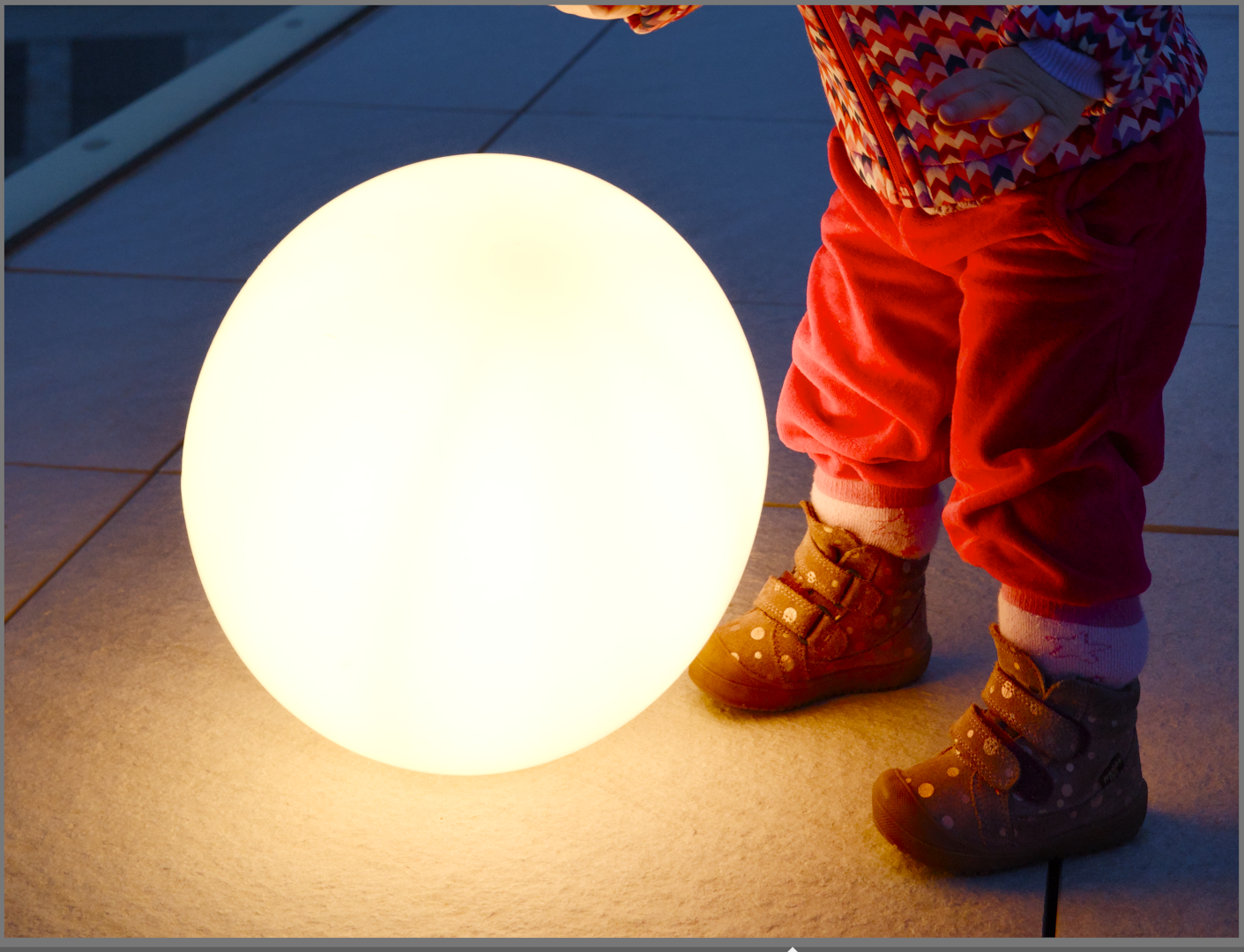
#1 Image as it appears in darktable using the “system display profile”
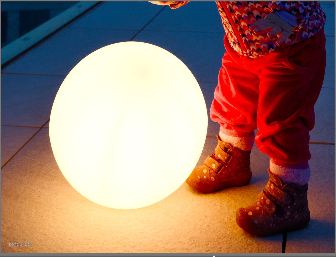
If I change the display profile in darktable to sRGB (web-safe), I get the same oversaturated look as in #3. Importing the exported oversaturated jpeg (#3) back into darktable, I get look #2 (soft-proof enabled version). I also tried calibrating my laptop screen and using the newly created profile in Gnome, but that didn’t help.
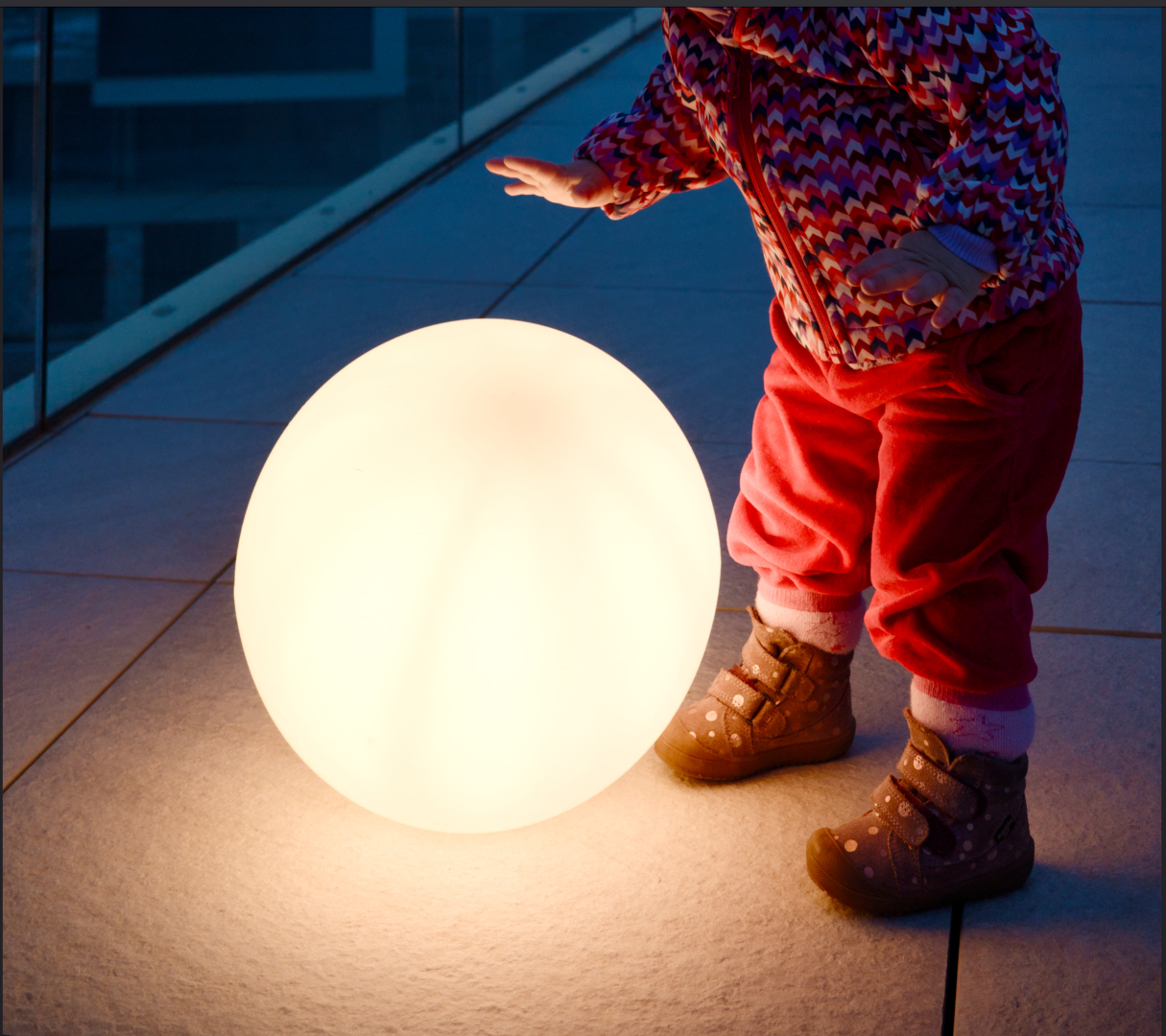
Viewing the exported image in Geeqie also gives the oversaturated result (#3).
i’m running darktable 5.4.1. on Fedora Workstation 43.
I suggest that likely your screen is not going to be the same as the srgb output that you have selected…Your profile might have slightly different gamma or some other settings. Softproofing is for printing not checking exported files and the DT color profiles cannot do softproofing or rendering intents as they are matrix profiles.
It looks like it might still be out of gamut on the red and what you see is that reflected when you export from your display to srgb.
Are you sure also that your display is using your calibrated profile…I would put it in the config folder in the color/out folder and specify it implicitly to be sure…
Finally check your settings for preview vs export…if you use the default preview make sure high quality reprocessing is off. If you use the high quality preview then set it on when exporting… You could just check and enable it to see if you see a shift in your displayed image…certain modules have more impact than others…
But maybe just be sure gamut is under control too before exporting to ensure that profile conversion can work with non clipped data…
Yes, as Todd said, I think you’re outside of sRGB gamut. Soft proofing isn’t going to do the right thing for you here.
You’re exporting with an sRGB profile so there’s loss of detail in the saturated reds.
Do you want the image to look like #1 or #2? If #2, then reduce the saturation in Darktable before export.
Set histogram / waveform profile to ‘export profile’ so you know if values are going above what the output colour profile can hold.
I will also note that I have weird issues with geeqie recently that seem similar to your own. Namely, if color management is enabled, the saturation of darktable exports goes crazy. When I view the same image in Firefox (or on my wife’s mac) it looks pretty identical to what I see in Darktable.
I do not know if you have looked at the exported images in other viewers (or devices), but it is worth double checking.
Thanks everyone for your suggestions. I’ll try getting the reds under control in that specific example (I don’t think I’ve encountered this problem before using other editors).
Nevertheless, other colors are oversaturated as well, which perhaps isn’t as apparent on the posted example (if you look at the blues in the upper part of the image).
I want the image to look like #1. I checked the exported jpeg on my phone (with Firefox on the web and as a file) and the result is the same (#3).
I feel like this problem lies with display profiles. I am no expert on the matter but remember others having success with setting the display profile in the system settings.
Are you able to share the image or others as RAW+xmp to troubleshoot on our machines.
Also: which colour profile have you set on the export module?
Slightly tricky. You could set the output colour profile to ‘system display profile,’ but any truly sRGB screen will look like #2, and any wide-gamut screen that is being treated as sRGB will look like #3.
I use ‘Pix’ which is an image viewer on Linux Mint. It allows you to switch colour management on or off if there’s an embedded colour profile in the image (off meaning ‘treat as system display profile’).
Okay, now that I’m finally on my computer, I checked the reds and they’re clipping according to the waveform. It turns out that even the blues are clipping, so this edit is wildly outside of sRGB gamut. Whoops.
I tried @priort 's next advice as well and put my calibrated profile in the color/out directory, set it as the export profile (which I was unable to do before manually placing it there) and viola! The exported jpeg looks like the one I see while editing. Thanks everyone!
Btw, @gwbarn, I tried Pix, but I couldn’t find the color management option. Maybe I missed it or maybe it’s missing in the Gnome version.
I still don’t understand how these different profiles affect my final image, though. If I export the final jpeg with my display profile instead of sRGB, how will this affect the colors on other screens? My laptop screen supposedly covers 100% AdobeRGB and I checked the “display profile jpeg” on my phone and it looked okay, though I have no idea what Google photos does to an image or if my phone’s screen is color managed.
Also my biggest concern with exporting images like this is printing, since I like to make printed albums.
Anyway, I’ll try to bring the colors under control and see if I can get a better sRGB jpeg out of my edits.
All you can do is keep things accurate and to your taste on your display. It sounds like it has a higher gamut than srgb so you would need to be mindful of gamut and even then if you are in display gamut you might benefit from a profile that will do some gamut mapping to get that mapped into srgb. Phones …Google ones are generally P3 colorspace so not adobe rgb but bettern than sRGB and they will be often brighter so that can impact how it looks…its kind of hard once the image leaves your control as others will have a myriad of hardware and perhaps profile issues etc that will impact what they see…
The safest way for sharing is maybe to set everything rgb and then you will have a better idea of where you stand…soon this maybe set everything to P3 or some other higher gamut standard but for display that’s not often Adobe RGB. It should be okay for printing as most of the printer profiles can do a decent job of color mapping once you get a feel for it…
With some experimenting you will get the right fit for your workflow.
Most likely they will silently default to sRGB. Or, they will complain…and then display it as sRGB.
I would not use your display profile as the export profile. That goes double if you want to print with 3rd parties. It is an easy way to get unwelcome surprises.
This button in the top left, when the image has an embedded profile. I think another suitable way to describe it would be ‘adapt to system display profile’
What are your preview and export settings…are you matching them up… ie default preview with HQR set to no on export and HQR preview enabled for both preview and export.
Those would be the two conditions that should line up…when you cross them you can see differences…
I’m not on my editing PC but where I am looking now in Chrome I don’t see a massive difference…
Do you evaluate back in DT or via a 3rd party viewer??
I’ve never needed to match anything up before (but then again, I usually try to go for quite saturated images, but this one I wanted more muted).
The left side is inside of Darktable, and the right side is the default Gnome image previewer just placed on top.
Unfortunately, when I open the same edit in Darktable 5.2.1 in Windows, most settings seem messed up so I can’t compare (and it’s also more saturated from what I could see).
The HQ preview is newer and uses the full image data. This means that some modules based on how they do the math will be different when you enable it…and so for any random set of modules applied again these differences could be involved…zooming to 100% is not impacted but when you look zoomed out to access the image you can see it by toggling…Its very performance demanding so unless your PC is very high end it best for those sort of toggling investigations and not full time use…
Bringing it back into DT should keep the color managment and profiles all common and so it should be good…then going to an external viewer you will just need to confirm that it color manages and that all of that is set correctly and in agreement with DT when you compare…
@gwbarn I seem to have installed the wrong “Pix” app. There is a different image viewer with the same name in the Gnome store. I don’t think the Mint one is available for my distro, but It’s supposed to be based on gThumb, which is available for Gnome and has the button you mentioned.
I don’t understand how it works, though. If I export an image in sRGB, there is no difference (as expected) if I press the “Apply embedded profile” button. But if I export it in, say, Adobe RGB (which looks more muted in darktable) the “apply embeded profile” option works opposite of how I would expect. When this option is off, the colors are less saturated and when turned on (as in, the Adobe RGB profile is applied), the colors get more saturated. ??
I went through my batch of images and re-edited them using sRGB (web-safe) as the display profile in darktable and then exported them (in sRGB as well). Now my everything lines up, what I see in darktable and the final jpeg.
I’m not thrilled with how it turned out, the colours clip really quickly and everything looks blander (as I could have expected, I guess, since the sRGB color space is smaller). If I aim to edit in a way that’s maximally compatible with screens on other devices and third party print services, why not just edit with sRGB set as the display profile in darktable all the time?
On a side note, my phone (Oneplus 8) seems to have P3 coverage, which would explain why the image with the embedded calibrated display profile looked okay on it.
What is your display situation wrt profile, hardware and calibration status?? Just curious… Also if you could share an image and xmp others could confirm or deny that they see things as you do…Rendering intents in DT are generally not operational with the built in profiles…they are matrix profiles that cannot map rendering intents…
I’m dashing off but when you don’t use the profile you would be mapping adobe numbers which might be higher rgb values esp in red to srgb values so things would be brighter …when you use the profile the values are mapped as they should be…using the right profile…