How can you develop the RW2 files of a Panasonic Lumix well with ART?
This is mainly about the red cast and the oversaturation of colors, especially in portraits.
I would like to share my experiences with my S5M2 with others and also tell them which settings I prefer and why.
I welcome suggestions and of course improvements to my workflow.
So far I have always used the following profile: Color > Color Management > Custom: “PANASONIC DC-S5M2.dcp”. It reproduces the colors most naturally when you photograph a color test chart. That was always my impression, I didn’t measure it technically.
The red cast of my camera has always annoyed me a lot. There are also many reports on the net about the tendency to render slightly red skin even redder. So I looked for tools in ART with which you can correct this well.
Now I’ve gotten a tip from @Thierry007 to use “Camera standard” again. Much to my delight: the red cast is visibly less.
After a good white balance, the skin tones usually do not need to be improved any further with “Camera standard”.
“PANASONIC DC-S5M2.dcp” boosts the yellow a little and the red a little more. Sometimes the pictures look fresher as a result, but the red cast also becomes clearer.
That’s why I’ve now switched back to “Camera standard” and my great dissatisfaction with the skin tones of my camera has subsided.
Hi,
a have a similar journey behind me but related to a Sony A7M4.
After long tests with available profiles of Adobe and the integrated ones I am now using the following settings in ART:
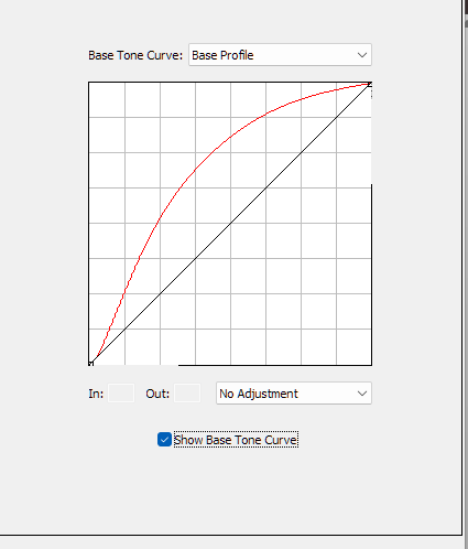
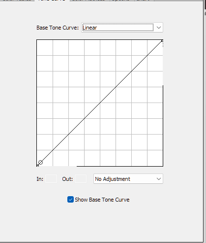
Tone curve: Neutral; soft lightning; contrast=10, auto matched curve
Input color profile: camera specific linear profile from Tony Kuiper
See: https://goodlight.us/linear-profiles.html
The profile for your camera is already existing !
This setting gives me the best starting point for my RAW files…
Perhaps worth an additional test…
BR
click on the link and you will see a very detailed description how and why to use a linear profile and you also get a description how the get the profile…
Would it not basically be the same to use the Adobe profile…be sure the tone curve is not checked. And then just set tone curve1 in RT or ART to be linear…
The description of Tony and other experts convinced me to go this way. There are many mutual influences with profiles and curves that I believe my solution is more straight forward…
Your described way can also be a solution…
I haven’t tried Tony’s profile yet, maybe it’s really good, I’ll see.
But it’s my goal to achieve good results with the resources from ART. So I can discuss and exchange my .arp with everyone. It is difficult to ask questions about problems in the forum if I use a special profile that (almost) nobody has.
edit: Tony wrote to me: The linear profiles on my website will only work with Adobe Camera Raw or Lightroom. If ART-RAW is not an Adobe product, then linear profiles like mine, which work from the Adobe Standard profile, will not work.
This topic is now closed for us in this forum.
I’d have to read but I think I have seen these videos before and its really about getting lightroon not to use the base curve in those profiles out of the gate and instead open the images with a linear curve ie none basically… RT and ART can disable that so I am not sure what those profiles would offer as I don’t think anything related to color is changed… but I will maybe go and followup… just to confirm
I have been able to use the “Linear-Panasonic DC-S5M2.dcp” from Tony in ART, it gives good results, but they are practically identical to “Camera standard” from ART. So there is no reason to deviate from the Camera standard.
It was worth it to me as a little experiment.
I stick to my opinion: Camera standard from ART is the best profile (definitely for portraits) I don’t know of a better one and I’m not looking for one anymore.
Just after min 6… and the problem in this video is Anthony doesnt show by checking the tick box the base curve that is in all of the normal dcp profiles ie the one you can turn off in RT and ART… I think those profiles will be exactly the same as if you simply turn off the tone curve when using the default profile…
So this should be the same as having a linear tonecurve in ART’s tone curve module and disabling the tone curve in the normal DCP profile .
THe reason for these profiles is that LR needs this modification as they get applied by default without this option to turn it off so you had to manipulate the profile…
All the other information in the profile is unchanged…
I can see a bunch of Adobe DCP profiles for your camera. Maybe it would be worth to try some of them?
/data/soft/photo/CameraProfiles/Camera/Panasonic DC-S5M2/Panasonic DC-S5M2 Camera Cinelike D2.dcp
/data/soft/photo/CameraProfiles/Camera/Panasonic DC-S5M2/Panasonic DC-S5M2 Camera Cinelike V2.dcp
/data/soft/photo/CameraProfiles/Camera/Panasonic DC-S5M2/Panasonic DC-S5M2 Camera Flat.dcp
/data/soft/photo/CameraProfiles/Camera/Panasonic DC-S5M2/Panasonic DC-S5M2 Camera L Classic Neo.dcp
/data/soft/photo/CameraProfiles/Camera/Panasonic DC-S5M2/Panasonic DC-S5M2 Camera L Monochrome D.dcp
/data/soft/photo/CameraProfiles/Camera/Panasonic DC-S5M2/Panasonic DC-S5M2 Camera L Monochrome S.dcp
/data/soft/photo/CameraProfiles/Camera/Panasonic DC-S5M2/Panasonic DC-S5M2 Camera L Monochrome.dcp
/data/soft/photo/CameraProfiles/Camera/Panasonic DC-S5M2/Panasonic DC-S5M2 Camera Landscape.dcp
/data/soft/photo/CameraProfiles/Camera/Panasonic DC-S5M2/Panasonic DC-S5M2 Camera Monochrome.dcp
/data/soft/photo/CameraProfiles/Camera/Panasonic DC-S5M2/Panasonic DC-S5M2 Camera Natural.dcp
/data/soft/photo/CameraProfiles/Camera/Panasonic DC-S5M2/Panasonic DC-S5M2 Camera Portrait.dcp
/data/soft/photo/CameraProfiles/Camera/Panasonic DC-S5M2/Panasonic DC-S5M2 Camera Standard.dcp
/data/soft/photo/CameraProfiles/Camera/Panasonic DC-S5M2/Panasonic DC-S5M2 Camera Vivid.dcp
Hello @priort,
I don’t think we need to worry about Tony’s Linear Profiles, they may be an advantage for LR, but we don’t need them in ART.
Hello @tankist02, I know all those Panasonic profiles from Adobe: they are not good to use in ART, they make too high saturation. Portrait.dcp makes the faces bright red, a disaster, also in the camera the profile is not suitable for Europeans, but maybe for Japanese.
Now it would be good, also for other Panasonic users who want to develop with ART, if we could get back to the essentials.
I can definitely say that I don’t know of any profile that is better suited to portraits than the “Camera standard”, because it doesn’t exacerbate the Panasonic’s problem, but actually mitigates it a little: The red cast.
After this first step, I would like to address the topic: Exposure > Tone Curves > Mode. My experience here is that Neutral is the best. If you want a little more color, you can also choose Standard. And if both offer too much saturation, then Weighted Standard is a good choice. I never need the other modes.
I think Micha has tried those…I presented it to him some time ago…He has been chasing this issue for some time and done some evaluation.
The problem on one hand is that unless you evaluate this in a systematic way you can end up with many different results and therefore conclusions due to the possible combinations.Those Adobe profiles have tone curve base table and look table options and even base exposure sometimes… To assess them you have to imo disable the ART TC module because it has color models and curve models linear and 2 other variants that can impact things and then if the auto tone curve is also on it bounces around. So it would have to be ART camera profile and desired ART TC options versus that disabled and using exposure and the full Adobe profile. The hybrid of that would be the Adobe profile for color but with its TC disabled and some set of TC options in ART…
And really of course the best would be a profile coming from a test shot not just a random one but a quality one made by the user to make sure red is red… and if that still doesn’t correct red properly tweak that profile to handle red better…
How does the Luminance tone curve mode look to you? It’s the only mode I would describe as neutral. The other modes alter saturation in various ways, some also change the hue. The “Neutral” mode would be in second place.
The manufacturers’ tone curves (which are what the auto-match curve estimates) are usually pretty contrasty. It might be that part of the problem is caused by this higher contrast.
I’ll also suggest using the Adobe Camera Standard DCP profile and unticking all of the camera profile check boxes (tone curve, LUTs, and baseline exposure)–but keep “Illuminant: Interpolated”. What that does is provide a matrix (“linear profile”) like the camera standard, but with its white point automatically adjusted to match ART’s white balance temperature setting. The difference is usually pretty subtle, becoming more noticeable as the white balance temperature decreases.
ART’s “Camera Standard” is derived from Adobe D65, so I think it’s basically the same as the “Adobe Standard” profile. If you use ART’s “Camera Standard” and check “Perform chromatic adaptation (CAT),” you can achieve the same or similar effect as the method you suggested. CAT is also a type of white balance adjustment.
Yes, the two profiles are practically identical if you switch off everything in "Panasonic DC-S5M2 Adobe Standard.dcp in DCP: Tone curve, Base table and Look table. That’s why I don’t need Adobe’s profiles.
What exactly does “Perform chromatic adaptation (CAT)” do, I’ve never used it before? With or without - the differences are really minimal.
Normal white balance balances the colors so that R=G=B appears neutral gray or white when the color temperature is D65. However actual images are not always in D65. I understand that CAT is a white balance that takes into account color temperature changes and other color factors of the image.
Adobe DCP profiles have D65 and D50 data and I suppose the “Illuminant: Interpolated” option estimates the white balance result based on the D65 and D50 data to match the actual color temperature of the image. So, I think “CAT” option and “Illuminant: Interpolated” option are similar functions.