“Perform chromatic adaptation (CAT)”
Do you know if it makes sense to include this in ART? I’m asking because I don’t really understand the science behind it and basically don’t see any difference.
Could it be that this function is particularly effective in extreme lighting situations and you don’t even notice the differences in normal lighting?
Gloss over all the math… just read it for context…
Sections 4 and 5 might be the most related to your discussion…
Basically it about crafting a perceptual correction between scene and viewing conditions so that color is percieved to be the same or closer then it would otherwise be…
Chromatic Adaptation explained.pdf (3.7 MB)
Hello priort,
a PDF with 17 pages of higher math - you have to know that I can’t do that.
I have to go into practice and see what happens. Now I have a shot where big differences are visible: Stage lighting. And I can’t say whether I really like the picture better with:
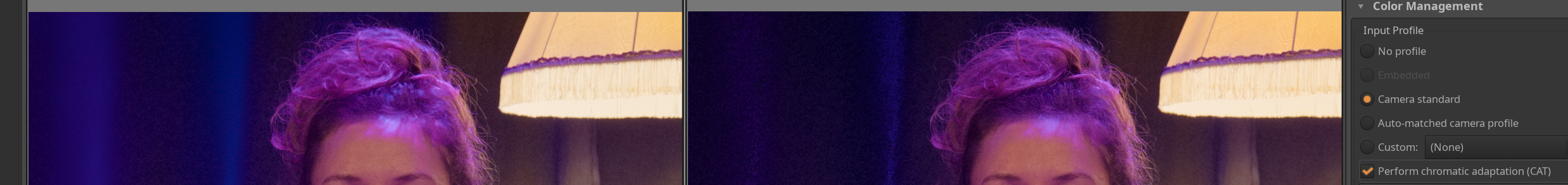
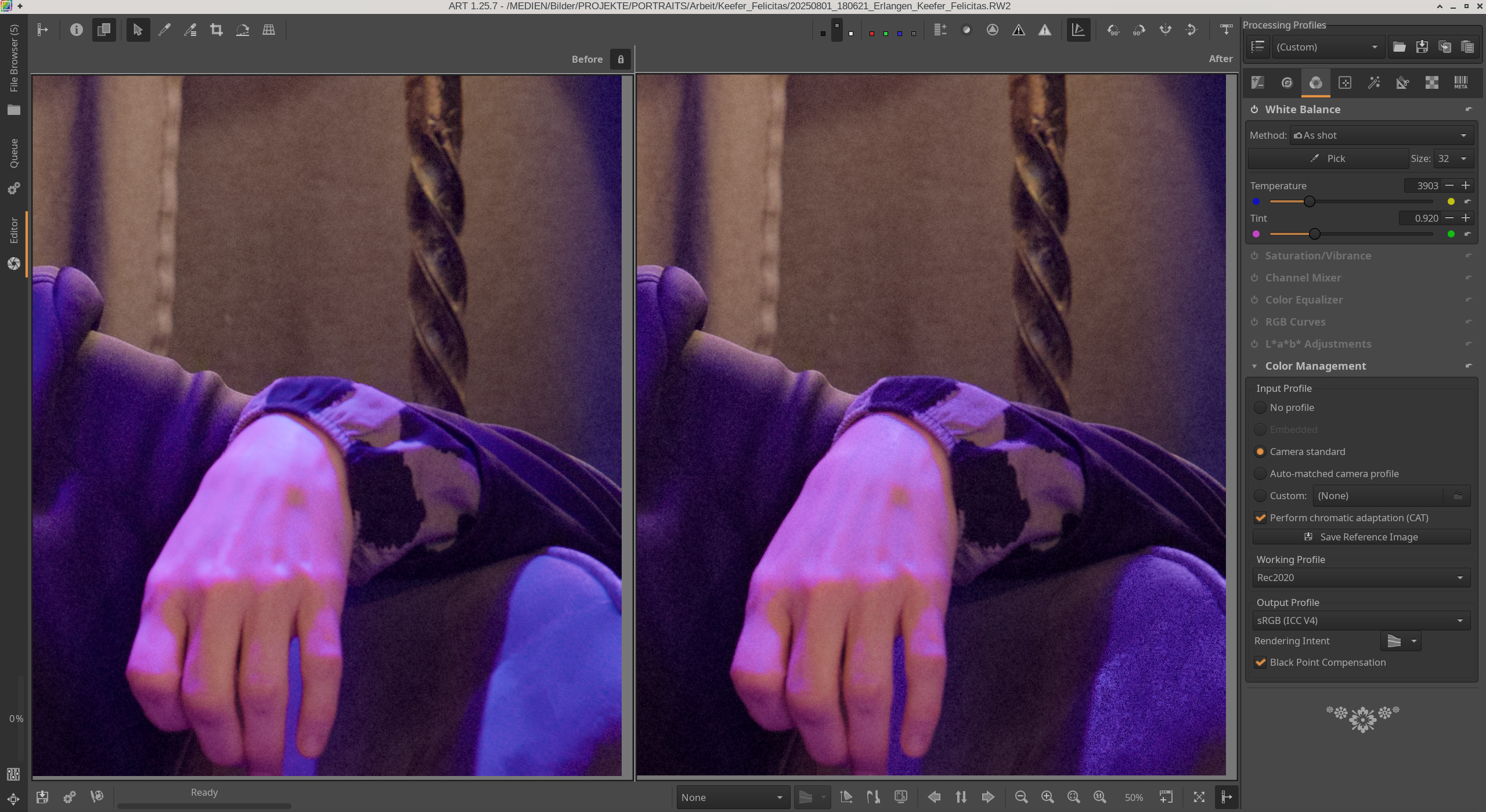
Links jeweils ohne, rechts mit CAT.
With CAT, there is much more violet in the bright areas of the fabric in this light. But I can’t remember exactly what it was like in reality. I also have the impression that CAT is trying to darken the light areas, i.e. to add a little more detail, especially on the hand, which doesn’t look natural here.
I’m sure there are shots where CAT has advantages, but for this picture I’m sure I’ll turn CAT off.
You asked the question and I did say gloss over all the math and just get the context of what it is doing… ![]()
Basically its the math to do this…
I had forgotten about dcptool…I had used it in the past just to get xml of the profiles so I could see what the data was…
It has an option to make an invariant profile so I used the adobe standard profile …
Working again using the head shot image you shared in your earlier post as an example it seems to do a nice job as well of cancelling out the red…
I tried it in two conditions…one with all the adobe options on, and 0.3 EV and the ART TC off and then turning off just the adobe tone curve keeping the rest of the profile and then turning on automatched tone curve in art…
Both seemed to really address the strong red…
Changing one more option in ART to smooth s-curve looked pretty nice to me…
s5M2inv.zip (429.5 KB)
Might not be an improvement as far as you see it to your use of the camera standard matrix profile…