The color calibration module tries to guess what color the light is, and transform the scene as it would look if that light were white. But the eye/brain only mostly does that. Incandescent lights still look yellow. Overcast days still look whiter than sunny afternoons.
I’ve been thinking about how to better render these scenes with indoor lighting. I want incandescent lighting to incandesce a bit.
Strategy 1: using the new workflow (although because I have a Sony I need to use a manually created 6500K WB preset), the default “color calibration” module looks somewhat balanced after “reset”. I think it might be reading metadata to fairly similar to “as captured”. It’s not ideal because it can’t be scaled back or increased. (I can reduce the opacity of the CC module or decrease the chroma of the lights. I’m not sure those give the right result. Reducing the opacity definitely doesn’t, but it looks fine in some photos.)
Strategy 2: I think the documentation implied I could use WB+CC as usual, then shift the color temperature a little bit in WB. That seems to look good, but it turns neon lights black. I guess it pushes them way out of gamut. Plus, the resulting image looks more creamy than yellow.
Strategy 3, and this one works: correct the illuminant to completely white (using the color picker or manual adjustment)

Then click “area color mapping”, open the “correction” dropdown menu. Use the color picker to get a white sample if the input sample is still unset, and change the target from grey to yellow. Set the hue around 70-80 degrees. Set the lightness based on how bright the target is. (A grey card would be ~18%. A white wall might be 80%. These are guesses.) Then set the chroma to decide how yellow the scene should be.
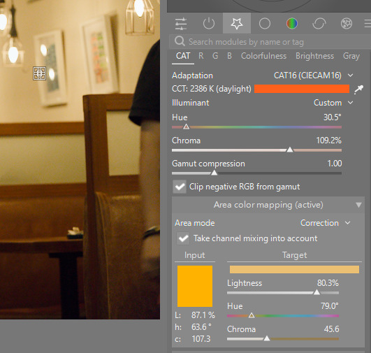
These settings are sticky, so it’s important to reset them afterwards. You must change the mode from “correction” to “measure” so your changes have no effect. Then you can double click each of the sliders to reset the values to 50%, 0, 0.
I guess if the scene didn’t have any white surface, I would open the “measure” mode, get any sample with the color picker, then go into the “correction” mode and rotate the hue slightly, and probably add some chroma.
If you have a strategy that works, I’d like to hear how you get good white balance when you want the scene to remain lit as we saw it, not perfectly white.
Note again that my white balance has a custom value for 6500-ish K, and that’s set in the sidecar. These files are licensed Creative Commons, By-Attribution, Share-Alike.
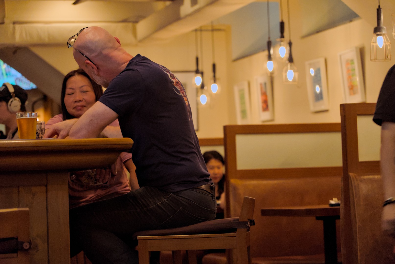
Here’s the JPG straight from camera, showing that the camera agrees with me. The light should be yellow:

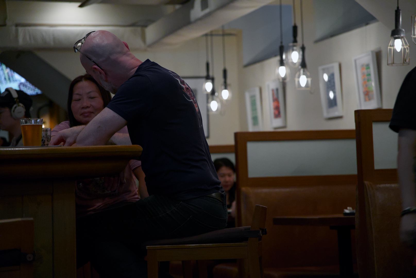
The raw and my 6500K white balance:
SIU01883.ARW (23.7 MB)
SIU01883.ARW.xmp (11.9 KB)
Oh, and a tip I got from one of Boris’s videos is to turn up vibrance in color balance RGB right away, since you will better see what colors you’re dealing with.