Remark: BTW, if you notice, the name of file has two extra `dots’. RawTherapee 5.6 consistently crashed if I load the attached pp3 file and tried to save without those two dots! I request some of you to download this pp3 file and see if you also encounter this issue. (I am on Win 10 64bit system)
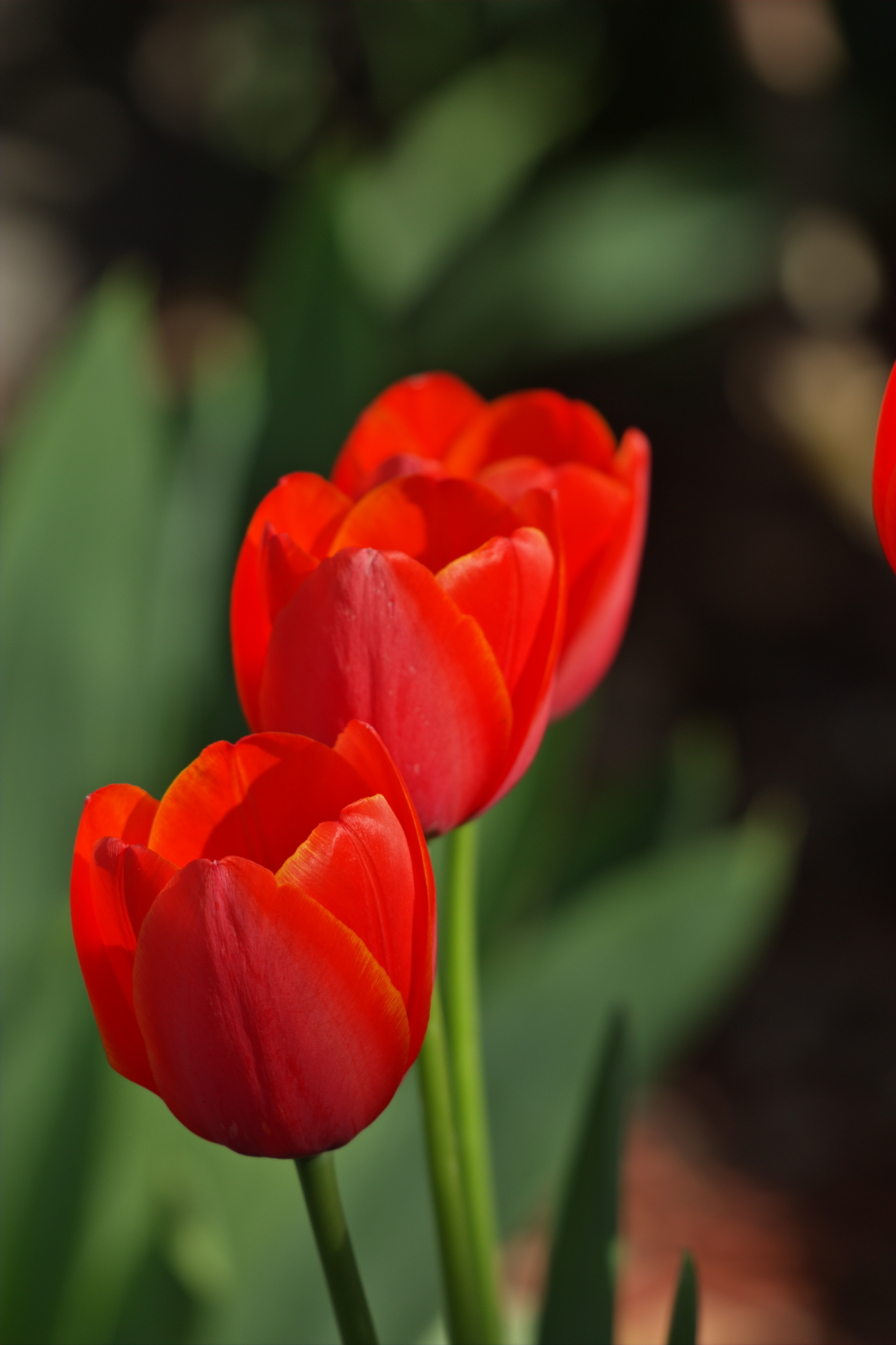
It’s a pity that I could not compare to the original. I have the strong feeling that my monitor can not display colors that come close to reality. Because @CarVac claims that the tones were more red than orange I tried to go into that direction.
Turning off the look table mitigates it. However, I examined the file using various input profiles, including ones from Adobe and some I custom-made specially for this image, and the orange is always there, so eliminating it completely seems to be wrong - it must be part of the scene.
colorspace:camera,assign: Primaries from RT camconst.json
subtract:camera: Blackpoint subtraction from the metadata
whitebalance:camera: As-shot from the metadata. More on this later…
demosaic:amaze: Always a good choice, IMHO… oh, there was also a normalization rotation here to put it in portrait
colorspace:Rec2020-elle-V2-g18.icc,convert,relative_colorimetric: Get out of camera space for the subsequent operations. I also let it do a 1.8 gamma to spread the data out.
whitebalance:1.141,1.000,1.374: So, here’s where I attempted to get colors back in line. As-shot seemed to have left a residual color cast, evidenced in a shift in the histogram, red and blue below green. So, I used this operation to align the rightmost histogram channel peaks. I haven’t picked apart the contributions, but it seems to put the colors a bit more where you want them.
curve:rgb,0.0,0.0,38.0,23.0,129.0,125.2,255.0,255.0: Pull the shadows down a bit.
saturation:1.20: Just for fun…
crop:0.000000,0.159533,0.880239,1.000000: Put the subject more clearly in the frame, shave off the flower peeking in on the right.
blackwhitepoint:rgb,data: linear scale the data bounds to the display bounds
I understand that the raw file actually has oranges and yellows, but the flowers were actually entirely red in real life, not even the trace of orange that Filmulator delivered.
I think this is why people complain about digital reds.
Yes, I think I got a better red at the expense of the rich greens in the background.
So, what would this be about, that the red response (and blue also, for that matter) of most cameras where I’ve seen the spectral response curves are “less-definitive” than the expanse of green response? Not a very precise sentence, but looking for a bit of discussion…
If parts of the flower that appears red to human eye, are decoded as orange or yellow, does’nt this mean that the green sites of the sensor are activated?
And thus the sensor green response should be wrong in such cases?
Indeed, the transitions between cooler and warmer reds in the petals look very strange, but they are definitely part of the captured values. I have tried both the standard Adobe matrix profile and few DCP profiles for the Canon 60D, with the same kind of result.
Here are two attempts, converted to sRGB from ACEScg with PhotoFlows’s gamut mapping function.