One more try.
Two white balances out of RT, blended them in Gimp using luminance masks and then added a little masking:
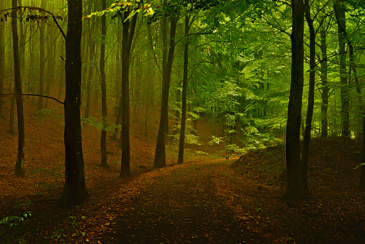
One more try.
Two white balances out of RT, blended them in Gimp using luminance masks and then added a little masking:
How do you apply this glow?
I’m not exactly sure anymore. I played with a lot of things. Local contrast + lighten, the equalizer in Darktable and soften module in darktable. With soften I usually apply a parametric mask to limit it to the highlights combined with some blur. So if it looks over processed it’s because it is. 
Did you use split-toning? cause the tint in highlights is available too…
In the spirit of the season, and because I’ve been listening to classic spooky stories all week, my version.
2016-10-16_soderasen_12.arw.pp3 (10.4 KB)
Same image with a more aggressive ‘cinema’ crop (2.35:1) and letterboxed to 1.85:1. Not sure which I like better. Some of the darker areas might have clipped more than I wanted, but I didn’t think the shadow detail there was important to the feeling. The silhouette told me everything I need to know…
After re-inspection here I think I prefer the 2.35:1 crop (this one). I don’t think the slightly lighter foreground in the larger view adds anything to the image - rather I’d say it detracts a bit by trying to pull the eye down to the bottom of the frame.
The only additions to this beyond straight RawTherapee was some slight coloring in GIMP + a bit of an exaggeration of the lighter tones + crop.
Personally I prefer (and like very much) the first version. In the second one there is something slightly disturbing in the lit part of the leaves, although I do not know what exactly it is that distracts my eyes…
You’ve kept the green too Pat. I stuck with the original idea of taking it too bright really - Autumn. I added a gradient to get round the bright foreground. It needs to be angled and RT doesn’t handle that well unless I have missed something. It brightened from each side of an angled line so left a brighter patch bottom left. I’m not keen on the cinema crop either.
Seeing glow mentioned I thought I would see what GIMP’s Orton effect would do. Too much fine detail really so wasn’t keen on the result. I duplicated the blurred layer and set normal mode and reduced the opacity to get a sort of misty result.
By the way, my inspiration when I first saw this was Steichen’s The Pond—Moonlight, 1904:
The Pond—Moonlight - WikipediaPP3 attached to first post.
Am I late for the woods party?
Here is my darktable developed photo.
Sorry resurrecting this thread. But I just found this image and couldn’t resist to try myself. Darktable only.
Yes– this photo is great, as are many of the older play-raws.
Don’t forget everyone - you can see a list of all of the posts tagged play_raw right here:
https://discuss.pixls.us/tags/play_raw
Or you can just click the little “play_raw” up at the top by the topic title: