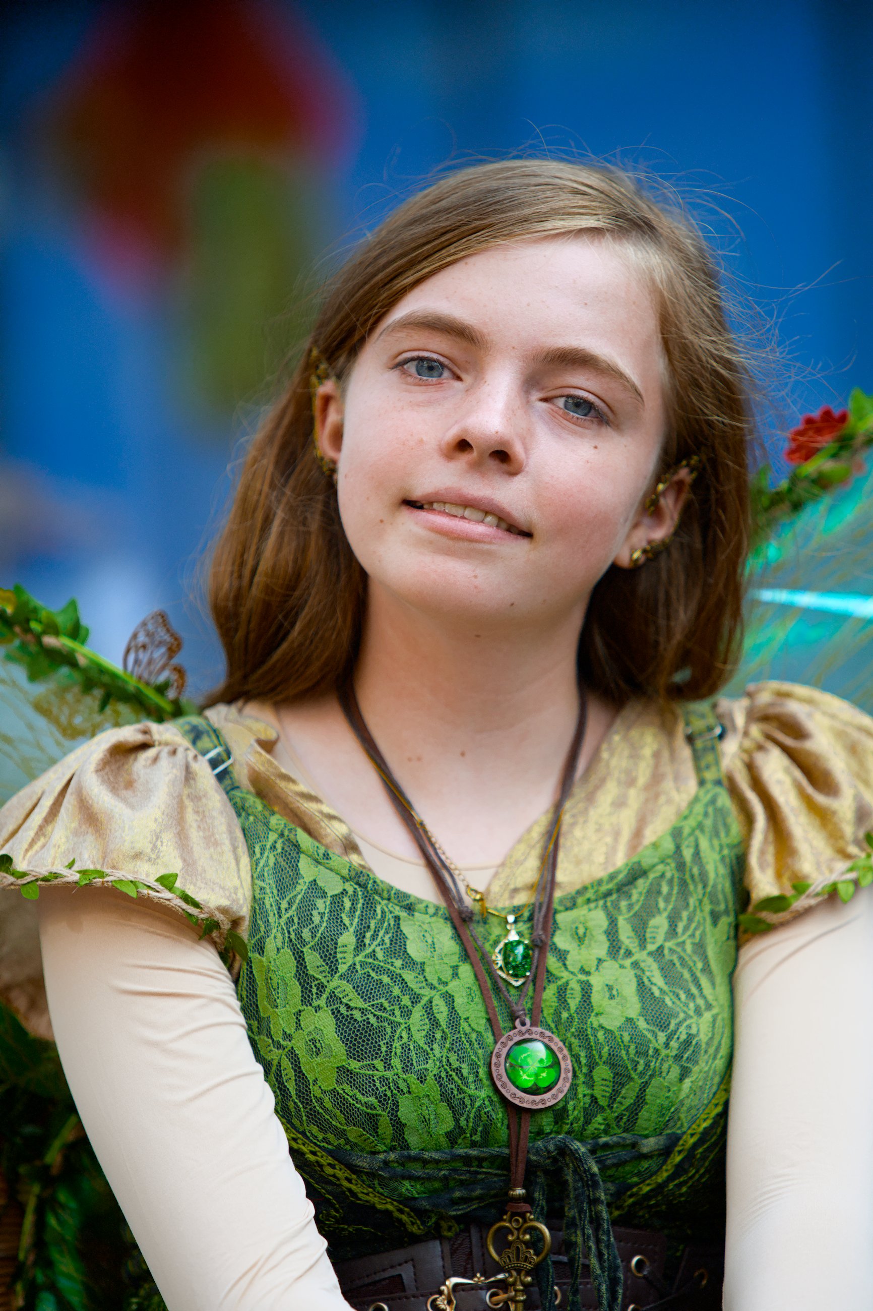
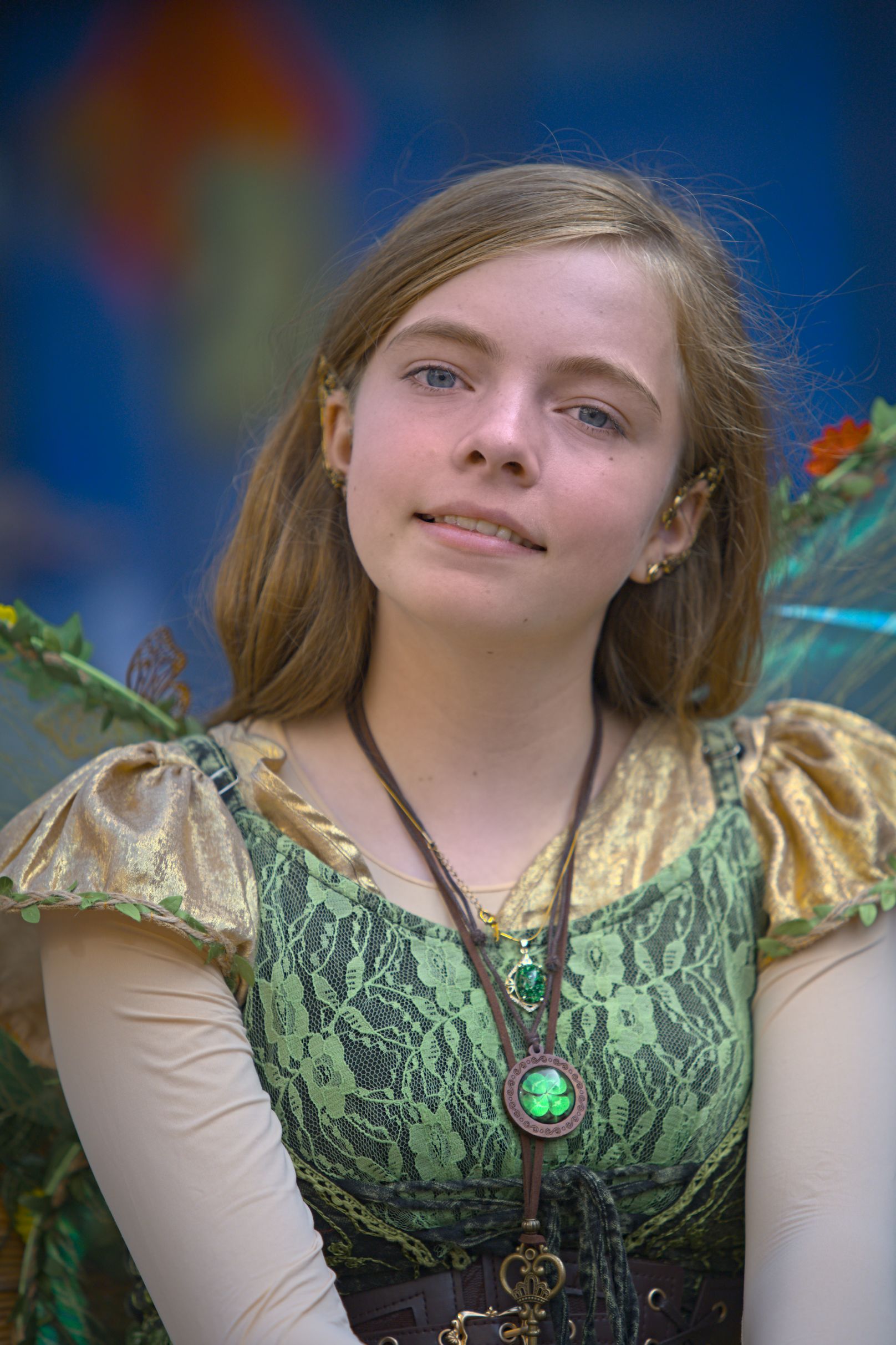
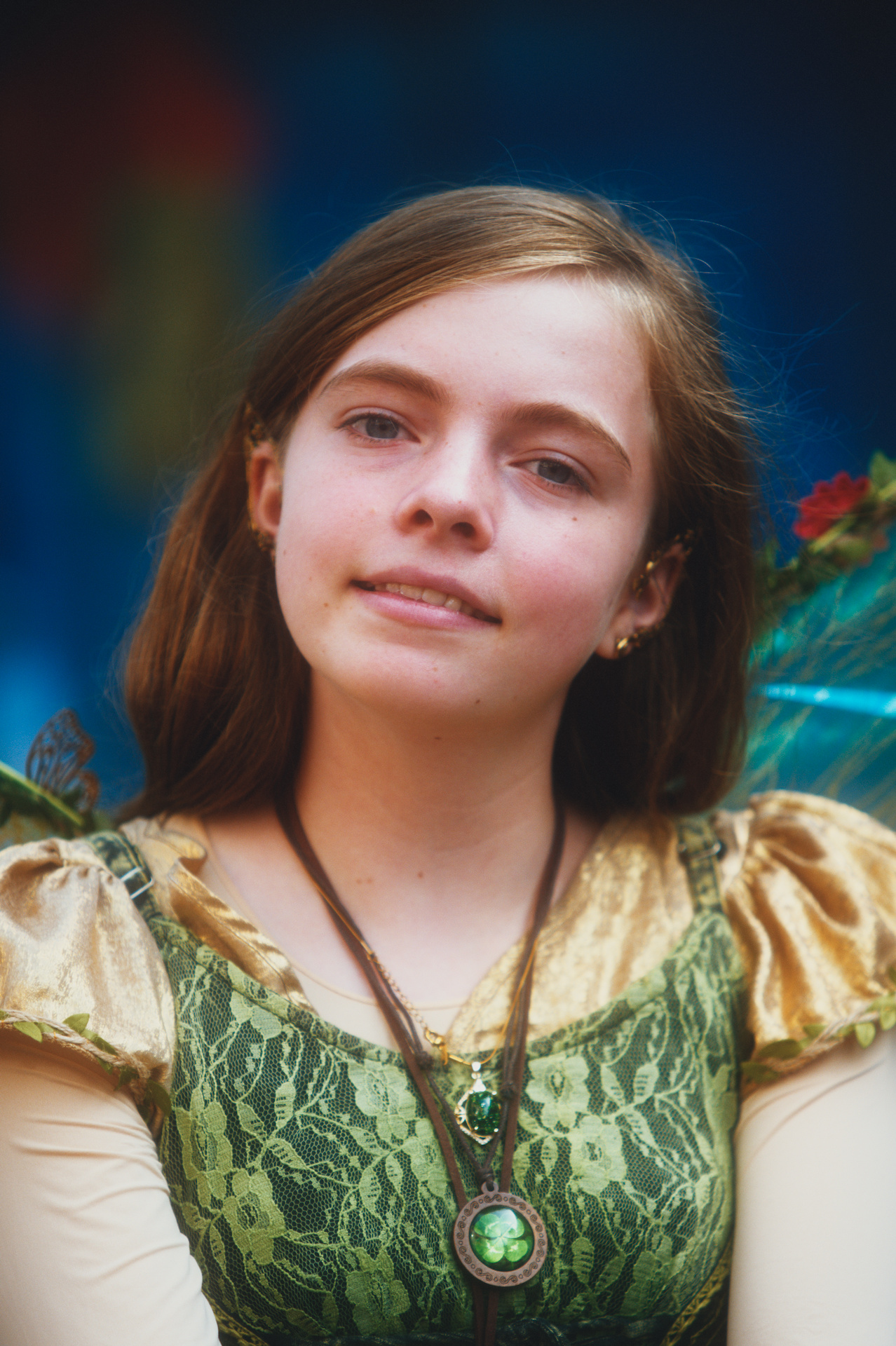
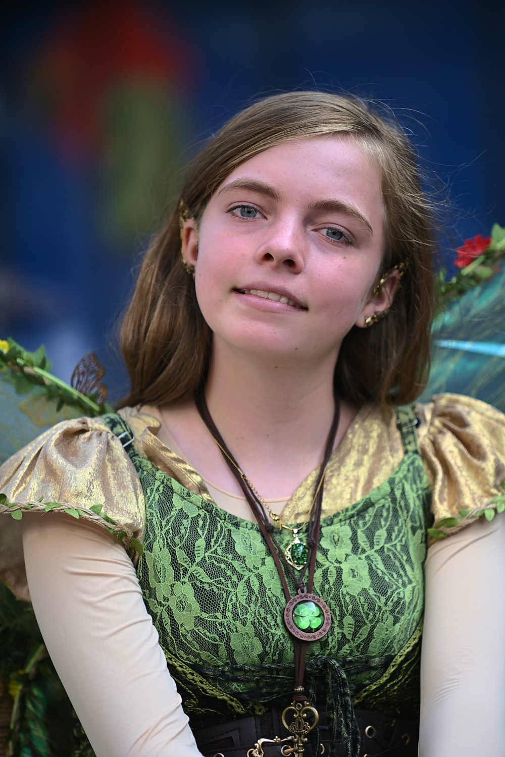
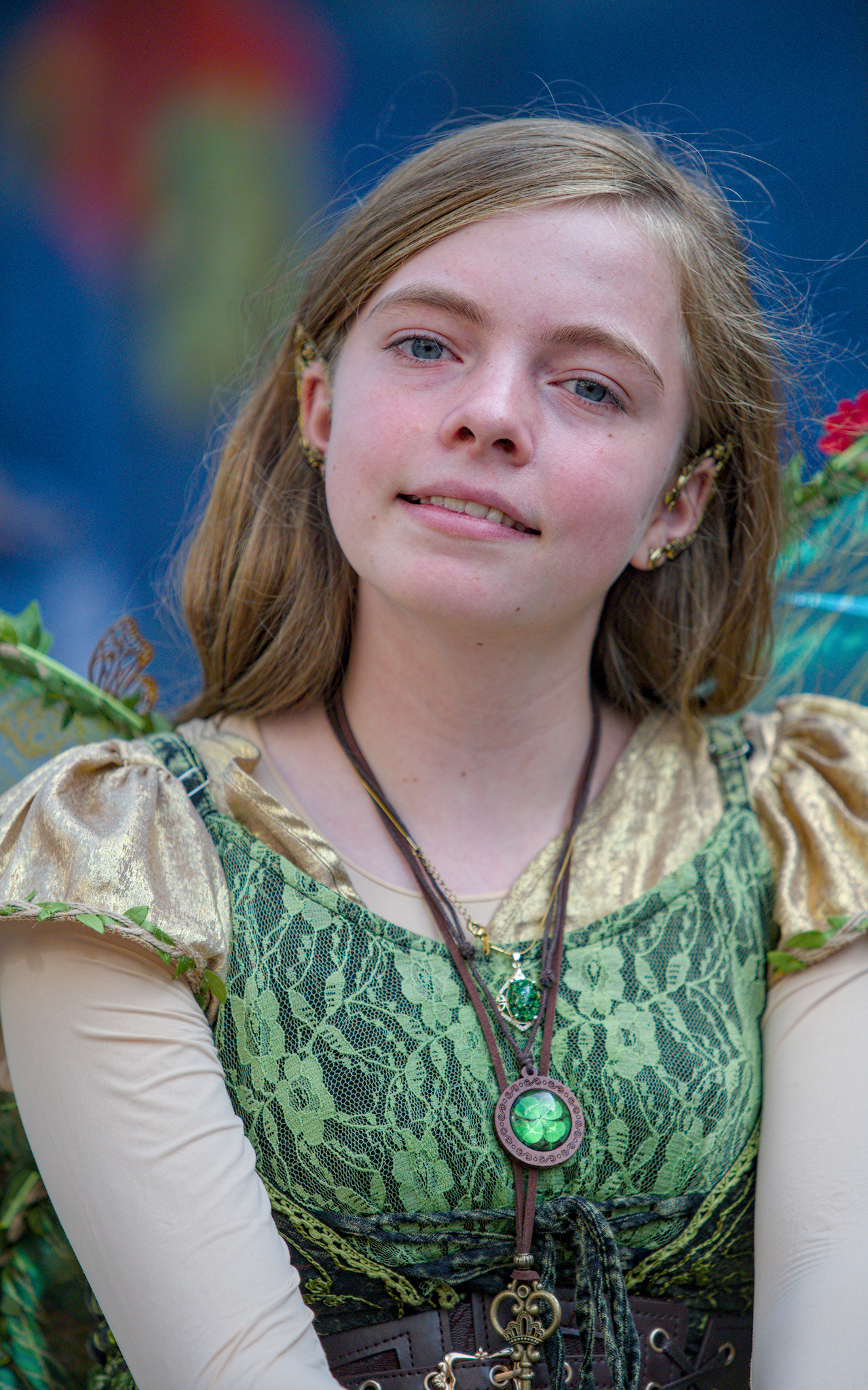
Here’s one to play with considering the discussions around A skin tone editor
I don’t have much experience with skin editing, but I appreciated the discussion in terms that it could be a useful module and I would like to learn how to do skin properly in ‘plain’ Darktable (I didn’t have a chance to look at the skin-tone branch though)
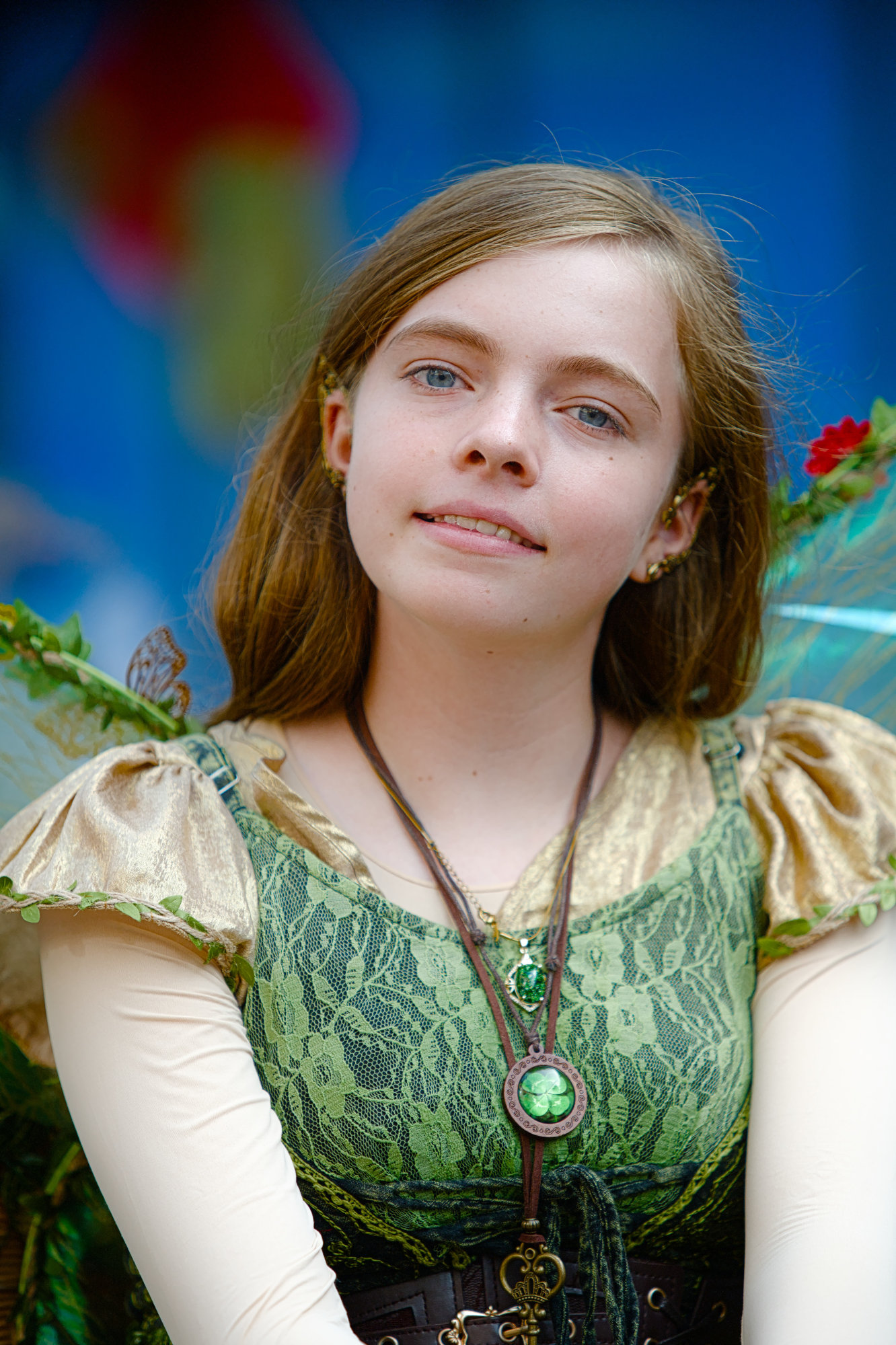
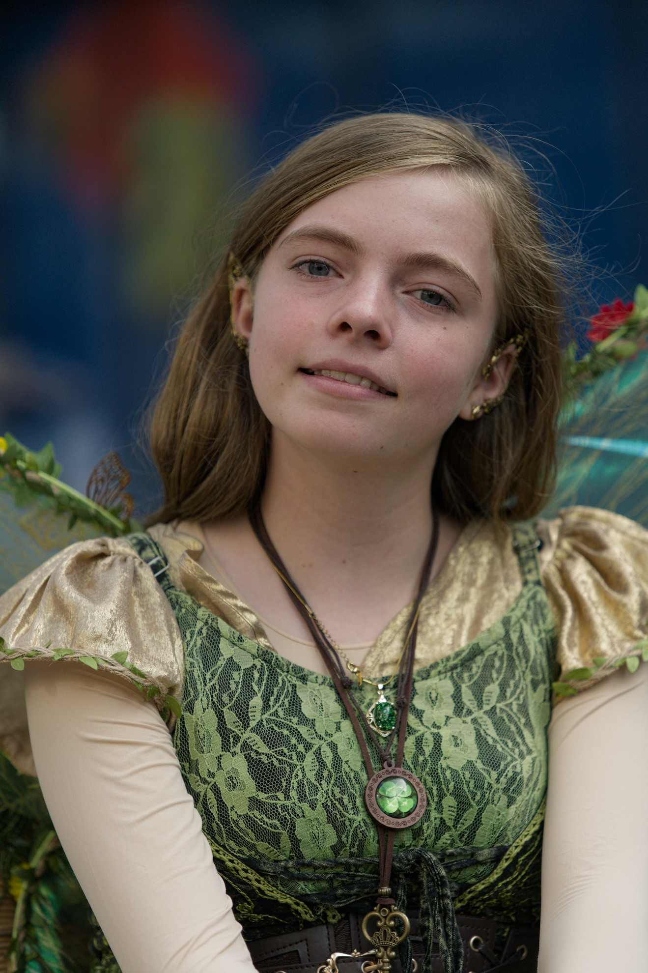
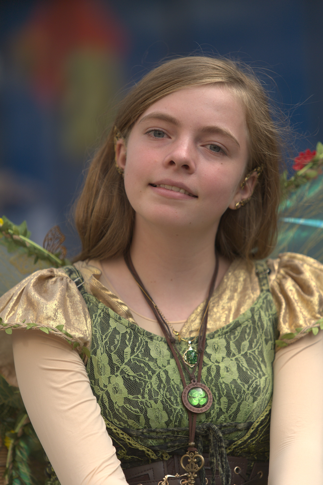
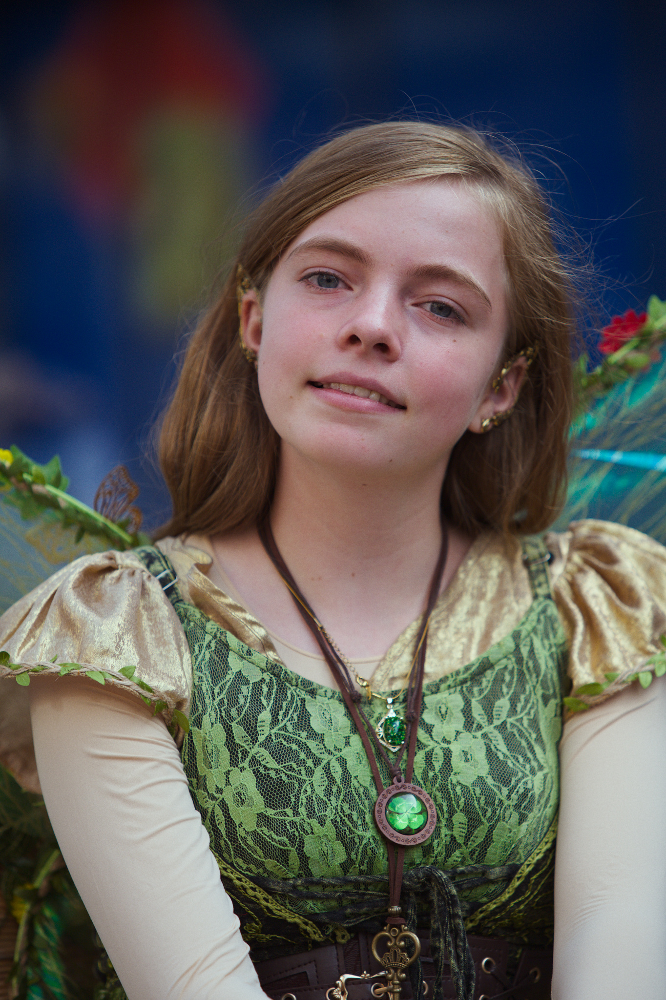
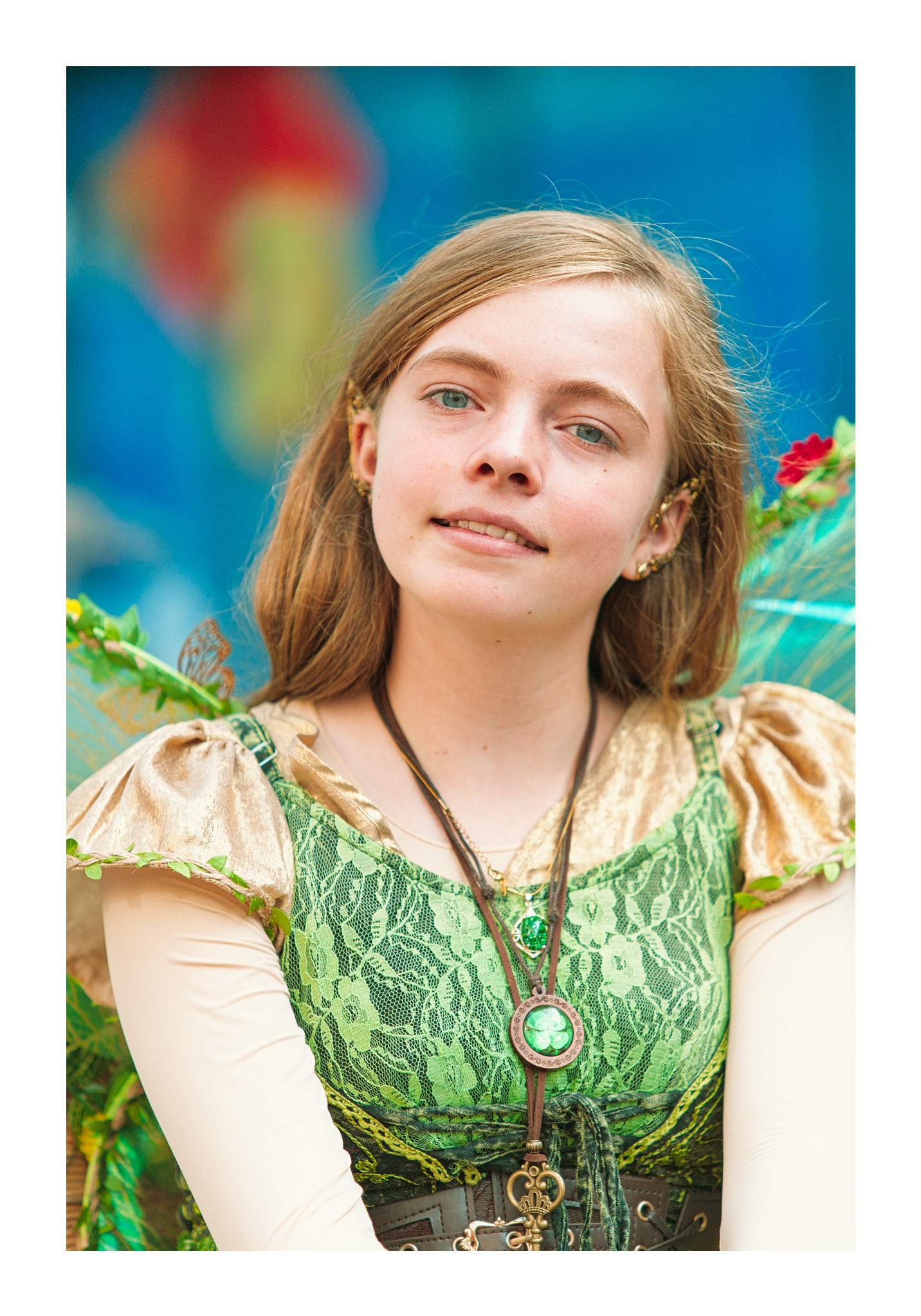
The picture is taken outside in slightly overcast daylight on the local ‘live statue fair’
p.s. the xmp is for Darktable nightly of today 5.7.0+1237
I am not very good at portraits, I prefer landscape photography, but I will repeat here what a friend of mine told me a few years back. As a pro, she was doing portrait for art and weddings for food.
Do not cut people at the joints, elbows, knees, etc.
Do not roast (saturate) skin.
Do not remove all skin imperfections, that’s what make us human.
I’m not good with skin generally, so I jumped on this to have a go, with the proviso that I’ve not spent any time with the linked post or have any scientific grounding on working with skin tones. I just worked with the RAW and my usual favoured tools
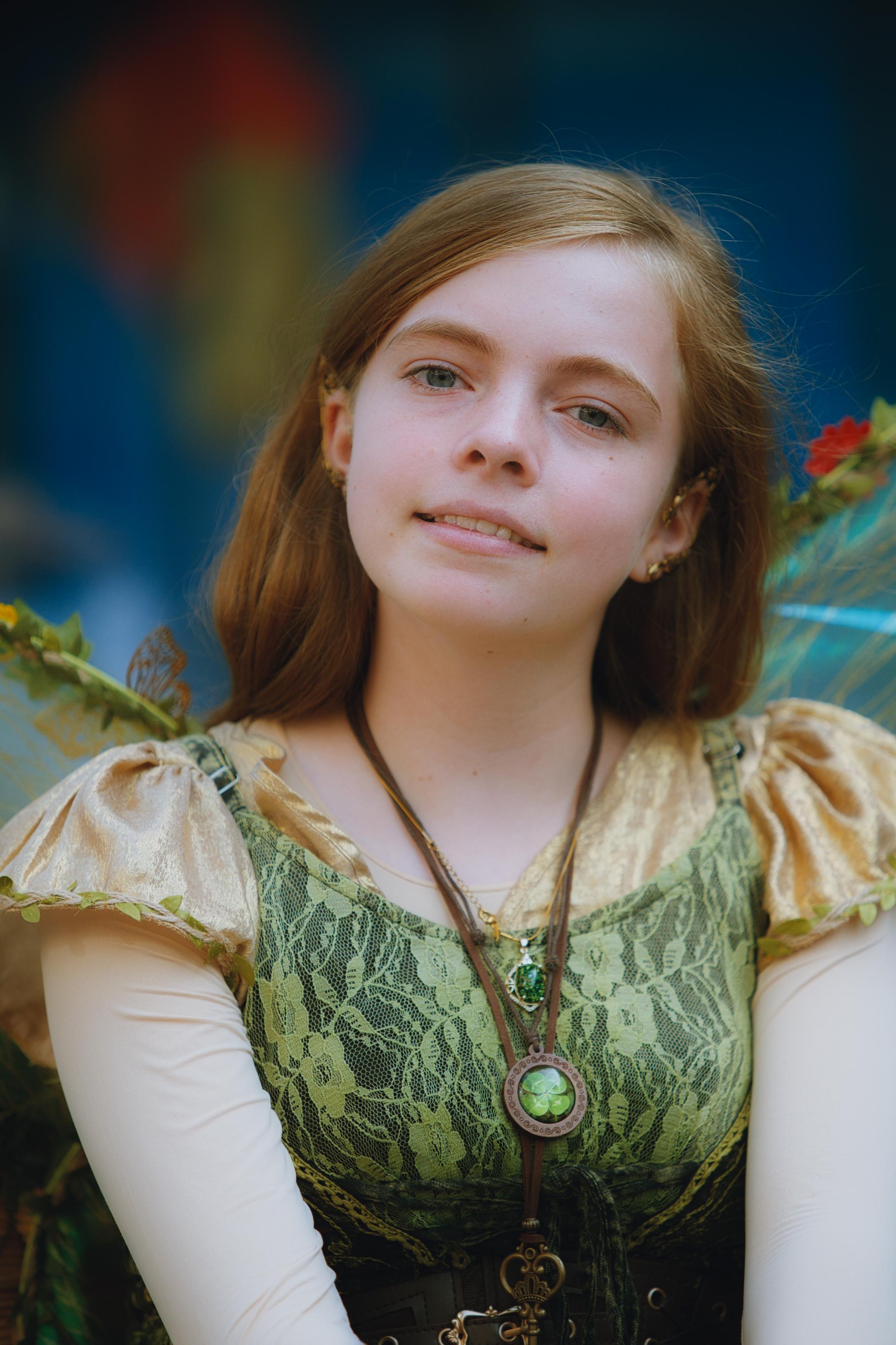
Contrast equaliser here does a fair bit of the lifting. Softening the overall tone and brightening things without losing the shadows. Then some Color LUT to cut down the reflections a bit and a blended lowpass to give it a little glow. I wanted to be careful not to oversaturate given the lighting. Hope this works (I’d really appreciate feedback on whether this is a good approach at all when working with other peoples’ skin. Is it too soft?)
Imo, yes it is too soft, maybe too much of burring ? skin is somewhat unnatural and hair is blurry, giving a strange sensation, like if the subject were out of focus.
This is a very beautiful portrait, and you don’t have to do too much to it.
I used the retouch module to balance the skin tone a little (to tone down the pink) and, using the RGB Primaries module, shifted the red hue toward yellow to bring out a slightly more orange tone in the skin.
What also makes this portrait beautiful is the color contrast between the skin tone and the blue eyes—something you absolutely have to keep in mind and bring out appropriately. The blue background further enhances this effect. :
First, I cannot know the young lady’s actual skin tone, so I just had to try to make a guess.
In White Balance, I chose the User setting with the sub-selection of Cloudy. It looked great, but later, I’m sure that both ColorBalanceRGB and FilmicRGB changed it. This is what I ended up with. I may re-post a simplified edit a little later to try to get back to what I saw after just WhiteBalance.
I dont really do portraits, and this one felt quite challenging - the light, even though it was overcast, seemed to be against me
Anyway, 5.7.0+1224 and spektrafilm, started as a fun experiment with the profile from here - Spektrafilm "presets" share thread (+darktable styles) - #40 by bazdesh - turned out quite “rational” (even though looking at it now, it is quite overexposed, isnt it. welp, next time )
darktable + experimental dcp profile module (Canon 6D II) + some “stolen” modules from @s7habo .
btw, your color calibration magic is always interesting to me.
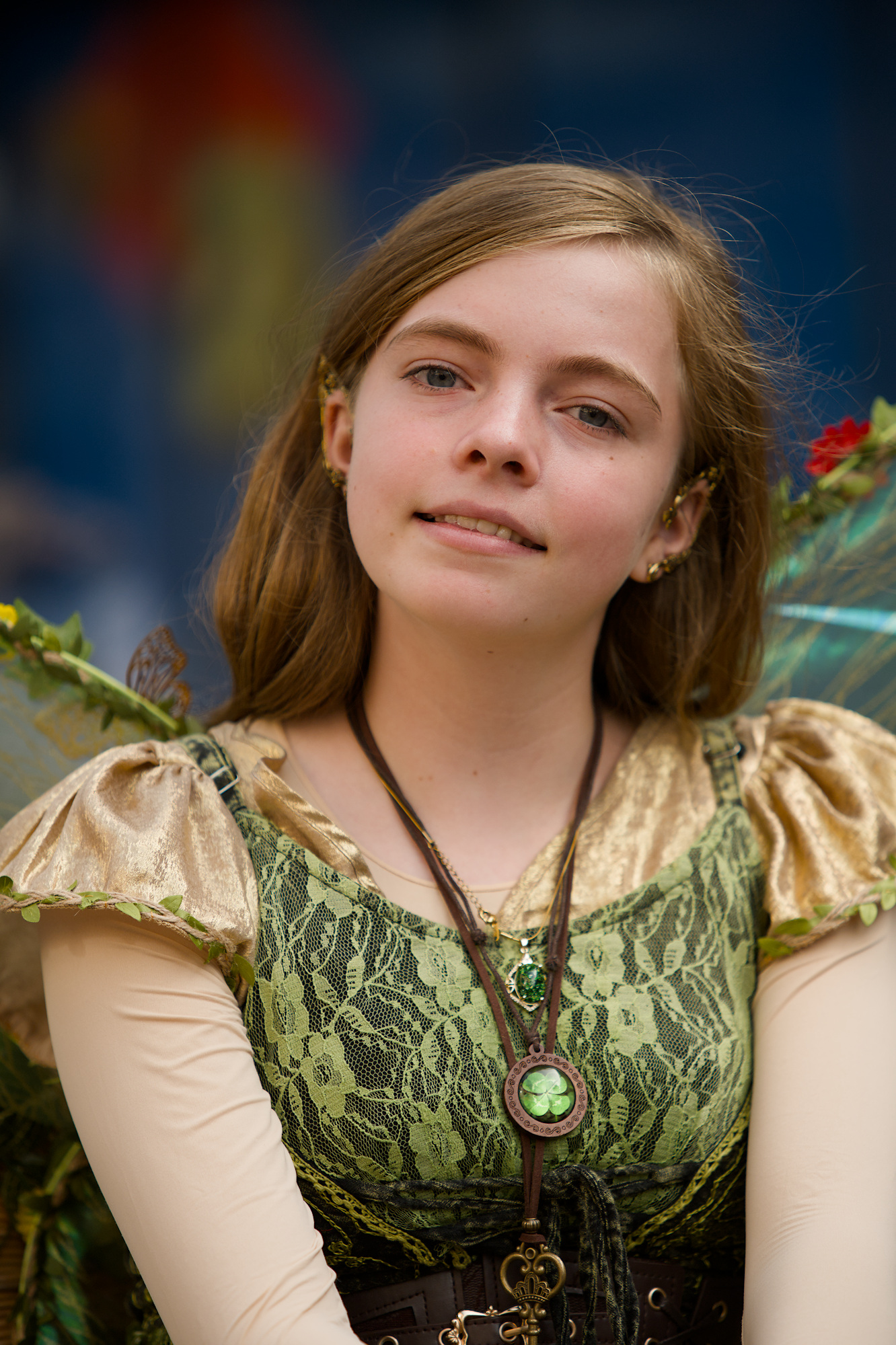
I’ve diffused the face in chromaticity mode again. Then rotated hues in colour equaliser. Little boost to medium local contrasts. Tone curve to finalise brightness.
I have problems identifying what you exactly did here.
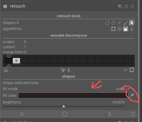
It seems like you created feathered path shapes for four areas: forehead, two chins and jaw/neck, and used the fill tool to achieve some color adjustment, but I cannot see what color is used for the fill operation. (Maybe it has something to do with your xmp file being from dt 5.7 while I am still on 5.6.2?). Did you pick color from some less pink skin patch?
I would also have expected that the opacity would be somewhat reduced as I have thought that a fill operation will be more uniform and “brutal”, compared to the amalgamation happening in a healing action, but it appears not to be so,
I would appreciate it if you will clarify this, Boris
Interesting to try a portrait - something I am not familiar with.
GIMP 2.10.38.
Increase of contrast and brightness to the eyes. Slight softening of the shadows around the eyes. Evened up the saturation of the face (increase of sat in low sat areas). Lightening of the teeth.
I’m still learning contrast & texture and the spektrafilm modules in dt. I opted for a soft look and used the diffusion filter in spektrafilm. Portra 160 on Portra Endura.
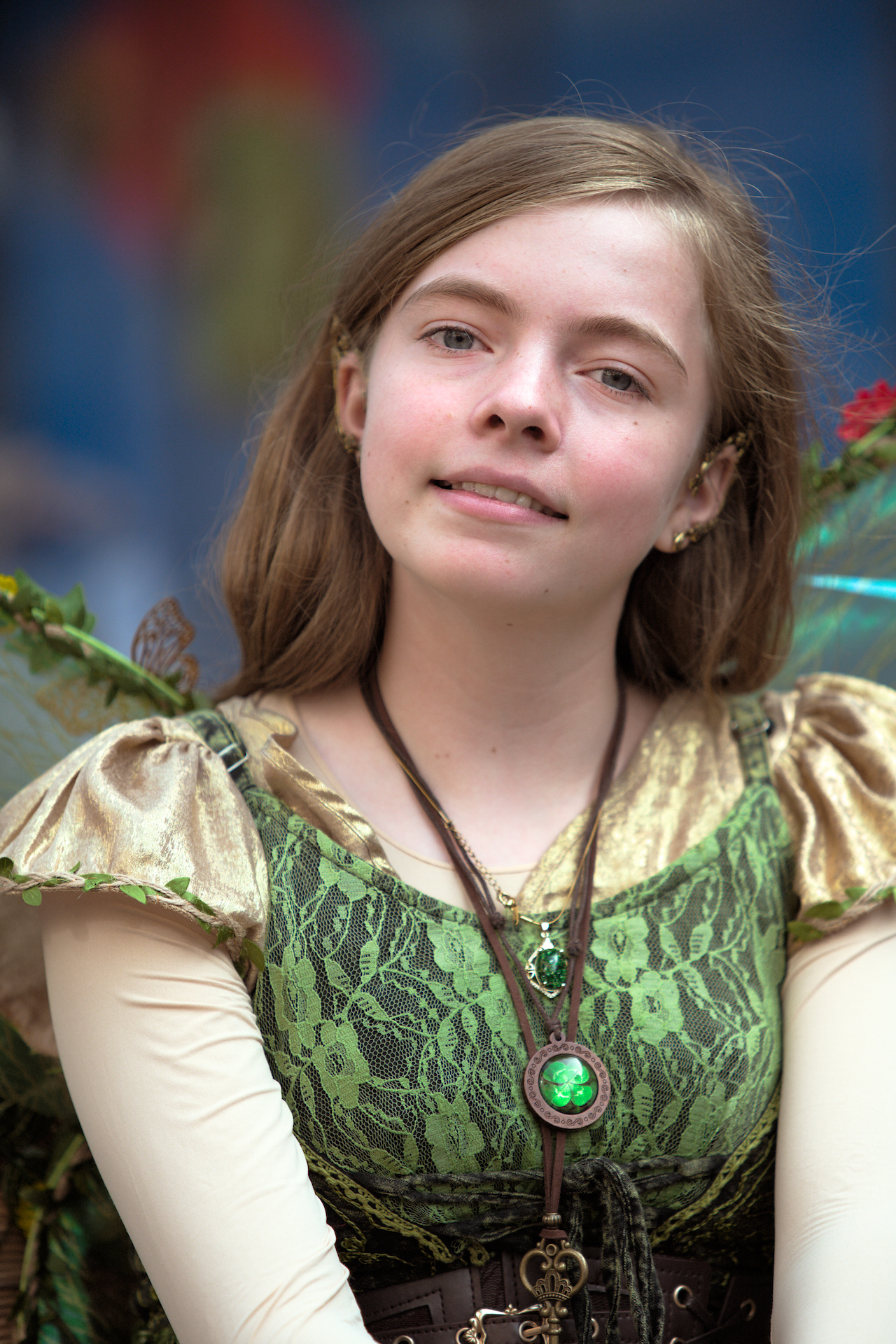
I did very little with this. I disabled the color calibration module and used the white balance module alone to select cloudy WB to add a touch more warmth to the skin. The skin didn’t need softening but I chose to soften it selectively just a little using the contrast and texture module.
DT 5.7 xmp 20260929_0074.NEF.xmp (27.2 KB)
Than you, @s7habo, but I’m still puzzled (that! …/) how the fill tool works here.
I would not have thought of using this tool for an operation like this, because in my limited experience it renders a uniform color patch (like the colorize module) unless the fill color is applied “thinly” with reduced opacity. However, I see no such reduction of effect set anywhere, and the patches are anyhow clearly not uniform/flat but remains “3D” modeled – like the color was “healed” onto the patch??
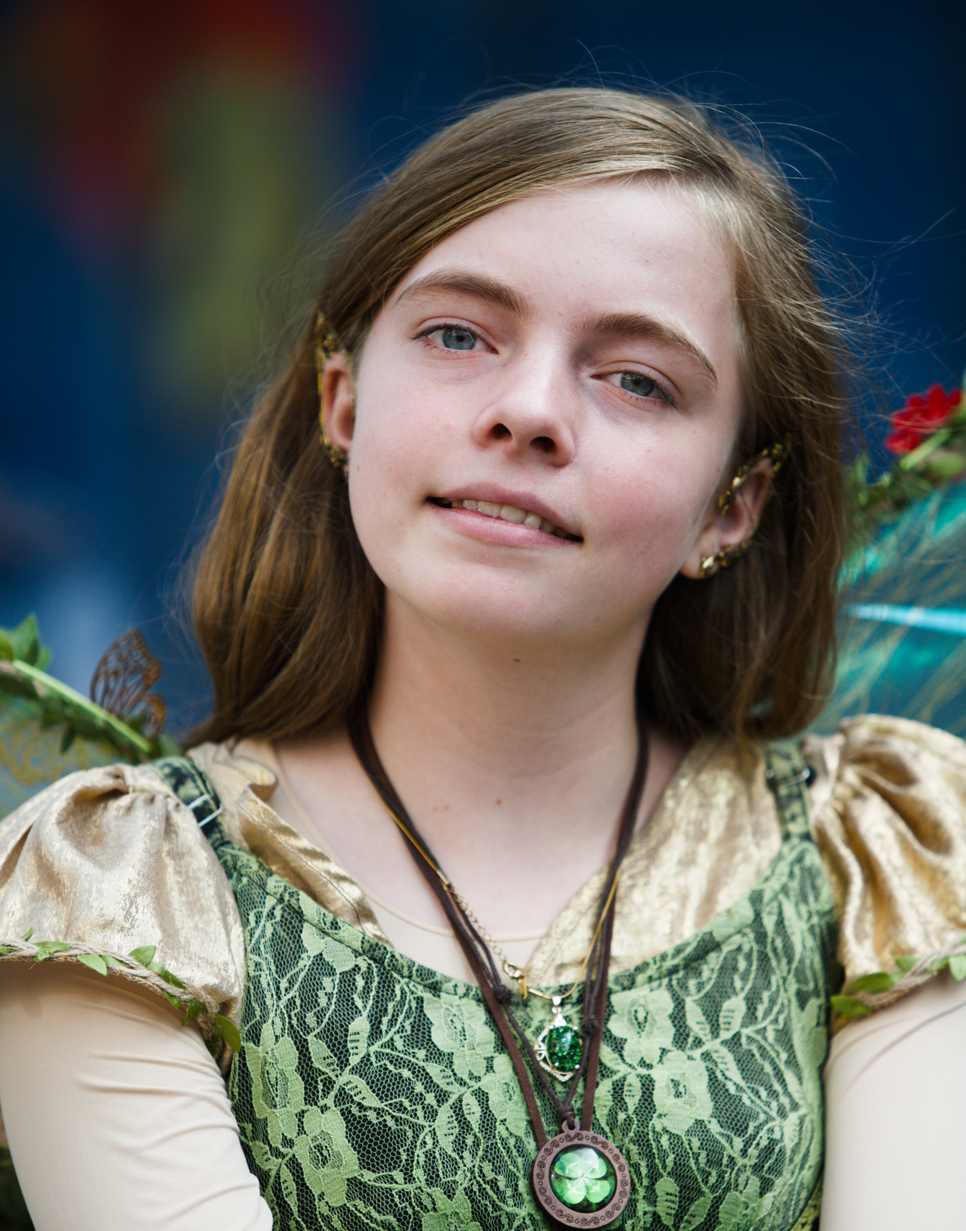
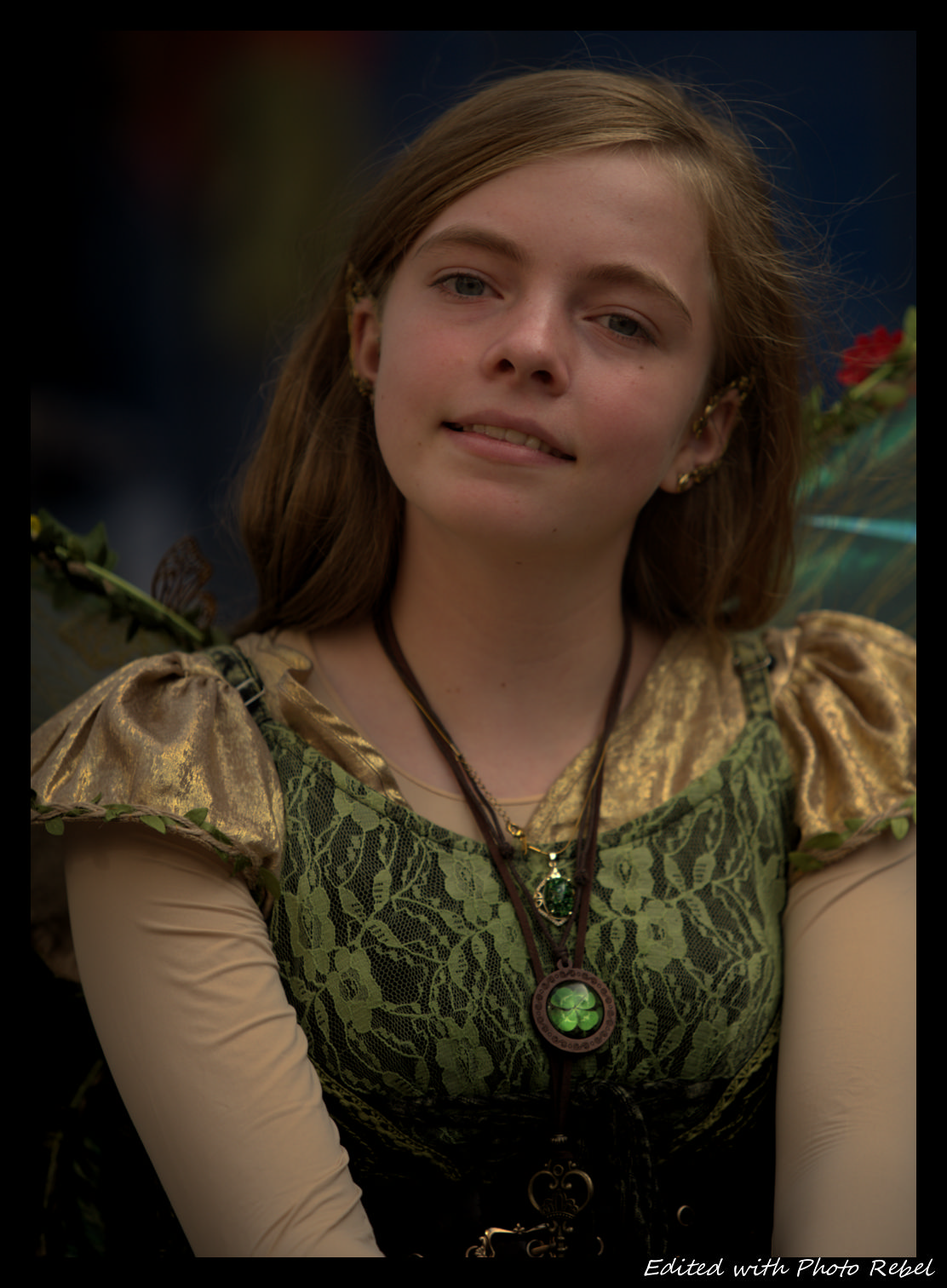

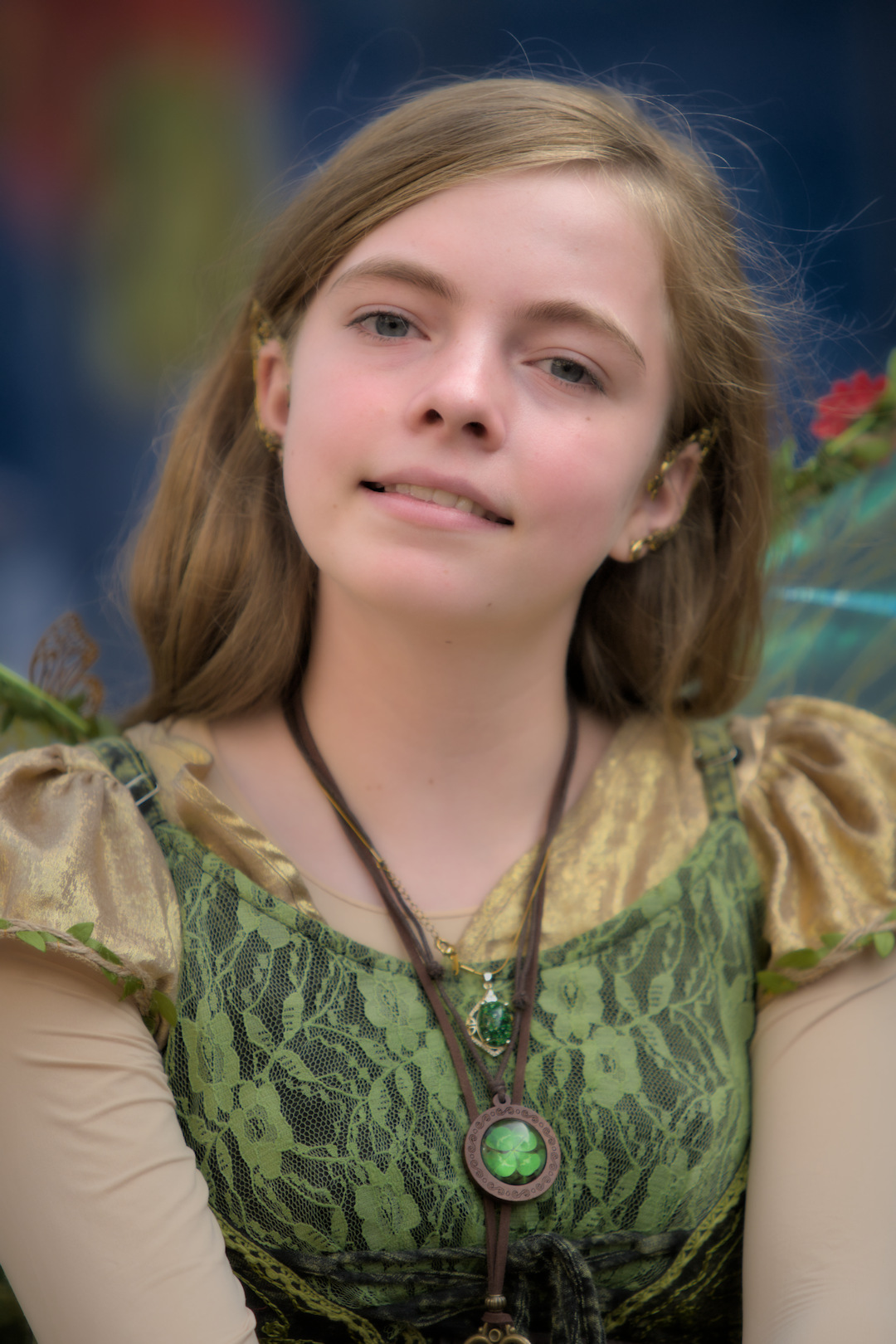

 )
)