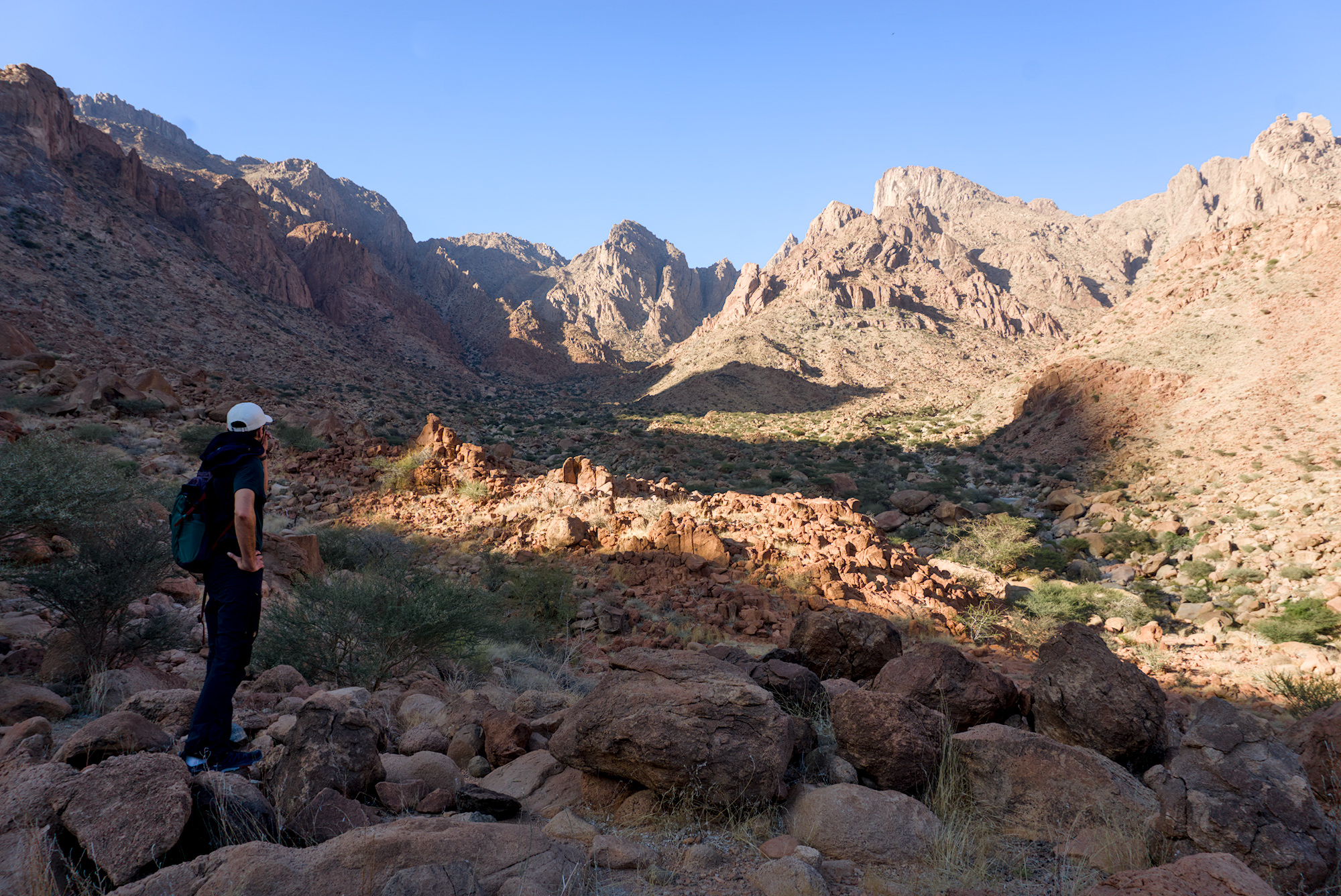
The bright parts of the cliffs on the horizon keep some detail
The rocks in the centre of the image have a strong orange tone, not too yellow, red or purple.
When I try to process, I start with the RGB curve (linked channels). I can lighten the shadowy area in the foreground by raising the curve, but this also causes the distant cliffs to appear grey and flat.
For the colour of the rocks, I tried adjusting global vibrance, chroma, and saturation, but the rocks end up much too yellow. I also tried adjusting the RGB curve (separate channels), but the overall image colours started to look very strange.
Please can anybody suggest how to achieve the attached JPG by processing the attached RAW image?
Here are a couple of quick versions… I admit I didn’t work too hard on a great color match… the shadows are easy to make as dark or light as you want … with the tone eq and here these two versions are only different by the addition of some negative shadow brillance or I could have tweak the tone eq…
Its a great image and could go many directions with color and the degree to which you might let it look hazy or not…
This seems tailor made for @s7habo latest tutorial showing the Linear Invert preset he made for the Tone Equalizer module. Here is what I came up with.
With my camera, which is a canon R7, I found I had to play with the color zones module to get my colors closer to the camera’s JPG. I also played with this module for your camera. I also took saturation away from the highlights, not because I liked it but to get closer to the JPG. I feel it would be better to not try and match the JPG but to exceed the jpg. DSC08665.ARW.xmp (16.5 KB)
I already asked myself when I read the thread title, what could be the reason for doing that. If you like the ooc jpg, why don’t you use it. If you think there is room for improvement, use darktable and don’t waste time by comparing with the ooc jpg, but make the edit the way you like it the most.
As I like bright and saturated colours, I would go more into this direction:
That was the challenge for me too. However, I have made the processing of my Canon R7 images an easier task by creating a style that gives a reasonable approximation of the cameras JPG. This gives me a nice starting point for most of my images. It doesn’t mean I am chasing the JPG look but the camera’s JPG look is often a nice starting point and I can 99.999% of the time then beat the JPG for detail and overall look. There are also some darktable camera styles now available in DT which is what inspired me to create my own.
Or actually I forgot which one’s which. You can tell me if you can spot the difference between the two.
You might notice I’ve used quite a few modules to get as close as possible to your jpeg (this is probably not necessary if you want to get a rough starting point that’s similar to your jpeg)
Actually I could get 95% there with just exposure and agx modules. Then 98% there with tone equalizer. The other few modules were only used to fine tune.
For me the out of camera jpeg seems very purple for some reason. And I had to hold myself back from turning the sky teal again
Edit:
Here’s my more creative “analog-like” interpretation. Stronger contrast, less overal dinamic range and softer overall feel. I’m biased towards this version
Next time, please post smaller files. The three images in your post take more than 10 MB. A smallish image is enough, as long as a sidecar is provided.
Just checked the pictures and saw they fit the above requirements, and have a setting in darktable export to ensure I don’t accidentally run over the resolution limit.
Should I limit overall post size instead or further lower single image size for any post?
Any recommendation for export settings in darktable?
Is there a way I can share an image link (maybe from my own google photos or drive) and have it still appear in the post? This way the burden of hosting the image wouldn’t fall on this forum but the poster themselves.
Is there a way to implement a warning system so if a post overshoots the limit there would be a bright red warning or auto-reject?
Sure I’m not arguing against a file size limit. And I apologize for uploading files that are too large.
I think we should update the sticky post to saying limit your jpeg file size to under <<reasonable size in mb/kb goes here>> instead of a resolution limit. (Currently it only specifies full hd resolution and I didn’t realize that even though my uploads were full hd resolution they were still considered too large)
I will look into my export settings and make sure to produce smaller files.
What would you say a reasonable file size is for posts in playraw?