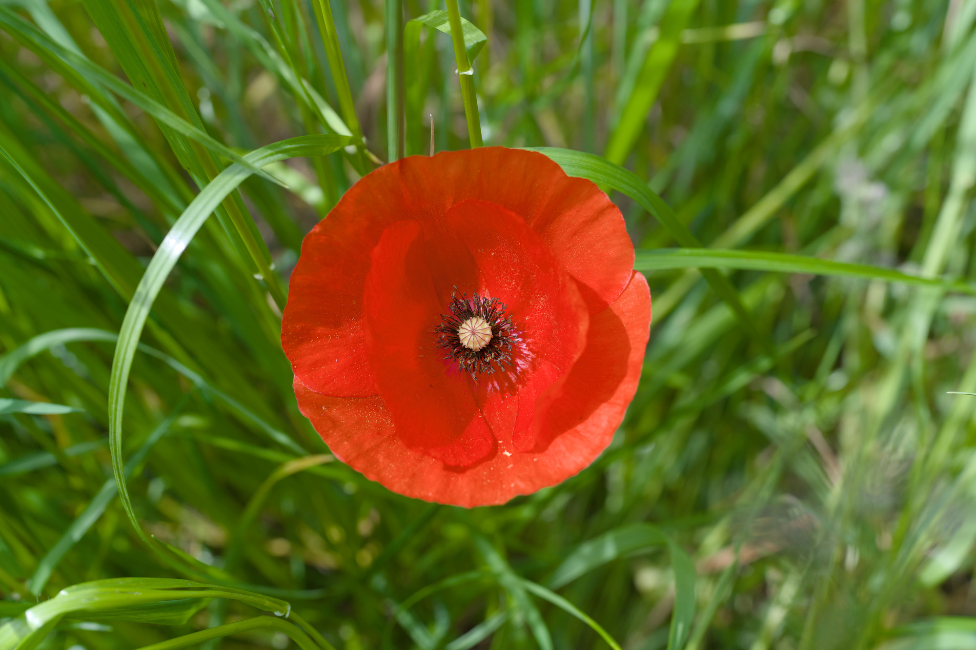
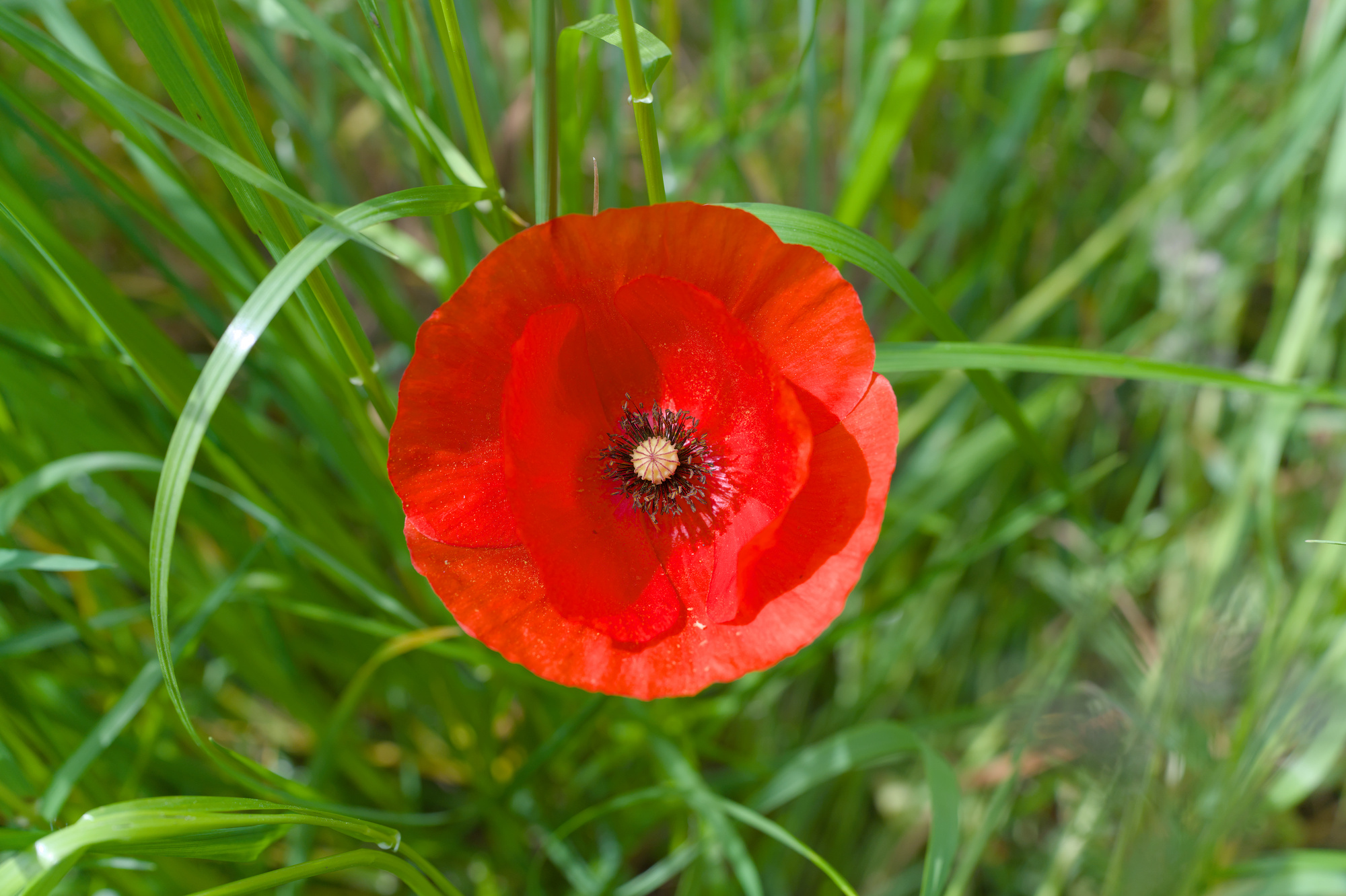
working on a puppy flower image I recognized today, that when rgb primaries module is active a simple activation of color balance rgb module changes red color of the flowers! I just activate the module without touching any dials.
Is there a problem to use these two modules in combination or is it just a bug in the actual master? Looks like a bug.
dt windows 4.7.0 1334 release of Bill installed
I’m not at my PC now. Do you get a corruption (e.g. something turning black), or a small change? If the latter: even if you don’t touch any sliders,
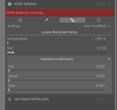
At its output, color balance RGB checks that the graded colors fit inside the pipeline RGB color space (Rec. 2020 by default) and applies a soft saturation clipping at constant hue, aiming to retarget out-of-gamut color to the nearest in-gamut color by scaling both chroma and lightness.
(darktable 4.6 user manual - color balance rgb)
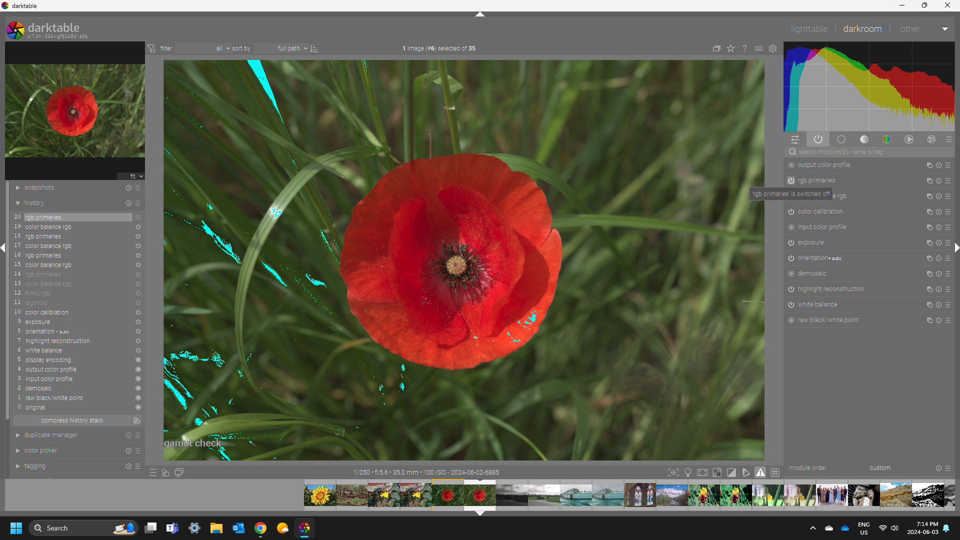
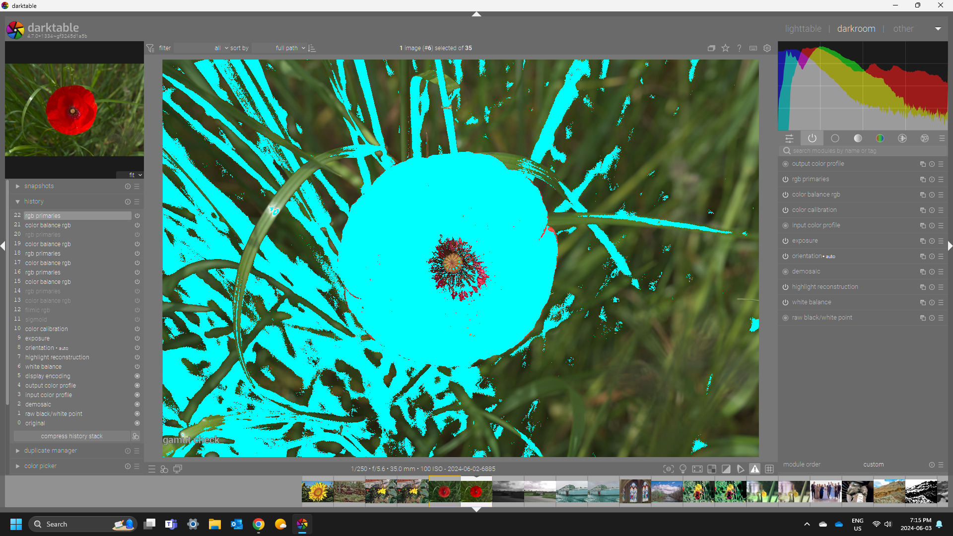
hmmm yes, I was out of gamut - although I’m unsure why. Color picker doesn’t show any RGB values in a critical height (I deactivated filmic rgb and sigmoid to see more)
I changed histogram profile to Display P3. Now colors at least do not change from red to violet but still the red gets darker.
After some more testing - it looks like I have to rethink my usage of rgb primaries as it’s very easy to overshoot and get out of gamut with this tool…
Gamut checking in DT can be a bit of a thing to take a moment with . The Color picker uses what you set for your histogram profile. The regular gamut checker uses your soft proofing profile and the over exposure warning can be set for luminance or saturation or full gamut and it uses the histogram profile. A final caveat is that your display profile could cause issues due to its location in the pixel pipe. You can check this by setting your display profile to rec2020. Your image will look bad in the preview but the gamut indicator should not change what shows as in and out of gamut when you toggle between this and your proper display profile. If it does then your display profile is likely introducing some gamut clipping as it comes before the histogram profile when processing pixels …
You look like you are using 4.6 or older… I suspect what you saw is what happens when using an xmp from the new master…there is a new default that uses the wb early and then camera reference data… I bet it goes to what you saw since you are on an older version…
Its the fifth option shown here…
I’m not at my PC but I am wondering if that is what you might have seen…
I’ll see how the xmp loads for me when I get home… I just updated my build last night…
Ouch - you are right - yes I am on 4.6
Just downloaded the latest app image (Darktable-4.7.0+1334.gf3245d1a5b-x86_64.AppImage) and tested. Sorry - I had to read the description more carefully.
I’ve seen such behavior in the past. Way back in 2.x
I would perceive it as a bug too but at the time I was told that it is not.
I can see how the vibrant red (when primaries only is active) get slightly dull when color balance RGB is enabled.
For the sake of it - checked against Darktable-4.7.0+800.g1f4abd0a20-x86_64.AppImage - looks the same to me
Also - checked against 4.6.1 - same thing.
So - unless I am completely misunderstanding something - when RGB Primaries is active and color balance RGB is activated - even without touching any dial - there is a noticeable change in the color.
Not sure how the behavior would be classified but it has been around for a while. It is not related to the latest build (in my opinion)
This module does some gamut management…I think if out of gamut it will clip it and keep hue constant. So images with big deviation would likely show this. I think it’s part of AP’s UCS. In fact you can use the module in 2 different colorspaces if you look in the mask tab and this also changes the look…
I did some more testing and it confirms what was said here before. The red of the puppy flower petals is at the edge of what fits into gamut boundaries.
rgb primaries is a powerful but dangerous tool in such cases, it let’s you push the reds easily (red purity) over all limitations.
color balance rgb changes the colors even if no dial has been touched, if color values in the image go beyond selected gamut
I usually work on and view at my images on calibrated displays, the one this morning was in my company and is of lower quality as the one at home. Finally I compare them on my iPad screen and most of the time everything fits together quite evenly. Whatever one may think about Apple, the display quality is very good and I love to show my final images to others this way.
Therefore I decided to switch to Display P3 in the histogram profile and voilá there is a little more space in the reds and I was able to push them even more, which makes the reds look wonderful on the iPad. That is the first time that I saw a meaningful difference in the larger colorspace of those Apple devices.
Although I must admit that the pictures I took of the same flower with my iPhone look even punchier, but that must be the new HDR-whatever that Apple uses on the latest models.
But everything fine on my side now, I get the reds I wanted to see quite well and learned, that on the edge of the color space things can get tricky, some reds looked a bit violet and needed special treatment.
Ya looking at it with the gamut checking indicators and then switching the order of the modules, then if CB comes first its not an issue as the gamut increase comes after it so not really a change noticed by enabling and disabling it…
Whole no rgb primaries and CB enable and placed before rgb primaries…
It is interesting how much difference the 2 profiles produce even on a Linux with an older Benq monitor. I am curious if apple uses p3 by default
When it comes to saturated colors - for some reason often I tend to gravitate to them but exports to SRGB dull the images quite a bit. This is an observation on both phones and calibrated display. It is like - whatever I see in darktable is somewhat muted to my eyes when I see it in SRGB. However - I never tried using P3. From what I see - Linux is handling it well in different browsers and programs. I mean I can observe the difference between SRGB and P3.
I’m curious there is any impact changing the histogram profile on the preview or editing result…this should only present a different histogram and color picker values… changing your display profile or export profile would change the results of the preview but it would only benefit a monitor that could support viewing exported files and just randomly using display P3 for your display is not likely going to be a faithful representation. I agree that exporting to a wider gamut for phone and tablet and perhaps Mac viewing would possibly make sense but for those with sRGB gamut panels strait to sRGB might be better than viewing a P3 image even if color managed… I can’t say as only my phone has this option sort of gamut possibility… I guess I could try and see what the result is…
How is this impacting your output… are you sure you mean the histogram profile or do you mean the export profile… changing the histogram profile is only going to change the colorspace used to display the histogram and calculate the picker values…it should have no impact on your image… from your xmp you are using linear rec2020 as a working space so you are not gaining anything as this is the space used to calculate the resulting edit and its much larger than Display P3??
I was surprised but my phone (Oneplus - older model) actually does have both SRGB and P3 selectable. I am a bit perplexed.
SRGB image viewed on SRGB profile on the phone - a bit dull to my taste.
SRGB images viewed on P3 profile on the phone - very vibrant. (I am estimating here but I think I maybe closer here to what I actually see in the working window in darktable - comparing if the phone is set to SRGB)
P3 (the supplied from @Roland_Rainer ) on SRGB on the phone - to my eyes it retains advantage comparing to the SRGB export.
P3 (the supplied from @Roland_Rainer ) on P3 profile on the phone - it is clearly displayed well. In my opinion - in this combination the phone surpasses the BENQ display.
I think the only way to validate my observation would be to ask a family member who does not have an idea of what is different between the images. In my personal opinion the P3 opens very much the display even with SRGB
Ya I think phones esp android ones can be tricky my pixel has two settings I think there used to be 3…natural and adaptive…for sure the later is colorful and punchy but in something like that red flower you need to look close an see if you lose resolution of detail to to gamut or boosted saturation. The natural setting on the pixel looks at first perhaps washed out compared to the other version but it resolves color fairly well without oversaturation so I think phones might not be as simple as setting a profile in software or the OS but I am no expert either… I exported the P3 and srgb versions on my PC and then viewed on my phone… the phone is small so its hard to tell and I think there may have been a difference but blinded I am not sure I would notice… Also a jpg is still only 8 bit so you could actually have some posterization I think with wider gamut. On my screen which is like 96% srgb both images look basically the same in my color managed viewer which is what I would expect…
I can see some differences here even though my monitor is not P3 gamut worthy… I can see clear changes in the sunset, and umbrella pictures but the yellow flower is the same again likely due to how my screen is calibrated and handles that color profile on a monitor that doesn’t support it…
I think since the display device will dictate the outcome its hard to say… On my monitor which is calibrated but not wide gamut…the P3 version shared by @Roland_Rainer is posterized a bit or has gamut issues not sure how to describe it but using the snapshot you can see it…
P3 is the snapshot on the left…see how it saturates the petal whereas with the sRGB there is some gradient of saturation… maybe on a wide gamut the P3 actually looks better but this the issue about knowing where the output is targeted for…
Apple uses the P3 space already for a couple of years , all newer iPhones, iPads and probably also Macs use it as standard. Viewers on Linux must have started supporting P3 during the last two years. I remember that picturs I took with my iPhone 11 already were shot with P3 by default, but for a long time Linux (Ubuntu) and gthumb or geeqie (which I prefer) were not able to use it and fell back on some duller looking converted colorspace. With an update somewhere last year it suddenly worked and now my iPhone images look a lot better when viewed on the PC.
The other way round exporting images from darktable using export profile “Display P3” seemed to be interpreted als sRGB images on the iPad/iPhone for quite a longt time - looking less vivid than on the PC display. I found no way to see the colorspace an image has on an Apple device, they simply hide all “unnecessary” information and metadata from the user.
But as the same image exported as sRGB and P3 now looks different something has improved. Either darktables export profile “Display P3” was improved to be more compatible with Apple P3 or Apple improved their interpretation of imported images to recognize colorspace better.
Anyway it is, things improved in both directions during last years. Years ago I had to adjust images twice to get nice bright colors - once in darktable and then another edit of the exported image on the Apple device with photos app, darkroom or photomator/pixelmator.