really very elegant the logo under digikam !! 


Fine it looks like this 
1 Like

I see that I was very late - but I also like to have fun 


Love it, but the brush strokes still irk me a little
My mockup with a pixelated version within the frame to highlight the digital approach. You go from outside (art, the real world) to inside (the digital darkroom).

1 Like
On the contrary we can think with pixels, that the software is not good enough not to see the pixels ! While with the other logo with the traces of paintings, we can think that the software is so good, that we can’t see that it’s digital !!! 
1 Like
Summer of love style… Like it!
My 2 cts: the logo with brush strokes indeed makes me think more about painting software, such as Krita, than about photography software.
Like, you have an empty canvas and you create painting art.
A logo like the one RT uses makes me think about working on a colour image which already exists, and that you improve with specific tools.
But I don’t have any good idea to make a proposal myself.
1 Like
Thanks everyone for your comments! I have decided for the logo that you now see on the webpage. I understand that it’s not perfect, but:
- I like it
- it has character
- it’s not recycled from Wikipedia
- it’s as least as evocative of what the software does as the gimp logo

That said, if a better one pops up, changing it is fairly easy… So, if you are unhappy, feel free to keep posting alternatives!
8 Likes
Alberto, keep it, it is very different from those of Darktable and Rawtherapee and over time it will participate in the identity of ART.
SM
3 Likes
Ciao Alberto, hope you stick with this, it’s striking and different. 
1 Like
I will be a dissenting voice, sorry. The old logo was cute and well defined. The new one is too fuzzy for my taste.
2 Likes
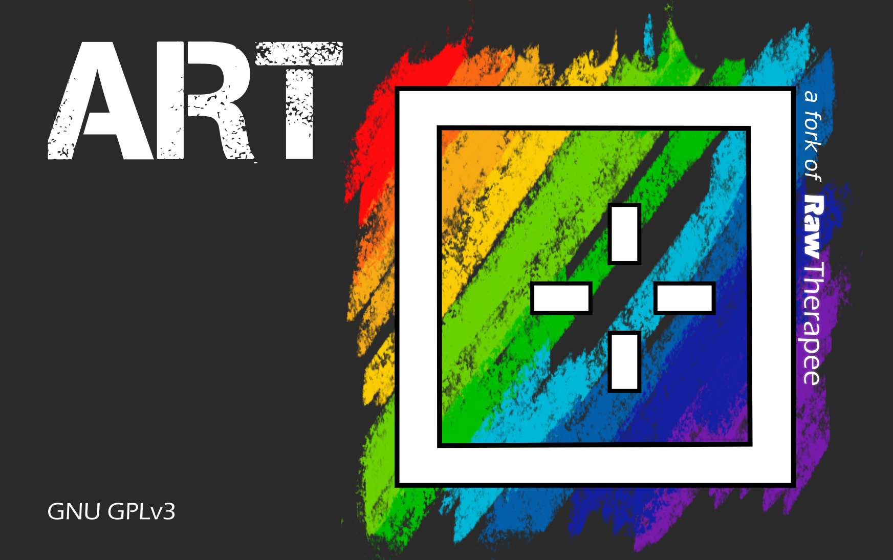
ART
A RawTherapee fork
or
ART
A fork of RawTherapee
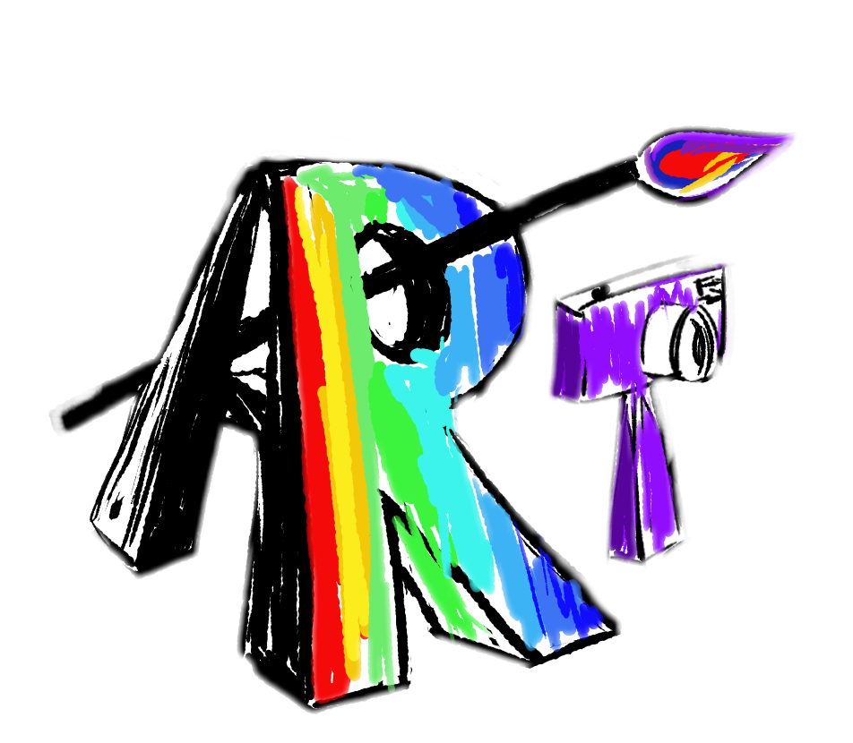
Hi, just for fun I redesigned the RawTherapee logo and then made a slight modification.
Let me share it with you in this subject that I think is apropriate.
PNG :

SVG :

4 Likes
Simple, elegant, photography related, RT related.
I Love it!
2 Likes
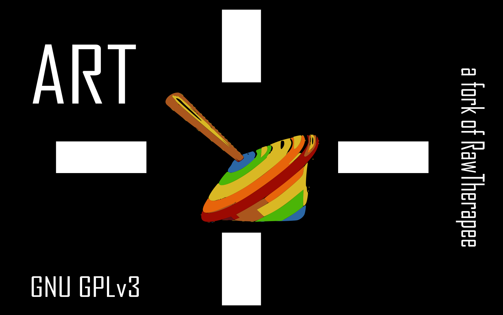
Most good lenses have an odd number of aperture blades. Though I have to admit, that the current RT logo also has an even number of colours ![]()
Nice! I think this would be a very good revamping of RT’s logo 
For ART, the ship has sailed – I like the current logo and I’m not going back (yet…)
Thank you for your feedback.
Good remark @heckflosse , I had just started from the RT colours.
No problems @agriggio , as mentioned above it was mostly for fun. 